| 96 |
Mar 24 |
Comment |
Hi Howard. Bright city lights always make for a captivating image, and you've found a very nice example of that here. I particularly like the shade of deep blue that you've rendered the sky, which complements the warm tones appearing in a lot of the buildings.
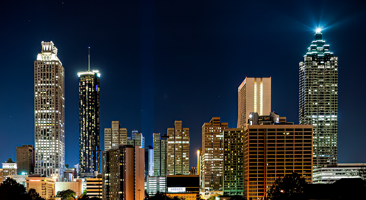
There are a couple of technical improvements that you could consider for next time. As Viren has pointed out, the scene exceeded the dynamic range of your A99, and you have a lot of blacks which have gone pure black, as well as highlights in the lights that have blown out to pure white. Since you are on a tripod, you could shoot a couple of different exposures for the darks and brights and blend them in an high dynamic range (HDR) approach. Short of that, for this image, I'd crop the bottom to reduce the areas that have gone pure black. Some images work with a lot of pure black silhouette, but I'm not sure that is the case here.
Second, you shot this with the back of the camera slightly tilted, so if you look at the buildings on the two sides, they are not vertical. Avoiding this is the reason architectural photographers get shift/tilt lenses. But nowadays, you can just correct the perspective in Lightroom and make the buildings vertical once again.
Finally, it's my impression that the image is not as sharp as it should be. Viren points out that you've shot wide open and have limited DOF. I am not sure whether that is the issue or not; everything is pretty far away, so I would not have thought DOF is a problem. But other things could be going on. First, another reason to close down the lens is that a lot of lenses are not their sharpest wide open. But another thing which could be going on is movement on the tripod. Was there traffic on the bridge "vibrating" it? Was there strong wind which could have been moving the tripod / camera over the 16 sec exposure? It is amazing how little it takes to reduce the crisp sharpness one is typically looking for in a shot like this. Once again however there are nowadays fixes available after the fact. Topaz Sharpen AI is wonderful in "fixing" blur, whether from DOF issues or camera movement.
In the attached I've applied a few of these fixes. I've cropped out a lot of the pure black at the bottom. I've straightened the buildings. And I've run it through Topaz AI Sharpen to crisp it up. Small changes, but in my experience they add up.
To take this even further, my final thought would be to ask what attracts you to this image? You said you were trying to capture the lights against the night sky. But why these lights against this sky? What makes this particular scene special to you? It is often not an easy question to answer. But I find that if one can figure it out, there is room to play with the image even more - both in composing it initially, and in processing it after the fact. And those refinements often make it even more special as an image. Just some thoughts which hopefully are constructive.
|
Mar 22nd |
 |
| 96 |
Mar 24 |
Comment |
Hi Viren. I very much like both the strong graphic pattern in the roadways as well as the color combination - the greens and reds of the land portions with the golden hues along the roadway edges. I think the image is very well composed, and in general holds the eye within the frame to explore the interesting detail of the roads, etc.
I'd only have a couple minor suggestions. First, there is a very bright, golden building right on the edge in the upper right corner (looks like maybe some sort of rail station). You might consider darkening this some to avoid having something which draws the eye so close to the edge. Second, I might try brightening the image a little overall. It seems a little dark or muted. Seems like a small change could increase the liveliness of the image. Otherwise looks great - very well done.
|
Mar 22nd |


