|
| Group |
Round |
C/R |
Comment |
Date |
Image |
| 96 |
Feb 24 |
Reply |
Thanks Sharon. Most of my images over the past 6 months have been from Rainier. So others to look at if you flip back to past months. Some more to come in future months too. |
Feb 18th |
| 96 |
Feb 24 |
Reply |
Thanks Haru. Yes, I think I just botched this one pretty completely. I had reasons related to the story I was after for a warm background and cool foreground, but I agree that I took it to a place that is not believable. I also think I am trying to include too much which causes other problems, including dissuading me from cropping out the upper right corner which just doesn't work. I've taken another shot below where I followed your approach of warming the whole image, although I did not go as far with that as you. I've also gone to some length to simplify the image - I explain that in the post I make below. Welcome your thoughts on the new version which I think is at least better. |
Feb 18th |
| 96 |
Feb 24 |
Reply |
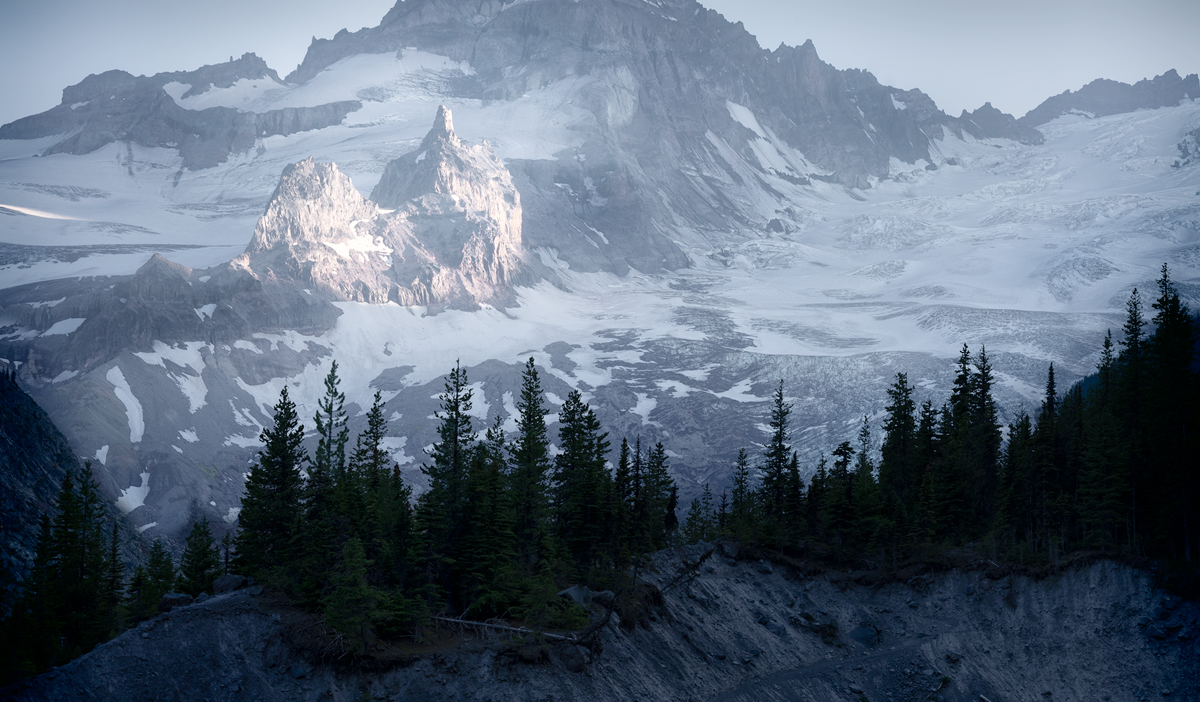
Thanks Howard. I think you are correct that I am trying to do too many things here. I was attracted to the line of trees on the moraine, but then I liked the river, and then there was the sun lit "peak". And of course the bright snow in the upper right that I don't like but was a wonderful distraction. I've simplified things considerably - my follow up post below explains how and has the new version. Welcome your comments on the new try - I think it is better but still not there. |
Feb 18th |
| 96 |
Feb 24 |
Comment |
Alright, sanity restored by your comments (what I was thinking with the processing I did in the initial version I don't know), I've taken another shot at things. I resonated with Howard's astute observation that I was trying to make this about too many things. So I went back to the start and tried various crops. I really wanted this to be about the wall of trees and moraine, but try as I might, the sunlit "peak" kept getting in the way. So I had the thought to use a second frame shot at a longer focal length as the background - essentially hoping to shift the sunlit peak high enough to get rid of it. I found that wasn't really working, but when I made the sunlit peak larger, it was working better as the actual subject. So I went with it. What I've posted below is therefore a focal length blend of two images - the original at 55mm and a new "background" at 85mm. I've also further played around stretching the two so the 85mm is cropped (as if it was an even longer focal length). This time around I did less messing with the colors. I whitened out the blue, but not completely. And I'm using just tonality vs. temperature to try to separate out the foreground from background.
I'm still not completely loving it, and I am not sure it really reflects my original story as much now. But it is less embarrassing at least. I'd welcome thoughts on this new version.
|
Feb 18th |
 |
| 96 |
Feb 24 |
Comment |
Hi Viren. I love many of the features you mention in the image - the subtle clouds that give a hint of variety to the sky, and the water that you've tamed with the long exposure to really bring out the reflections.
I think there are three things I'd mention in terms of improvement, now or for a future version of this scene - all are related. The easy one is that I find the one bright white light and reflection in the lower left corner distracting. Second, while I am not opposed to breaking the rules, in this case, centering the building to me makes the image a little static. Finally, I love the lights coming up from the right to illuminate the building, but I can't help but want to see where they are coming from. Of course I have no idea what is over there, and there could be good reason you left it out of the image. If not, to me what would make the image more dynamic would be to swing the camera right, show the beams of light back to their source, put the building off center, and in doing so, crop out the bright white light and reflection in the lower left. You could still do some of this with the image you have, cropping in on the left. Just some thoughts.
|
Feb 18th |
| 96 |
Feb 24 |
Comment |
But then at that point I decided that the message could be stronger cropping in a little, particular the stuff on the right. So I made the second version below.
Again, to me this is a little stronger story. But it of course may be a different story than what you wanted. So in the end it is just some thoughts to consider.
|
Feb 18th |
 |
| 96 |
Feb 24 |
Comment |
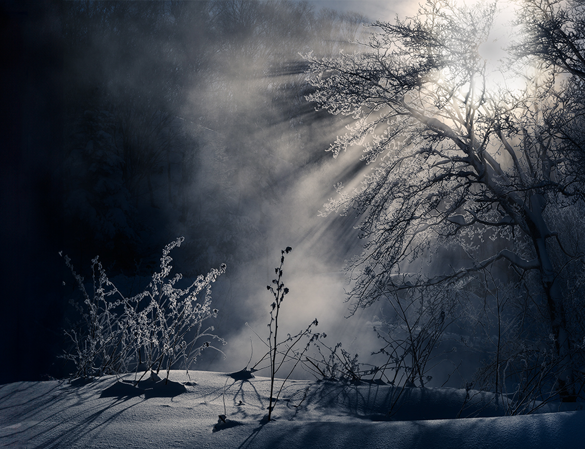
Hi Haru. You seem to find some amazing conditions. This is spectacular with the light playing with the fog rising off of the ground. I am really envious. Beautiful stuff.
My eye of course goes to the brightest thing which is the sun, but then I follow the light beams down toward the ground and the brightest area of mist. After that I wonder more and explore. I don't think the bright sun is distracting - it is natural for the shot, and the light beams guide me away from there, so I don't get "stuck" on the bright spot. Despite being bright, it doesn't dominate the image.
I have a couple of suggestions to perhaps make this even more amazing (if that is possible). An easy one would be to apply a subtle color grade - cools to the shadows and a very very subtle warmth to the highlights. I think that makes the highlights pop a little while still be delicate.
The other suggestion is a little more involved. Right now my eye flows from the sun down to the brightest patch of mist. While that is nice, it would be even nicer if it flowed down to the back lit vegetation in the lower left. That vegetation is set against a black background and could really pop. Also, I think that would make a stronger story. The little patch of vegetation becomes the subject and is touched by the heavenly light from above. Of course the problem is that the vegetation patch is too close to the edge.
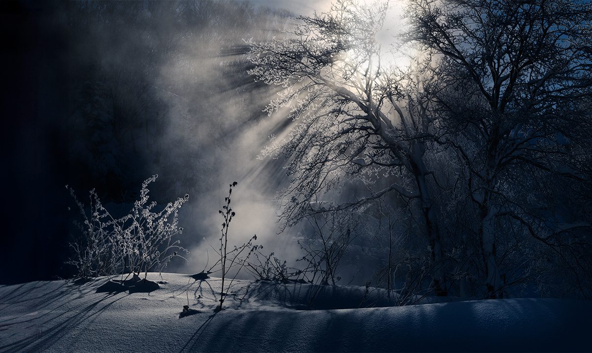
So I attempted to fix that. I re-cropped using the new PS generative fill, which when it works, is a better version of content aware fill. I had to try a few times and then touch up what it gave me, but it worked pretty well! Then I brought up the highlights in that vegetation clump, and brought down the highlights in the mist. Finally, I did a little digital pruning with the spot healing tool to give separation between the subject clump of vegetation and some of the other vegetation that was tangling with it. What I got is posted below.
|
Feb 18th |
 |
| 96 |
Feb 24 |
Comment |
Hi Sharon - welcome again to the Group! Having made two trips to Rainier in the last couple of years, I still can't get enough of the big mountain. So for me, in this image, the interesting part is the mountain and the warm last bit before sunset light on its flanks. I'd crop in to that interesting part - or trade your 200mm for an even longer 300mm or 400mm :)
A couple of technical things to watch in the future. Folks have commented on the wide aperture and the desire to stop down. That is both for depth of field, to get everything in focus, as well as because most lenses are sharper generally when stopped down a few stops. I think by f11 you are starting to get less sharpness due to diffraction, but f8 is usually enough unless you need a real lot of depth of field (and then there are other techniques like focus stacking more than one image). I don't think that the fuzziness of the mountain is due to focus - I think you are just seeing the haziness which comes from shooting mountains at great distance. Dehaze can sometime clean that up a little.
The other technique related thing I'd point out is what some call "border patrol", that is watching your edges for things just poking in that are distracting. You have that going on in the upper right with the little bit of branches sneaking into the frame. Good to look for these things while shooting (composing on a tripod so everything is steady helps) but you can always clone them out in post processing.
I took a cut at a crop, edge cleanup, and a few other tonality related things to try to bring out more majesty in the mountain. But I also felt that in this particular case, the colors in the image are not necessarily helping the message. The blue you have in the sky seems to me add odd shade - did you change the hue? One could play with the colors a bit, but I thought in this case the majesty is perhaps enhanced in B&W. So a quick edit for that is below. The crop has reduced the resolution enough it is suffering, but compositionally the mountain ridge is mirrored in the sloping of the trees.
Just some thoughts that hopefully help. I can't wait to see more images of the big mountain!
|
Feb 18th |
 |
| 96 |
Feb 24 |
Comment |
Hi Gloria. I really like this image. I see it as an abstract similar to the sort of intimate landscape abstracts that come from more close up photography. Except here you have done the same thing with a more grand landscape, which is less common. What makes this work I think is two things. First the subtle tonalities, particularly in the clouds, which you have rendered in a very delicate way. More saturation or contrast and I think that would be lost. Second, you have variety in the very linear horizontal pattern of the water, the broken puffy but still somewhat linear horizontal pattern of the mid clouds, and finally the large blob like pattern in the high clouds. So there is enough interest (but not too much) and there is a natural progression from very ordered on the bottom to very unordered on the top.
I think abstract images like this are meant to be explored - searching them and studying them. So I do not think the image needs a focus or anchor in the traditional sense. In fact, I think if you had one, like a boat in the water, it would change the entire image and to me would destroy the beauty which you have created. I think the lighter tonalities in the mid clouds are enough to pull the eye back there and provide a more subtle focus or anchor. To that point though, the one improvement I would suggest has to do with the left edge. The brightest tonalities of the overall image are at the left edge of the mid clouds. You can do without that to keep things better centered. So I would darken the brighter sky between the clouds at the left side, enough so the brightest tonalities are in the center vs at the edge. I did that below with a brush adjustment in LR targeting the highlights and whites. I also added a slight vignette to all the edges. It is subtle but I think holds the eye a little better.
It is a beautiful image. It is the sort of image that I think works well on a wall because its impact is slower and more continuous vs. a "wow" image that has great impact but then looses the viewer's interest quickly. This one can be explored over weeks and months. What is you intend to render emotionally is not obvious (and different people will see different things in it), so again one wants to spend time figuring it out. I am still not sure what it means to me emotionally, but it has me wanting to figure that out. |
Feb 17th |
 |
| 96 |
Feb 24 |
Comment |
Hi Howard. This is a beautiful first image - again, welcome to the group!
I particularly like the color pallet you having going in this image. I am not sure if this is the way it was out of camera or whether you've tweaked the tones. But the blues and pink/orange in the sky and the golden yellows in the building work well. You have a limited color pallet in those that I also think works well.
For me the image speaks to the magnificence of the building - standing alone, with dominant pose, and glowing regally. I agree with one of the earlier posts that the building is tight to the edges, but wouldn't want to add much room as I think the tightness adds to the tension and dominating feeling. It does seem like the left side vertical of the building is leaning and I think that works against the strong regal pose. I haven't brought the image into LR, so I don't know if it actually is not vertical or just looks that way.
My only other thoughts in terms of improvements would be to work to make the building even more "powerful". I think that is best done by backing off other elements. You could soften and desaturate the sky a bit - it is beautiful but is competing somewhat with the building for attention. Also there is a lot of detail in the lower front of the image that we don't care about - I might try darkening that to further hide that detail. All of this again is to get the building to really stand out even more and glow. Just some thoughts to consider. It is a beautiful image as is. |
Feb 15th |
7 comments - 3 replies for Group 96
|
7 comments - 3 replies Total
|


