|
| Group |
Round |
C/R |
Comment |
Date |
Image |
| 96 |
Jan 24 |
Comment |
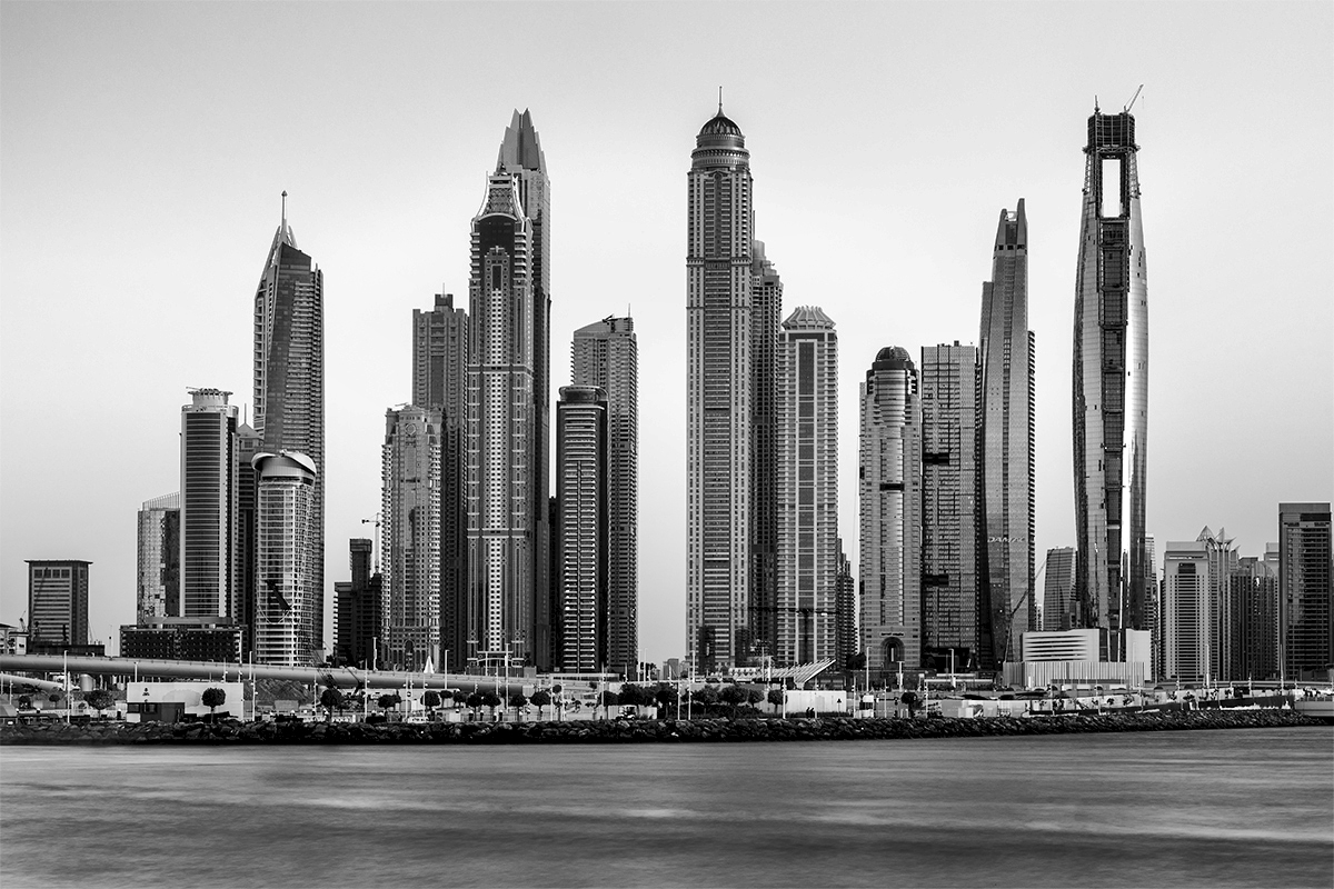
Hi Viren. I played with the image in Nik Color Efex, because even though it is B&W, I like the contrast tools in Color Efex better than other options. I think there are a range of different looks for this scene that are interesting to explore, but in the end I agree that the most striking was to enhance the blacks and contrast. In the attached I used Pro Contrast with the strong contrast preset which adds both contrast and what Color Efex calls dynamic contrast.
In addition to enhancing the overall contrast and giving better blacks, it is also slightly vignetting the upper left, and more importantly, to my eye, is bringing the water to life. I think the change to the water is perhaps the most important. I am not sure I can describe that change well, but other approaches I tried were leaving a somehow more flat rendition of the water (even if helping the blacks elsewhere).
Hopefully that helps some.
|
Jan 23rd |
 |
| 96 |
Jan 24 |
Comment |
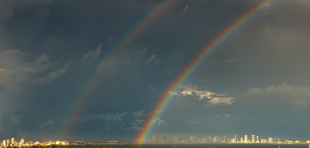
Hi Gloria. I have seen double rainbows a few times before, but sadly have never had my camera nearby when it happened. You were very fortunate! It is also really neat physics - see how the colors are reversed in the 2nd rainbow.
My other experience with rainbows is that it is very easy to get so caught up in the rainbow that I forget about the rest of the scene. I think there is a little of that going on in your image here. I actually like the "lot of sky" as I think you are trying to show the enormity of the rainbow over the tiny skyline of buildings - this definitely conveys awe. But the balance is off in the overall composition because of where the bright highlighted spots of building and sky occur. You've had great fortune in aligning the end of the secondary rainbow with one of those bright spots - that would be amazing if it wasn't in the very lower left corner of the image.
So my attempt to correct this was to bring it in to photoshop and use crop with the new generative fill to "add more" to the left side. I did a few other corrections to add a little more drama - more contrast and a darker sky to bring out the rainbow. Overall I think the balance is still not perfect, but I think it is a little better. Of course I've added city that doesn't really exist!
I hope you get more opportunities where double rainbows present themselves. I also hope I actually have my camera with me someday when I stumble in to one.
|
Jan 23rd |
 |
| 96 |
Jan 24 |
Reply |
Thanks Don. I appreciate you sharing. I often wander around a great deal in processing an image. I will give it some time and then come back only the say to myself "what were you thinking". Sometime the journey leads to a different look in the end, but sometimes it just brings me back to where I started - many hours and sheets of printer paper later!
Also appreciate you visiting Group 96! |
Jan 23rd |
| 96 |
Jan 24 |
Reply |
Thanks Gloria. It is really interesting that you connected the white flowers with the white snow patches in the mountains. Now that you point that out it is obvious, and perhaps something I could have emphasized - either in the processing or if I had seen it at the time in the process of composing the image. Like you say, it is interesting that everyone sees something a little different. That is what makes these discussions so valuable - and more than that, just so interesting. |
Jan 23rd |
| 96 |
Jan 24 |
Reply |
Thanks Haru. I like what you've done, particularly with the crop and the darker sky and mountains. While I think it is an improvement in the image, I don't know that the story of "trail markings" comes through as strongly - of course I am not sure it did in my original version. I'm very enamored with the fact I saw the story in advance and that was what made me take the image. But in the end I think the right edge is problematic for the reasons you point out - I needed to swing the composition a bit right to give more room. And then there are the unsharp flowers. Perhaps in the end best just as a learning experience. |
Jan 23rd |
| 96 |
Jan 24 |
Comment |
Hi Haru. I think this is a beautiful image. It is the sort of image that does not try to wow you over the top at a first look (like many oversaturated and contrasty instagram images), but instead makes you want to study it for a long time, again and again. It is the kind of image that has lasting impact - the sort that would do well on a wall because you would I think never grow tired of looking at it.
In an image like this - a more intimate image - I think it is hard to define center of attention in the same way one would for a grand landscape. It is hard not to be drawn by the color, but it is muted enough it does not grab and not let go. I am also drawn to the large central tree trunk. I think there the question could be asked whether it is slightly too dark - whether a slightly more muted black would balance the softness of color and contrast. But you want enough to ground the image in the center. I think I'd have to print both as is and a little more muted and compare them over a period to time to choose.
I think for me the image brings has a story of peace, cold, and delicateness - those are the emotions that come to mind.
I think in no way would I consider the image busy. There is detail to be explored to be sure, but the image is well organized around the central trunk, the colored bits are patterned, and the background of trunks is a very consistent set of verticals.
My only other complaint might be with the edges. It appears, whether you did this or it just looks that way, to have an inverse (lighter vs. darker) vignette. The fact that it seems obvious I think is clue that you have gone too far. I'd back off a bit.
Otherwise this is an amazing image. It is the sort of scene that many would have just walked by. Kudos for seeing the potential and stopping to capture this.
|
Jan 23rd |
| 96 |
Jan 24 |
Reply |
Thank Don. I think the subject is the journey that the flowers and a distant peaks together represent - path and destination. But I know that is a pretty ephemeral definition of subject. To the more tactical definition of subject in a traditional focus of the image perspective, I am not sure. I guess it would be the flowers. I think I want the viewer to start at the larger foreground flowers and follow them to arrive at the background peaks. But I recognize that is probably impeded by technical (flower sharpness) and compositional (path gets too close to the right edge) failings.
Would you be willing to post the version with the edits you did? I'd like to see where you took things in terms of lightening, contrast, and the texture/clarity.
|
Jan 7th |
3 comments - 4 replies for Group 96
|
3 comments - 4 replies Total
|


