|
| Group |
Round |
C/R |
Comment |
Date |
Image |
| 96 |
Oct 23 |
Comment |
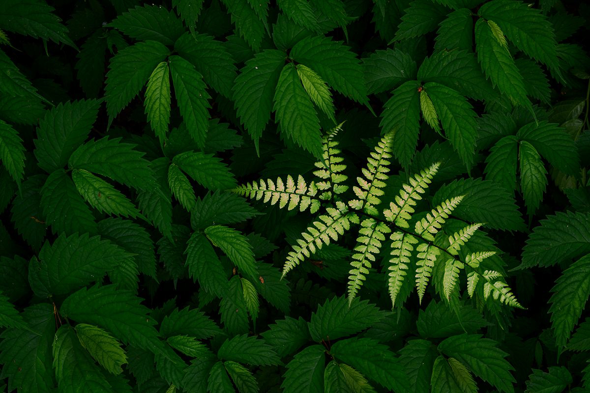
Hi Haru. I very much like the composition of this intimate scene. It is sharp, and the tonality in the background leaves is beautiful. But it seems to me that you've artificially lightened the fern in a way that does not look real to me. If I have that wrong my apologies and congrats on amazing lighting, although I think most photographers viewing this would guess it is not real (so perhaps still a problem).
I was going to play around with backing off the brightness of the fern, but along the way had a different idea, namely shifting its hue. I did that in the image below. I think it "stands out" as much, but at least to me looks more believable. I did this quickly - I think there is much to improve how I did this.
People say that a well constricted intimate scene holds attention. If it is on your wall you don't get tired of it. I am not sure I've personally found that to be the case, so I am probably not the one to judge how much "wow" factor it has. Does it move you emotionally? If you go back to it in a month, does it still move you? If so, I think you'd find it moves others too. Probably not everyone (but then that is likely impossible), but quite a few.
|
Oct 15th |
 |
| 96 |
Oct 23 |
Reply |
Bob, in the original, you have a little room on the right so that the wave does not touch the edge. I would try to keep that in the crop so that the viewer's eye does not wander out of the frame. Likewise, I liked the additional room at the bottom, where we could see the wave enter the frame. I think you can center without loosing these things - the original is pretty close to center. |
Oct 15th |
| 96 |
Oct 23 |
Comment |
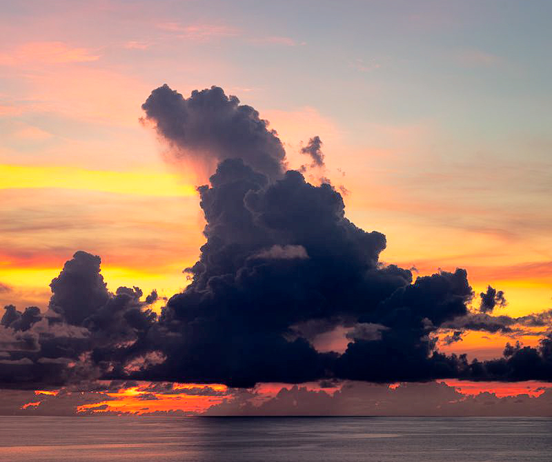
Hi Gloria. The clouds you have found here make this an amazing image. I think you have processed it just about right. I played with darker or lighter, but like the way you have it. I do think you could increase the contrast in the shadows (the clouds) to create more shades of gray or black which I think give the clouds a little more structure and to me make them even more powerful. I did that below with a curves adjustment in photoshop where I just steepened things through the darks. I also brought a little more red into the colors palette but that is personal choice.
While I like the two big clouds, I have trouble with two. Three big clouds would have been great. But I decided to look at the image with just one of them - the more interesting one to me on the left. To me just focusing on that one makes a more powerful image. But again, personal choice.
I like the linkage you have created to the song lyrics. I think there is a lot of power in combining images with prose (or poetry). Some might say leave the image to itself for the viewer to figure out. But for me, wanting to make more sure the viewer sees what I see, I think the added words touches the emotions from multiple directions. I suppose if we could add music, we'd have an even more powerful triad. |
Oct 11th |
 |
| 96 |
Oct 23 |
Comment |
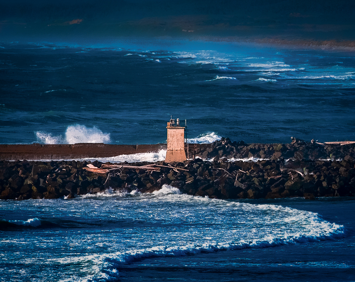
Hi Bob. I very much like this image which I think speaks to me and has a lot going for it. One might look at the lighthouse in the center as characteristic of a more "I was there" shot as you put it, but in this case I don't think so. I think it creates the story of the lighthouse, almost as the commander of the line (the line being the sea wall) standing against the waves and storms that it must see. I think it contributes to the starkness. I would only do a tiny crop to get it dead center, and to fix what to me seems like a slightly tilted horizon (as seen in the uprightness of the lighthouse).
I also really like the leading line of the wave which sweeps from the front but leads right to the lighthouse. I also like the fact that the diagonal of that leading line at the end near the lighthouse is echoed (same diagonal angle) in the waves in the distance.
I'd tweak the colors a bit to warm and reduce what I see as a little greenish cast. I'd darken the top and bottom to throw more emphasis on the lighthouse, and sharpen a bit more around the lighthouse for the same reason. I'd darken a little bit overall and pull the whites down a bit as they seem a bit too bright and distracting - again wanting the focus on the lighthouse. Perhaps desaturate the blue a bit and increase the orange of the lighthouse a bit. My stab with all of that is below. Very nice shot.
Hope you are feeling better.
|
Oct 11th |
 |
3 comments - 1 reply for Group 96
|
3 comments - 1 reply Total
|


