|
| Group |
Round |
C/R |
Comment |
Date |
Image |
| 96 |
Jul 23 |
Reply |
Thanks Haru for the thoughtful comments. Your rendering is definitely much nicer. It is a little more bleak, but it maintains a subtle approach. I think I am somehow stuck between a subtle approach and a more dramatic one - the later perhaps being not what I was after but more consistent with the light I was given. I need to think about this one more, but you've supplied some good inputs if I pick this one up again. |
Jul 16th |
| 96 |
Jul 23 |
Reply |
Thanks Gloria. |
Jul 16th |
| 96 |
Jul 23 |
Reply |
Thanks Dan. I think I need to understand my own intentions with this shot better before I can communicate them. I think I was after something like the Guy Tal image you reference. That image is amazing - just makes me realize how far there is to go. But my situation did not have the subtle light of the Guy Tal shot. So it is really not set up for the subtle beauty of such a shot, and I think I go back and forth between somehow looking for something that is not there and alternatively playing the more dramatic light card which might be there. |
Jul 16th |
| 96 |
Jul 23 |
Reply |
Thanks Bob. On reflection, I think I have two goals with this somehow jumbled in my head. The lighting was more dramatic than the soft detailed winter shot that I am somehow envisioning. In the end I am not sure there is really an image I love buried in this one. |
Jul 16th |
| 96 |
Jul 23 |
Comment |
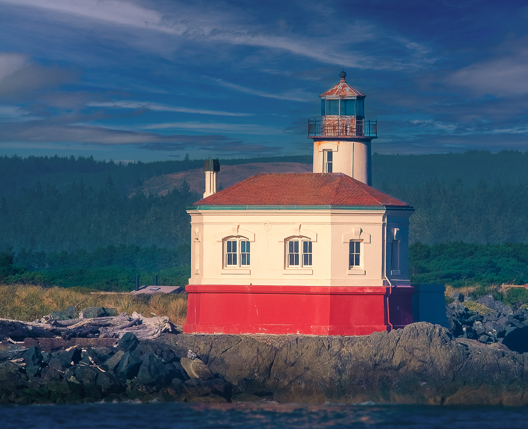
Hi Bob. I like the edits which you did to the original. The new sky helps bring things alive, and I also like the warmer rendering of the lighthouse which helps make it pop.
My thoughts for further improvement would be first a crop - some from the right so the lighthouse is not so centered, and most of the water, since it is blurry either from motion or dof. Then I'd use what for sports shots has become my favorite "AI" tool, namely lightroom's ability to select the background as a mask. It does a great job, here picking everything but the lighthouse, which I would edit to exclude the rock and vegetation near the lighthouse. With that "background" selected I'd warm it a bit, desaturate it a bit, and then darken it some - all to make the lighthouse pop even more. The result is below.
There is enough debate going on about AI in photography podcasts, articles, etc. so I won't add to it here. I am already tired of it. For the most part, it is the same debate which has raged over sky replacement, focal length blends, etc. - professional photographers worried their art will be lost to a bunch of enabled amateurs. It is not different than the concerns of Stieglitz and others when cameras and photography became available to the masses. Fine art photography survived that. It will survive AI. But meanwhile, where it provides tools which save time in a achieving a human inspired editing intent - like instantly creating a mask that would have taken an hour - I am all for using it.
|
Jul 16th |
 |
| 96 |
Jul 23 |
Comment |
Hi Gloria. This is a nice postcard type image which highlights the white town against the blue of the seas. I think the changing apparent color of the seas is subtle since that is a small element near the back. Also, as others have mentioned, there is a lot of sky which is not really a strong element of the photo. I see a bluff on the right side. I wonder if you shot from there toward the "dividing seas" you might emphasize the two seas more, still capture the white town from the bluff to the point, and also have that point reaching out more like your title, "at the ends of the earth"? Perhaps a different angle to try next time. |
Jul 16th |
| 96 |
Jul 23 |
Comment |
Hi Viren. I've tried a few cathedral interior shots in the past - I love the brilliant light in the stained glass. Seems everywhere I've tried did not allow tripods, so you at least have that going for you here. I agree that you need to play with the contrast further to bring back some of the brilliance which I am sure was there. B&W makes that harder but not impossible. Dan gave you some suggestions for that. Alternatively, could you not just remove the color cast you mentioned and preserve the amazing stained glass colors?
I agree with Dan that something is off in symmetry. I've found you need to be very careful to center yourself in the central aisle else symmetry is destroyed. Bob has done a nice job correcting most of the leaning in columns which comes from tilting the camera up so the sensor is no longer in a vertical plane. If you shoot a lot of these interiors, a tilt-shift lens would allow you to "point up" (with the shifted lens) while keeping the camera leveled. That keeps the columns vertical. Of course the angled columns is not necessarily a bad look.
|
Jul 15th |
| 96 |
Jul 23 |
Comment |
Hi Ye. It would be interested to understand what drew you to this particular image. Was it the sense of repetition in the buildings and trees? If so, I'd say the image is about form and shape which might lend itself to a more powerful B&W. You might also think about cropping some of the sky which does not really add to that repetition. I think the water reflection is an important element, but given the wind, it might have been interesting to do a long exposure and smooth it out. With the trees and buildings as the central element, the "texture" in the water make it compete. A perfect reflection would work as well, but I don't think conditions lended themselves to that. Just some thoughts. |
Jul 15th |
| 96 |
Jul 23 |
Reply |
Oh, and Viren is correct that all the trees seem to be leaning to the right. So I should have fixed that too. |
Jul 15th |
| 96 |
Jul 23 |
Comment |
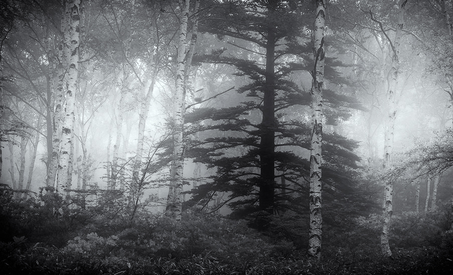
Hi Haru. I love the fact you provide us specific questions. It is very helpful in providing feedback. To your first couple - what do I see and what do I think the center of interest is - I start looking at the orange flowers which have the most visual contrast. The I shift to the brighter toned tree on the right. Eventually I get to the large, dark, partially fog covered tree near the center. If I had to pick a "focus" I think that would be it. It is the thing in this image that has more story - mystery, power, etc. - relative to the other trees and vegetation.
But to your third question, I don't think the image works overall in highlighting that more interesting "king tree" in the center. Yes, to me, it is too busy. And I am not sure the other elements support the message that the central tree seems to bring.
What can you do? I think you need to simplify the clutter. Again, I think the story is in the tonality not the color, so I would go to B&W which simplifies. I also think some cropping can help. Then I'd work the tonalities to bring focus between the dark tree "subject" and the fog "light". I took a quick cut which is below. I don't know that I love it, but I think it might be in a pile that I might work further and which might continue to grow on me. Hope that helps.
|
Jul 15th |
 |
| 96 |
Jul 23 |
Comment |
Hi Dan. When I look at this on a computer screen, blown up large, I think I see the effect you mention. There is a subtle feeling of separation between the house and the background, which is a bit spooky. There is also a general disassociation from reality conveyed overall. I think the muted colors which are reminiscent of an old film look add the overall separation from reality (I think since that look is not the norm these days). The effect is very subtle and I am not sure without your coaching of the intent that I would see it at a conscious level. But I may have misinterpreted what you are saying, and in any case, subconscious is probably the level which you'd normally be going for (sans the discussion group). I found that if I cropped from the top the unsettling feeling increases. That puts the house higher in the frame and gives an additional looming feeling.
It is an interesting shot. Like your initial inclination, I probably would have passed. So a lesson in looking more deeply at whatever is in front of us.
|
Jul 15th |
6 comments - 5 replies for Group 96
|
6 comments - 5 replies Total
|


