|
| Group |
Round |
C/R |
Comment |
Date |
Image |
| 96 |
Jun 23 |
Reply |
Hi Haru. Thank you for your comments which are very helpful. On the dark tree, interesting story. I convert to sRGB and downsize for posting the image here. Since my focus has always been on printing, I have not paid much attention to this process, but I noticed that the sRGB conversion of this image was blowing out and banding the sky. Way more effect than I would have ever imagined. So I ended up having to do corrections to keep the lightest regions in the sky under control before converting to sRGB. But I never thought about the blacks. So I just went back and looked. Sure enough, there is essentially no clipping until I do the sRGB conversion, and then the clipping goes up - the tree gets darker. I can see it looking at it now that I know to look. Your comment is well taken in any case - perhaps the tree is still too dark in the ProPhoto RGB version, but at least there I can see detail and there is very little clipping. I will think about lightening it a bit further. But I will also be more careful about the conversions in the future.
And thanks, yes, I need desperately to clean my sensor. And meanwhile do a much more thorough job of dust spotting.
|
Jun 24th |
| 96 |
Jun 23 |
Reply |
Thanks Dan. I never plan for a B&W image, but I try images in B&W in edit from time to time - generally when they are not working in color. Usually they don't work in B&W either, which is probably more to do with other things wrong. But this one just clicked. Yes, I think I should experiment more. I think B&W has a lot to teach about color. |
Jun 24th |
| 96 |
Jun 23 |
Reply |
Thanks Gloria. Yes, I would have to grow taller or get a ladder to accommodate the left hand tree without so much sky. I am a fan of negative space, so I am trying to pass off the flat sky as that. |
Jun 23rd |
| 96 |
Jun 23 |
Reply |
Thanks Bob. I struggled with this image for quite some time in color before realizing that it worked much better in B&W. There everything just came together quickly without doing much edit. |
Jun 23rd |
| 96 |
Jun 23 |
Comment |
Hi Ye. The colors here are hard to dislike. But I really like the contrast between the smooth tonalities of the sky and the detail of the pier/boardwalk. I am not sure whether you were on a tripod for this, but if so, it would have been interesting to see a long exposure which smooths out the water in a manner similar to the sky. I think that would have the detail of the pier popping even more. I might clone out the three bright pink round things that are up against the right edge - too much bright color right on the edge. More subtly I might also clone the white in the water under the pier up against the left edge. Just small edge patrol sort of details. Otherwise, a very nice image!
|
Jun 23rd |
| 96 |
Jun 23 |
Comment |
Hi Dan. Ok, since everyone is seeing different things in your image, I have to say the bottom third keeps saying blueberry muffin to me!
It's a beautiful image. I have never visited the Painted Hills, nor apparently seen much in the way of photography of the area. It is remarkable and very different. I have a difficult time understanding the scale I am seeing. I look at the trails of vegetation in crevices (another thing I find really intriguing) but can't judge their size. Makes me want to see first hand.
Compositionally, I really like the strong diagonal in the middle slopping down right to left; it separates the image into a foreground and background which I feel gives it depth. I can see the highlighting on the ridge tops, but it is subtle enough that had you not told us you have worked that it probably would be unnoticed. I am not sure what the natural colors of this place are, but you've given us colorful (which is important here) without going overboard. As usual, another amazing image.
|
Jun 23rd |
| 96 |
Jun 23 |
Comment |
Hi Bob. I like many others prefer the original colored version. I think there is some nice warm light that shows up more clearly in the colored version. Beyond that though, I think the challenge is that it does not quite work for me as a scenic, as I am not sure what the focus is - I keep exploring but there is nowhere to rest. As such I think it might work better as an abstract where a subject is less required. I took a shot at cropping out the sky to get such an abstract. I think there the strong horizontals become the subject to the extent one is needed. I think some minor tonal and color adjustments further emphasize those horizontals and bring a little more depth and life overall. Just a thought.
|
Jun 23rd |
 |
| 96 |
Jun 23 |
Comment |
Hi Gloria. I like the contrast of the vivid blue boats with the stark white of the sky and the buildings. It suggests to me a sense of joy existing in a harsh surrounding - the starkness and ancient nature of the buildings carrying forward a sense of harder times, but the colorful boats a sense of joyful life within that world. Perhaps I am reading too far, but I think it that in the imagery which makes it powerful.
Had you the opportunity to shoot on a tripod with long exposure, smoothing out the water might have further contrasted with the boats. I also might explore cropping just a bit from the top. Right now my eye somehow ends up in the small triangle of sky above the middle building and gets a bit stuck there. |
Jun 23rd |
| 96 |
Jun 23 |
Comment |
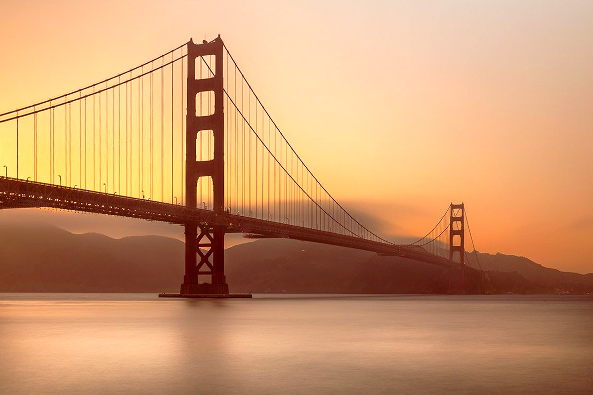
Hi Viren. Welcome to the group! This is a very nice first image. I like the colors which are harmonious and not overdone. I also like the long exposure which gives the image a calm mood.
I don't think you can make the image into something it is not (and were it me I'd be very happy with this one). The glowing red bridge image would be the one from the other side. I am sure that one would be spectacular as well - but very different in mood. It sounds like the image did not come out exactly like the vision in your head. I can't count how many times I have had that happen. That said, I think you can push a little more red into the shadows (for example using the color grading tool in Lightroom, which might give you more of the red bridge you are looking for. I would also think about a transform to straighten (vertical) the support wires. I think given the perspective, you need more than just rotating in the crop tool. Finally, you have room to brighten the whites - but that is a personal call as it changes the mood a bit. I've tried all of that below.
|
Jun 23rd |
 |
| 96 |
Jun 23 |
Comment |
Hi Haru. I am attracted to the bold colors in your image. But I have to admit that otherwise this one does not really grab me. I think one of the challenges is that all the light is on the background, so it is hard to pull off the branch as the "subject" or focus. Sorry to be so negative.
I went hunting for a composition within your larger (original?) image, trying a few different things. In the end what I liked best is shown below, which simplifies on the left side. The crop I did seemed to make it clear that the colors were a bit off, so I did some adjustments to make the branches less blue. Not sure I love this version either, but for me it works a little better. |
Jun 23rd |
 |
6 comments - 4 replies for Group 96
|
6 comments - 4 replies Total
|


