|
| Group |
Round |
C/R |
Comment |
Date |
Image |
| 96 |
May 23 |
Comment |
Hi Ye, welcome to the group. I look forward to both your images and your thoughts and comments.
You've jumped in with a very nice image. What I like most about this is the complementary colors which are very compelling. The long exposure also simplifies the composition and adds a calm feeling. I would have guessed this was longer than 3 sec from the water and clouds, but you've found the right formula in any case that leaves just enough texture in the water.
In addition to the simple cloning work that Dan suggested, I'd add doing something about the very right most rock at the bottom edge. It is off by itself and straddling the edge which I find a bit distracting. I think you could clone it out, but even better might be to add a couple of smaller rocks (borrowed from elsewhere in the image) to fill in to its left and make it more connected and hence not distracting.
Bob W's crop solves the problem of the contrail residue. I don't like giving up the majestic sky, but agree with Dan that the mixture of cloud and contrail is less than ideal. You might be able to do some cloning work there too, but it would be challenging.
Just some thoughts to consider. But even as is, a very beautiful image, laden with soft emotion.
|
May 14th |
| 96 |
May 23 |
Reply |
Interesting. The color theory aside, I might have been inclined to leave the grass along the shore in front, that sweeps from right to left and helps as a leading line or frame. But maybe making room for the clouds at the top then makes things too square an aspect. Or maybe a portrait version, like this. |
May 14th |
 |
| 96 |
May 23 |
Reply |
Thanks Gloria, that is helpful. You are not along in thinking the stormy sky is overdone. I took a second pass in my response to Dan below and tried to dial back the storm (in addition to a very different crop). Does that look more realistic now, or still too superimposed looking? |
May 14th |
| 96 |
May 23 |
Reply |
Thanks Haru. Great comments and suggestions. I posted another version in my response to Dan below. In addition to the crop to solve the issues with the "big dark region", I've tried to dial back the storm in the sky. What do you think - have I gone far enough? |
May 14th |
| 96 |
May 23 |
Reply |
Cheryl, thanks for the comments and suggestions. Dan suggested a much more severe crop from the bottom; it resolves the issue of the distracting area but also eliminates the issue of too great an uninteresting dark area. It is a bit different look, but I like it. I also tried to dial back the rainy vertical bursts which I think were overdone. I'm curious whether the image I posted below goes far enough with that, or whether you think they should be more or less eliminated altogether. |
May 14th |
| 96 |
May 23 |
Reply |
Dan, thank you for the suggestions. I don't think I would have considered such a large crop from the bottom without your prompt. But having done it, I am now convinced that is a MUCH stronger composition. I also painted in a little orange through a lights mask. What do you think - is this about right or too heavy handed? Finally, since so many people commented that the darkness in the sky (top edge & streaks) did not look realistic, I've tried to dial that back a bit. Again, there is a "to taste" question. I'd love to know what you think of this second version. |
May 14th |
 |
| 96 |
May 23 |
Comment |
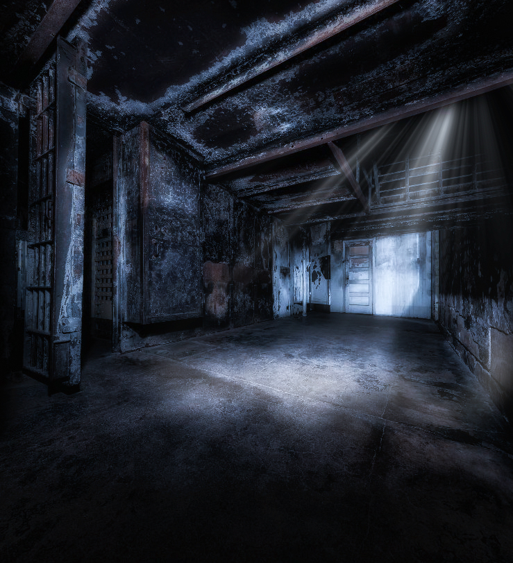
Hi Dan. Your images of the last couple of months definitely make me think I should be exploring more and trying different things. This one is again very interesting. I agree that the original is a little empty. But I have to admit I am not sure what to think of the elk in the prison. Without your story, I believe I would default to thinking it is about the facility being deserted and now overrun. But I don't know that that was really the intent, so again, not sure what to think.
On the technical side, something about the elk does not look quite right to me. I am curious - the room was shot at 11mm while the elk presumably at something a lot longer. Did you perspective correct the elk to 11mm before inserting? If so, I'd love to understand how you did that because I tried to do something like that once before and found it very, very challenging (never got things to look right). I also have a hard time really seeing the elk's eyes; I think it might help make it look more realistic if the eyes were more visible.
Otherwise the atmospherics you've created are amazing. I might have gone a cooler tone which to me adds to the bleakness, but that's personal taste.
I had the idea that an easier thing to "add", particularly given the ultra wide lens capture, would be light. So I played with that to come up with the attached. The thought here is that the prison is decayed enough there is a hole in the roof. I think the white wall in the back is too bright, but fixing it would require re-doing the sun rays and I was not up for that. Clearly could be a more carefully done version but you get the idea. Just a thought.
|
May 6th |
 |
| 96 |
May 23 |
Comment |
Hi Gloria. These are fascinating trees indeed. I certainly hope they do not fall victim to the parasite you mention. They also make a very interesting photographic subject although I don't know that I would get peace out of the image as you were experiencing. For me, with the grouping of them, I get more of a sense of community or family.
A couple of suggestions to consider. Since you were shooting up, tilting the camera, things that should be vertical have become tilted. You can see that most clearly looking at the brick building on the right. This perspective distortion can be easily fixed in Lightroom. Even if you don't do that, I feel getting the man-made structure in the middle vertical is important since that stands out among the trees (or you may want to clone it out since I believe your focus is the trees). I'd also crop down from the top a bit; the sky is beautiful, but too much of it makes it less about the trees. Finally, depending on the look you are after, you might play with the tonalities and color a bit. I think you have room to recover the shadows and make the trees less silhouette. I've taken a shot at some of these things as I might approach them in the attached. Just some thoughts to consider. |
May 6th |
 |
| 96 |
May 23 |
Comment |
Hi Bob. This is a nice bit of architectural photography. I am always captivated by stained glass in churches, although I don't think I have ever captured it very well the few times I've tried. I think you've done a better job here.
One of the challenges is always dynamic range. I feel like the whites in the window are just slightly blown out. I took it in Lightroom and it seemed there was room to pull the whites down at least some. You may have more room in the original image.
I'd offer a couple of other small tweaks. It would be good to align the paneling on the left truly vertical. Also, there are some "dark" spots near the top and bottom. I'd say it was vignetting but the top one is not right in the corner. Would be good to smooth out the tonality there whatever is going on. Finally, I tried warming things up in lightroom and I think it brings a glow to the woodwork that I like. Just some thoughts. Did a quick version below, but more time is needed on the dark spots. |
May 6th |
 |
| 96 |
May 23 |
Comment |
Hi Cheryl. I don't think I'd change much - this is a beautiful image. I think I've been to this exact spot, but was slow enough about getting there that I missed sunrise.
I am a big fan of color.adobe.com and have used it a lot, ever since reading an Erin Babnik article on color theory in landscape photography. That article was eye-opening for me. The idea of shifting hues or desaturating colors so that the image was in a better color balance had never occurred to me. Seemed like cheating - but I got over that fast. I only wish the adobe tool was easier to use - like being built right into photoshop. I am not sure why they have not done that.
The only thing perhaps to consider in terms of additional color manipulation might be to reduce the saturation in the greens, particularly along the water to the left. I tried it quickly and could not decide whether it really made a difference or not. I guess the other one small thing, staring at the image for a while, is the dark cloud reflection at center right on the bottom edge. I might just brighten it a bit so it is not such a stark contrast right at the edge. Again, otherwise beautiful, and well done. It might be informative for folks if you posted the original before the color manipulations. I'd love to see the comparison. |
May 6th |
| 96 |
May 23 |
Comment |
Hi Haru. This is a beautiful image with amazing light and color. Simplifying forrest scenes is not easy, but you've used the light here to do that well. I also like the framing provided by the trees on the right.
I prefer the landscape version to the portrait, although I would do a little cropping on the landscape version. The portrait version feels tight to me. Everything feels constrained, and the beautiful light from the left has no room to sweep across the frame.
Since this was such an amazing image, it was a pleasure to take a cut at what I might do, which is shown below. I started from the horizontal and cropped where I thought things worked best, coming up from the bottom a bit as well as in from the left. Then I used a couple Nik Color Efex filters. I used Reflectorx (or something like that) to accentuate the light from the upper left. I used glamor glow to give a little pop and softness to the lit leaves. And then finally a modest use of some Tonal contrast. The later I tried largely to see what it would do, but found when used moderately it shifted the center of brightness of the image in a way that I thought balanced it better. Finally, it still felt a little tight to me, even in the landscape, so I stretched it horizontally a little bit.
There are lots of possible "looks" one could create with such a beautiful capture. So please just take mine as one additional possibility.
|
May 6th |
 |
6 comments - 5 replies for Group 96
|
6 comments - 5 replies Total
|


