|
| Group |
Round |
C/R |
Comment |
Date |
Image |
| 96 |
Apr 23 |
Reply |
I took a few minutes to play around with crops and do a very quick re-edit. This one is back to a more dramatic style vs. the soft colors. But I think that is appropriate since the light touching the trees and foreground has now become the main act. |
Apr 23rd |
 |
| 96 |
Apr 23 |
Comment |
Hi Dan. This one definitely says disturbing to me. So it brings emotion - I think the particular one you are after - but I am not sure it carries my interest too much further. Of course, it is difficult to say whether that is because it does not connect with me, or if it connects with me in a way I want to disconnect. I think there is the making of a deep philosophical discussion here - beauty, truth, positive vs. negative emotional content, etc. - what is or can be effective (whatever that means) in landscape photography.
Since I am always trying to creatively play with flare, I hate to suggest removing the green flare. And I see your point that something is lost. Perhaps change the color to something which gives you a "half way between" option?
|
Apr 23rd |
| 96 |
Apr 23 |
Comment |
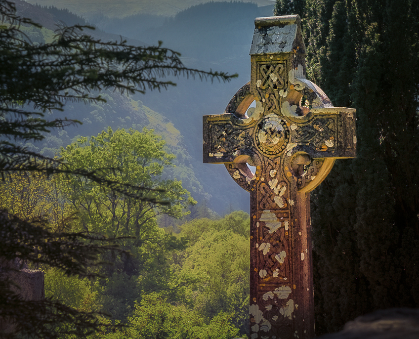
Hi Bob. For me the image is about the cross, not so much about the valley or hills beyond. The cross is interesting and attention grabbing. I think everything else needs to yield.
So I would crop in a way that cuts out some of the "other", particularly the right side that is dark and not particularly interesting. I'd also crop the sky as it is bright and distracting from the cross. I wish there was more room to do that without the top edge of the cross being tight to the top edge, but I'd settle for tight vs. leaving in the sky. Then I'd increase clarity, detail, etc. in the cross and soften it in the background. Finally, there is a definite color cast which I'd remove. My take at all of that is below.
I am not sure this emphasis on the cross was your take. But it is the direction that calls out to me.
|
Apr 23rd |
 |
| 96 |
Apr 23 |
Comment |
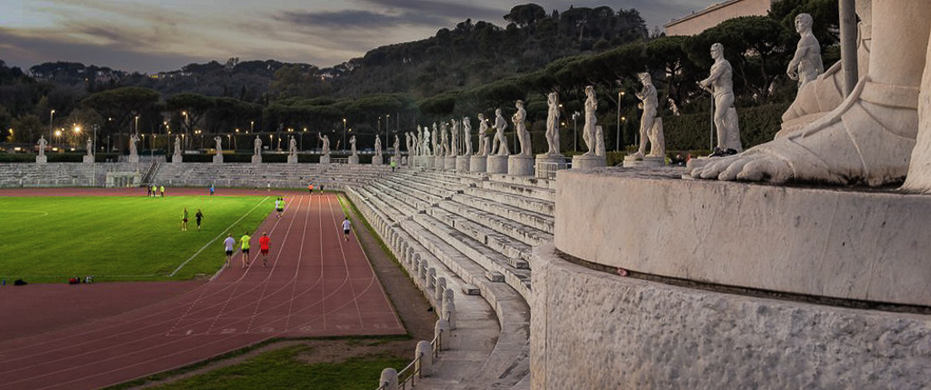
Hi Gloria. Being someone who has taken a lot of photos at track meets, I have to say, none of the venues are as impressive as the one you've photographed here. I can only imagine the feeling of competing in a place surrounded by such amazing history.
Others have made great suggestions already. I would echo that something needs to be done about the bright light/reflector. I'd also reduce the amount of sky. But my reason for doing it is more to emphasize the row of statues ringing the track. If you pull in to those, it gives, for me at least, a strong feeling of them "watching" the more modern proceedings in front of them. I think it emphasizes the juxtaposition of the modern and the historical. I've done a quick crop below starting from Cheryl's version.
|
Apr 23rd |
 |
| 96 |
Apr 23 |
Comment |
Hi Cheryl. I like the lighting you managed in this shot, I gather through what was there as well as how you've processed things. I think it is the character of the light overall which makes this image compelling.
I don't find the moon too bright or too large. I think it needs to be larger than in the original to balance the hay bale. Somewhere in between original size and what you have now might be better, but then again, maybe not. I wouldn't go bigger.
I like the vertical as it includes the interesting elements and gets rid of the rest.
My one suggestions would be with the lighting of the hay bale. That looks too bright and unrealistic to me, at least relative to the rest of the scene. This seemed more of a blue hour shot to me, so I was surprised by your photo of what was behind you. Nonetheless, if that sunset was lighting the bale that much, it would have lit the rest of the scene more too. I'd say you just need a slightly more conservative brightening of the bale in getting it to pop as the subject. Otherwise, very nice scene. The one behind you is very nice too!
|
Apr 23rd |
| 96 |
Apr 23 |
Reply |
Hi Cheryl. Thanks for the edit, which while a different look than I was going for, is perhaps a nicer one. I went back and forth a lot when developing this. I think I will explore some crops (per comments above), but maybe let this sit a bit and see if I can get my mind to settle on a look. As always your comments and take, as well as those from everyone else, are extremely helpful. |
Apr 23rd |
| 96 |
Apr 23 |
Reply |
Thanks Bob. I can't really complain about the sky - it was this same trip I got the lenticular cloud. That more than makes up for a few boring blue sky days. But it is another reason to perhaps explore some interesting crops that omit the sky completely. |
Apr 23rd |
| 96 |
Apr 23 |
Reply |
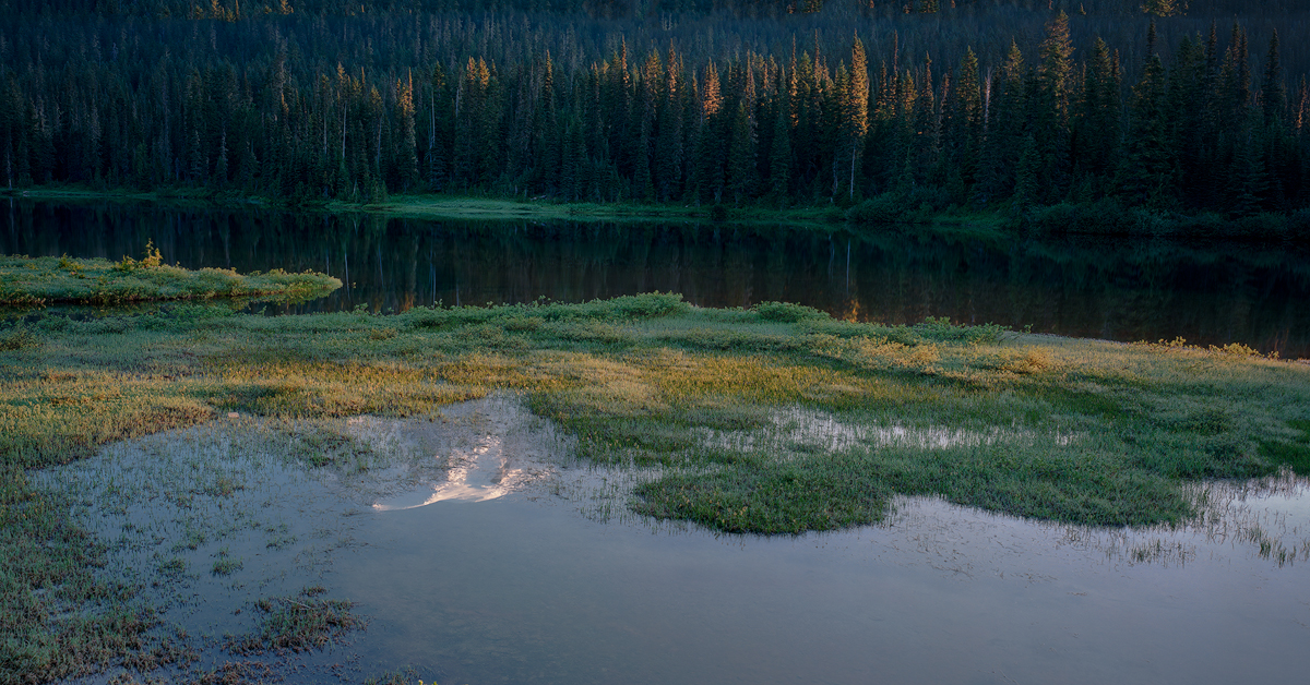
Thanks Gloria. Yes, I am realizing that the interest in this image is in the reflection and foreground generally. Not in the mountain. Your comments add to my desire to explore some crops and processing that focus on the interesting stuff and perhaps move it a little away from the thousands of other photographs from this spot. |
Apr 23rd |
| 96 |
Apr 23 |
Reply |
Thanks Haru for the comments and suggestions. While I am not a big fan of square crops, I do like what you've done, and it gets me thinking about even more radical crops. It occur as to me the highlight of the show is the light on the trees and foreground, not Rainier. So I may play with some crops that actually exclude the mountain. They would at least be less like the thousands of other images taken from this location. |
Apr 23rd |
| 96 |
Apr 23 |
Comment |
Hi Haru. I admire your persistence with frozen waterfalls, which I find very difficult to compose in compelling ways. In this image I love the framing top and bottom by the top of the falls and snow/rocks at the bottom. I also love the mood set by the blue tones. I think the more neutral white of the "snow flower" (I guess that is what we are calling it) sets it out well from the background. Unfortunately however it looks contrived - it is too different to seem realistic. Bob's version which reduces the blue hues to the bottom snow and rocks looks much more believable, but now the highlighting of the snow flower is lost to too much clutter.
If I were re-shooting, I might experiment with a tighter shot on the snow flower with the cleaner, more dramatic frozen icicles of the fall behind. I think those are the two most compelling elements, and I think the tight shot concentrating on those would clean up the clutter. A more subtle difference in cool tones between the snow flower and falls could perhaps be enough to make it pop. You could also limit depth of field perhaps to just put a slight blur to the background and also enhance the pop of the foreground element. Just some thoughts - hopefully helpful. |
Apr 23rd |
| 96 |
Apr 23 |
Reply |
Thanks for the honest review. Yes, this one is nothing special. But I do keep coming back to it more than I thought I would - for example to present it at all. I am not sure why, and maybe it is clues to that why which I am actually seeking. I don't think it was the experience of the moment which was also not extraordinary.
Appreciate the processing suggestions. I will give those a try. |
Apr 9th |
5 comments - 6 replies for Group 96
|
5 comments - 6 replies Total
|


