|
| Group |
Round |
C/R |
Comment |
Date |
Image |
| 96 |
Jan 23 |
Comment |
Hi Bob. Must have been a fun trip. I was trying to figure out which falls it is from my recollection of a similar trip down the ice field parkway. But it is not clicking - do you recall which falls?
Mid day is always challenging, but you have done a great job of not blowing out the whites while at the same time loosing very little shadow. And if I have my physics correct, you could not get this rainbow any other time than mid'ish day. Normally, on flat ground, you can't get a rainbow with the sun high overhead; geometry puts it "in the earth". But looking down into a ravine like this you can, and in fact need the high sun to get it. So, earlier morning or later afternoon you might have had better light, but no rainbow down in the ravine.
I played around with the image some, trying to find a "fine art" shot that I liked in there, but didn't have much luck. I think this is a nice tourist shot, and fabulous rainbow, but I am not sure what to do to bring it to the next level. I will keep thinking about it.
|
Jan 20th |
| 96 |
Jan 23 |
Comment |
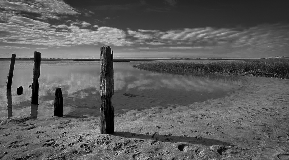
Hi Gloria. Nothing wrong with an iPhone - they can take some nice pictures. This one has a lot of nice things going for it. I like the sweeping curves of the water edge, the textures varied in the grass and sand, the clouds with their reflections, and the posts as stoic elements to contrast the softness of the other elements. All very nice.
As Dan points out, better to shoot this at sunrise/sunset if you can to avoid the harsh light. One thing tough to fix is that you lost the shadow detail in the posts to pure black. Since they are important elements, you'd like to be able to see into the shadows.
Compositionally, the other thing I'd point out is that you are very left heavy. The posts are on the left, as are the predominance of clouds. So things feel a little unbalanced. If you had walked to your left you might have been able to put the posts on the right side where they would be more balanced by the heavier clouds on the left. You might also have been able to get the waters edge to meet the frame edge in the corner - that is often nice to create a leading line. Of course hard to tell how other elements would have lined up not being there.
If I were to suggest some changes here, I might try B&W which I think sometimes works better with mid-day sort of lighting. I think there is a lot of empty sky in the upper right, so I might crop down from the top. I would keep all of the posts other than the far left stub which I'd clone out. Counting the other stub that is 5, so still odd as Dan describes above. I like the left most larger post leaning - I think that has character and also visually pulls me back from the edge because of the lean. The horizon is slightly out of level - an easy fix. Finally, up to you whether to try to do anything about all the footprints. They do disturb the "peaceful" message a bit, but a lot of work to fix. All just some thoughts. My cut at these things is below. Again, a nice image, so worth working on it some more.
|
Jan 18th |
 |
| 96 |
Jan 23 |
Comment |
If you let me do a crop, I would both crop the bottom and then I'd do a free transform to smush it horizontally (since I don't like wide short aspect ratios). What I got, I guess my best shot is below. I still don't love it, but I think it is intriguing enough that if it were mine I might put another couple hours into exploring it further. Hope that helps. |
Jan 18th |
 |
| 96 |
Jan 23 |
Comment |
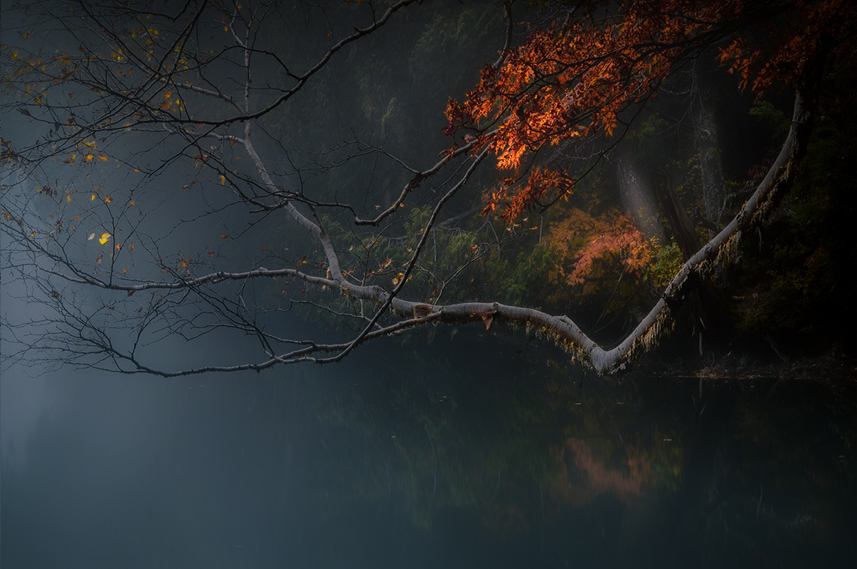
Hi Haru. I love the soft colors and mood to the image, but I am having trouble with the composition. I had to stare at it a bit to understand what was going on. The issue for me (and others have not mentioned it, so it might be just me) is that the bright foreground branch elbow meets the shoreline in the background right where the shoreline "ends". It is there right of the elbow, but not left. And left of the elbow, the foreground branch breaks the symmetry enough that it does not instantly even register as a reflection. It feels as if that piece of shoreline is the edge of a cliff, and to the left of it, things drop off. It was (again for me) very disorienting. Sorry.
To answer your other questions. My eye first goes to the bright branch - somewhere near its middle. Then it hops to the colorful foliage in the upper right. Then, per the above, it mills around trying to decipher the background. I don't ever want to really explore the left side (so it is clearly not too bright and distracting) - I am too caught up trying to decipher the shore and reflection.
To make it better, with or without cropping, I think you have to simplify the image so it is less visually confusing. I think you also need to tone down the bright branch so it does not jump at you so much. I took a cut - I worked this for quite a while to get this look, so hard to describe everything. Besides working the tonalities, there was some blurring of the water and non-highlights and some color shifts to help make the leaves and trunks in the upper right the star. Without crop, the best I could do is shown below. |
Jan 18th |
 |
| 96 |
Jan 23 |
Reply |
Thanks Bob. I continue to learn from you and the others in the group. You all have different perspectives, likes and dislikes, and force me to look at things through different lenses as it were. |
Jan 18th |
| 96 |
Jan 23 |
Comment |
Hi Kate. I agree with Gloria that it is often difficult to convey emotions that are uniquely personal. I have had images that I believe say a specific thing - what I felt at the time for example. But after a bit, I've had to admit that they just don't say that thing to others that didn't share my experience. If despite that I still find the image visually compelling, I often try to figure out why, realizing that the image may be trying to say something different on its own. I can decide to embrace that and edit to help bring out that alternative story. Or I can just be happy with what is says to me. Sometimes that is enough. |
Jan 17th |
| 96 |
Jan 23 |
Comment |
Hi Dan. This is a beautiful image. The colors against the deep blue background give a glow effect that somehow feels like glass to me. I can appreciate both the hour you describe hunting for the composition as well as the clean up time. Time well spent.
It seems there are a lot of comments about removing the leaf in the upper right. My thought went there initially as well, and I wondered why you left it. Since I knew you must have a reason, I played back and forth with it there and not. My conclusion is that the leaf adds a more dynamic feel. Without it the image feels more static. If that isn't quite right I'd also describe the image without it as too clinical. So I would vote to leave the leaf in the corner. I would not change anything. I'd blow it up life size and put it on the wall. Lit right, the Lilly Wogs will jump off the wall. |
Jan 17th |
| 96 |
Jan 23 |
Reply |
Thanks Kate. I am glad I did not turn back (but thought about doing so a great deal). Yes, I think it has a mystical feel. As Dan points out, somehow the trees contribute to that quite a bit. They had no choice but to wait with me for the clouds to break. |
Jan 17th |
| 96 |
Jan 23 |
Reply |
Thanks Gloria. This image is growing on me the more I go back to it. It is both dramatic and subtle at the same time. Yes, I need to do some painful photoshop work to redo this without the crazy Topaz AI artifacts that I should have caught up front. |
Jan 17th |
| 96 |
Jan 23 |
Reply |
Thanks Dan. I agree there is something to the trees - their individual stance and spacing. They are somehow like sentinels. And I think that adds to the mystical sort of feel. |
Jan 17th |
| 96 |
Jan 23 |
Reply |
Thanks Haru. I thought you might like this one. The stone that you mention in the lower left - is it the tiny one just above the corner? Or is it the snow patch on the edge about 1/3 up from the bottom. If the later, yes, it bothers me too. I toned it down in brightness, but I think later adjustments have it distractingly bright again. Cloning is probably the right move. |
Jan 17th |
6 comments - 5 replies for Group 96
|
6 comments - 5 replies Total
|


