|
| Group |
Round |
C/R |
Comment |
Date |
Image |
| 96 |
Dec 22 |
Comment |
Hi Bob. This is really very nicely done. All of the artistic filters are applied at the right amount - the texturing, washing out of color, etc. are all enough and not too much. The effect is a very compelling piece of art.
Like Dan I might try darkening the left wall a bit, but I'd be careful to not go too far. I think the washed out is part of the charm, and I also wonder if it is not pulling one back to the left where the road on the right would naturally try to take one out of the frame. For the same reason, I'd worry that if there was more of the road as Haru has asked that one might similarly be pulled out of the frame. All things to try and explore, but again, a very compelling piece as it stands. |
Dec 18th |
| 96 |
Dec 22 |
Comment |
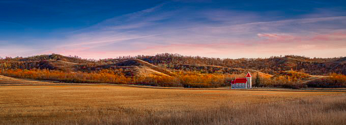
Hi Cheryl. Like others, I am not getting loneliness from the image. I think the same shot taken mid winter with snow everywhere, and on a semi-overcast day - that would probably have a better chance of conveying loneliness.
It is beautiful light, but for me it is a bit too monotonic and does not provide enough to really hold my interest. Looking closely, it seemed like there were some reds in the trees. So I decided to do an edit and try to pull those out. I also cropped, since like Dan, I am not sure there is a lot going on over on the left side. For me the result has a little more visual interest. I also like the diagonal of the grass in front, which meets the tree line and comes back the other way, and then leads one to the clouds - another diagonal back up to the right.
|
Dec 18th |
 |
| 96 |
Dec 22 |
Comment |
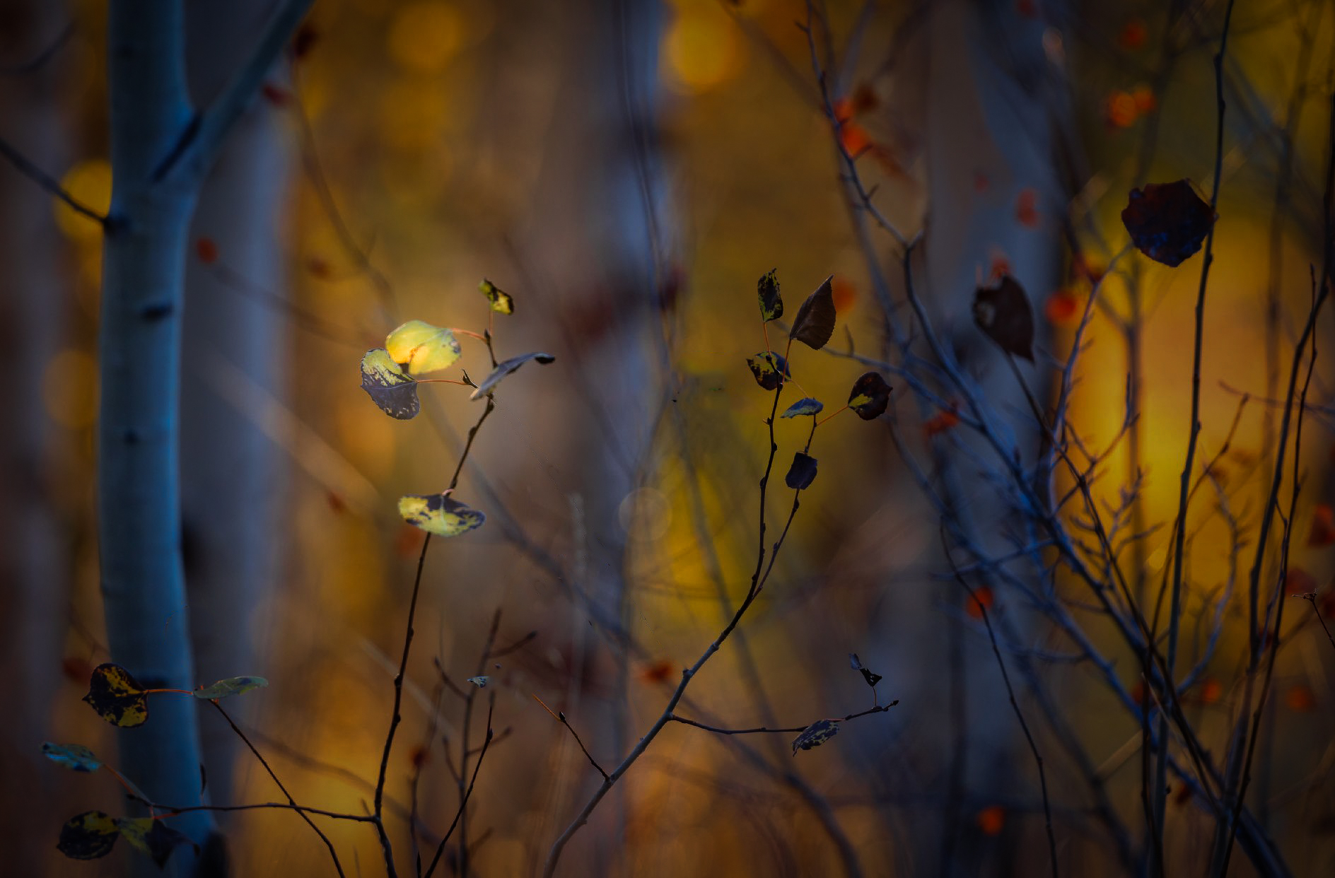
Hi Dan. My first impression was like Kate's - stunning. I love the colors (your colors are always amazing), particularly the contrast in the blue cast to the aspens. I've had difficulty maintaining the sense of light in the trunks of backlit aspens like this. You've handled the dynamic range really well.
But then I went back and looked at the image as the thumbnail on the group page, the image at the top of this page, and then the even larger image from clicking on that. I found the larger it got, the more I found the foreground cluttered and began agreeing with some of the comments that Haru made. Put differently, when viewed at a distance, it is stunning, but when looked at more closely I don't know where to look and details starts interfering with the beautiful sense of light and color which is what stands out at a distance.
Similarly, I really liked Haru's edit in thumbnail form - the sharp foreground elements seem to pop against the background. But when viewed larger, I just see the foreground elements and they don't seem visually organized.
So I took tried my own edit, taking a little bit the route of Haru in darkening the background, but I also did some pruning with the idea of isolating one set of foreground leaves. I further highlighted those in light and detail. The result is a very different interpretation for sure. For me it preserves (for the most) the stunning colors, but gives more focus and cleaner details. Probably not the mood you were going for but it was a very compelling image to edit.
|
Dec 18th |
 |
| 96 |
Dec 22 |
Reply |
Thanks Bob. It was pretty green to be sure, but I may have accidentally pushed it even further in an effort to get the tonality I want. |
Dec 18th |
| 96 |
Dec 22 |
Reply |
Thanks Dan. You and Haru agree on the greens so I will tone them down. I will also see if I can get the micro contrast a little quieter while also lifting the shadows a bit. |
Dec 18th |
| 96 |
Dec 22 |
Reply |
Thank Haru. You and Dan both agree on the greens being oversaturated, so I will tone that down. This is another image where I struggled to get the darks not too dark. It is much easier for me to do that for print that on-screen. But point taken that I need to recover the shadows some. And good point on the stones needing to be darker. I like your edits. |
Dec 18th |
| 96 |
Dec 22 |
Comment |
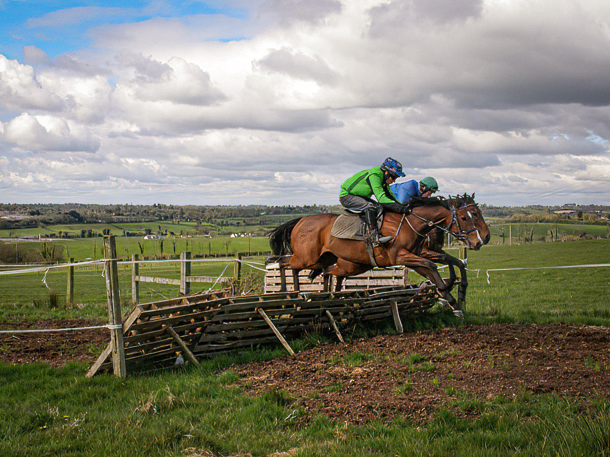
Hi Kate. Many photography forums will tell you that gear doesn't matter much, and it is all about the photographer. Sports is one of those places where that is clearly not the case. I discovered that shooting HS track and field. I think you are having the same challenge here with horse jumping.
But in additional to sports cameras, the other thing which has come along considerably are computers and software for de-blurring images. There has long been algorithms available based on deconvolutional techniques, but they are very computationally intensive. But with computers now, not such a problem, and they are making their way into photography editing software. A lot of them are claiming AI as well - maybe that helps in some cases.
Anyways, I ran your image through Topaz Sharpen AI, and the result is attached. I am not sure it is perfect, but probably close enough that the blurriness no longer gets in the way. |
Dec 18th |
 |
| 96 |
Dec 22 |
Comment |
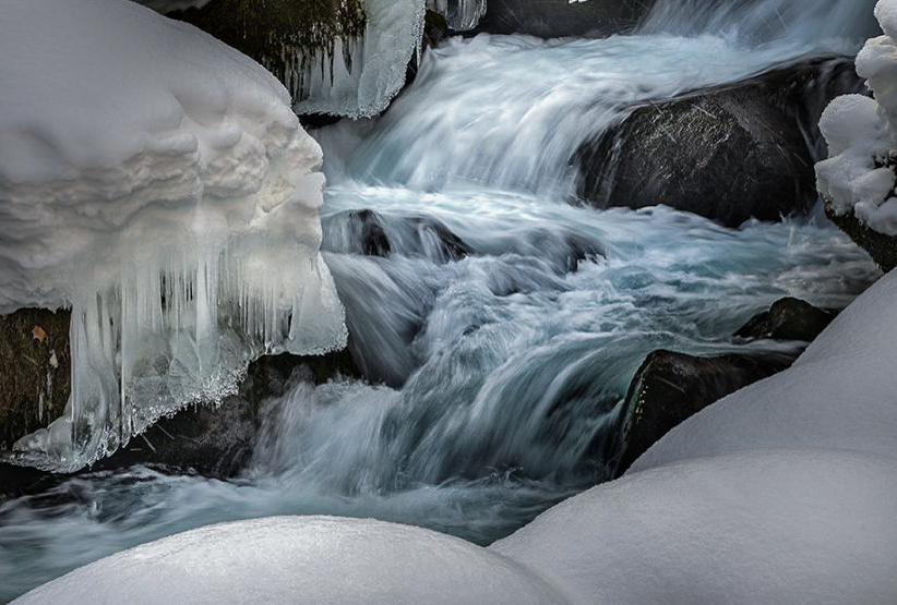
Hi Haru. I am a bit late to the game, so many have collectively covered a lot of my thoughts. My eye is pulled to the water in the center, and then to the top of the snow in the lower left. It is brightness which pulls me there. I do feel like the lighting does not feel real - there seems to be a heavy vignette which I'd guess you might have applied to try to simplify some of the clutter that Dan mentions. I also feel the scene is very cluttered. To me waterfalls are always difficult because I feel they always have this clutter problem to deal with. I also don't get the feeling of cold, and was going to mention cooling down the scene, but perhaps not as far as Cheryl took things.
I took a shot at a crop which to me helps minimize the clutter and emphasizes the most interesting part of the image. I gave the water a cooler tone to separate it from the snow. There are a couple areas in the water that are burned out, which I patched. And I played with the light and contrast a little here and there. I don't think I love it, but then again I can never get waterfalls to work for me.
|
Dec 18th |
 |
5 comments - 3 replies for Group 96
|
5 comments - 3 replies Total
|


