|
| Group |
Round |
C/R |
Comment |
Date |
Image |
| 96 |
Nov 22 |
Reply |
Bob, you are too hard on yourself and too kind to me with your words. 4x5 film is not magic, it is just different - good at some things and terrible at others. I enjoy it partly because it slows me down, and partly because the engineer in me loves all of the pixels that it produces. But I have just as many rejects as everyone else. It is just harder to toss film than it is to delete things digitally.
I think you and the others in the group do a wonderful job commenting, and I continue to learn a great deal from participating in the group. While some things like detail don't translate exactly from print to screen, many others do - things like composition, color, and contrast. Please keep commenting. My work is far from the class of those who inspire me - I have a long way to go.
Lastly, I'd say I've found that improvement is rarely linear. It tends to surprise us when we least expect. And remember that you don't have to climb great mountains to take great images. |
Nov 21st |
| 96 |
Nov 22 |
Reply |
Thanks Gloria. It is helpful to hear what comes across most strongly to you in the image. I am very glad that you feel the anticipation of the day as I did that morning.
As I mention in a couple of responses above, I agree that I need to play with the crop some more. Seems to be a common thread, but you have helped confirm that there could be some improvements there. |
Nov 20th |
| 96 |
Nov 22 |
Reply |
Thanks Haru for the kind words. I very much appreciate you sharing the words that come to mind for you viewing the image, and I am pleased that the "gold to be alive" feeling comes across.
There seems to be a common theme in the comments to explore different crops - either in from the bottom or from the right. As I replied to Dan, the consistency of folks looking for different crops has convinced me there is a bit of a compositional imbalance. I will try a few things to based on the comments from you and the group. Again, thank you. |
Nov 20th |
| 96 |
Nov 22 |
Reply |
Thanks Kate. I appreciate the suggestion on the crop. I think since many are suggesting crops, it seems there is a compositional problem which I posit to Dan above. Your approach of cropping from the right would indeed solve that.
I think my large format images are often described as painterly. I am not sure whether that is good or bad. I also am not sure whether it is owed to some of the unique tonality of large format, or somehow to my processing. |
Nov 20th |
| 96 |
Nov 22 |
Reply |
Thanks Bob. Various people have suggested various crops which leads me to believe there is a compositional problem - my guess at that is in the response to Dan above.
I am not sure about the lack of detail other than shrinking things to 1200 pixels. The scanned original is 16000 x 12800 pixels - there is plenty of detail there. Large format has lots of challenges, but that is not one of them. |
Nov 20th |
| 96 |
Nov 22 |
Reply |
Thanks Dan. As always I appreciate your comments which are very helpful. I may continue to play with the tonality of both the mountain range and the foreground.
Based on multiple comments on composition and crop, I suspect the bigger issue is there. I am feeling that the two pairs of peaks which frame Mt. Adams are a bit too far apart for how closely they are pressed to the edges of the frame. I am not sure anyone articulated that, but folks are suggesting varying crops to change things compositionally. This same problem may be why rule of thirds feels forced. I did have a little more to either side in the original. I have no idea why I cropped in on the sides other than aspect ratio. Should probably try fixing that. |
Nov 20th |
| 96 |
Nov 22 |
Comment |
Hi Bob. I have never been to the Badlands, so I have no first hand knowledge. I also don't know exactly what sort of look you are trying to go for with the image. As others have pointed out, it is very otherworldly - I would call it the graphic novel sort of look. I find the image a little unsettling. It is as if you have brought out the dark side of the landscape.
Could you post the original? I am curious what sheep's clothing covers up this dark side. And there might be other directions to take things. |
Nov 20th |
| 96 |
Nov 22 |
Comment |
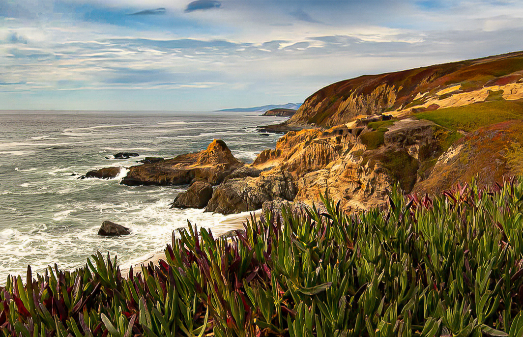
Hi Gloria. As others have pointed out, Cheryl has done the heavy lifting here in mid-tone contrast and enhancements to the sky. I'd only add one other thought in terms of the crop. What I really love is that if you trace the line of the plants from the bottom left to the cliff then up to the hill top and across to the right, you have a beautiful S-curve. I think this is really strong compositionally. To emphasize that further, a thought would be to have the curve end the same distance from the bottom of the frame on the left and top of the frame on the right. So you could take Cheryl's edit and crop down a bit on the sky to even things up. But when done the image is getting a little short and wide. So another thing you could do is then stretch it in photoshop to restore most of the aspect ratio. I took a cut at that below. It is a couple of small changes, but I think it might strengthen the composition. It also pulls in more on the cliff and waves which I think is the focus.
|
Nov 20th |
 |
| 96 |
Nov 22 |
Comment |
Hi Cheryl. I too like the re-edit version better. I think the warming has pulled the colors into a more complementary position which gives a stronger image. I feel like you've darkened it a bit overall which I like as well.
I think the person and dog are integral to this. They provide scale, but I think in the end they are also the focal point. There is a stronger story with them there.
I can't suggest much to change. Like Haru, I wish there was more complete separation of the dog walker from the dark background. Maybe you can move the person? And if so, I wondered where I would put the walker and the dog? Would I put them a little closer together? I am not sure what my answer would be, but if I had the person and the dog on separate layers, I might try moving them around a little bit. Of course the reflections make this somewhat challenging.
Otherwise another beautiful image, and more unique than most of the Canon beach images I've seen.
|
Nov 20th |
| 96 |
Nov 22 |
Comment |
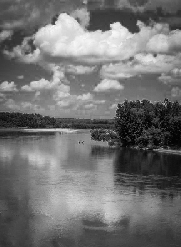
Hi Kate. I agree that there is a very nice feeling of peace with this image. I can almost hear the silence, and imagine sitting on the bank and just letting some time go by. Compositionally though I feel like my vision is being constrained. The beautiful clouds are cut off at the top. I don't see the sweep of the river bank down the left side of the image as the river turns to the right in the distance. And I am not entirely grounded in the foreground - I don't see enough of the bank there either. It is as if I am looking through a window and not allowed to see all of the beautiful, peaceful scene. I also feel like the colors are not really doing much for the image given the time of day. Often times these middle of the day shots work better in black and white.
Since you say that it is the clouds which draw you to this scene, I might try to crop in a way that emphasizes the clouds but does not give me the window feeling (i.e., either go wider or go narrower, and of course after the fact you can only do the later). I'd also try B&W. I took a shot at those in the attached. I did some edits to give the clouds prominence, and I cloned out what was left of the near zone bush after the crop. To me this focuses things a bit more on the peaceful clouds and their reflections.
|
Nov 20th |
 |
| 96 |
Nov 22 |
Comment |
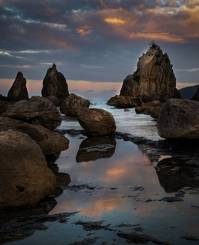
Hi Haru. While I find the original image very beautiful - I love the colors and tonality - I do believe it is a little cluttered. I have a hard time identifying a focus. In contrast, I think the portrait shot is much stronger in this regard. I clearly go to the large triangular shape rock as the focus. The two smaller similar shaped rocks to the left add to that suggested focus and give some pattern. But I admit I like the sky and colors in the original shot better. I assume the portrait shot was taken a little later. You loose some pixels which may or may not matter depending on your final intent with the image, but I'd say the best of both worlds would be a crop of the original.
I did such a crop below. I also did a bunch of dodge and burn to direct the eye down the central "channel" in the image and to highlight the large triangular rock as the focus. Might not be what you were going for, but for me in this case simpler is stronger.
|
Nov 20th |
 |
| 96 |
Nov 22 |
Comment |
Hi Dan. I am glad you successfully found Moonscape Overlook and made it there and back safely - it is a little remote. It is truly an amazing place. I could have camped there for a week shooting sunrise and sunset and not run out of compositions.
Your image here is striking, and shows the versatility of the location to lend itself not only to grand landscapes, but abstracts as well. The branches of the tree that wander out of the frame don't bother me as much as Cheryl because the main trunks are darker and more defined, and those for me are enough to keep me in the frame. As always your colors are wonderful with great color theory match, and I like the tree trunk leading us from cool to warm, reinforcing what the colors have the eye doing already.
I am hard pressed to find much I'd tweak. The one sense I have that I am not sure about is that it feels narrow. I perhaps have a preference to something a little closer to 4x5 aspect in portrait shots. Given that it is an abstract, I might stretch it wider - I don't think anyone would know. I don't think I'd go all the way to a 4x5 aspect, but something in between - preserve the vertical flow of the image but feel less narrow. I also looked at cropping a little off of the top - maybe half to two thirds of the "golden region". That approach is interesting too. It makes it feel less narrow, but it also makes the warm region a little more subtle. It hints at more outside the frame without giving it away. And it makes the image more about the beautiful tree. Just some thoughts. Lots of possibilities with abstracts like this - particularly ones as beautiful as what you have captured. |
Nov 11th |
7 comments - 6 replies for Group 96
|
7 comments - 6 replies Total
|


