|
| Group |
Round |
C/R |
Comment |
Date |
Image |
| 96 |
Sep 22 |
Comment |
Hi Bob. I love the tonality, soft color, and geometric patterning of the front building. Clearly that is what attracted you, and I think you are on to something. But like others, for me, there is too much clutter both behind and in front. So I am not sure that better editing is going to help here. I did play a bit with crops without finding anything that really did justice to the front building. I don't know the surroundings but suspect this one could benefit from a different composition from a slightly different position. I think you need something other than just the glass (e.g., a very tight crop), just not too much. Is the glass such that you can get reflections? That might bring a little extra interest to a tight crop. |
Sep 28th |
| 96 |
Sep 22 |
Comment |
Hi Cheryl. I'm late to the game here, and am not sure I could add too much. I did want to comment though that your original and later repost with the sky smoothed out are for me two very different images. Both excellent to me, but different. The later one is very fine art, and beautiful. But I think I actually prefer the story that I get from the original, where the sky clearly shows the passage of time. I like the contrast of that with the static building. I think you could do some of the later edits you've done to the building itself while preserving the blurred sky. Then the building would still pop more despite the slightly more cluttered sky of the original. Again, clearly two different directions to take things. |
Sep 28th |
| 96 |
Sep 22 |
Comment |
Hi Dan. I've spent some time thinking about this image. It is not my cup of tea, both because b&w is not my thing and because I resonate less with man made structures. At an immediate conscious level, my reaction was that there is not enough there to really hold my interest, but then it somehow has. For one thing, the combination of the very wide lens and perspective makes the boardwalk feel not flat. I feel like the front end of it at least is like the sloping floor of a fun house. It holds my attention.
Additionally, my instinct was to want something more in the back - a brightening of the far distant highlights in the hills at least. But I think your point is that there is not something more.
The combination of the seemingly warped path, and not even the hint of it going to something grand (or what that might be), leaves me with a distinctly unsettled feeling. I am not sure that is what you were after, but it is a fairly powerful sense of "unsettled" which I get. So this one, at least for me, clearly evokes emotion.
I don't believe I could suggest further edits other than not to enhance the surrounding hills. I think those want to be mundane of sorts. Which makes the strange boardwalk to nowhere the highlight, and by standing apart, even more unsettling. Hopefully I've done some justice turning feelings into words.
|
Sep 28th |
| 96 |
Sep 22 |
Comment |
Hi Gloria,
I had a similar miss with a rainbow recently where I could not get set up in time. Ugh, they always hurt. When I'm shooting digital in fast paced conditions I will often try to just shoot a couple frames handheld. That way I have something if the tripod setup takes too long and I loose the light.
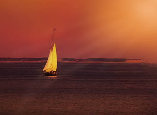
Like others, I don't think there is much rainbow there to recover. Given that, my thought was that it could use a little creative light. So starting with Cheryl's version, I've painted some in below (very quick crude job of it, but illustrative of the idea). Just a thought. |
Sep 24th |
 |
| 96 |
Sep 22 |
Reply |
Thanks Haru. The highlights in the print are a little darker and not so blown out. Even there I will try to tweak things a little darker, but probably need a separate version for web. I will also try a little more light on the trees. Thanks for the suggestions. |
Sep 11th |
| 96 |
Sep 22 |
Reply |
Thanks Stephen. I knew I was somewhat fortunate to get this image, although not having visited Rainier before I sort of assumed this happened pretty often. But as I've searched on the web looking to find similar images I have not found much. Could be I was even more fortunate than I thought. |
Sep 11th |
| 96 |
Sep 22 |
Comment |
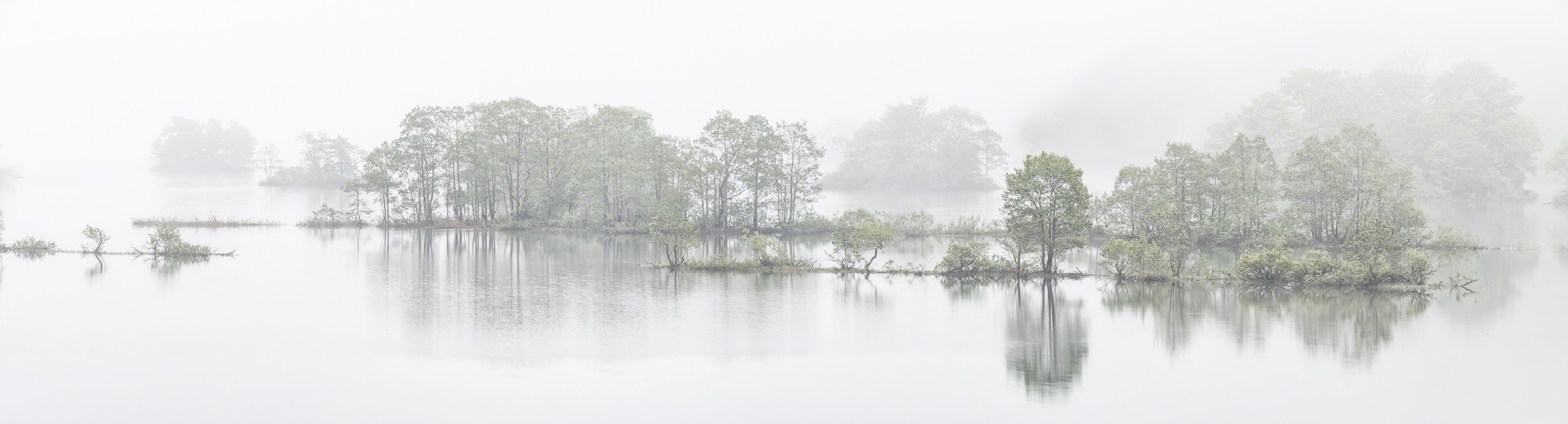
Hi Haru,
I loved the image from this location last time, and I think I love this one even more. I like the B&W as is, but on the color version, was thinking to keep the color but match the same ethereal look of the B&W. I took a quick cut in the attached with a Nik High Key filter.
My only other comment would be about the stuff on the left edge that extends out of the frame. I feel pulled out a bit. I wonder if it would not be better cloned out and then cropping in a little from the left.
I'd love this on the wall where I could see it all the time. It is very calming.
|
Sep 11th |
 |
5 comments - 2 replies for Group 96
|
5 comments - 2 replies Total
|


