|
| Group |
Round |
C/R |
Comment |
Date |
Image |
| 96 |
Jul 22 |
Comment |
Hi Bob. I've only spent time on the Oregon coast once - and not long - but it is on my bucket list for one of my trips. Seems like one could photography there every day and not get bored.
Others have commented on toning down the blue a bit and maybe choosing a better sky to blend in. So let me go in another direction. Like Cheryl I see potential in the foreground sand patterns, but when I follow them I am blunted by the hard horizontal lines in the mid ground, which either stop me (and I'd have to fight through a couple to get to the stacks) or lead me out of the photo to the left. There is nothing in the mid ground that bridges to the background. I played around for a bit with tight crops to try to get a composition that grabbed me, but couldn't really find anything. So on this one I am at a loss for suggestions.
|
Jul 16th |
| 96 |
Jul 22 |
Comment |
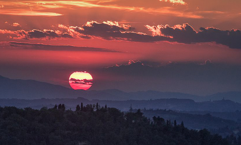
Hi Gloria. I think this is a beautiful sunset, which you've made even grander by catching that moment in time where the sun just touches the horizon.
I don't see a sharpness issue. There is of course haze which softens the distant landscape, but that is not a lack of sharpness and in fact helps give the image depth. But if there was a problem, one more technique arrow for your quiver would be to shoot a bunch of images and look for the sharpest one. Usually if you are hand holding, you can find at least one in between the motion which is pretty sharp. Some people will actually put the camera in continuous mode, hold the shutter down, and shoot a sequence.
The image is beautiful as is, but like others, I think a slightly different crop might make it stronger and emphasize the sun more. My cut at that is below. I also shifted some of the hues. I find when there are as many different saturated colors as you have here, I want to see where they fall on the color wheel, and maybe make some shifts to give a more pleasing color balance. I am not sure whether I made things better or worse.
|
Jul 16th |
 |
| 96 |
Jul 22 |
Comment |
Hi Cheryl. What I really like about this scene is the fact that the two trees are twisted in the same manner mirroring each other. So I like Haru's crop as well as his effort to bring the 2nd tree a bit more out of the shadow. I might go even tighter on the two trees if there were pixels to do that. I think the trees not the flowers are the subject. And the fact the flowers are all on the right feels unbalanced to me - I almost wish they were not there. Tighter also helps with the fact it is a really cluttered scene - that is the main thing you are fighting. But this is amazingly interesting visually so worth figuring out all the challenges.
Don't tell people exactly where this is or they will all be flocking there like the now famous site with twisted aspens in Colorado. |
Jul 16th |
| 96 |
Jul 22 |
Reply |
Thanks Bob. I did play a lot with darker and lighter versions, and couldn't really make up my mind. To that point, I like your version as well. I think they just have a little different mood. I am encouraged by you and the others to spend a little more time with this one. As much potential as the scene had, I feared I had missed with the fundamentals. Since I perhaps judged that too harshly, I will spend more time with the esthetics. |
Jul 16th |
| 96 |
Jul 22 |
Reply |
Thanks Haru. I will try again with the lower right corner as you suggest, but I think there is not much to work with even in the RAW. That area is not lit by the volcano, and otherwise there is little light. Since I was on a tripod, I should have done a long exposure for the foreground and then layered it in. A more modern camera probably would have more dynamic range into the shadows too. I did bracket a bit, so let me look and see if there is one with any more hope of pulling out detail. |
Jul 16th |
| 96 |
Jul 22 |
Reply |
Thanks Cheryl. You are the master of content aware fill. I have to admit that when I try if often doesn't work for me - I obviously have not mastered the tricks of making it work. So I tend to shy away from it. But I will give it a try. Thanks as well for the other suggestions. |
Jul 16th |
| 96 |
Jul 22 |
Reply |
Haru, it would be a totally different image, and I don't know how you feel about people in your landscapes, but I had the thought of having an elderly gentleman with a cane standing and contemplating the tree. I think the purpose of the poles might be clarified for those of us less familiar with the practice, and it could be a powerful story. Just a thought - again, it would be a different image, but perhaps helps others access some of the culture and emotion. |
Jul 16th |
| 96 |
Jul 22 |
Comment |
Hi Dan. This sort of image is less my thing, but I love the creativity you used in adding an interesting story. I also like that the shot feels a little tight and claustrophobic - but perhaps that was deliberate. It adds to the story for sure.
I scout with my iPhone in trying to identify compositions before pulling out the 4x5. Sadly some of the iPhone shots turn out better than the 4x5's. |
Jul 9th |
| 96 |
Jul 22 |
Comment |
Hi Haru. What I like about the image is the light on the cherry blossoms and the light and moss on the tree branches - both are beautiful. What I don't like are the "poles" on the right side, and rocks in the lower right corner. Both draw my eye. The first seems unnatural, and the later is just two dark a mass of rock.
So for me, the focal point is the temple and sun lit blossoms on the left (despite at least equally beautiful blossoms on the right). I think I'd prefer a composition of just the left side, which omits the poles. I think I prefer color, but with different editing might prefer either equally. So I might do something like the attached.
Having said all that though, I have to clarify - are the poles holding up the 100+ year old tree? If I have that right, I have to say that that fact - the age of the tree, the love that obviously goes into caring for it in its age - all that is very emotionally powerful. It would be great if the image could communicate that to everyone. I would not have understood that from the image without your words to that effect. I don't know how to make that more clear. Maybe as Dan points out, the emotion of that is reserved for you or others that understand what is going on. But I guess I would think more about communicating that emotion (if that is also what you feel) more than aesthetics. Emotion has an aesthetic all its own.
|
Jul 9th |
 |
5 comments - 4 replies for Group 96
|
5 comments - 4 replies Total
|


