|
| Group |
Round |
C/R |
Comment |
Date |
Image |
| 96 |
Jun 22 |
Comment |
Hi Gloria. I love the subtle colors you've captured, as well as the sense of light bleeding in from the right side of the frame. The later suggests the strong setting sun outside the frame without having to show it.
I'd make a couple compositional comments if you have a chance to shoot this scene again. All are just suggestions to consider. First, there is less going on in the left side. At the same time I really want to follow the shore on the right as a leading line, but it runs into the frame edge. So, not really knowing what is further right, I'd swing the camera a bit to the right to try to work both of these issues. Second, I'd rather if the tall tower didn't touch the dominant, colorful cloud. Of course a different day could be completely different. But if not, your only choice might be to move back and then use a longer focal length. That might buy you more separation. |
Jun 23rd |
| 96 |
Jun 22 |
Comment |
Hi Haru. This one is really spectacular - I believe the favorite for me of what you have posted in the group. The composition is wonderful - the sloping island chain works for me in leading right to left and then to the distant mountain which I follow back the other way. The colors, as is your way, are just enough, subtle, but beautiful, particularly the color in the clouds. The still water, reflection, and clouds definitely deliver a sense of peace and calm. The low clouds hugging the far mountains similarly give a sense of slow time or tranquility.
The reflections of the trees are a little dark - I might try lightening them a little bit. Then again, trying that, you may decide that the look is better as is.
I am not sure I follow your first compositional point. I think there is interest or highlight across the whole extent, so I am not sure why you would consider cropping to just the right side (if I have it correct that that is what you were considering). However you arrived at it, I think the composition is very good, and I would not change it.
On your second point, why do the clouds make you uneasy? To me they are very peaceful clouds, not storm clouds or the like which would add tension. The darkness in the clouds doesn't bother me. You could try lightening the dark spots, but I think as is it helps hold the eye in the frame, so I am not sure I would go far in that direction if at all.
Again, an amazing image. Where is this if you don't mind me asking?
|
Jun 5th |
| 96 |
Jun 22 |
Comment |
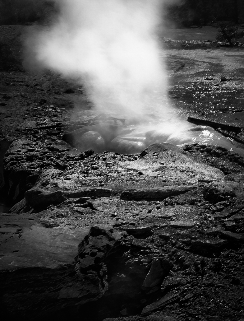
Hi Bob. There is a great extent and diversity to the beauty of Yellowstone. It would be difficult to capture prize winning images of it all without living there and getting to experience it everyday. But it is still beautiful even when conditions are not photo perfect, and having remembrances of that are wonderful nonetheless.
If I were to try to spice this one up, I'd start with trying to correct the lack of sharpness. I gave Topaz sharpen AI a try and it helps a lot. Then I might tighten the composition. The left side is not as interesting to me, as I find the steam the center of attraction. Of course steam looks marvelous with the right back light, so I might then try to play with the luminosity to add as much of that kind of drama as I could. Finally I'd further play with the luminosity and crispness of the details to give the eye a path through the image. Since there is not a lot of color, I might take a look at the end result in B&W and see which I liked better. I took a shot at all of that in the image below. Of course, I don't know that this is necessarily how you remember the location, so the original may be a better remembrance.
|
Jun 5th |
 |
| 96 |
Jun 22 |
Comment |
Hi Dan. Another beautiful image - colors, composition - everything is very well done. I particularly like the extended foreground with the horizon set high. It really draws one into the image.
It was indeed great timing with the conditions and hour of day. It is difficult to find anything to improve. If I were really nitpicking I might desaturate the blue a bit in the upper right - it feels a little stronger than the other colors and I get pulled up there a bit.
I think the sky and reflection are matched well by the 3 stop grad. But I am curious why you went that way vs. blending 2 exposures. It does seem the tops of the sea stacks are a little dark from the grad (particularly the tall one on the right), and you could have perhaps avoided that with a blend.
You do have very interesting titles for your images which I admit I can not often figure out. |
Jun 5th |
| 96 |
Jun 22 |
Comment |
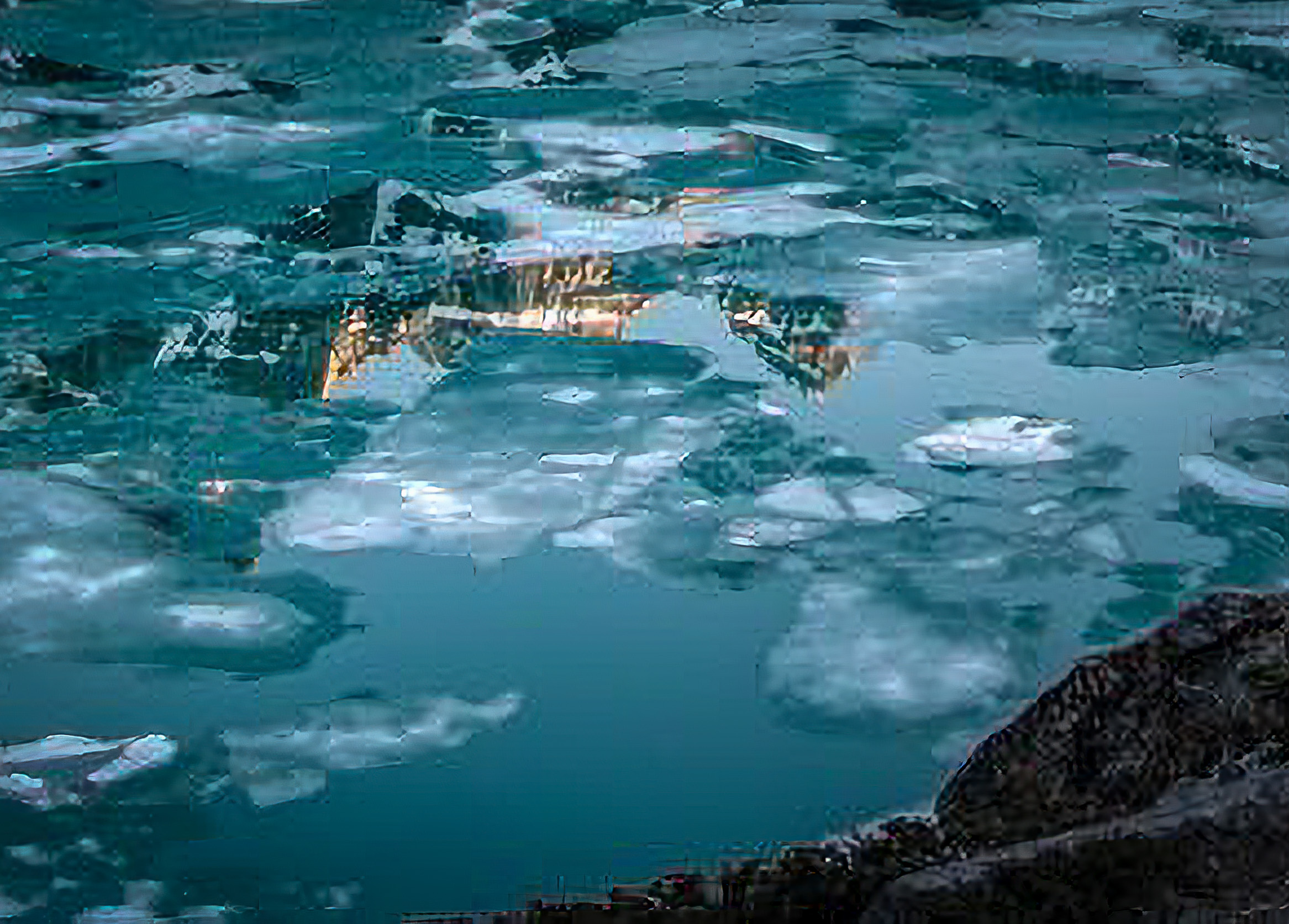
Hi Cheryl. This is a beautiful image. I particularly like the contrast of the cool colors in the lake and the warm sky which you've added. Also, just amazing catching the lake in this half frozen state. I was not looking at your original and had no idea the sky was swapped until I read your description. Even knowing it I think it holds up fine. I looked to see if the reflections would reveal it, but because of where the clouds are and where the lake is still frozen, I don't think there is a major problem. I imagine you worked that deliberately.
I don't think there is too much going on. The trees on the edge help frame things and hold the eye in the frame. There is a lot to keep one interested looking through the image, but I don't know that it is too much.
Where my eye keeps wanting to go is the warm lit reflection in the particularly open part of the lake just below and left of center. I think if you had zoomed in and cropped that, it could be a stellar image all on its own. I took a cut at that, but of course there were not many pixels to work with, so it suffers from that (even with super resolution and Gigapixel AI). Just a thought - you may have enough pixels in the original RAW. |
Jun 5th |
 |
5 comments - 0 replies for Group 96
|
5 comments - 0 replies Total
|


