|
| Group |
Round |
C/R |
Comment |
Date |
Image |
| 96 |
Apr 22 |
Reply |
Thanks. I indeed used this when I made the new version I posted above (with the composted stuff in the corner). |
Apr 10th |
| 96 |
Apr 22 |
Reply |
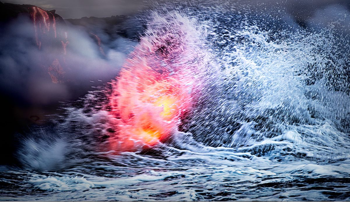
Hi Haru. I decided to see if I could do something about the context problem you brought up. I had the idea to compost in something more recognizable in the background - like lava running down the cliffs. Originally I wanted to do it above the crashing wave, all along the top edge (extend the canvas vertically) but that the challenge of blending the spraying water is well beyond my compositing talent. So, I settled for the left corner and kept the top edge where it was. I cropped a little from the right because I felt that was now needed for balance (and Bob had suggested it earlier too).
My questions would be, first, do you think this supplies enough context? Second, does it look believable, or is the compositing obvious? Don't worry about hurting my feelings on either point, just give it to me straight.
I'm not sure I like this better even if it does provide context as I think it distracts from the power of the wave/lava. But I will have to come back to it in a bit and see if I still feel that way.
|
Apr 10th |
 |
| 96 |
Apr 22 |
Reply |
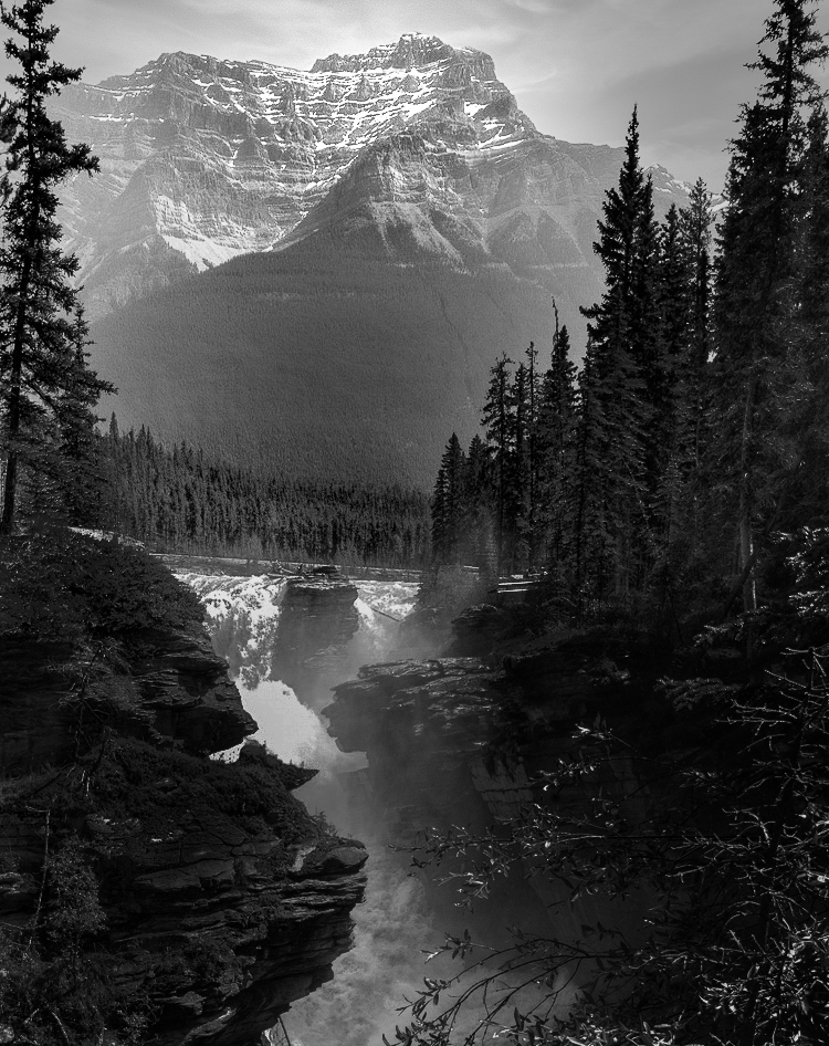
Well, your question prompted me to give it the college try, and see if I could make the mountain work as the subject. It was a torturous process - I started in color because that is what I'm better at, but ended up in B&W. I cropped, substituted the sky, ran it through a bunch of Nik filters, on and on because I was trying to figure out what would make it work. I think in the end it actually works (see attached), but you can judge.
The more interesting question is why, looking back, I didn't think it would work, and how did I overcome that (assuming I did). I guess I would say it needed something to make it prominent and that was lacking in the original. I think it wasn't prominent in form (geometry) because as you point out it was not in full view. And it wasn't prominent in lighting, because, well the lighting was not so great. I don't know how to fix the geometry, so you have to fix the lighting. Cheryl was going there with a quick try. But I think to make it work and look realistic takes major surgery on the lighting. The lighting in my image doesn't look much like the original. And I couldn't get it to work in color - just too hard. But B&W is more forgiving of this type of surgery, and I think it looks believable, with the mountain top now the star. To me it is believable in part because for the peak I have not eliminated the haze completely, I've just shaped the light, and given it just enough crispness for your eye to want to go there.
I'd be very interested in what other people think.
|
Apr 10th |
 |
| 96 |
Apr 22 |
Reply |
I like this a lot! You've made the buildings the "lonely" subject. The mountain is supporting. And the negative space very much adds to the feeling of loneliness. After seeing this I'd say my version was more sadness than loneliness. |
Apr 9th |
| 96 |
Apr 22 |
Reply |
Bob what did you change the blend mode of to Linear Light? Did you duplicate the background and apply that blend and fill to the duplicate layer? I don't think I have ever heard of that technique. It has definitely increased the contrast but in a different sort of way - I think it has enhanced the drama of the motion. It has also added more dark regions like Haru was looking for (if I understand his comment). Again, please let me know exactly what you did - I need to play with this.
BTW, you give me more credit than I deserve on the capture. This is one of those cases where equipment and lots of shutter presses is probably more important than talent. |
Apr 9th |
| 96 |
Apr 22 |
Comment |
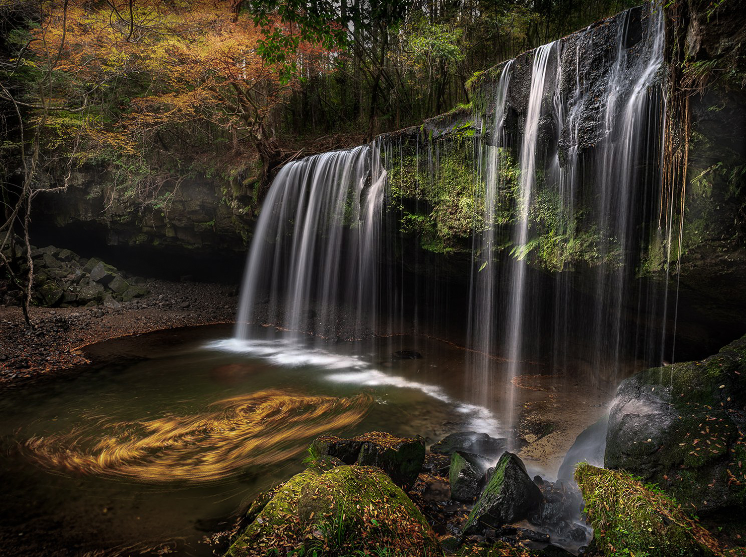
Hi Haru. Thank you for presenting another beautiful image. This is indeed a very nice location, and as usual, I think you've more than done it justice.
I like the swirling leaves because I think they complement the story of motion and time that the falls start. The blurred water suggests that motion, and the moving leaves pick up that story.
I would start there, and then try to address the concern folks have raised about the swirling leaves stealing the show. I would say all you need is to balance the elements you have, perhaps leaving the fall itself a bit prominent. I took a cut at it. I darkened and desaturated both the swirling leaves and the bright orange ones in the upper left which I found also to have too great a presence. In contrast, I saturated the greens a bit more throughout to pull them up as supporting cast. Then I darkened the image overall a bit, but went back and highlighted a few points - the orange in the trees and water, the tips of the foreground rocks, the greens behind the falls. All of this was to provide a range of interest points for the eye to enjoy around the scene. Finally I brought the whites back up in the waterfall to make sure it was the star. All of this is very subjective, but I think the overall image has a bit better balance, and the eye is more free to move around. Just some thoughts. Again a beautiful image in any case. |
Apr 9th |
 |
| 96 |
Apr 22 |
Comment |
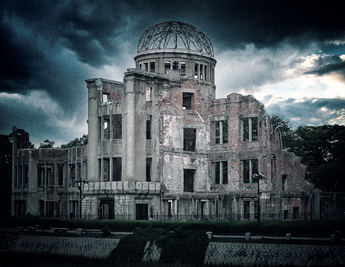
Brian, I had a few moments, so I took a cut at creating that sort of bleak look. Actually an interesting image to play with. I replaced your sky because indeed it was blown out and tough to salvage. |
Apr 9th |
 |
| 96 |
Apr 22 |
Comment |
Hi Brian. I was not familiar with this building, so thank you for sharing. Based on your first two images, you are quite the traveler - I'm jealous.
I think Haru and Bob have covered a lot of the technical - the dust, the sky, etc. I think with the sky (and lighting) it is at least bleak if burned out, which does contribute to an appropriate mood. But I don't think I would have known what this was or what you are trying to communicate. The connection to the Hiroshima event is probably difficult to get across to those who don't know the building. But there are ways which might help convey bleak and a sense of destruction. For example you might make the colors bleaker, make the overall scene darker, and maybe add some gritty grain to the image. I'd also clone out the people. Just some thoughts that would make it more art and less journalistic. Nothing wrong with the later but in this particular case I am not sure it conveys strong emotion. |
Apr 9th |
| 96 |
Apr 22 |
Reply |
Thanks Brian. We were in a boat which I would say at times got within about 50ft of where the flow was entering the water. It was close enough you could certainly feel the heat. I can only assume the tour operators knew what they were doing from a safety perspective. The lava was running down cliffs and then across the new bench which was being formed before entering the water. The cliffs were significantly further away. The little I understand, the real danger is from when the cliff edges occassionally collapse as part of this process. So I think we were at a safe distance from that. |
Apr 9th |
| 96 |
Apr 22 |
Reply |
Thanks Haru. I am not sure I can do much about the context. My thought is that this would be part of a collection of images on the volcano (no idea what I would do with such a collection), so that would give context. But I agree that alone, it is hard to say what is going on.
In terms of being more able to explore the image, let me try to make the red a little less vivid, and also do some selective dodge and burn to add more dark tones. I think that that may further help emphasize the drama as well. |
Apr 9th |
| 96 |
Apr 22 |
Comment |
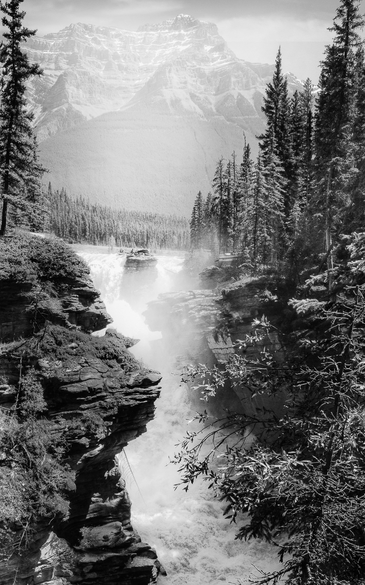
Hi Bob. I made a trip to Jasper and Banff a few years ago, and I think I visited this fall, but I can't place it. There are a lot of them. It does seem like shooting here is pretty constrained.
As I've said before, I'm terrible at B&W. But I am fascinated with B&Ws where the distant mountains are lost in haze - that they are very subtle. So I tried to take this one in that direction (see attached). But I think that pointed out to me what the problem is here, namely that there is no real "subject". Perhaps the mountain wants to be, but I am not sure it is. Same with the falls. Cheryl has tried to create a subject or focus with the use of light. In this image I think it is difficult to do that enough while being subtle enough that it is not obvious you did that.
If this image had a small tree growing on the outcropping that sticks out over the water on the left, it would change this whole image. That could become a powerful subject - surviving in the precarious position with the water raging below - and everything else would become great supporting elements. I think the right playing with light would enhance that further then and really make it work.
Sorry that I don't have better suggestions here. |
Apr 9th |
 |
| 96 |
Apr 22 |
Comment |
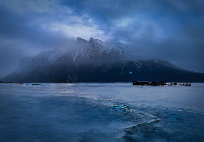
Hi Cheryl. I took a shot at reprocessing the image a bit with your "isolation" theme in mind. It seems like "isolation" benefits from the mountain being alone, so I cropped in from the sides (and then from the top because I don't like square). The dark bits at the left and right edges I found distracting - pulling me there anyways. To me "isolation" is also a dark mood, so I darkened overall. I also but a pretty heavy vignette on to give a bit of a tunnel view which again I think is consistent with "isolation". The rest was to give the mountain more focus as the isolated subject. I gave the mountain top a little more light, but also warmed it up a bit (radial filter). Then I enhanced the crack as a leading line bringing you to the isolated mountain. That could have been more carefully or subtly done but I did the quick version - a little light, contrast, and warmth. There is a balance in making it too obvious vs. not enhancing the crack enough.
It is a nice shot and so a pleasure to play with. There may be a way to convey isolation without such a dark mood, but again, I guess that is where I go. That is despite really enjoying the time alone photographing with no one around as you described for this image. |
Apr 9th |
 |
5 comments - 7 replies for Group 96
|
5 comments - 7 replies Total
|


