|
| Group |
Round |
C/R |
Comment |
Date |
Image |
| 96 |
Mar 22 |
Reply |
I'd go a bit further. But my thoughts are based on my style, as well as how I tend to process color. Like I said, I am terrible at black and white. That may be because b&w is supposed to be more subtle. |
Mar 13th |
| 96 |
Mar 22 |
Reply |
I don't normally use Topaz for sharpening - only when I have blown the focus. I find in that situation it can save an image that nothing else can. But at the cost of some artifacts. Yes, definitely other tools for "normal" sharpening sorts of functions. |
Mar 12th |
| 96 |
Mar 22 |
Reply |
I like this one better. I actually like the sky better in this one - it is a bit more subtle, and as such, the touches of light in the sky become more of the subject. The branch plays more of a supporting role and works well as a leading line. Yes, this one is really nice. |
Mar 12th |
| 96 |
Mar 22 |
Reply |
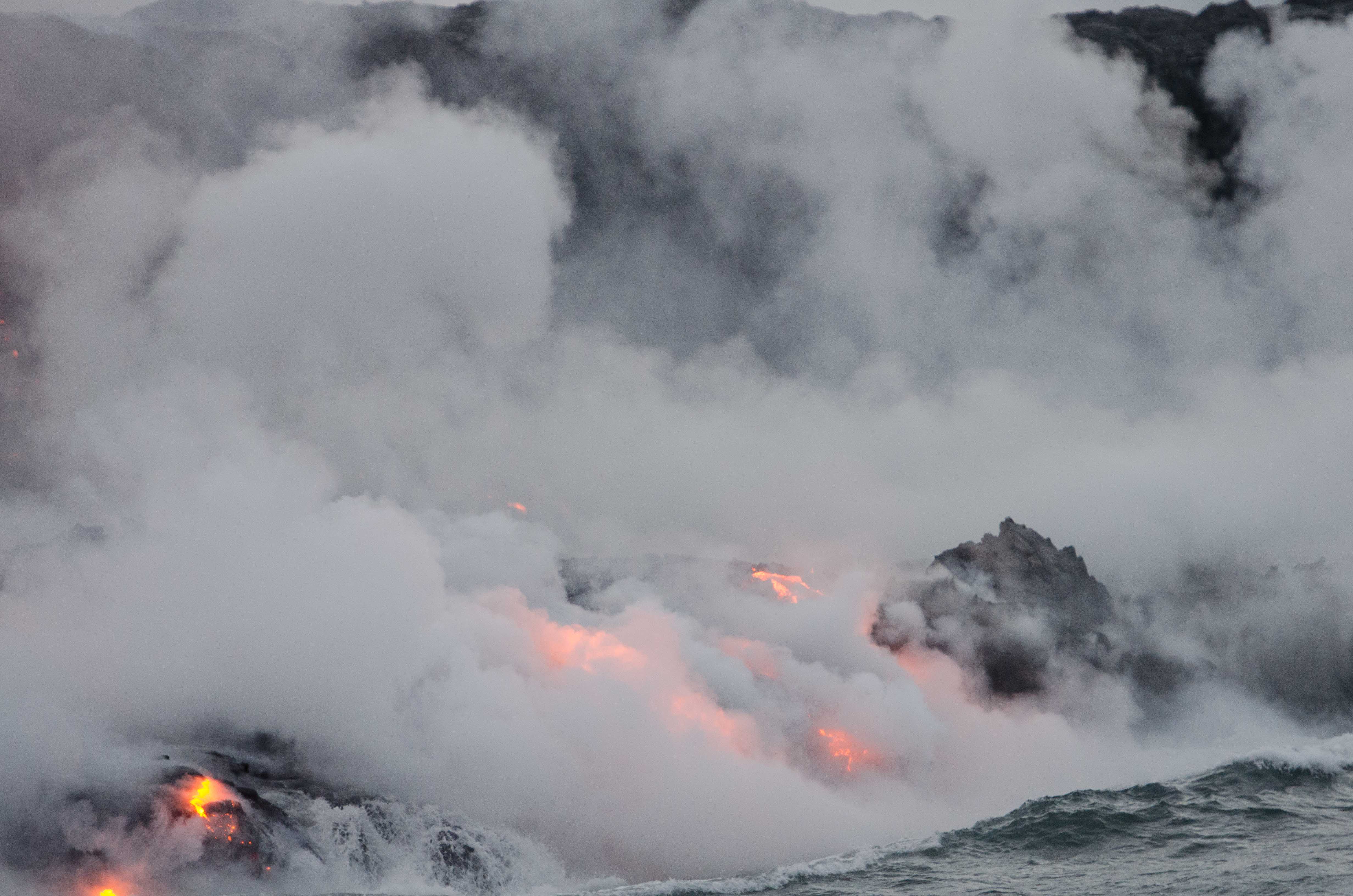
Thanks Bob. I think the real test on the blackness is printing. I have an 8x10 which I did before submitting the image. It is ok in the right light, a little flat in other light. So what you've done in adding some brightness - particularly in the lava area - may be what is needed for appropriate drama in print. Of course the right gallery lighting makes almost anything look good. |
Mar 12th |
| 96 |
Mar 22 |
Reply |
Thanks Dan. Have to admit though that I give up - where are the sensor spots? As a film shooter, I'm not used to looking for them. I find enough dust I have to clone from film scans, but I must be missing something looking for sensor spots.
Fighting noise is also new for me. Tough here because I am also fighting softness. Topaz Sharpener AI helped but also put a bunch of weird artifacts here and there as it usually does. I still need to go fix all those. |
Mar 12th |
| 96 |
Mar 22 |
Reply |
Thanks Haru. Your suggestion prompted me to look to see if I had another frame where the wave action was even more dramatic, but alas I do not. Everything was changing very rapidly. Next frame I have the mist & steam have dissipated enough you see too much lava. Of course I wasn't shooting 10 or 20 fps which is what I'd show up prepared to do now.
I've attached "raw out of camera" so you can see the colors. Of course the camera is screwing with the colors some, so who is to say if even that is "real". I'd need a color standard in the scene, and I wasn't venturing over there to do that. The color contrast adjustment I did in Nik shifted things a bit, and glamor glow effect (like Orton) has increased the saturation some. But I don't think the colors are wildly different.
You can see that I cropped. In the original you can make out the cliffs in the background that the lava is flowing down. The portion I cropped in on is the new cliff being built. |
Mar 12th |
 |
| 96 |
Mar 22 |
Comment |
Hi Bob. I have never been to Palouse Falls, but I like the composition you've found. The land has a lot of interest in its shapes and the textures created by the dusted snow. I wish you could have gotten a little higher, which I suppose would have required a drone, in order to separate out the layering of the land a bit more. I also find myself wanting to explore the canyon on the right in more detail.
I agree with Haru that the colors don't seem right - too red. Of course I've never been there, but I suspect the LUT has given it a bit of a post apocolyptic look that you were probably not going for. The sky also doesn't quite match with that LUT coloring. Did you replace the sky first and then apply the LUT or the other way around? It would be interesting to see the original right out of camera. |
Mar 12th |
| 96 |
Mar 22 |
Comment |
Hi Gloria. I am afraid I also do not get the emotions out of the image that you were trying to convey. The isolated focus on the one shell pairing to me speaks to isolation vs belonging. I understand that the limited depth of field was done intentionally - you've done a good job exploring that. But for me it is a lot out of focus and so little in focus that even putting the message aside, it doesn't work for me that well. I also can't really see enough detail to understand it is a second shell in the first - I would not have know that without you telling me.
I tried to think how you could change this to get across more a sense of belonging or coziness. I am not sure this is still a scape, but if you had two hands cupped, delicately holding the shell, that might get across a sense of belonging and safety.
Similarly, I tried to think about a way to photograph the shells and the boats together - that tied them together - even if the story was completely different than you intended. A thought would be to layout the shells in a pattern that the eye naturally follows from shell to shell, and which then transitions at the water line to a boat and similarly follows a continued connect the dots from boat to boat. This might convey connectedness or order. Since you can't move the boats, you would have to see a strong pattern in them, and then continue it with the shells. Of course it is possible to cheat a little by cloning out boats that don't work. I suppose for that matter you could even move the boats in photoshop. Just some thoughts.
|
Mar 12th |
| 96 |
Mar 22 |
Comment |
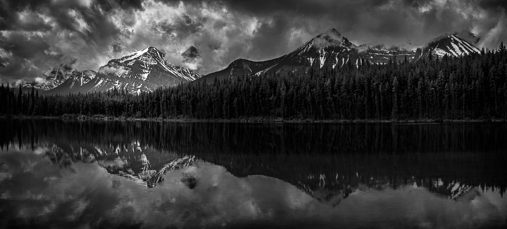
Hi Cheryl. I agree the color version is flat, and think going to B&W as you did is the right path. But alas, it seems like that is flat too - which BTW is the problem I have every time I try to go to B&W. So others can probably help on this one more than me. The other comment I'd make though is that there is the opportunity to make the peak on the left more or the subject or star. As is, it is a nice scene, but I don't know where to focus.
I took a shot at adding more drama and a little more focus on the left side peak, but, as usual, I'm not sure I'd say I'm thrilled with the outcome.
|
Mar 12th |
 |
| 96 |
Mar 22 |
Comment |
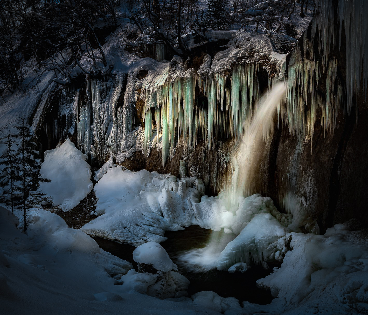
Ok, here is a cut at keeping the crop as is. To answer your questions, having done this, I'd say yes, there is potential to make this comp work. I would still prefer to crop a little bit from the top, but I didn't. I don't think wide horizontally here is the problem, I just don't think you need all the stuff above the falls. BTW, I had never heard your never shoot icicles with a wide lens rule of thumb, but then I don't shoot many frozen waterfalls. Strange being in New England that I don't. I solved (or at least helped) the clutter problems from the wide aspect by darkening it. I suspect that makes this image more dramatic than your usual taste.
I started from the diffused version. I think the highlights are blown out in places in the other version. I'd rather start flat and put the drama in where I want it. That is what I did bringing light back to the fall and icicles.
Again, I can't comment on B&W - I am no good at it.
Overall, the processing was to darken the image, the edges more so, and cool it down. I then did a bunch of dodge and burn to highlight the falls and icicles and make them warmer. I also played with the colors of the icicles to highlight them a little more. This was all a quick LR job vs what I would normally do in PS. And was probably heavy handed. But to me at least it shows this composition has potential.
|
Mar 12th |
 |
| 96 |
Mar 22 |
Comment |
Hi Haru. I started playing with your image, and only then read your back and forth with Dan where you said you really wanted to see if this comp would work vs. cropping. So, I will go back and think more about that. But first, putting that aside, my cropped version is below. I think there are two issues - and these may apply whether you crop or not. First is that the unfrozen spraying water wants to be the star. I think you want the icicles as the star, but with the movement and drama in the falling water, I don't think it will take second fiddle. The icicles have to be the chorus. Second, you have what I describe as the waterfall muddy colors problem. One solution to that is of course to go B&W - someone who is better at B&W than me can help with that, as I find things start blending together too much for me in a quick B&W attempt.
So anyways, here is a version that attempts to address both, admittedly with cropping. I am not sure I like the colors still - so there is probably more playing to be done there. I will circle back in a separate post and see what I can do with the uncrossed composition.
|
Mar 12th |
 |
| 96 |
Mar 22 |
Comment |
Hi Brian. Again, welcome to the Group 96, and thanks for joining us. I look forward to seeing your images over the coming months, as well as hearing your thoughts on the images of the Group.
Diving right in with your image this month, I'd ask, what makes this image special to you? What is the story? You mention the architecture in your description, but my eye goes immediately to the people, most likely because that is where the bright colors live in this image. I actually like those colors - for me it gives a sense of vibrant life in an old land. But many of the people are walking away, and the exception, the ones in the lower left, being the brightest of the bunch, pull my eye there and sort of leave it there.
As others have described, there is a lot of sky which is not seeming to add much, and the architecture, which is interesting, is a bit overexposed. There is a lot to look at - it is visually interesting in that sense. But then I still try to understand what message it is trying to leave me. |
Mar 12th |
| 96 |
Mar 22 |
Comment |
Hi Dan. Another image with beautiful colors, and great drama in the sky. I like the balance the trees bring on the horizon; the third in from the left feels right to me. I am not sure I find the branch as visually compelling as some of your previous foregrounds though. I wondered if it would help if it were angled differently as a bit more of a leading line from the lower left. I do like the bubbles. But overall I just feel the branch is too much the subject, and it leaves me flat in comparison to what is going on in the horizon and sky. |
Mar 12th |
7 comments - 6 replies for Group 96
|
7 comments - 6 replies Total
|


