|
| Group |
Round |
C/R |
Comment |
Date |
Image |
| 96 |
Jan 22 |
Reply |
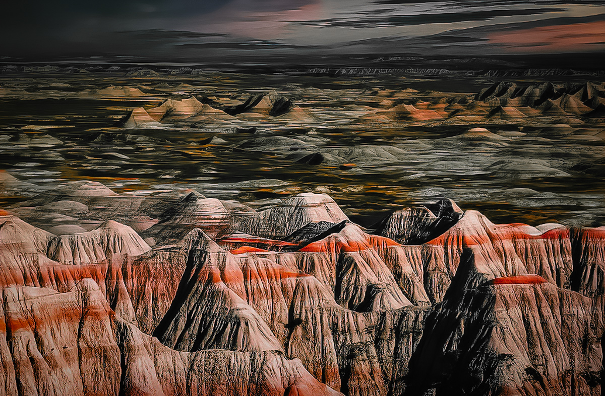
Thanks Bob. I think for me it is not so much a rainbow image, as an image about the majesty of the moment - the dramatic light with the sky and earth touching, connected by the rainbow. So as I mention in a response above, the tight crops, while they work fine from a composition perspective, don't give the sense of majesty that I am looking for (although your crop is a bit of an interesting compromise). Alas, the wide crops don't work for the reason you and others have pointed out. Ugh. I at least understand the dilemma better. It could be understanding it, I can go back and find a different frame that would work better.
This is a digital shot and therefore one I have never put as much energy into. If I had this in 4x5 it would be killing me not being able to get this to truly work. |
Jan 22nd |
| 96 |
Jan 22 |
Reply |
Thanks Dan. The emotional experience may be part of the problem, but I think there is more to it - more in composition. When I crop tight, as Cheryl did above, I feel it is too simple - I get bored of it quickly. And when I crop wider, I get more "majesty" which keeps me interested, but in terms of balance, the weight and position of the light, it feels off. As Haru points out, there is a lot of dark space between the bright clouds and bright peak. As I think about this though, I do have a bunch of frames, and the clouds were moving quickly. It is possible I can layer in from another frame and create a better compositional balance. This is probably the best balanced individual frame, but I have not considered combining them.
Then again, at the end of the day, maybe you are right, I should put the photoshop brush down, and just remember it as an awesome morning. |
Jan 22nd |
| 96 |
Jan 22 |
Reply |
Thanks Cheryl. I have tried cropping it as you did, and the problem for me is that I don't think the image is just about the peak and the rainbow but their place under the grandness of the sky. I feel like when it is tight to the peak and rainbow, it is beautiful, but I get tired of it quickly.
As much as it was a unique lucky moment, I don't think the problem is as much that I have too grand an expectation in the image as a result. I think as lucky as the rainbow was, the lighting overall doesn't really work compositionally. I want the majestically lit heavens, and have even deliberately pushed the upper left further in that direction (e.g., brighter), but compositionally it creates a ping pong back and forth between two bright but separated areas. I may tone the upper left down and try bringing up some other bright areas to create more of a diversity of draws for the eye - but I am not sure that isn't pretty close to the original, which just didn't seem to work compositionally. |
Jan 22nd |
| 96 |
Jan 22 |
Reply |
Thanks Gloria. Yes, power and majesty is what this is about to me. Which is more than the single peak or the rainbow - it is those in the context of the dramatic sky. Which others are pointing out doesn't really work compositionally. I can perhaps bring out a bit more of the colors in the rainbow, but unfortunately I think there are other problems to solve before it is worth spending too much time on that. |
Jan 22nd |
| 96 |
Jan 22 |
Reply |
Thanks Haru. I deliberately have brightened the upper left corner (I will try to describe my reasons in one of the other responses below). But yes, thank you for pointing out that what I've now created is one of these situations that the eye wants to ping pong back and forth between the two bright regions with no where to rest. Ugh, ok, I see the problem, but am not sure I can fix it while keeping the feel I am after. The dramatic sky to me is as much of the subject as the mountain and rainbow - perhaps more. |
Jan 22nd |
| 96 |
Jan 22 |
Comment |
Hi Bob, Happy New Year! Of the images that you've presented since joining the group, this is my favorite. I like it a lot. In particular I enjoy the strong graphic forms, repeated with the layering you've created, and contrasted with the softer sky. I also like the repeated reddish tone, which shows up in the foreground, then the highlights of the mid ground, and then the sky. All elements of this image work very well together. I could keep looking at it for a very long time and not get tired.
I agree in part with some of the suggest corrections others have made. I think there is a green color cast. But rather than shift everything around, I would try desaturating (not to B&W, but a good ways) everything except the reddish highlights. I think then you would have strong graphic form and a common color woven through. I might darken the foreground a bit, and maybe reduce the clarity a bit, but not too much on either - I think you want it in your face. This is image is about strong graphic form, and you don't want to back off from the theme. I took a cut at these, a crop, and perhaps a couple other tweaks, all easy stuff in LR, which is attached below. |
Jan 22nd |
 |
| 96 |
Jan 22 |
Comment |
Hi Cheryl, Happy New Year! I've looked at this image a few times the last couple of weeks, and at this point read through the other comments. I think it is beautiful, and I wouldn't change the crop or add replica fireworks. I think it is well balanced compositionally - it feels right. I'm also impressed as always with your planning the lengths you go to to assemble the image - I don't shoot fireworks, but I'd never heard about the approach you used to get around the smoke.
I was prepared to say I can't think of anything to add but something was nagging at me and it came to me as I was re-reading how you handled the fireworks. The image feels a bit too clinical to me. I think you've done such a good job piecing in the fireworks so cleanly, that while amazingly sharp and clear, it doesn't feel real. I wonder what would happen if you just brought back a bit of the smoke? Not all across the scene, but just in the area near the fireworks - I'm thinking just in the area left of the tall buildings. The cityscape would still be clear and sharp, but there would be more of a sense that the fireworks were really happening - more of a sense of a moment in time. Just a thought. |
Jan 22nd |
| 96 |
Jan 22 |
Comment |
Hi Emily - Happy New Year! I had never heard of an ice volcano, so thank you for introducing a new feature. They are indeed quite strange, and you've captured a nice documentation type shot - particularly considering the concerns about getting close to them on the ice. But as an artistic shot, I don't find it really speaking to me - or at least I don't know what you are trying to say. I think different lighting conditions might give you a little more drama and mystery, which seems appropriate since the ice volcanoes seem such mysterious things. Or if one of the animals that made the tracks was poised on the edge looking down in - that would truly be special and bring a strong feeling of curiosity and mystery as well. I understand that would take true luck in timing!
In terms of technical things, I also agree with Cheryl that stopping down would have perhaps made things sharper, particularly the front edge. The composition also feels a little tight to the front volcano to me. I might try including a little more room around it to give it space and perhaps help with context.
I am not sure if these features hang around for most of the winter, but if you have the opportunity to shoot them again, I think they would be an interesting subject to play with for awhile. I can imagine trying some more abstract shots for one. I also wonder how they look when the ice is partly melted. Just some thoughts. |
Jan 22nd |
| 96 |
Jan 22 |
Comment |
Hi Gloria, Happy New Year! I'm intrigued by your combination of words and image. I find expressing what I am thinking about a place through an image alone is very difficult - portrait or even wildlife photographers have that part of things much easier. But maybe you are on to something here, in that writing down the feelings at least forces one to make it concrete. It helps if one is not starting with a fuzzy sense of what you are trying for the image to convey - I think Ansel Adams had a famous comment on that. You certainly have many textured feelings about this particular location - maybe a first step is trying to simplify those. Get it down to one strong thought you are trying to focus on and get across. Different images perhaps at different times could try to convey other aspects of your feelings.
On the image itself, some suggestions to consider. Perhaps emphasize "your rock" a bit more. Which rock specifically is it that you would sit on and reflect on the location? Can you get in closer to that rock? Can you do something to further highlight that spot? For example, you or someone else sitting on the rock would bring the connection to the place. But I could imagine more subtle approaches - placing something on the rock, an object of significance or maybe a flower which appreciates the place and again shows the connection. It also would give the image a bit more focus - it is beautiful now, but there is no real focus point for the eye to go to. Also, the colors in the sky are beautiful, but the sky above is a little bland - I don't think you need it and recomposing in closer would perhaps help you eliminate it. A camera position which moved the rocks out in the water so they do not overlap with the background, and where they are pulled left (there is a lot of right-side weight going on) might help as well. Then little things - the horizon does not look level. Easily enough corrected in post.
Again though, I very much like the words. Novel ideas like that help us all find ways to improve. |
Jan 9th |
| 96 |
Jan 22 |
Comment |
Hi Dan, Happy New Year! Another really beautiful image to start the new year. The muted colors are beautiful and complement the calm, peaceful mood. I love the birds - I am curious whether you added them. I think their coming from over the last fence adds to that story of mystery around what's back there. Like Haru I wondered about the crop. I found when I started cropping in the elements started coming apart - individual trees more than the cluster or trees. I find myself wondering about an even wider crop that off centers the trees and sun a bit more. But beautiful as is. I don't know there is anything I'd change. What IS beyond the fence btw? |
Jan 8th |
| 96 |
Jan 22 |
Comment |
Hi Haru. Happy New Year! I like this version much better than the original. I think you've eliminated the distractions, and I think the color from the autumn trees is a nice addition (and not over saturated), particularly in contrasting the cool tones you've given the falls. I am not a big fan of the person under the falls - I'd opt for the version without. I'd also clone the bright branch at the extreme upper right which pulls my eye up there. Finally I might darken the lower left corner and left edge a bit - they fall outside the frame you've created and also pull my eye away from the otherwise well showcased falls. All small things. It is a beautiful image - the color balance and composition are excellent. |
Jan 8th |
6 comments - 5 replies for Group 96
|
6 comments - 5 replies Total
|


