|
| Group |
Round |
C/R |
Comment |
Date |
Image |
| 96 |
Oct 21 |
Comment |
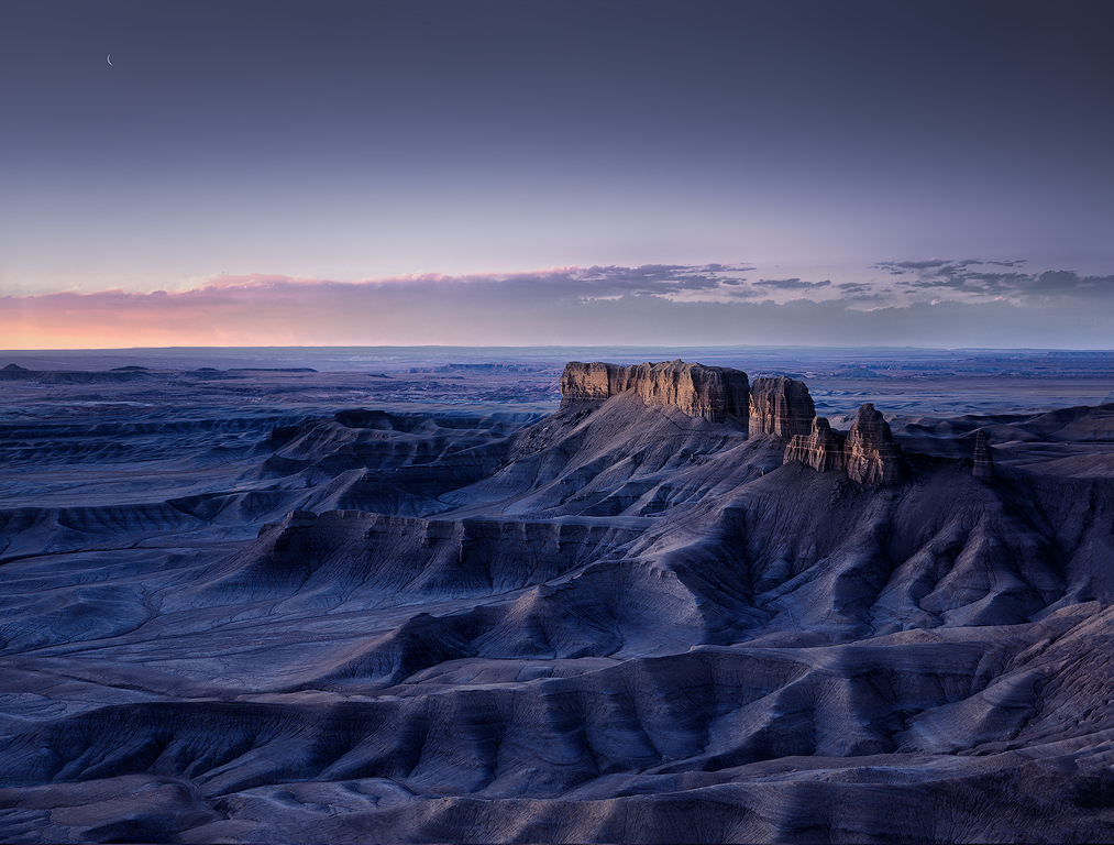
For what it is worth, I took everyone's feedback, and did a 2nd pass. I used gradient map with a mask to make the sky more blue vs. gray (Cheryl's and Dan's suggestion), warmed up the light on the mesa and horizon at the left (which Dan, Haru and Emily all commented on), slightly desaturated the blue at bit (Haru's suggestion), lightened up the distracting peaks in the upper right behind the mesa (Bob W's suggestion), and then dodged and burned the foreground a bit to get a little bit more 3D look (Cheryl's suggestion). Thank you all! |
Oct 24th |
 |
| 96 |
Oct 21 |
Reply |
Dan, I went back to look at your image again - who wouldn't it so beautiful - and one other small thing I noticed. If I carefully compare the reflection to the sky, matching up points, the reflection is brighter (and I think physics says it can't be). It is very hard to notice because the brighter water seems to balance the brighter portions just above the background terrain. Maybe this is coming from how you blended the exposures? I guess I might try to correct it, and see how it looks. If it destroys the sense of light, I might just leave things alone even though it is a little unnatural (to a physicist).
|
Oct 9th |
| 96 |
Oct 21 |
Reply |
Thanks Cheryl. I really like what you've done with the sky. You are right it was too grey. This was actually my first ever sky replacement, and I had a difficult time getting the colors to match (not sure why it was so hard). Overall your version is also a little darker, which is actually the look I originally wanted. But when I printed, the darker version seemed muddy to me. Perhaps it was lacking the dodge and burn you've done to give it more 3D. I struggled a bit to get the overall brightness of both the foreground and sky right (together) to give a print where the light sang to me. |
Oct 9th |
| 96 |
Oct 21 |
Reply |
Thanks Haru. I can see your argument on the color. I am not sure I would tone down the blue quite as far as you did, but I can see some reduction of saturation improving things a bit. On the warm colors, I went back and forth on more red, both on the peak and on the horizon. I felt the warmer colors there did not look as natural, but again, perhaps I can try moving in that direction. All good suggestions.
I go back and forth on a lot of these final subtle changes when printing. While my monitor is well calibrated, prints do have a different look. I'm usually optimizing things for print, and then posting on-line whatever that is. If I optimized the on-screen version, I might end up with a little bit different final image. |
Oct 9th |
| 96 |
Oct 21 |
Comment |
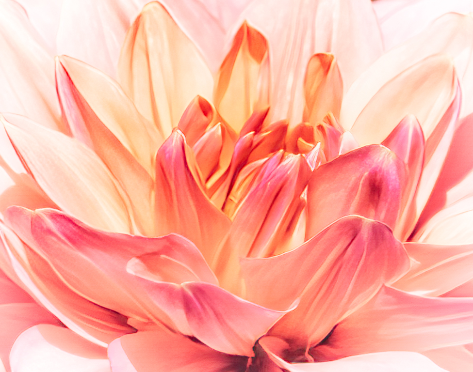
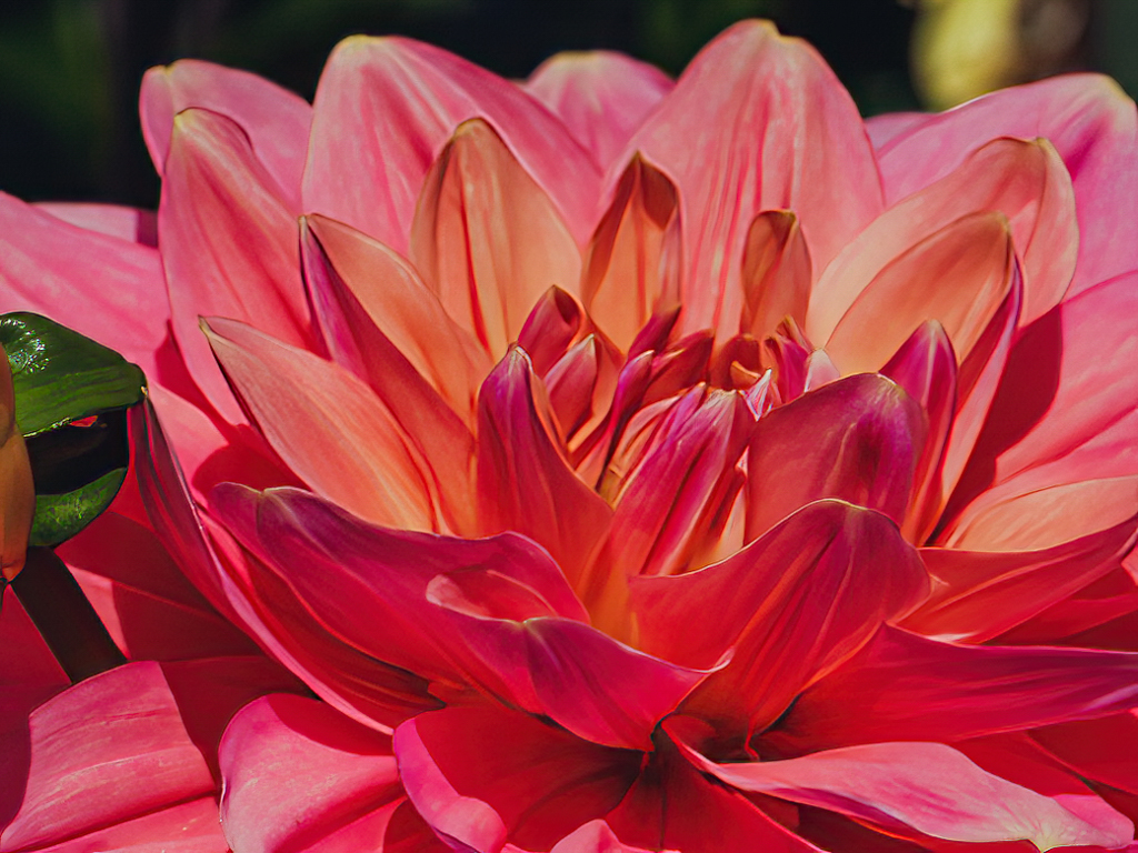
Hi Bob. I have very little experience with flowers. Someday I will get around to spending more time seeing what I can do, but for now I am a rookie at flowers. So judge my comments accordingly. But like others, I tend to want flowers soft and ethereal. So I would preserve the delicate pinks, soften the saturation, and lighten things vs. darkening. I do like your crop, but I might either come tighter to eliminate the dark area at the top right, or else try filling it (content aware) or cloning it.
I took a shot at a different look which reflects what the original speaks to me. In addition to the above, I used Topaz Sharpen AI to correct the depth of focus issue, and I added some Nik Color Efex - fill lighting, high key, vignette to lighten, etc. It is definitely a different mood.
Hope you feel better soon. |
Oct 9th |
 |
| 96 |
Oct 21 |
Reply |
Not to be an ad for Topaz Sharpen AI, but I took a shot at fixing the sharpness issue, and it is truly remarkable what it can do. |
Oct 9th |
 |
| 96 |
Oct 21 |
Reply |
This crop puts the horizon close to thirds, which inherently I sort of like. But it gives up the moon ... |
Oct 9th |
| 96 |
Oct 21 |
Reply |
Thanks Bob. I stumbled on this location while doing internet research for my trip and decided I had to go see it. I was glad to make it there and back twice without car issues, because I had a 4x4 want-a-be not a 4x4.
I really like the small moon. I occasionally come across images where there is a small element like that which is subtle. I find I don't see it at first, and then it is this little reward when I do. I also like the negative space, punctuated only by the small moon. I considered extending the sky upward and putting the moon higher to adjust the horizon location, but I think that would be too much. Also considered coming down lower, but I feel it needs that negative space and breathing room.
Agree the peak behind the mesa is a little distracting. I can tone that down to make it less so. Good catch. |
Oct 9th |
| 96 |
Oct 21 |
Comment |
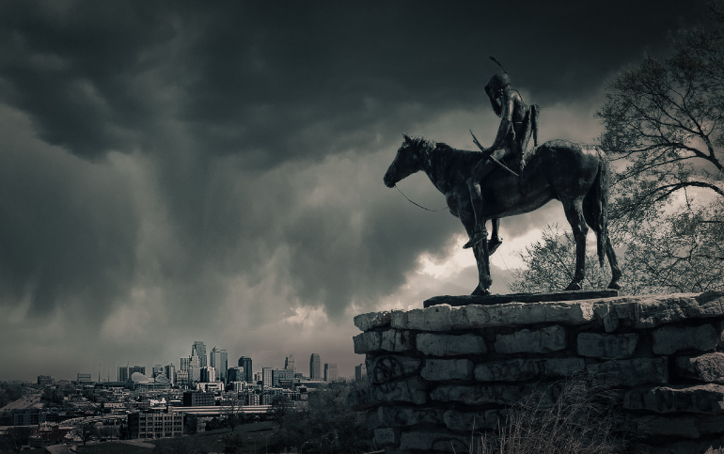
Hi Bob - once again, welcome to the Group! I think a lot of my comments probably echo the others above. I like how you've positioned the statue with the story of it looking out over the city. I think with the right lighting - like sunset as others suggested - the shadowed statue might look almost real at first glance.
Given the flat lighting, my instinct was to try B&W, but I made a quick attempt at just doing that and didn't like it. So I decided to try a different look. I did do a sky replacement, went for a threatening, dramatic sky, and "futuristic" LUT, and then desaturated to near black & white, and darkened. I guess it is sort of a story of the "storm ahead", and the past looking upon that with dismay. Clearly a different look, but you provided an image that was fun to play with. |
Oct 9th |
 |
| 96 |
Oct 21 |
Comment |
Hi Emily. Your image has a nice combination of the sunset colors and the shadowed graphic forms in the metal lock superstructures. I also like the red light, which I am not sure whether you were deliberately center-piecing, but it seems to have some story with it, like "end of day, time to stop operations". It also is consistent with the bottom part of the image being dark, and it seemingly saying "stop since you can't see well enough to proceed."
I think overall though that dark bottom part of the image doesn't work so well. Unlike the shadowed superstructures which we can see well enough to understand what they are, I keep wanting to see into the bottom region and see what is going on. Do you have any room in the exposure to bring up the shadows there and bring back some detail? If not, this is perhaps a time that blending two different exposures might help.
A small thing, but I also think there is something about the sky color that seems a bit off or pushed too far. And I am not sure whether this is real or your processing, but there seems to be more saturation above the metal structure than below it. Perhaps AI sky enhancer failing on the AI? |
Oct 9th |
| 96 |
Oct 21 |
Comment |
Here is the 2nd image. |
Oct 9th |
 |
| 96 |
Oct 21 |
Comment |
Hi Cheryl. I hear you on your experience getting home and thinking the image was not what you saw in the field - I've done that many times. Since your original vision was to make the sun lit tree at the end of the path stand out. I did play around with other ways of doing that, looking for feels that were consistent with "hope". I'm not sure I like anything that I came up with, but I attached my best shot. Obviously short on pixels given the crop.
But like last month, I applaud your efforts at new creative approaches. We are a little more limited in options there as landscape photographers since we can't arrange or pose grand landscapes (little more room with intimate landscapes). So it comes down to a place or composition never tried before, or else something novel in post. I'm not sure I'm in love with your final image, and am still trying to figure out why. Best explanation I can find is that the forced division of things into literal and impressionistic zones messes with the beauty. All literal or all literal impressionistic feels beautiful, but the split feels science fiction to me, and that somehow cuts into the beauty. So I took a cut at also blurring the tree at the end of the path - not as significantly, so the difference in blur helps it stand out, but enough to try to keep a uniform impressionistic feel. I then tweaked some other things a little to further help it stand out as the subject. I will attach my attempt at this below. |
Oct 9th |
 |
| 96 |
Oct 21 |
Comment |
Dan this is beautiful. You always do a very careful, considered job of composition, and this image is no exception. The leading lines of the foreground rocks, as well as how they fit with the opposing shapes and angles of the background reflection, showcase that careful thought. I think you are consistent also in carefully handling color. The saturation is crisp without being overdone. There is also a limited color palette which simplifies things and achieves excellent harmony. I think that is also a common element of your images - do you deliberately limit colors in post (desaturating or shifting hues to simplify)? Finally, there is effective use of blacks. You don't shy from letting some things go to black while preserving detail where it is needed.
If I am looking to really nit pick, there is a brighter greenish spot on the left of the rocks - I'd clone that out but only because my eyes keep going there. But that's all I can come up with. I wouldn't change anything else.
I wish I could visit such a location again and again. Of course it takes more than that to pull off such an amazing image. |
Oct 8th |
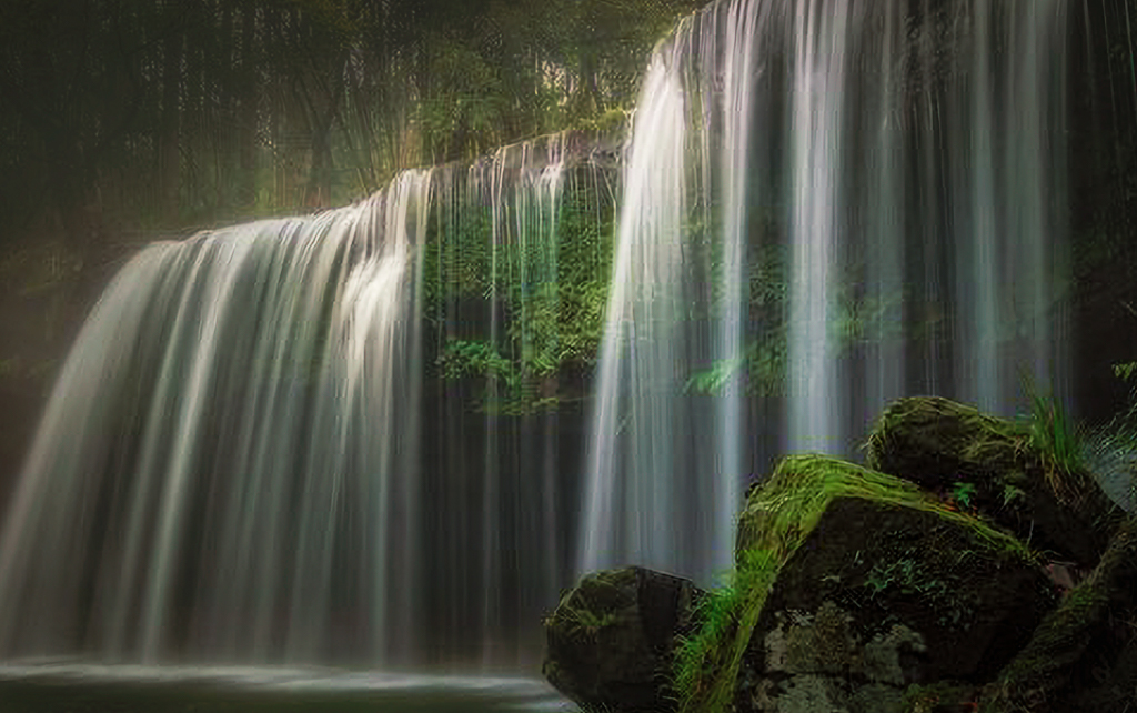
| 96 |
Oct 21 |
Comment |
Hi Haru. You've created another image of a very elegant waterfall. Indeed the waterfall itself is wonderfully silky - one of your goals - and I think it is that about the image that I find most compelling.
Since you asked about the sky, I would say the gray is not as distracting as the white it replaces would have been. But to me the bigger issue is that there is just a lot going on here. Is the focus the unique tree or the waterfall? Then there are smaller distractions - the bright upper corner above the overhanging tree, the bright spot in the water that merges with the unique tree structure, a bright twig in the lower left that merges with the edge, the particularly bright green foliage left/above the waterfall.
I think you have too many distractions and need to simplify. Since I am attracted to the waterfall, I took a cut via cropping focusing on that. I am not sure I love it - probably better to simplify in the original composition. But there is no doubt that the waterfall is beautiful, and you have done well to really capture that beauty. |
Oct 8th |
 |
8 comments - 6 replies for Group 96
|
8 comments - 6 replies Total
|


