|
| Group |
Round |
C/R |
Comment |
Date |
Image |
| 96 |
Sep 21 |
Reply |
The photo book thing is actually a really good idea. I really need to give that a try. |
Oct 24th |
| 96 |
Sep 21 |
Reply |
Yes, in focus stacking you take several shots, manually focusing at different distances, and then you combine them in post processing - essentially taking the "in-focus" part of each image. You can get much greater depth of field in the final result than you can from any one shot. Generally people do this with the camera on a tripod so things are framed exactly the same in each of the versions you are combining. If you were very careful you probably could get it to work hand held.
I actually don't have any experience doing this since I shoot film and it would get expensive to be shooting multiple frames to focus blend, particularly in 4x5 (but 4x5 cameras allow you to tilt the lens which is another trick for greater depth of field). There are dedicated post processing software packages for doing focus stacking - helicon focus is one of the better known ones. But you can also do it in photoshop by stacking, aligning, and auto blending the individual images. I am not sure there is yet a way to do it in Luminar AI. |
Oct 24th |
| 96 |
Sep 21 |
Reply |
Bob, I'm very glad to hear you are out of the hospital, and I hope you are doing well. Thanks for the additional comments on the latest version. I still need to print it, and then I'm sure I will adjust further.
I actually have not used blend if much. I check the highlights and shadows often and protect them when needed using more elaborate luminosity masks. But blend if would certainly be simpler, so I am not sure why I don't make better use of it. Too many features in Photoshop. |
Sep 24th |
| 96 |
Sep 21 |
Reply |
The photo book thing is actually a really good idea. I really need to give that a try. |
Sep 19th |
| 96 |
Sep 21 |
Reply |
Yes, in focus stacking you take several shots, manually focusing at different distances, and then you combine them in post processing - essentially taking the "in-focus" part of each image. You can get much greater depth of field in the final result than you can from any one shot. Generally people do this with the camera on a tripod so things are framed exactly the same in each of the versions you are combining. If you were very careful you probably could get it to work hand held.
I actually don't have any experience doing this since I shoot film and it would get expensive to be shooting multiple frames to focus blend, particularly in 4x5 (but 4x5 cameras allow you to tilt the lens which is another trick for greater depth of field). There are dedicated post processing software packages for doing focus stacking - helicon focus is one of the better known ones. But you can also do it in photoshop by stacking, aligning, and auto blending the individual images. I am not sure there is yet a way to do it in Luminar AI. |
Sep 19th |
| 96 |
Sep 21 |
Reply |
Thanks Emily. I too am still deciding between the horizontal and vertical. As you say they each emphasize different things. I've yet to print either image which I am finding is dangerous. Everything looks good on the screen. I'm finding once again (knew this but had little reason to print the last year or so) that prints are the real test of how an image holds up. |
Sep 19th |
| 96 |
Sep 21 |
Comment |
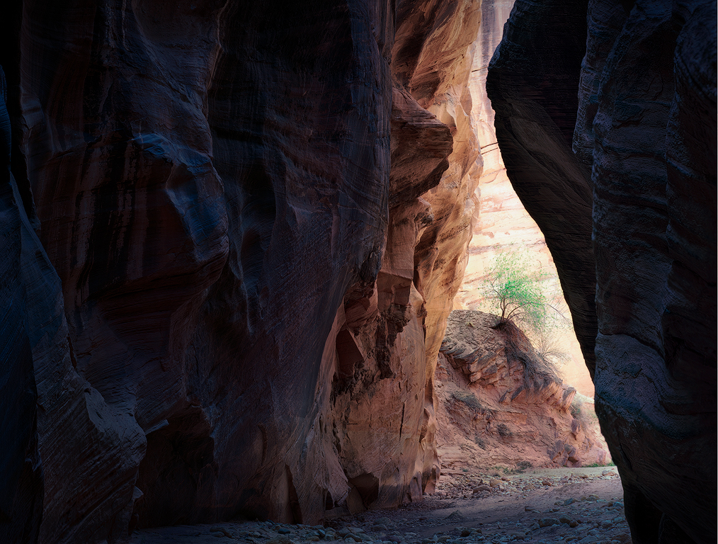
And here is the vertical ... |
Sep 12th |
 |
| 96 |
Sep 21 |
Comment |
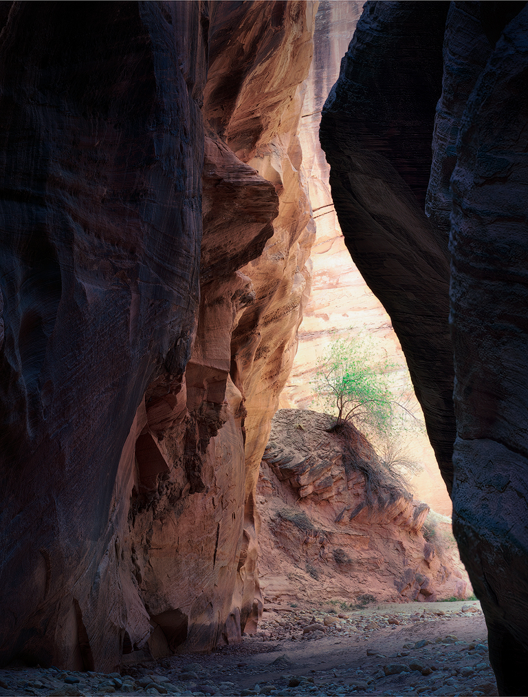
Ok, I've taken another go at this image. First, thanks again everyone for all of your comments which were very helpful in allowing me to see a better path with this image. From the beginning, the image for me was about the somewhat raggedy little tree seemingly sheltered by the canyon. I also liked the strong glow to the canyon wall behind the tree. Technically, the biggest challenge was drawing focus to the tree, and here I fixated on trying to create separation between the tree and the canyon wall behind - something I don't think I did particularly well. Feedback from club salon pushed me further down this path. But as you have all pointed out, bringing focus to the tree is also about eliminating things which draw focus elsewhere, like overly saturated rock walls. So, with that in mind, I took another cut at the post processing, starting pretty early in my stack, somewhere between the original scan and what is labeled as "Original 2" above.
I did first try to do a better job of separating the tree and the canyon wall. I pushed green, saturation, and reduced brightness into the tree leaves (and the later into the branches), while lightening but not saturating (e.g., yellow) the canyon wall. I also tried the Orton like effect that Dan had suggested. While I am not sure it does much for the tree, I also applied it to the canyon wall behind, and I love the effect there. It smooths things out and helps let the tree pop, but also enhances the glow of the canyon wall, which is one of the things I was after. I increased the contrast overall (but this is relative to a pretty flat starting point) and brought up the shadows in the nearer walls on both sides. I still like these relatively dark, but nothing is at absolute black, so there is detail throughout. In print, I'd probably have to tweak these some more up or down, ideally dependent on whatever lighting I expect. I also pushed cool grading into the shadows and a little warm into the highlights. I did a little dodge/burn to darken the mound the tree sits on as well as some of the left canyon wall down near the bottom. Finally, I desaturated the whole thing, protecting the tree in this process, to further make the tree the star.
The two things I'd still consider playing with further are the warmth and brightness of the canyon wall behind the tree. I tried it a little warmer, which emphasizes the warmth of the sun on the wall, but it also diminishes the sense of brilliance and light glow. For me, the tree also pops more against the more neutral background, and a little less so on the warmer background. However, I have come very close to blowing things out (I have in fact clipped the reds a bit). I think it works aesthetically to have something close to white in parts of the wall, but others might disagree. With more time I might go back and be even more careful, but I feel I am walking a very narrow line between the brilliant sense of light I am looking for and blowing things out too far.
With crop, I am more on the fence now with the new look. So, I have provided both. In the horizontal I've just taken a little off of the top. I like the horizontal in it makes the most of the striations of different colored rock. The vertical on the other hand keeps even more focus on the tree. But maybe there is enough in the horizontal.
If folks have patience for providing more comments (or even reading this long post), they would be appreciated. Odds are I have corrected some of the original mistakes only by making a different set, so please let me know if that is the case.
|
Sep 12th |
 |
| 96 |
Sep 21 |
Comment |
Hi Emily. You have a pattern of finding very compelling leading line structures, and the dock here is another excellent example. I'd second a lot of the comments above, but the high priority one is adding a compelling focus that you've chosen at the end of your leading line. The clutter issue, that is de-emphasizing other things, can be more easily dealt with in post. Haru has done an excellent job in the B&W version he offered. But even if the leading line itself is for you the subject, you still need some reward to the viewer that follows it - the pot of gold at the end of the rainbow.
If indeed the leading line is for you the interesting subject, another suggestion I would make is to get down low and close to it, with as wide a lens as you have. I think you could have filled the front of the frame here with a close up of the dock and its interesting weathered and textured wood. In doing so, you will have to probably focus stack to get front to back sharpness. You needed that (or at least a smaller aperture) here as it is not just the far boat which is soft but the front part of the dock as well. It will only get harder to keep all sharp when you get low and close. You can do this with your 50mm, but it is also more effective with a wide angle lens, even a super wide angle - something like 12mm for your APS-C style a5000, so I'd use a wide angle if you have one (or can rent or borrow one to try this out). Just some thoughts. |
Sep 11th |
| 96 |
Sep 21 |
Comment |
Hi Haru. Again, welcome. It is great to have you join the Group. I have to say I cheated and looked at the B&W version of the falls you have over in Group 74. I like the color image here - particularly how you have brought out the delicate light on the foliage near the top of the frame. But I really like the treatment of the water in the monochrome image. You used a little slower shutter speed there which gives it a little more ethereal feel, but then beyond that, you did a masterful job of bringing out the subtle tonalities in the water in the B&W. I think you could do more of that in the color version here. I have the same comment as others about the water needing a place to go, a problem which is solved with the tighter crop Bob suggests or that you used in the monochrome. I also understand what Bob was talking about with the horizontal being off - it is probably just a perspective thing but it feels like the area the water lands is tilted to the left. Finally, the birds eye view works for the tight crop, but I'm still not as sure how I feel about it here. But we were not there like you to walk around and find the best composition, so probably unfair to comment. I like the color image here, but I really love the monochrome. |
Sep 11th |
| 96 |
Sep 21 |
Comment |
Hi Dan. I really like the image - it is both creative and visually beautiful. The bee was recognizable to me right away. I really like the bubbles visually. If I think about it I might have wondered what they were, but somehow I didn't care to do that. They seemed in place even not knowing what they are. To me the image comes across as peaceful. I'd have said the bee is sleeping (although I don't even know if bees do that), hugging its equivalent of a pillow in the bubbles. I guess the bright warm colors and saturation don't speak of death to me, but then I am happy to have the bee sleeping vs. dead or dying. I don't think I want as much to look at an image of a dead bee. In any case, I believe the whole thing was masterfully executed (no pun intended). It is a very different image but for me one of your most visually compelling (among many amazing ones). |
Sep 11th |
| 96 |
Sep 21 |
Reply |
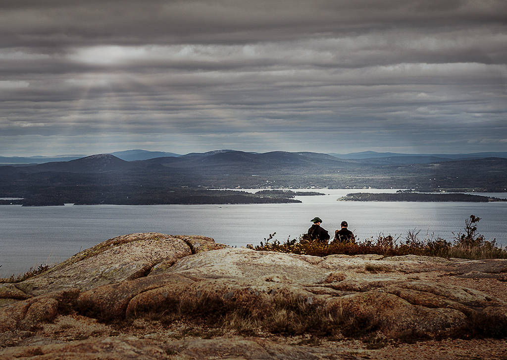
I think it is far from garbage. I think you just have to pick a direction of what you want to make it, and move a little further there. For example, I took it one direction in the attached below. I decided the two people were watching dramatic weather. So I took it into Luminar 4 and added some sun rays to give the weather a little more drama. Then in camera raw I cooled it down and darkened the top - again for more drama with the weather. I also darkened it overall, but brightened up the area across the water from the two people to give them something more to be "looking at". I desaturated everything a little to make it bleaker - again dramatic weather. And I added a vignette which I often do to just help hold attention in the frame. Since it was cropped small from the original, I also used Lightroom's new super resolution to give more pixels. Might be forgetting one or two things, but that is the most of it. I think it gives the image more mood and emotion, and also helps connect what is going on with the two people. Just one option, I am sure there are more. :) |
Sep 11th |
 |
| 96 |
Sep 21 |
Reply |
Hi Bob. I like this version better than the version you posted initially. I think the colors are more realistic and the tonalities not as harsh. I do think there is something beyond water on the lens going on. It is even more apparent in the "original" below. It looks almost like dodge and burn streaks with a broad hard brush. Are you sure that is the "original"? |
Sep 11th |
| 96 |
Sep 21 |
Comment |
Hi Cheryl. I don't think I have ever put a person in my landscape images. I applaud you for venturing out and trying something new with this. I also don't have any experience with portraits or flash, so take my comments with all that in mind.
I like the colors in the image. I think the red dress is a great choice in complementing the natural background colors, and demands attention. I don't have as big a problem with the unnatural wading in the water - I think that suggests something interesting and different is going on and potentially evokes emotion. But then given the pose and where your daughter is looking, I am not sure what that is. I also think even with the red dress, your daughter and the mountain fight for focus and attention. It is hard to say which the photo is about. I think that is fine that there is a balance, but then it would seem to require them to be connected for things to work, and again, with the pose and direction she is looking, I am not sure the connection is there. I guess a straightforward thing to do would be to decide what emotion your daughter is feeling toward the mountain, and then pose her in a way that tries to convey that emotion (and also connects her to the mountain).
I think you chose a very difficult first step into something new with lots of challenging aspects - the model and posing, the flash lighting, the composting, etc. It would have been amazing if you had nailed everything on the first try. I think you nailed the technical aspects, which is still pretty impressive. And leaves you free to focus more on the big new space of how to better aesthetically include a model in a landscape image. |
Sep 11th |
| 96 |
Sep 21 |
Reply |
Thanks Bob. At its best for me landscape photography is the combination of finding compelling images and the adventure required to find them. So hopefully everyone will continue to endure my stories that blend both.
I am always frustrated with club salons. Even when the judging is decent, there is often precious little real feedback, and in the case of the print competitions has only been thought about for seconds. There is nothing worse than receiving all glowing comments and then a less than perfect score with no thoughts on how to improve the image. At this point I think I participate in the club essentially because it forces me to find time to print a couple images each month.
Thanks for suggesting the horizontal. I am going to re-edit based on everyone's comments, and I think I will again look at both horizontal and vertical framings. |
Sep 11th |
| 96 |
Sep 21 |
Reply |
Thanks Cheryl. Yes, I seemed to pick out a lot of lonely trees on this Southwest trip. Not sure what that says.
The consensus is clear to back way off on the saturation. So I will take another cut at the image and post for everyone. I appreciate the thoughts on isolating the tree. When I went from Original 2 to the final image I did something similar but used Nik Effects Viveza. I rarely go to it, but this was a case that the U-point technology just works amazingly well in "masking" for just the tree and allowing the corrections. Luminance masking was having a little trouble separating the leaves and background wall, where the U-point approach is masking on some combination of color and luminance.
I'm glad you don't tire of the canyon images, because I still have a few left.
|
Sep 11th |
| 96 |
Sep 21 |
Reply |
Hi Haru. Nice to meet you and welcome to the Group! Also, thanks for your thoughts on the image. Yes, the overwhelming message is that the saturation is pushed too far. So I will take another crack at things and post for all below.
A couple of questions. First, your suggestions - crop down top, desaturate, add contrast, brighten right rock - are those starting from the original? I'm asking because my sense is the biggest spread of opinions is over the saturation, and guess you are suggesting something very desaturated. Which would be interesting, and perhaps I will play around with that. But for reference, I've attached an iPhone shot (actually a still from a video frame), right out of camera which is the closest I have to a "straight" interpretation. The "original" is less saturated than even that, due to the Portra film. Of course nothing to suggest the final image can't be less saturated than reality of that is what works.
The other question is about copping down from the top. Are you suggesting going with a landscape framing vs. portrait?
|
Sep 11th |
 |
| 96 |
Sep 21 |
Reply |
Thanks Dan. Yes, the overwhelming consensus is I went too far. It seems like multiple folks even think the Original 2 is too far. So I will take another cut at things, perhaps starting pretty close to from scratch, and post it for everyone to take a look.
Your Orton effect suggestion is interesting. I've been trying just the opposite to make the tree sharper as part of the effort to make it stand out better. I'm not sure whether Orton will help with that or not, but it would I think add to a different sort of contrast between the sharp textured rock and a more dreamy tree. I think that is what you are suggesting if I understand you. Let me explore that as part of the re-edit. |
Sep 11th |
| 96 |
Sep 21 |
Reply |
Thanks Stephen. I pushed the yellow (and the orange came along for the ride which I clearly could have prevented) after the salon judge feedback to do so. But, yes, I think it is too far. I think I like the earlier processed version better. Maybe something in between? The specific criticism was the tree not popping against the back ground. I can try to work that without pushing the yellow and orange so much.
I haven't printed the latest version. I suspect if I do it will be obvious I went too far. I should just always print to really evaluate things. But I also need to learn to be more subtle with changes. |
Sep 5th |
6 comments - 14 replies for Group 96
|
6 comments - 14 replies Total
|


