|
| Group |
Round |
C/R |
Comment |
Date |
Image |
| 96 |
Aug 21 |
Reply |
Sounds like a great setup. Mine is very similar although I have not yet got the 10 Gbs card for the NAS (plan to but need to fill all the drive bays first to generate fast enough reads and writes to warrant it). My photoshop problem is an inability to save to the same file name on the NAS more than once - I get an error. The work around is renaming the file every time I save (e.g., a version extension, which does have the benefit of keeping old versions). But that takes a lot of space and I'm not good about cleaning stuff up. |
Aug 25th |
| 96 |
Aug 21 |
Reply |
Wow, I can't imagine how painful it must have been to loose 6 years of images. I'm sorry. I was none too careful in days past, but luckily put a better system in place before that happened to me. I too have a NAS, which is great except that photoshop has some problems interacting with it. Others have noted problems as well - I'd be curious if you have had problems. Adobe's official position is that they don't support NAS devices, which is crazy given the widespread use of NAS in the professional digital arts community. |
Aug 24th |
| 96 |
Aug 21 |
Reply |
I printed this version, and didn't like it so much on paper. So I kept going. The latest version is below (in my response to Cheryl). But I don't really like that one on paper either. I am looking for a real 3D pop to it, and am having a hard time achieving that in print. Suggestions welcome if you have any secrets that generally help with that. |
Aug 24th |
| 96 |
Aug 21 |
Reply |
Thanks Cheryl. I've continued to work on it beyond the 2nd version - dodge and burn as you suggested, but a whole lot of other tweaks too. I'm having a hard time getting a look I like in print. Everything looks good on the screen but a different story on paper. I haven't printed much for the last year and half, so I am sure partly I am out of practice. My latest version is below - but not sure that I like that one in print either. |
Aug 24th |
 |
| 96 |
Aug 21 |
Reply |
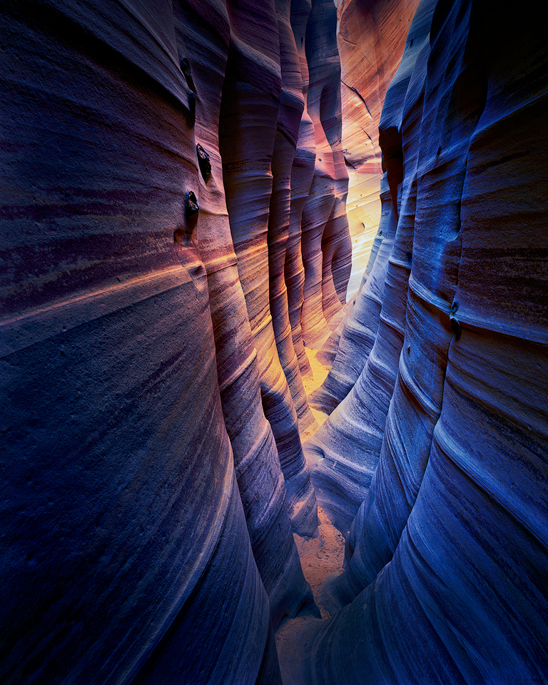
Thanks for the kind words Emily. Yes, the "undulating" walls are a feature of this particular slot canyon, and make it uniquely recognizable. Perhaps not in light, but in form, it is probably the most beautiful canyon I've visited. Still trying to do it justice in the post process though. I keep putting it down and when I come back not really liking what I see. This one is very hard to "finish". |
Aug 24th |
| 96 |
Aug 21 |
Reply |
I'd say just go for the GFX 100S and the 100 Mpixels at a mere $6000. Has even me thinking. But then again, the break even for me would be at about 600 sheets of 4x5 film. And only then if I could borrow the lenses. |
Aug 20th |
| 96 |
Aug 21 |
Reply |
Thanks Bob. I do carry a SPOT satellite device, and this trip I even tested it before I went. There is always the chance of not connecting with a satellite down in the slot, but hopefully I won't ever have to loose a limb. |
Aug 14th |
| 96 |
Aug 21 |
Reply |
As I looked at in back in PS, I agree it was a little flat. Here is a new version with some Nik help - Tonal Contrast, Pro Contrast, and a little warmth from Brilliance/Warmth. |
Aug 14th |
 |
| 96 |
Aug 21 |
Comment |
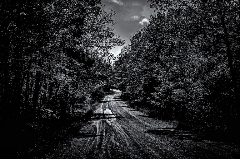
Hi Emily. This is very well composed, capturing as Dan mentions the "vortex-tunnel" of the road disappearing off in the distance. I like the slight jog in the road at the far end that adds a little visual interest. For me though I am not sure that is enough to make this compelling. I like Dan's suggestion of adding some color or light to the trees, which would provide additional visual interest. I also think you could go for a more dramatic look. For one you could taper the tonality of the road so it starts off darker and becomes lighter in the distance to help emphasize the far reach and jog in the road as a subject. I think you could also darken the trees and sky - the later in particular right now competes with the road a bit. And this is one that just might work better in b&w. I'm nothing if not terrible at b&w but took a cut at some of this in the attached. Just some thoughts. |
Aug 14th |
 |
| 96 |
Aug 21 |
Reply |
Thanks Dan. I have to say, as usual, I was worried I'd pushed the colors a bit too far. Not as worried as with some other images, but surprised by your suggestion of going further. NIK Tonal Contrast is my good friend, so I'll push a little further and offer that up as an iteration. |
Aug 12th |
| 96 |
Aug 21 |
Reply |
I think chatting over a beer someday would be awesome. |
Aug 12th |
| 96 |
Aug 21 |
Comment |
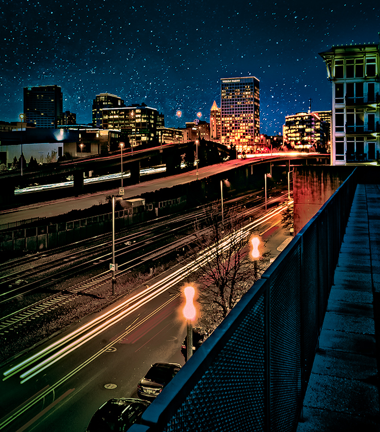
Hi Bob. This is an interesting city scape with bold, complementary colors that grab you from the start. You've pushed the colors creating a bit surreal like look, but I think that can work for this sort of city image. I like the strong diagonals in the fence, tracks, and car headlights - they guide you back through the image. I only wish there was a stronger subject at the back - something like the moon that you added in the previous month image.
There is clearly a lot you can do with this image, pushing it in different directions. For example in the version below, I've adjusted the colors to give it more of a cinematic look (teal / orange), and also shaped the light to make a couple of the buildings in the background more of the subject/focus that the headlights lead you to.
|
Aug 7th |
 |
| 96 |
Aug 21 |
Comment |
Hi Claudia, it is an interesting dilemma - the lighter vs. heavier look to the fence grid. In the heavier ones, I find it difficult to see through the fence enough to understand what the photo is about - it seems like it is about the fence. On the other hand, on the light one, without the benefit of seeing the "heavy ones" I am not sure that I would understand that it is a fence vs. some interesting effect that you have introduced in post.
I don't know if there is a f-stop in between the ones really open and pretty stopped down which you used which would create a "medium" fence look which works better. Probably even better, if you had the camera on a tripod and did a focus stack set of images then you would have more options. You could for instance leave the fence "heavy" around the edges (so the viewer understands it is a fence), but create a "window" of lighter fence in the middle which allows the viewer to see through better and understand what is behind.
I've tried to think about how to do something in post which creates any of those effects from the image you have, but I haven't come up with any bright ideas. I don't think the images you have are easily stacked. Sorry I don't have any better ideas.
|
Aug 7th |
| 96 |
Aug 21 |
Comment |
Cheryl, I think what makes this image is in fact the clouds. Mount Rundle is nice with the alpenglow, but by itself is just another mountain image with nice light. I think the light and shape of the clouds is more interesting and unique to that time and place. I also like the simplicity and symmetry of the current framing, giving the mountain space. So bottom line, I would not tighten the crop.
I imagine you indeed got this level when shooting, but the way the left shoreline approaches gives the illusion of not quite level. I wonder if it might be worth playing with a correction which keeps the prominent trees (and their reflections) at the right vertical, but levels the left shoreline. It might look better even if it is "correct" now.
I was also noticing there is a "light border" in the sky above the trees on the left. It doesn't seem to be there in the originals (or as prominently), so I am guessing it happened when you added light to the tops of those trees. It is not a big deal, but easily corrected.
Finally, I like the rocks in the foreground underwater. I think they add visual interest without being so prominent that they interfere with the simplicity or symmetry of the composition. I would not increase their clarity any further, but I don't think you need to go in the other direction either.
Another beautiful image Cheryl.
|
Aug 7th |
| 96 |
Aug 21 |
Comment |
Dan, I think this is a beautiful image and clearly well planned. The composition is balanced, and, as you point out, you managed to separate all the elements that might overlap if you had not positioned so carefully. I love the sun positioning, which again carefully done, brings in an element of time. The light and colors are wonderful.
I do think it is stronger with the added birds. While I have yet to add an element like that to an image, I have nothing against it. Photography is art and as artists there should not be rules limiting our creativity. The complaint (repeated often in some photography podcasts for example) is that the viewer is deceived. The photographer who has lucked out or found through persistence the opportunity to capture this shot with the birds actually there at the time of capture, now has their luck or perseverance devalued by the photographer who adds the birds afterwards. I understand that, but also think it reflects a position that photography is some sort of hunting sport vs. art. Ok, maybe it is a little of both - after all we are all happy when "find" magical light or an impactful scene.
I've always thought this dilemma could be easily solved by devising a standardized system where photographers designate what they have done in post. A string of abbreviated "flags" could be used for the things which some believe should be admitted to - focal length blend (FLB), multi-image composite (MIC), time blend (TB), elements removed (ER), etc. So photographers could append to the typical descriptions - for example: Sony A7R, 70-200mm f2.8, f8, 1s (FLB, ER) might be the description for a focal length blend of two images where a major distracting element was removed.
For me, whether the birds added are your own image or not makes no difference to the impact. Art doesn't care. But again, maybe what is important is just flagging if it is not your own (which you of course did). |
Aug 4th |
5 comments - 10 replies for Group 96
|
5 comments - 10 replies Total
|


