|
| Group |
Round |
C/R |
Comment |
Date |
Image |
| 24 |
Jun 21 |
Comment |
Hi Tab, visiting from Group 96 - long time! I very much like the drama you've created in the b&w! I too would crop a little from the top but less - leave more dark sky at the top to minimize the clouds pulling the eye out the top of the frame - something like the attached. I'd also darken the trees at the left a bit more, again to bring more focus to the pyramid. Great shot! |
Jun 6th |
 |
1 comment - 0 replies for Group 24
|
| 96 |
Jun 21 |
Reply |
Thanks Emily. In the end I have to agree that the flare was not really working. I am going to keep looking for a image where it can work artistically. Meanwhile I need to get a lens hood so it doesn't keep showing up where I don't want it. Following the vertical and no flare suggestions I took a second try at the image which is posted below. |
Jun 25th |
| 96 |
Jun 21 |
Reply |
Thanks Bob. I think the vote was unanimous for the vertical and against the lens flare, and I have come around to that as well. I took a second try based on that which is attached below. Yes, I don't know how many more years I am going to be able to hump the 4x5 anywhere other than car side. I am holding out for an affordable 200MP digital camera. |
Jun 25th |
| 96 |
Jun 21 |
Reply |
Cheryl, thanks for the info on the sun rays. I played around with them quite a bit, but couldn't get anything that looked "real" to me. In the end I decided to go without and actually darken the top edge a bit. Or at least that is where I am so far. My "second try" is attached below. Thanks again for your suggestions. |
Jun 25th |
| 96 |
Jun 21 |
Reply |
Dan, I did get a chance before month end this time to take a second shot based on all the comments. It is attached to the comment below if you want to take a look. Thanks as always for your suggestions. |
Jun 25th |
| 96 |
Jun 21 |
Comment |
Thank you all for the feedback - it was very helpful in thinking about a next pass in processing the image. It was clear that everyone likes the vertical better and that no one likes the flare - I think I've come around to that too. I think the vertical without the flare works the best compositionally. So, I picked up where "original 2" left off and did some edits to bring out the colors and lift the shadows a bit more while trying to preserve the mood and natural vignette. I also darkened the top edge of the lit portion of the slot to help keep the eye in the frame. The resulting update is below. Not sure it is "final" without letting it sit a bit longer and coming back, but perhaps one step closer. Comments are always helpful so certainly welcome. |
Jun 25th |
 |
| 96 |
Jun 21 |
Reply |
Thanks - good to see the original even post HDR. There is a lot going on so I agree you need to crop. I played around with tighter compositions on the sand but didn't find anything that grabbed me. I actually liked something I found with the rocks better. I took the liberty of adding a little dramatic light to the crashing wave. |
Jun 18th |
 |
| 96 |
Jun 21 |
Comment |
Hi Emily, another interesting bridge photo. Coincidence, or are you assembling a project on bridges? I thought a bit about the asymmetry of the photo, but in the end I very much like the off center perspective which moves the vanishing point right of center. Of course the strong graphic forms you've found are great - you have a good eye for those.
For me though, the literal interpretation of this image does not have quite enough to hold my interest. Cheryl offered one option for going beyond the literal. Let me offer another one (and there are many directions one could take this image). I chose a high key approach. I first did a perspective correction in LR to bring the uprights vertical - they of course lean in because you were tilting the camera up. Then I brought it into Nik Color Efex and played around with a lot of filters until I got an artistic high key sort of look that I liked. Again, many directions you could take this. |
Jun 13th |
 |
| 96 |
Jun 21 |
Reply |
Thanks Cheryl. Like I mentioned in replying to Dan above, I am not surprised that folks are not fond of the flare, but I am going to keep trying. I think it has a place somewhere, so either I have not found it or am not skilled enough in subtly applying it. I can be a bit heavy handed.
I like the enhancements you have made to the foreground rock. You brought a depth to the blues that is beautiful. I have to admit I played briefly with sun rays as well. But I feel that is an area I truly don't know what I am doing in terms of making them look realistic. I am not sure here whether they steal part of the show from the tree or whether they in fact point to it more. Did you add them in Luminar? Do you recall the settings?
|
Jun 13th |
| 96 |
Jun 21 |
Reply |
Thanks Dan. My guess was that folks would not like the lens flare (I'm going to keep trying), but I'm a little more surprised about the vertical. I like both, but was worried the tree was lost as too small an element in the vertical. When you point it out though I agree the horizontal is busy. One advantage of the vertical and smaller tree is that it hides better the fact the tree is not perfectly sharp. It was a long exposure and I think there was some wind up where the tree is - just enough to move stuff. I "saved" things with Topaz Sharpen AI's "motion" mode (which is simply amazing), but it is not perfect. So far no one has noticed, but it's probably harder to see on the small jpeg.
Yes, I've been mulling over where to post finished shots, particularly when they don't get finished the same month as the original post. Truth be told I have a big back log of "finishing" images. You are right that I put a lot of time into post - often many hours and multiple prints before posting for the month to the Group. The fact they are ~200MP files from the 4x5 scan and my computer is not the fastest doesn't help. I am saving everyone's comments so I can go back even if I don't get to it right away. But when I do finish there is the question of where to post and whether anyone at that point really wants to continue the discussion. I will take a look at the group Bulletin Board option you suggest. I think the PSA monthly format is not the best match for someone really trying to work on the last few percent of improvements, particularly someone busy with a day job. Those last few percent benefit from a lot of little things, a lot of iteration, a lot of continued feedback, and therefore, a lot of time. |
Jun 13th |
| 96 |
Jun 21 |
Comment |
Hi Tim, I really like the repetitive pattern you've found in the bird flock, as well as the overall shape of the flock, and the thirds sort of balance between the flock and its reflection. Compositionally great! I also get a strong sense of time - you can almost feel the motion of the flock despite the frozen moment in time. Finally the light is wonderful - great golden hour timing and great positioning with sun illuminating the background.
Saturation is always a personal taste thing, but I think I would desaturate the yellows and oranges a bit, as well as darken them a bit. To me the birds are the star, and right now the background grabs me as much as the birds. I'd try to get the birds to pop a bit more against the background. Also, it could be the size reduction and jpg, but to me the birds are not really crisp sharp. I know you shot at 1/1250, but I recall pipers move really fast! As a final detail, the green foliage in the upper corners is a distraction - pulls my eye to the corners.
I took a quick cut at some alternative processing. I desaturated, darkened, and slightly tone changed the yellows & oranges. I also ran the image through Topaz Sharpen AI using the "motion" setting to see if I could sharpen up the birds. Probably would work better on the original before downsizing, but I think it still improved things. Finally I cropped a little thinking I'd cheat to eliminate the green foliage, but then backed off on the crop somewhat and cloned out the green foliage in PS. I don't know that I would crop at all if I redid things again. Just some thoughts.
|
Jun 9th |
 |
| 96 |
Jun 21 |
Comment |
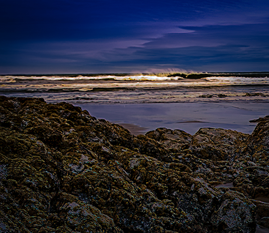
Hi Bob, welcome to 96, and thanks in advance for all your efforts as administrator. This is an interesting image. It has strong leading lines in the sand bringing the viewer to the center of the frame. It also showcases interesting textures both there in the sand and throughout the image. The sky exhibits strong tonality and color contrast.
It would be interesting to see the original image and to better understand how you've shifted the hues overall. It's a different look you've created - were you looking to create a less natural interpretation? Also, I wonder if you could have composed a bit differently so we would see a little more of the rocks on the right? The rocks mirror the shapes in the sand - a strong point - but at the edge as they are, they tend to draw one out of the frame. |
Jun 6th |
| 96 |
Jun 21 |
Comment |
Hi Cheryl, a very nice sunset shot. With the restrained but still vivid colors, and the wet sand in the foreground it has a very glossy feel to it - the kind of shot I've seen looking quite spectacular printed on metal in gallery shops. I agree with Dan that the composition is good, although I wonder if it isn't a little busy.
I've shot very little seascape sunrises/sunsets, but I seem to have the problem that they are too colorful - by that I mean too many different hues. I am wondering if that might be true here too? I would think that the blue, pink, and yellow could work in triadic sort of way, but somehow it doesn't quite work for me. I wondered if one could drop the saturation from the blue and get a simpler look (see attached). I think the trick is doing it so it doesn't look B&W other than the yellows and pink, and I'm not sure I was careful enough to achieve that.
In addition to the horizon which Dan mentioned, a couple of other details to consider. I'd clone the one little bit of cloud peeking out above the large sea stack. I'd also think about the rim lighting on the sea stacks. I am sure that is what it is given the strong sun behind, but I've seen judges call it sharpening halo and mark off. So I often eliminate it anyways. I don't think removing it really impacts the image, and it keeps happy those folks sticking their noses really close to the print.
Otherwise, nice image - good timing of the light and conditions. Also good HDR work which looks very natural. |
Jun 6th |
 |
| 96 |
Jun 21 |
Comment |
A very grabbing image Dan. I love both the colors as well as the strong graphic forms in both the trees and cracked earth. I am guessing composite with maybe three images (or else you found quite the scene!). I think the clouds down at the horizon line somehow was the thing that first suggested composite to me - maybe the coloring there doesn't seem to quite match? But I don't know that you are trying to or need to be hiding the fact it is a composite (e.g., "bluffing at poker"?).
Again, I love how you've brought things together. I like Gerard's suggestion of the crop - I also like his suggestion to use the scroll to try that out (I don't think I have ever thought of that - thanks Gerard!). I might think about cloning out the tree leaning out of the frame on the left. And strangely the large curved branch off of the thin tree at the right is distracting to me - perhaps because it breaks the strong linearity of trees.
Can't wait to hear more about how you pulled this off!
|
Jun 5th |
6 comments - 7 replies for Group 96
|
7 comments - 7 replies Total
|


