|
| Group |
Round |
C/R |
Comment |
Date |
Image |
| 96 |
Apr 21 |
Reply |
Thanks Emily. I too very much like the colors in Cheryl's version. It was an experiment to try the more subdued look, but I think it is not really my style. This beach was spectacular in person; I am still figuring out how to convey how spectacular it felt. |
Apr 23rd |
| 96 |
Apr 21 |
Reply |
Thanks Dale, I appreciate your thoughts on the saturation and contrast. I have played around with this image in photoshop for many, many hours. There are so many different looks possible with this particular image. I think I am still in search of the one that speaks to me. |
Apr 23rd |
| 96 |
Apr 21 |
Reply |
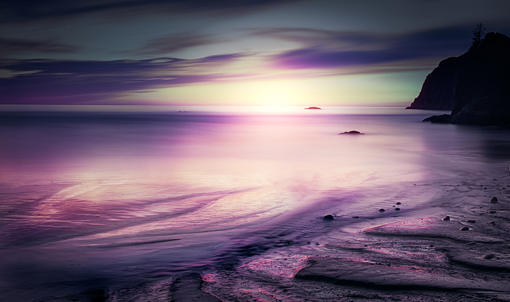
Dan, I took another try at things, realizing as you point out that the composition is what is really not working. I thought about removing the right most part of the sea stack as you suggested to create separation from the edge of the frame, but realized how hard this was going to be; it not being there would mean different light in the otherwise shadowed region in front of the sea stacks. Making that look right seemed really hard.
But I also realized that the "subject" for me is not the sea stacks but the light, particularly the "pools" of light in the foreground. So I decided to go a different direction. I cropped in on that, and I also did some work to bring in the sun on the horizon to make that a distant focal point. In this crop, the sea stack becomes a framing element on the right side. I've tried to match that on the left by darkening the left / upper left, which was already somewhat darker. What I am hoping is that in this composition the light guides the eye from the foreground pool of light to the sun in the background, using the shoreline and then sea stack to hold us in the image on the right side. I would normally argue the sea stack on the edge of the frame is a bad idea, but again here it is not the subject but more of a frame. I don't know though - do you think that works?
After that it was just a matter of bringing the contrast and colors to more where I usually put them - hopefully tastefully. I'd be very interested in what you think of this version. |
Apr 23rd |
 |
| 96 |
Apr 21 |
Reply |
Cheryl, I took a quick shot at adding sky as you did, using content aware crop. It didn't work very well at all. Then I tried going back and re-doing the newly added sky by selecting it and using content aware fill. That at least allowed me more control in picking where photoshop looked to get the patterns and colors for the fill. But that didn't work very well either - no where near as well as what you came up with. How did you add the sky? Are there any content aware crop/fill tricks that you can share? |
Apr 19th |
| 96 |
Apr 21 |
Reply |
Cheryl, thanks. I like your version very much. As I commented to Dan below, I've been experimenting with a more subdued look, but I think your colors are better. Also, I really like the way you solved the pano problem by creating more sky. I don't know why I never think of that. You've brought a couple such solutions to cropping problems in my images over the past year. Thank you! |
Apr 18th |
| 96 |
Apr 21 |
Reply |
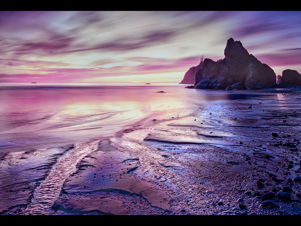
Thanks Dan. I think I am trying to play around with a bit different look in the processing of some of my old photos. I printed a version of this (I've attached it) with much more dramatic colors for a club salon and it got a 30, but I was never that pleased with it. It also didn't do well in broader PSA competition. In general I get comments from some that my images can look unreal - I don't know that I am generally pushing the colors much more than others, but I'm sort of sensing that I should back off some. This was an attempt. Actually the last several months photos I've backed off some, but this was probably the most - going for something more pastel. And it is a different crop.
Again, thanks for the thoughts. If you had an opinion on the attached version, I'd be interested. I will keep playing around. |
Apr 18th |
 |
| 96 |
Apr 21 |
Comment |
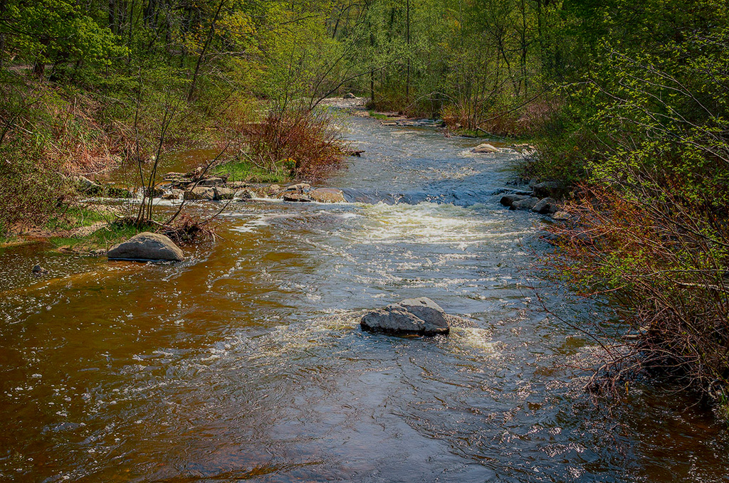
Hi Dale. I very much like the image you've captured here with the river leading us upstream through the scene from front to back, and letting us explore the spring foliage along the way. The river itself has a lot of visual interest with the rocks and the turbulence they create.
I like Gerard's crop. I think it gives a little stronger visual balance to scene. My other suggestion would be to continue playing with the processing in terms of the color and contrast. It looks a little too warm to me - I'd go for a little "greener" look to the foliage, since to me that says spring. I think with some color adjustments you can get a very harmonious color arrangement between greens, blues, and reds. I took a shot at that below.
I'm glad you survived the ledge. It seems like many in the group had some degree of risk or adventure to get this month's image. |
Apr 12th |
 |
| 96 |
Apr 21 |
Comment |
Hi Emily. This is a really interesting image - the crossing structures are almost unreal in their nested complexity. They are visually quite interesting, but also, for me, seem like a metaphor for the sort of urban chaos of the modern world. I like the color version much better - the consistent greenish tones in the structures pull them as the subject out of the background. They fade into that background in the B&W version.
I think it would be interesting to see this same image shot at night. I'm guessing there is enough city light to still see the structures, but the night shot would eliminate the bright sky. It would also be interesting to see a longer or multiple exposure capturing traffic moving through the scene on the street. That might add to the sense of urban chaos.
Well done to pull such an interesting image out of the complexity such an urban setting. |
Apr 12th |
| 96 |
Apr 21 |
Comment |
Hi Cheryl. I love the adventure story that comes with the photo almost as much as the photo. Coming from New England where no one has even heard of chains, I've only used them once, and that was a minor disaster. Good for your husband if he successfully got them on and off the car (I was not so lucky).
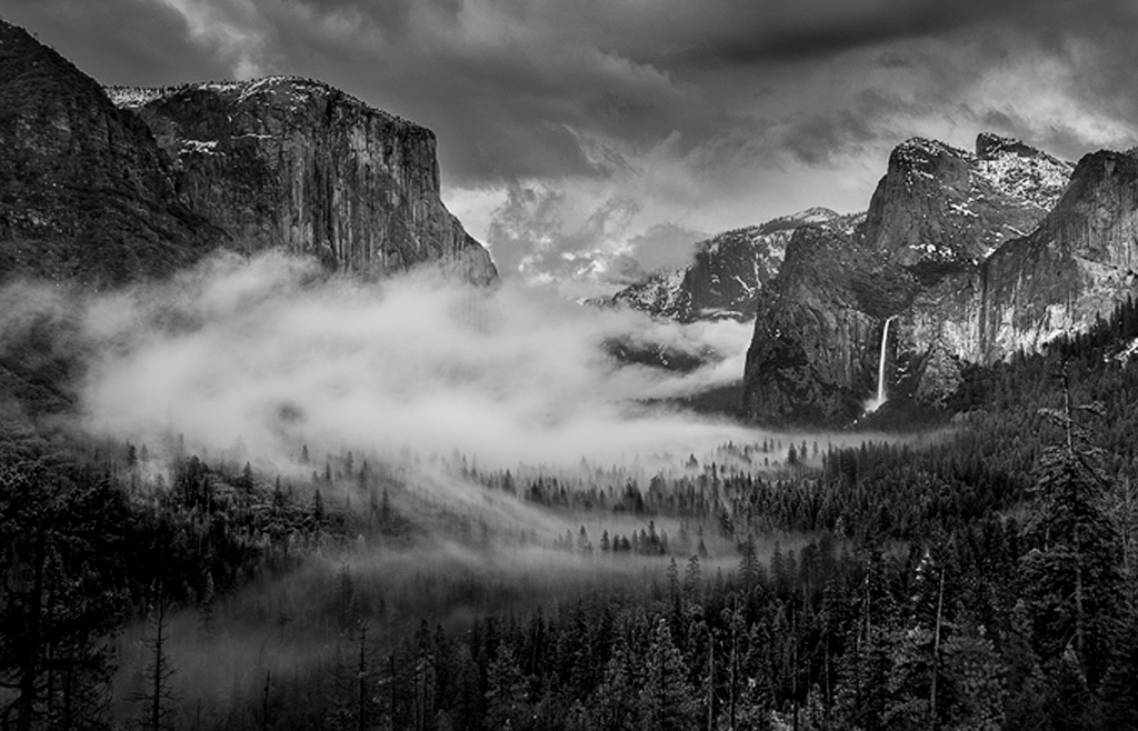
I'd say it was worth the effort though to manage this sort of spectacular weather conditions at Tunnel View. The B&W in particular is very impressive. I love the clouds flowing through the trees in the valley, as well as Bridal Veil Falls, which I suspect you've brightened to make really stand out. My only suggestion would be to crop more tightly to what I think is the interesting part - like below, where I also darkened the sky to hold the interest on the clouds in the valley.
Classic scene, but I'd rank your version pretty highly, both for effort as well as the result! |
Apr 12th |
 |
| 96 |
Apr 21 |
Comment |
Hi Gerard. I love the colors in the grasses and vegetation, particularly the silvery green grasses which are beautiful for such an intense place. The pyramid shape also is interesting. But I am not sure for me whether that is enough to carry the vegetation as the subject. The shallow DOF which f5 gave you kind of forces you past the birds to the vegetation. I'm not sure I have any suggestions though.
It sounds like it is quite an adventure to get to this location. I assume if you stay photographing too long you are in trouble getting back? |
Apr 12th |
| 96 |
Apr 21 |
Comment |
Dan, this is AMAZING light. If you don't consider this unique, you must truly be blessed when you show up on location.
I think the image is spectacular as is. But it also has so much potential to take in other directions. Below is a little different interpretation (hope you don't mind - I couldn't help myself) that focuses more on the light in the clouds - you might title this version "Dragon".
Brilliant capture of an amazing scene.
|
Apr 8th |
 |
| 96 |
Apr 21 |
Comment |
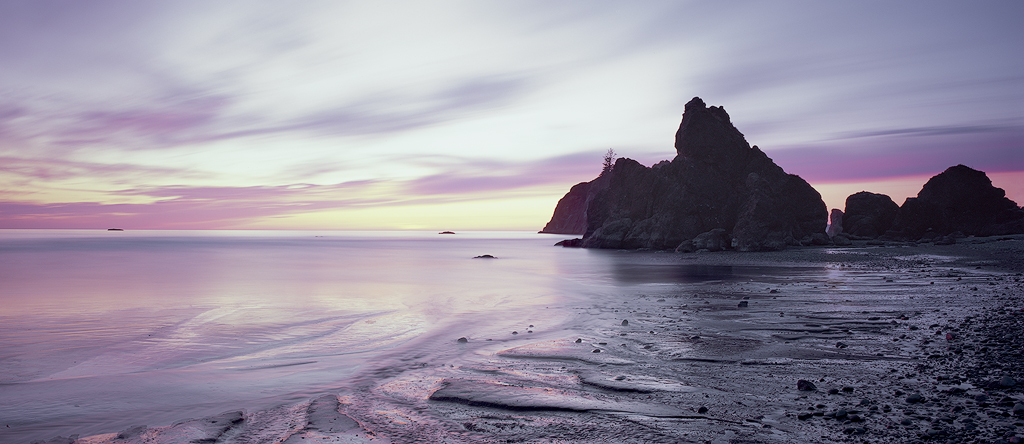
Thanks Gerard. On the crop, I see a couple of dilemmas. On the right side, I've tried cropping closer to the main sea stack (cutting off the sliver), but it feels like the sea stack is then pushed too much up against the edge. I've also gone the other way with more room but have a hard time deciding where to chop things. The version below has the whole horizontal extent - where would you cut it? Glad to get other folks opinion as well.
On the left side, your comment made me take a closer look and realize there is a pointed shape in the water flow, and I'm chopping off the point, so I feel I should go wider there and include the whole thing (as in the image below).
Then I tried your idea of cropping more on the bottom. Anywhere near a quarter it seems to lose the sweeping feeling I get when the shore line goes closer to the corner. The version below is a compromise where I've backed off a little from the corner. Again, I'm probably not seeing things right, so I'd be glad to have you take a crack at where you would cut it.
I'm not a particular lover of panos, but it seems that is where this is headed. |
Apr 8th |
 |
6 comments - 6 replies for Group 96
|
6 comments - 6 replies Total
|