|
| Group |
Round |
C/R |
Comment |
Date |
Image |
| 96 |
Jan 21 |
Reply |
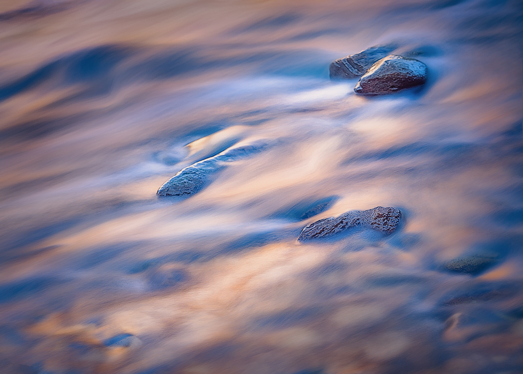
Dan, it sounds like Emily was seeing the same distracting "texture" in the water as you. If you wouldn't mind, can you look at the version in my reply to her below? Does that clean up the "texture"? Better? Would you go that far or somewhere in between that new version and the original? Dealing with details remains one of my struggles. |
Jan 24th |
| 96 |
Jan 21 |
Reply |
It sounds like you are talking about the same "texture" in the water as Dan was. If you wouldn't mind, can you look at the version below. All I have done is add negative clarity, negative texture, and a bit of noise reduction in Lightroom. I think what you and Dan are talking about is reduced, yes? Is this version better or at least more realistic? |
Jan 24th |
 |
| 96 |
Jan 21 |
Comment |
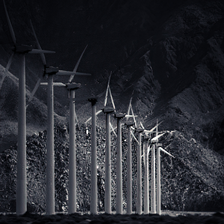
Hi Emily. For me there are three elements that really come together on the right side of this image. First you have the line of wind turbines - your capture of which was timed very well considering you were traveling 70mph past them. The symmetry and receding diagonal they make is visually interesting. Second, you have several other elements that connect to the back end of that same diagonal. You have ridge line of the near "mound" coming up from the right, and you have ridge lines in the more distant mountains coming down to the left - all of this pulls you toward the back end of the wind turbine row. Thirdly, you have the light, which is most luminous at that back end of the wind turbine row.
So, believing that was real magic part of the photo, I took a shot at accentuating those features. I cropped to that area (and to square which was mainly convenient but which I also think works well for this). I had to clone out a couple power lines - others had already pointed out how those distract. Then because this for me is about graphic form, I brought it to black and white. I increased the contrast quite a bit, and further darkened the upper right to give some negative space, but also to emphasize those ridge lines running down to meet the turbines.
For me this rendering just enhances what you clearly saw in the graphical pattern of the turbines, and what you captured with great timing, that aligned other supporting compositional forms, and that offered great light. |
Jan 23rd |
 |
| 96 |
Jan 21 |
Reply |
I am with you Dan (and I guess with Art as well) on the Camera Club thing. My own experience was that scores and critiques correlated strongly with how sharp the image was and how saturated. Try to soften part of an image to guide the viewer and you would only be told that part was not sharp. And in my particular club at least, the path to a higher score seemed to be also to crank up the saturation further - again, subtly was not appreciated. It was almost impossible to experiment in that culture where everything was judged by a fixed formula and the usual set of photographic rules. You are forced to "trust your gut" as Cheryl says - something particularly difficult to do when you are early on in gaining experience. But it makes me appreciate even more this PSA group and the wonderfully thoughtful and open minded colleagues it has brought me. |
Jan 23rd |
| 96 |
Jan 21 |
Reply |
Cheryl, I really love your interpretation of this. You've added just the right amount of drama while preserving the peace and calm of the image. |
Jan 23rd |
| 96 |
Jan 21 |
Reply |
Thanks for your comments Emily. I am not sure the fact it looked computer generated is a good thing. What about it gives that impression? I ask because I am often worried my processing goes too far - not in simple ways like too much saturation, but in some more complex way which makes the scene look unworldly (my wife's words). I typically want my images to "pop", but I don't want them to look unnatural. |
Jan 23rd |
| 96 |
Jan 21 |
Reply |
As always Dan, thank you for the very kind words. I too have struggled with water shots like this one, and admittedly this one took a lot of Photoshop work. Not so much a lot done to it, but a lot of trial and error. And interestingly for such a simple scene it was much the same problem as woodland scenes, namely trying to tame the clutter. On the texture, I think I understand what you are referring to. I went back to the original before any processing and it is there too, so some of it is a function of the sort of in between shutter speed I think I used (log time ago and unrecorded). But I think the processing has enhanced it some, and perhaps the sharpening for web at the end in particular. I've blurred out that texture away from the main focus (the upper left corner for example), and tried to use that as one more way to hold the eye where I want it and to cut down on visual clutter. But perhaps I should back it off in the center some as well. Thanks again for your comments which are always both insightful and thoughtful. |
Jan 23rd |
| 96 |
Jan 21 |
Reply |
Thanks for the suggestions Cheryl. I am still pondering the crop, perhaps because the Group has offered some many varied interpretations, and the role of the rocks is key in deciding on the crop. A tighter crop does have the advantage that you have pointed out, namely being better able to make the flow truly diagonal corner to corner. Truth be known, I have already cropped from the original in a bit rotated way to make the flow more diagonal than it was in the original. A lesson to keep in mind next time I compose such a shot. I will also play with the contrast as you've suggested. I found myself continuing to take out contrast and saturation as I processed it (very unusual for me) because it seemed that helped make it less cluttered as an image. So maybe what it needs is more contrast but selectively placed. In any case, thanks again for the suggestions as well as your interpretation of what it means. |
Jan 23rd |
| 96 |
Jan 21 |
Reply |
Thanks for your comments Gerard. It is amazing the diversity of interpretations and opinions across the Group - e.g., whether it is about the water and light or about the rocks, what the rocks represent, etc. I think the abstract like nature of the image probably solicits a greater spectrum of interpretation. Despite the more abstract appearance, hopefully I haven't drifted beyond what is acceptable in a "scapes" group. |
Jan 23rd |
| 96 |
Jan 21 |
Comment |
Hi Dale. I believe this image indeed conveys the serene, peaceful feel that you were after. It brings to mind for me a relaxed weekend morning - the drama of fall is over and the landscape is restfully waiting for what is next. Similarly, the swans seem casual in their pose, enjoying the morning, free from an urgent need to accomplish whatever sort of weekend to-do list swans execute. And although the foliage is "done", I like the warm orange of the fully changed leaves, as well as the complementary contrast here and there with hints of green . I also like the potential which is there in the single white barked tree (birch?) in the center of the image as another center of interest beyond the swans. I think the composition of this tree, placed as it is directly behind the left of the swans could probably be improved. With landscape like this which include birds or animals as centers of focus, I find it is hard to plan compositions as the creatures move around (and having more than one just complicates that further), so it is often a matter of waiting, shooting a whole bunch of frames over whatever patience you have, and then looking for the most pleasing composition after the fact.
|
Jan 9th |
| 96 |
Jan 21 |
Comment |
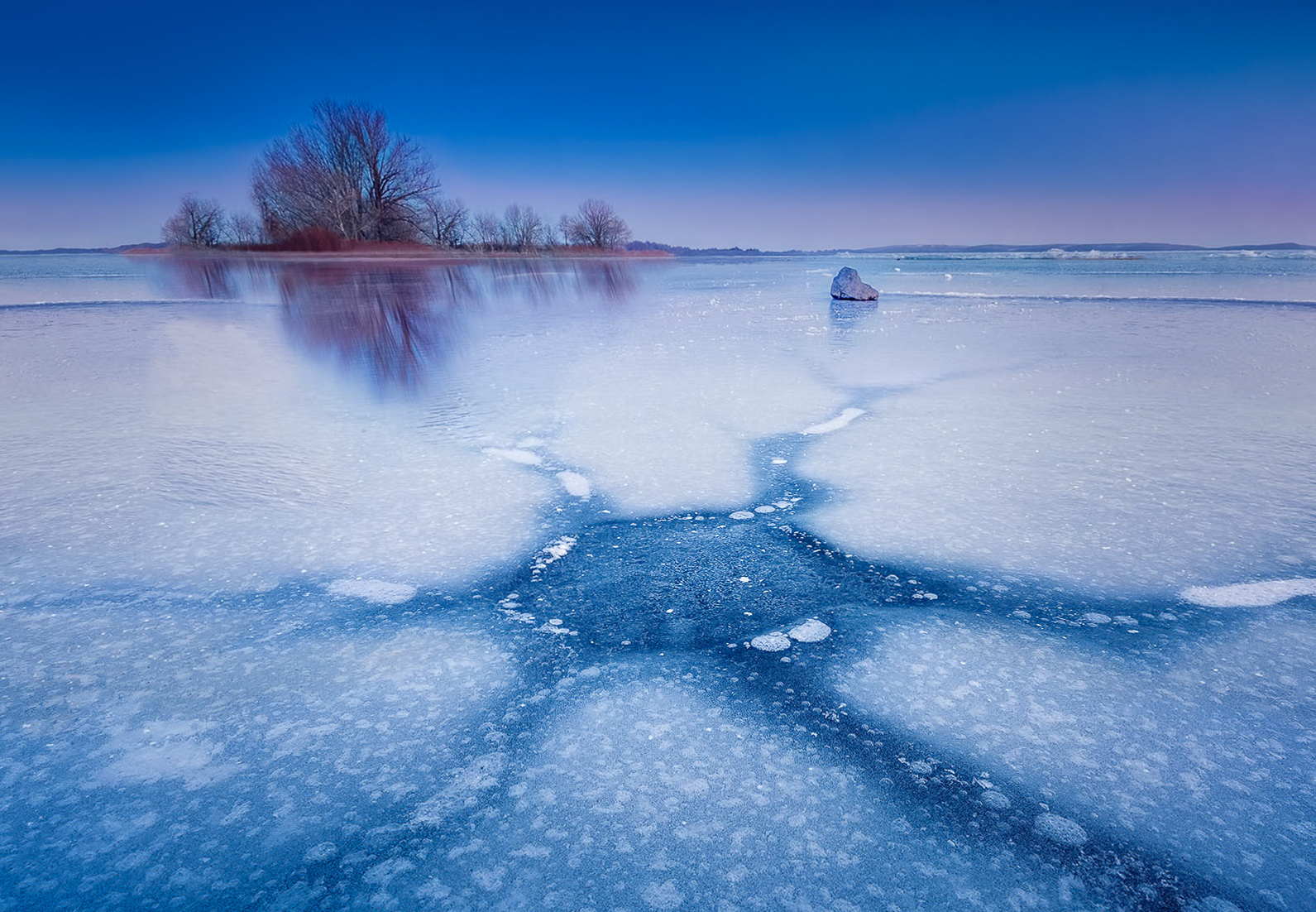
Hi Dan - Happy New Year to you as well! You've started the year off wonderfully with another image that I love. You've kept things here very simple and elegant, and have masterfully applied the near/far sort of composition. In addition to the beautiful patterns in the ice that are amazing, I really like the sense of cold which comes through in the blue tonality, but with hints of complementary pink which add great artistic flare. You could have brought the pink out more, but I think it would have pushed against your effort to portray the cold - so I think you've managed the balance really well.
Your discussion of the rock I think hits on the one area where I think the image could be made even stronger. Partly I think you are right, there is a tendency to drift out to the right. But I'd say the issue is more that the foreground and background are not quite as tightly linked as they might be. So there is a little disconnected feel. I also think the contrast of the rock to the bright ice is so great that my eye wants to go there and then not leave.
I thought of maybe three things that could help with this. First, I think you can lighten the rock so the contrast is not so great. Second, I think you can crop a little more tightly so that there is less loose space around the edges to drift into. Finally, although you said you deliberately chose not to do a vignetting, I think a subtle spotlighting of the foreground ice, rock, and background trees again helps hold us in the center and flow from the front to back. I've taken a shot at those in the attached.
All matters of taste. Overall this is a wonderfully composed shot with great visual interest and very compelling color palette.
|
Jan 9th |
 |
| 96 |
Jan 21 |
Comment |
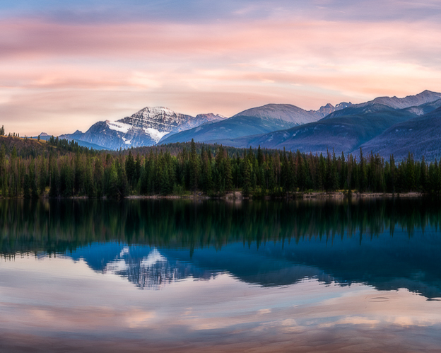
Hi Cheryl. As usual, you have found another very beautiful scene. Its interesting that I see your original as a very different image for me than the final crop. I agree the original doesn't show the peak as dominantly or have as strong a center of focus. So instead the original for me is all about the trees along the shoreline - the repeating pattens and textures there that run the whole long pano width, but undulate up and down in extent creating visual interest. I think this makes the original "work" in a different way that I like.
I think on the cropped version, I might go even tighter, mainly cropping to more of a 4x5'ish format vs the wide aspect - something like the attached. This is clearly a matter of preference. Your current crop is lovely, but going further makes the mountain even more a center of focus.
I have trouble judging the Orton effect. If I use it, I generally mask and only apply it to select areas of an image. And my sense is that if it is "visible" (at least without toggling back and forth quickly between before and after), you've gone too far. I tried to toggle in that way between your final and original, and it seems the trees along the shore look sharper in the original - I'm assuming this is the blurring the Orton is introducing? What if you limited the Orton to the clouds/sky where a more dreamy rendering would be ok?
Just some thoughts. Beautiful image as usual. Where is it?
|
Jan 9th |
 |
| 96 |
Jan 21 |
Comment |
Hi Gerard. I love the atmosphere in this image with the fog obscuring the deep background. As I may have mentioned before, I keep looking for fog, and going out when my weather app tells me it is going to happen only to be disappointed. So I'm envious of the conditions you've found to shoot.
I think I like the monochrome approach since there is really not a lot of color in the original. What is there creates one of these situations where the image looks muddy to me. But monochrome fixes that. I'm not sure if I would have gone with the particular tone you have - I might have opted for something more cool and blue which for me matches the mood the image invokes. I'd be curious what drew you to the warmer reddish shade?
My eye is drawn immediately to the broken branch at the front right, by it's strong contrast. I would either de-emphasize it or more likely try to clone out the broken portion hanging straight down.
Like Dan, I also noticed the additional "noise" in the monochrome. Am I correct that it is not noise but that you have deliberately added grain? If so, I'd love to hear more about that choice. I know others add a little grain regularly to improve perceived acutance, but I've never seen guidance on exactly how to do that.
Overall, a very lovely image which allows me to imagine the mood as if I was really there myself.
|
Jan 9th |
5 comments - 8 replies for Group 96
|
5 comments - 8 replies Total
|


