|
| Group |
Round |
C/R |
Comment |
Date |
Image |
| 96 |
Dec 20 |
Reply |
Thanks Dale. I typically use my iPhone just to scout compositions. Much easier to decide on a photo that way before setting up the 4x5. The phones are getting really good in many situations, but this one just points out the difference in flare resistance between the iPhone lens and even a run of the mill 20 to 30 year old large format lens which controls flare so much better. |
Dec 26th |
| 96 |
Dec 20 |
Reply |
Thanks Gerard - I appreciate the alternative view. I like your strategy of adding the effect in post processing assuming one can manage to make it look realistic. I've never really tried, so not sure how much skill that takes, but I will try on the 4x5 shots (which don't show the flare) when I finally get to scanning them. I've also thought about shooting both ways - to eliminate the flare on one hand and to enhance it on the other - and then blending in post to dial in whatever looks best. |
Dec 26th |
| 96 |
Dec 20 |
Reply |
Thanks Dan. I really appreciate for your very kind words. I'm never sure how a particular image will be received by others, particularly when trying something new. I'm glad to hear that the sun flare/rays/beams are effective here because I really fell for them and its made me realize I should get out of my usual box more often.
I too am not a fan of the painterly look and still plan to redo this with the 4x5 images when scanned. I like your suggestion on the grass near the water, which I will tone that down when I do the 4x5 version. And I will find somewhere to let folks take a look at the more "finished" version. Thanks again. |
Dec 15th |
| 96 |
Dec 20 |
Comment |
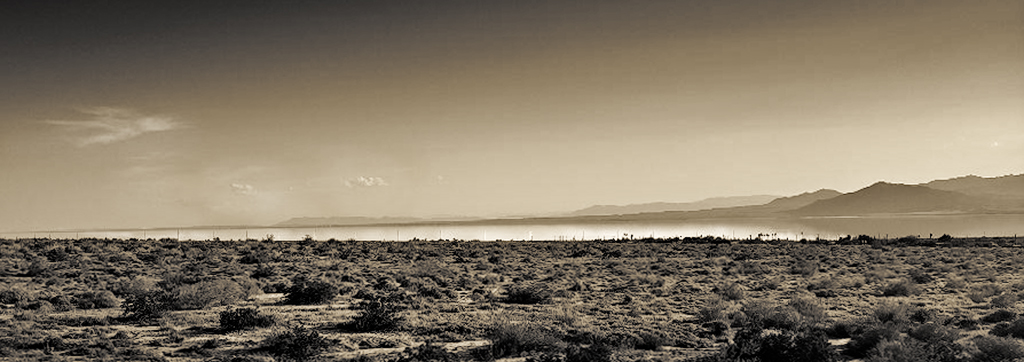
Hi Emily - very neat capturing the mirage effect as you did in the distance here. I also love the soft, overlapping layers and tones of the mountains. I'm less moved by the foreground desert - interesting forms in the scrub, but tough lighting conditions to make that foreground look compelling.
Sometimes with tough lighting, moving to black and white helps, so that would be my thought here. This image for me is not about color in any case, but about all the different tonalities you have going on. Also, I like a pano crop, something like 6x17, which emphasizes the parts that really move me, over more foreground.
I took a cut at that which is attached. I chose the crop to keep the clouds which I thought added a little balance in the sky, and to position some dominant scrubs in the lower right as an anchor. I lightened the mirage so it would really pop and draw the eye as the key center of interest you are trying to emphasize, and then darkened the top and bottom. I went with a warm toning because it seemed appropriate to the desert. A few other misc tweaks played with to get the tonalities to standout against each other.
Anyways, that's what I would do since you asked. Others might take this in a different direction. Again, good eye picking out the mirage as worthy of a photo. |
Dec 12th |
 |
| 96 |
Dec 20 |
Comment |
Dan, I will pile on as well that I believe this image is stunning. The colors are beautiful, as are the strong graphic forms and the textures. It has a classic near/far composition which is always a powerful approach. More than that it has the combination of sharpness, simplicity, and bold saturated colors which is in vogue with photo club judges - I love those attributes too.
So, given all that, I hesitate to point out what I don't like about it. For me the composition geometry doesn't mesh as well as it might. I think the biggest element of that is the sunlight illumination on the sand. It is beautiful, but it doesn't seem to connect geometrically with the kelp. Also it contributes to a sense I have that there is a tension between a center balance that the kelp creates, and a left centric balance that the sun creates. Since you say you arranged the kelp, I also wonder if there wasn't a different arrangement that would have created a more right to left feel that connected better to that sun illuminated sand and led back from there. Alternatively, I was thinking there might have been an opportunity to better echo the graphic geometry of the sea stacks in the shaping of the kelp - more points reaching upward in the frame toward individual sea stacks just as the sea stacks reach up toward the sky. But in this approach I don't know how the sun illuminated sand would be handled.
It is a compelling enough image that I have come back to it again and again over the last week before sharing these thoughts. Again, it is stunning as is. I think the compositional harmony I am suggesting is the difference between stunning and a really world class photo.
|
Dec 12th |
| 96 |
Dec 20 |
Comment |
This is a very nice image Dale. In particular I like the vanishing point usage which leads the viewer naturally to the tree at the end of the street. The tree then in turn leads us to the sky, and you have captured beautiful texture and color in the clouds there. I also like the yellow tones throughout. With the clear winter setting, they suggest a happy warmth to me despite the winter cold. The deeper orange tone in the building behind the tree is also effective in enhancing the other features which collectively draw the eye down the street.
I agree with Dan that it appears things are leaning a bit left - this is most easily seen in what would otherwise be level horizontal lines in the architecture of the orange building at the end of the street. I might also play with darkening the snowy street a little to give it a little more texture, but particularly at the bottom edge of the frame to further help pull us into the scene.
I'd be interested in seeing the original of this to better understand how you have processed it. It seems to be a fairly non-traditional approach, but I think one that works very well with this scene. You captured and created a beautiful image. |
Dec 12th |
| 96 |
Dec 20 |
Reply |
Thanks Emily. I appreciate the reference which was interesting and a good overview. I think the softness in the image is as much the low pixel count iPhone (digitally zoomed and further cropped to make things worse) than the flare. So in this particular case it is a little hard to sort out that vs what the flare is adding or subtracting. Thank you for the recommendation to keep exploring artistic use of flare - I will definitely keep playing with it. |
Dec 12th |
| 96 |
Dec 20 |
Comment |
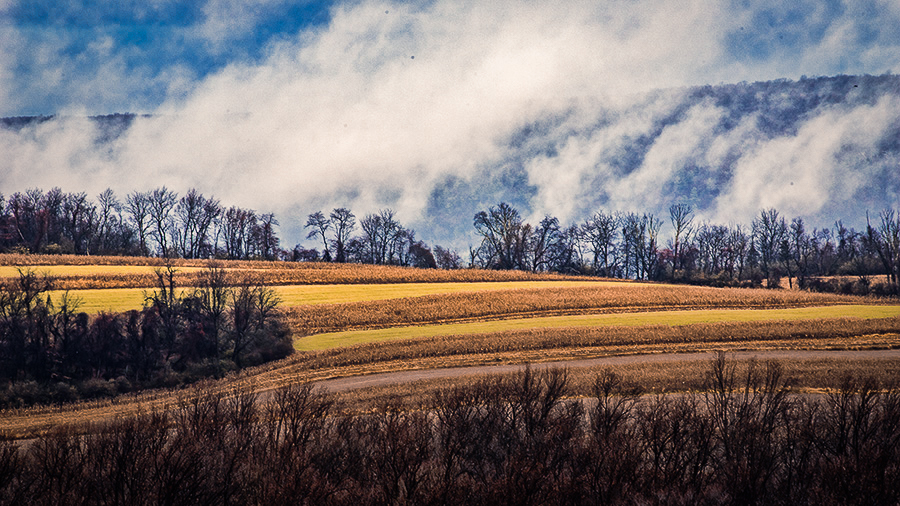
Hi Gerard. I really love the atmospherics you've captured here. I watch the apps for unique weather, but when I show up it never seems to be there like the app predicted. You've found it, and I'd say timed things pretty well as it lifts.
Since you asked about color, I think there is an opportunity to take the impact over realism spirit a bit further. I used to wonder at landscape images I'd see on-line, really amazed at the luck they had in finding such great colors that work together. Then I read an article by Erin Babnik where she explained all the post processing tricks to get colors to go together from a color theory perspective - changing hues or colors all together, or desaturating colors that were overly complicating a color palette. It was like a light switching on for me.
In your image, the green field and blue sky don't harmonize as well as they could because they are next to each other on the color wheel. But change the green to a golden yellow field (see attached), and as complementary colors across the wheel, they harmonize better. Similarly, if you warm up the clouds a little bit, they pop a little more against the blue sky and hills.
From what I understand, this would be cheating in the "Nature" category. But everywhere else it is impact over realism!
|
Dec 4th |
 |
4 comments - 4 replies for Group 96
|
4 comments - 4 replies Total
|