|
| Group |
Round |
C/R |
Comment |
Date |
Image |
| 96 |
Nov 20 |
Comment |
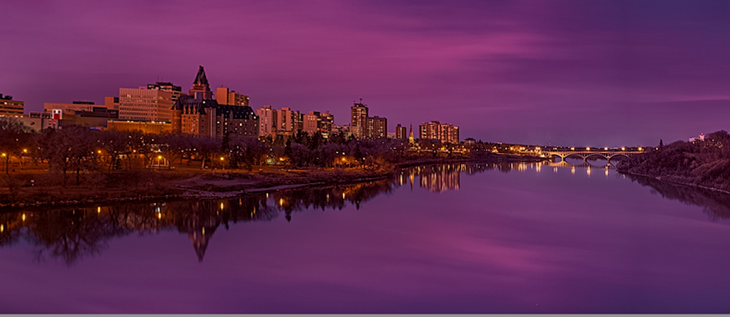
Hi Cheryl
I think this is a beautiful image. The color palette you've captured and rendered is amazing. Graphically it is also excellent - I love the symmetry as well as the very strong leading line that draws us down to the distant bridge.
Like Dan, the fact the bridge, which becomes the resting point at the end of the leading line, is sloped was a bit troubling for me. I too couldn't figure out what was actually going on, whether it was perspective or actually a sloping bridge. But I figured it could get fixed while keeping the uprights on the buildings vertical with the correct transform. Also, like Gerard, I thought the right side of the water was a bit less interesting, so thought a crop might help, but leaving enough resting space there on the right side of the bridge. Finally, with the leading line, I wanted to make the bridge a little more of the subject, so I think it can be emphasized with some subtle dodging and burning, brightening the bridge and darkening some of the buildings at the far left to further help guide the eye down the waterline. I attached my cut at this stuff.
While I am more into natural landscapes than cityscapes, I think this is every bit as good as similar cityscape images I have seen hanging in galleries. Beautiful color and form.
|
Nov 14th |
 |
| 96 |
Nov 20 |
Comment |
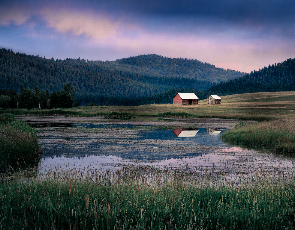
Dan, I somehow missed the title on this image when I looked the first time. Now seeing the title, I interpret this image differently. If it is about "isolation", perhaps a metaphor for our current times, then, were it me, I would take the image in a different direction. I took a shot at that in the attached.
I recognize that you have beautiful warm colors which attracted me to this image, but I don't think they are keeping with how I interpret the "isolation" theme. So in the version I took the liberty with, I've desaturated things, cooled it down, and darkened it to give the gloom of isolation, while highlighting the structures with a little more light and warmth. They then stand, admittedly alone, against the gloom of the isolation. I left a bit of the brightness and warmth in the clouds - seems to me they suggest hope coming from over the mountains. Ends up in a more dramatic look, less beautiful than your version, and I imagine not what you had in your head. But it resonates with what I see, at least when coupled with your title.
|
Nov 14th |
 |
| 96 |
Nov 20 |
Reply |
Thanks Gerard. You hit on one of the things in this image that I haven't been able to decide - how much pop to give the dominant yellow aspens. I have a problem in that I tend to want to push the pop pretty far. In this image in particular, however, a subtle touch is needed, since it is a softer, quieter image than others. I literally went back and forth. I would push the pop further, then come back a bit later, look again, decide it was too much and back off. Then I'd come back later and decide it needed more to pull the eye more dominantly to a center of interest, and add more back in. This continued through a few iterations. The light shaping (dodging and burning) which also helps with guiding the eye, went through a similar back and forth. Where I ended up is at the end of that cycle with more pop and more "brightness", hence your comments as well as Cheryl's and Dan's. So, I think the consensus is I've gone a bit too far. I will back off with the yellows and brights in front on the next iteration. Thank you for helping with this decision. |
Nov 14th |
| 96 |
Nov 20 |
Reply |
Thanks Cheryl. I agree the front is a bit too bright, and I will not go as far there in the next version. I will also have to try your technique of burning between the trees to add depth - I now understand what you meant when you brought that up with respect to last month's image. I had not heard of that technique before, so thank you for the suggestion! |
Nov 14th |
| 96 |
Nov 20 |
Reply |
Thanks Dan. I was rushing a bit on this image, which I hadn't processed before, and did for this month's post. I think you are right about the brightness in the front - a little overdone. The whites look a bit blown out in the jpg looking at them now, although the histogram back on the original looks ok. I've never spent much time processing for web as my love is printing, so I should probably spend a little time making sure the jpg and sRGB conversions aren't botching things up. But still too bright in front - that's not the conversion. And I will look at the sharpening too.
Appreciate also your comment on the critiques. I really want to improve so I appreciate frank, open, insightful discussion. I tend toward the same in my comments because I really want to help. I try to be diplomatic, but I recognize that is not always my strength. |
Nov 14th |
| 96 |
Nov 20 |
Comment |
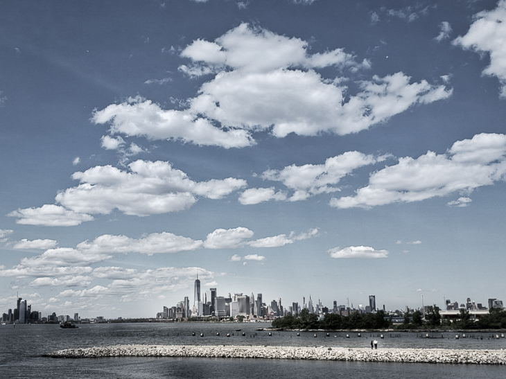
Hi Emily
I looked at this image for a while. I agree with others that there are some distractions to remove on the front edge and left side, but was really trying to decide what spoke to me. It took me a bit to find the two people standing on the rock jetty, but when I did, I settled on the grandness of the scene behind and above them - their small place in the world. So I took a cut at trying to emphasize that. I found the color distracting to what to me was a very graphic scene with strong forms - I didn't want to go black and white (I'm frankly lost there), but muted the colors considerably. Then, other than the crop, I mainly tried to dodge and burn in ways to create layering - highlight the two people and jetty, then the dominant distant city skyline, then the clouds above. All less careful edits than if I were doing this for final.
It would be interesting to hear what pulled you to this image. I find sometimes I don't know when I take the image and have to figure that out later. And typically we all see different things in an image.
|
Nov 14th |
 |
| 96 |
Nov 20 |
Comment |
Hi Dale. Like Dan, I like backlighting too, and you found some nice backlighting here, particularly in those sections of the image where it is highlighted against otherwise dark sections of the image. But I really like light rays. They are subtle but there, and my thought was that more could do be done to bring them out. So, hope you don't mind, I decided to do some quick and dirty practice and see what I could do.
So, I did a few things. I cropped to focus on the region near the light rays - which also has the nicest back lighting in my opinion. In cropping, the tree would have leaned out of the frame to the right, so I applied a transformation to straighten it and use it as a frame. The tree and the foliage on the left then "frame" the light rays. For the light rays I threw a bunch of things at them. First I cooled down the whole image so I could paint the light rays warmer to help bring them out. I also darkened the image overall so the light rays and back light would stand out more. Then I brushed over the light rays - I increased their brightness, lowered contrast, and added a little negative dehaze (e.g., added haze). I did everything in Lightroom, and not as carefully as I would for a final image.
It was a fun exercise because I've never worked on light rays before (as much as I like them I never end up with them). It is admittedly a very different look, but it emphasizes the parts of the image that really attracted me. |
Nov 5th |
 |
| 96 |
Nov 20 |
Comment |
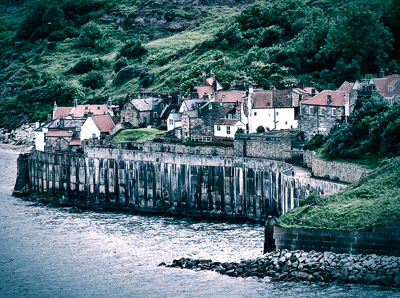
Gerard, you've definitely captured the bleak mood through the processing you've brought to the image, as well as through the image itself. The little piece of civilization seems perched close enough to be threatened by the sea, while similarly loomed over by the hills behind. A narrow trapped existence between the two.
I like the suggestion of the vignette, and might go further by darkening the brightest few walls of the houses a bit to add to the gloominess. I would also cool things down a bit, or try the traditional teal and orange sort of color grading, to bring even more sense of bleakness. Here is a quick shot at adjusting the color temp. |
Nov 5th |
 |
| 96 |
Nov 20 |
Comment |
Dan this is a very lovely image. What I like about it is the colors which are subtly magical. And technically in terms of composition, etc. I don't see anything which I would change. But since you asked for a fresh view, I'd say that among your images of the past couple months, all of which are stunning, this would not be my favorite. For me it is a little more "ordinary", and I'm less sure what story or feeling it is trying to convey. Contrast that with last month's which was a more graphical scene, taken with fleeting conditions, and with the insightful composition where you aligned the sun, all giving it a uniqueness and a moody feel.
It sounds like this image is special to you because you had it in your head for a while. But what is it that draws or excites you to that particular image in your head? Maybe understanding that there would be a way to better communicate those feelings in the image?
|
Nov 5th |
6 comments - 3 replies for Group 96
|
6 comments - 3 replies Total
|


