|
| Group |
Round |
C/R |
Comment |
Date |
Image |
| 96 |
Oct 20 |
Comment |
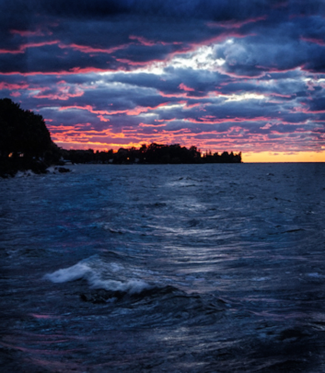
I really love the colors you found in the sunset, under lighting the bottom of the contrasting, storm like clouds. That kind of light typically changes pretty fast, and I think you picked the right moment to click the shutter. Great job recognizing the special light and capturing it.
I think the composition of the image however could be strengthened. My eye goes to the bright areas, which means the bright patch of sky above and right of center, as well as its reflection which leads the eye from the front of the frame to that bright sky patch. Trouble is, I think where you want to lead the eye is toward the wonderful color on the left.
So, hope you don't mind, but I took the liberty of recomposing. I cropped down to the part of the image that I find really compelling. In the attached crop, the prominent wave provides foreground interest, and the other less bright sky reflection leads the eye from there to roughly where you want it to go - the amazing color in the clouds. I did a little quick photoshop work to enhance the foreground wave and the sky reflection (dodge and burn), as well as to bring out some of the scarlet color in the water that shows up here and there (some selective use of vibrance). I burned the edges some, and then admittedly made a quick pass through Nik Color Efex, using Tonal Contrast to boost the contrast overall. It is definitely a different look when done, but to me the interesting elements you've captured fit together a little better. |
Oct 10th |
 |
| 96 |
Oct 20 |
Comment |
I really love the colorful time of Autumn for landscapes - your image showcases that with its warm, saturated tones. Compositionally, the fence is a nice leading line, although it isn't clear what it leads to. It almost suggests that there is a hidden surprise around the corner. The road heading off in the same direction complements that sense of something "round the corner". A poet would probably say it is winter.
Some of the highlights in the leaves look a little blown out to me. A polarizing filter might have helped with that, or you could have tried for softer lighting conditions.
The image definitely conveys a happy fall mood, and makes me think of pumpkins,apple cider donuts, and football. Nice image! |
Oct 6th |
| 96 |
Oct 20 |
Comment |
It seems like everyone is doing images with fog or mist this month - I must have missed the memo! This is another such great image, where for me the mist here portrays a calm, peaceful mood. I think the black and white rendering works well to support this feeling.
Compositionally, I think the image could be strengthened by getting slightly lower, so that the branch/leaves on the left are not touching any of the cows. That also would enhance the framing that the branch provides the image. You might also play with cloning out the rightmost cow. I like the way the fence on the right leads off into the mist, and I find that cow interrupts that.
I have to admit, not knowing my cows, I didn't notice the Jersey until you pointed it out. Glad you were able to pivot from the train to this scene instead. Nice image!
|
Oct 6th |
| 96 |
Oct 20 |
Comment |
I always love the moodiness that fog brings to a landscape, and how it simplifies an image, creating a strong sense of depth. You have all of that here, plus wonderful soft colors, and strong drama in the dead trees and the alignment of sun with the tallest tree. It conveys a sense that something supernatural or magical is about to happen.
To me this is technically and compositionally perfect. I don't see anything I would change. Awesome image! |
Oct 6th |
| 96 |
Oct 20 |
Comment |
I really love both the light and the mood created by the fog in this image. I think you were rightfully excited about the conditions. The clouds seem like they were very cooperative in the way they radially extend from the mountain.
I agree with your removal of the foreground elements in the original, which to me just add clutter. I'd also prefer it if the fallen tree (branch?) on the left wasn't there as I find it wants to pull my eye out of the frame. Similarly, I wish the rock on the bottom right (which I like) was all the way into the frame vs. sitting on the boundary. Finally, I wish the grass tufts on the right side (which I also like) sat below the reflection of the mountain vs. straddling the edge of it.
Your image has got to have a truly massive amount of megapixels! I am definitely envious of your GFX 50S - your stitched pano has got to have more detail than I can get from a 4x5 sheet (with much less of the headache of setting up a 4x5). You could print this REALLY big! Great image!
|
Oct 6th |
5 comments - 0 replies for Group 96
|
5 comments - 0 replies Total
|


