|
| Group |
Round |
C/R |
Comment |
Date |
Image |
| 96 |
Aug 20 |
Comment |
I love the graphic form of the rocks and texture and tonality of the image overall. Like others, I see a natural leading line in the rocks moving to the pier and structure at its end, but then my eye wants to leave the frame since the end of the pier is so tight to the left edge of the frame. I'd also prefer if the horizon line with the sky didn't line up exactly with the top of the pier structure, but I have no idea if there was an opportunity to compose from a lower position.
I know you are after a B&W shot, but I'd be curious what this looked like in color. Part of my curiosity is because I think there is an interesting graphic abstract image cropping to include just the foreground rocks. It actually is interesting as a B&W, but to me could be really amazing with the right colored light.
|
Aug 22nd |
| 96 |
Aug 20 |
Comment |
I like the B&W approach you have taken with this image. I also really like the composition which naturally leads the eye from the foreground rocks through distinct mid-ground features to the mountains in the distance. I wish we saw more to the right of the frame in the distance - the mountains feel a bit cut off to me. I don't think I'd go as far as Cheryl, but I do think I'd bring a little more contrast to the mid-ground part of the image. Otherwise, great image! |
Aug 22nd |
| 96 |
Aug 20 |
Comment |
Another beautiful image Cheryl. Your edits and HDR have really brought out what looked to be an amazing sunset.
My only comment perhaps get too metaphorical, but by enhancing the lit clouds as you have they suggest power, but also more harshness or anger. It comes across a little like the power of the heavens reigning in anger or a threatening way over the church. I wonder if there is a way to enhance the clouds but in a way that comes across softer, and more supportive - that conveys more the heavens supportively watching over the church. Both are equally valid metaphors, but I guess I naturally tend to the less ominous one. Also maybe I'm reaching too far to consider the metaphors at all.
|
Aug 22nd |
| 96 |
Aug 20 |
Comment |
This is a very nice image. I particularly like the reflections in the moving water from all of the lights. I also like the foreground bridge structure (Manhattan bridge), although for me I feel in the current composition it is a leading line taking me to the upper right where not a lot is going on except the tower. I think Gerard's recommended crop that tightens that corner helps. But I wonder if there was a way you could have used the bridge as more of a framing element, perhaps including more foreground river with the reflections that to me are a beautiful element. |
Aug 22nd |
| 96 |
Aug 20 |
Reply |
Thanks Emily. Your descriptions do indeed make sense. I originally titled this image "Gathered Against the Storm" because the group of tree on the knoll somehow stood out more clearly against the storm shrouded background. I wanted to convey a sense of them huddled against what was going on around them. I agree with you and others that I've lost too much of the mystery and threat from the storm by brightening and dehiring things too much. So I will take your and other folks suggestions and make another try. |
Aug 22nd |
| 96 |
Aug 20 |
Reply |
Thanks Dale. I am definitely starting to agree with folks that my version is too bright, and therefore destroys some of the mystery. I like your edit. You have re-introduced some of that mystery feel without washing out the details too much. Thanks for your edit. I will play around with something similar. |
Aug 22nd |
| 96 |
Aug 20 |
Reply |
Thanks Cheryl. You have made a lot of good suggestions. I've gone back and forth a bit about how bright and how "hazy" to make the image. I think I agree with your perspective, echoed by others here, that I've gone too far in removing the mystery and looming atmosphere of the storm. I like your edits. I particularly like your suggestion of touching the tops of occasional trees with more clarity. So, I think I have some more work to go on this image. |
Aug 22nd |
| 96 |
Aug 20 |
Comment |
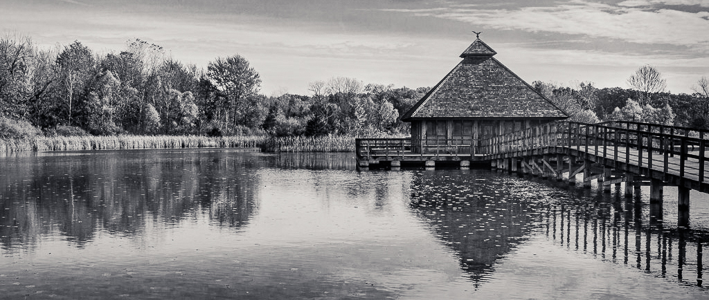
It is a nice image that seems to bring across the peace of a quiet Autumn day. I think the B&W works well, as there is interesting graphic form in the wooden structures, and tonalities in the B&W rendering of what must be multi-color trees.
Overall the image seems a little flat in tonality to me. Particularly if you are trying to emphasize the shadows and highlights in the trees, I think you could push the contrast a little further overall as well as locally in the areas of the trees. I also think this would work really well in a pano type format, since the interesting stuff is really in the middle third of the image. I'd crop off a lot of the sky and front of the pond. I took a shot at these couple of edits. I also split toned it subtly which I think also helps further separate the highlights and shadows in the foliage.
It is a very well composed image. I love the reflections, and the wooden structures balance the natural foliage in a nice proportion. |
Aug 3rd |
 |
5 comments - 3 replies for Group 96
|
5 comments - 3 replies Total
|


