|
| Group |
Round |
C/R |
Comment |
Date |
Image |
| 36 |
Jul 20 |
Comment |
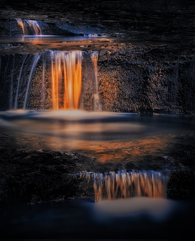
Larry, this is a beautiful image. I love the soft color and graphic form of the posts. The long exposure for me is what really conveys a calm mood, which is consistent with the feeling you express in the story of a better time coming after the destruction of the storm.
I think without the story, the image would have taken me to a little different place. Where your story talks to the pier being destroyed, I saw the persistence of the posts, and would have thought not of one storm, but many over the years, and how the posts had endured. To me the image would have been a bit more about calm resolve in the face of adversity. Of course the rock posed somewhat of an enigma.
I wish I had sat with your image for a bit longer, and let my thoughts and feelings sink in before reading your story. I think perhaps that is my lesson for next time. As I often struggle to sort out my feelings about my own images, it strikes me that the task after that might be conveying those feelings, or it might be providing the substance to emotionally touch the viewer, knowing that different viewers will be touched in different ways and see different things. I'm not sure those are necessarily the same task.
|
Jul 28th |
1 comment - 0 replies for Group 36
|
| 96 |
Jul 20 |
Reply |
Georgianne - Thank you for your thoughts and suggestions on the image as well as the challenge of communicating a specific feeling through it. I resonate with your analogy to a book, and the need to re-write, edit, and edit again to get the novel you want. I often find with images I am not sure when I am done. Or if I think I am done, I come back a year later to say "what was I thinking" and edit some more.
It took me some time, but I also took your suggestion (which was brilliant) of amplifying the color and light in the pool to better connect things, and combined it with a bunch of the other suggestions I received, to take a final crack at the image. The power of a village is amazing. Anyways, I can't reply all in this forum, so I posted that final image and more detail on what I did in the thread with Larry above. I hope you can take a look.
Thanks again for the great discussion. I hope there can be more in the future.
|
Jul 30th |
| 96 |
Jul 20 |
Reply |
LuAnn - Thanks so much for the thoughts and discussion, as well as the idea to de-emphasize the lower fall and shape the light more in the middle. It took me awhile to find time, but I've taken those ideas, as well as others folks suggested, and taken another cut at making the three fall image work. I can't "reply all" in this forum, so I posted the final re-processed image as well as more description of what I did in the discussion thread with Larry above. Hope you can take a peak.
I'm really energized by the discussion. I hope it can continue in future months. |
Jul 30th |
| 96 |
Jul 20 |
Reply |
Larry, everyone - Based on all of the wonderful feedback and ideas, I wanted to take another final shot at re-processing. The crop which leaves out the lower fall simplifies things and I believe there are lots of workable options there. But I wanted to throw all the tools people suggested, and a few more I thought of, at making the three fall version work - solving the flow problem.
So, I took LuAnn's idea of de-emphasizing the lower fall by de-saturating it as well as darkening it some. I also took Georgianne's ideas of darkening and cool toning the bright parts of the lower pool to further de-emphasize the lower fall area, as well as her idea to brighten the highlights in the central pool to help connect the middle and lower falls and create more of a flow. I also shaped the light around the middle fall, as LuAnne had also suggested, to promote it more to the subject and a more definitive place for the eye to rest. I also took Cheryl's advice that things were too saturated overall, and backed off (although perhaps not as much as some would suggest). Then I did a couple things of my own (that some might consider too far and cheating). I used a free transform to shorten the extent of the pool in the center, and to bring the middle and lower falls closer together. I also used a second free transform to change the aspect ratio of the overall image (make it shorter vertically). I think the altered aspect ratio also helps visually connect things better than the taller, skinnier version.
If folks are willing, I'd love opinions on whether this is enough to improve the flow and provide the needed subject or resting place for the eye. In any case I really want to thank everyone again for the great ideas and great discussion. Hope there can be more in the future. |
Jul 30th |
 |
| 96 |
Jul 20 |
Comment |
I think it is a lovely image which keeps things simple to really focus on the clouds which are your subject. I also think Gerard, Emily, and Cheryl pretty much nailed the processing that I would have suggested. So I decided to take things in a slightly different direction and emphasize the closer, cooler colored clouds vs. the warmer more distant ones. I started with Cheryl's version, dialed back the yellow in the warmer clouds, and then did some dodging and burning to shape and highlight some of the storm clouds. I also added a little negative texture to the water to smooth it out a bit (like a longer exposure) since I found it competed a bit with the clouds for attention. Again, just a different direction. |
Jul 28th |
 |
| 96 |
Jul 20 |
Comment |
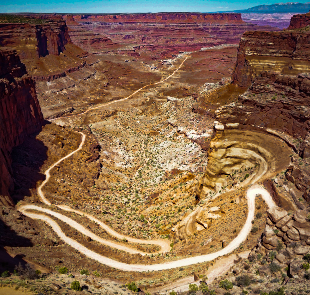
What attracts me to the image is the twisting road, which when done playing with us, takes us off into the distance. For me that road is the real subject despite some of the other beautiful aspects of the canyon which you've also captured.
So, as others have suggested, I would crop on the top to eliminate all but a hint of sky which gives context. And I'd crop at the bottom both to eliminate the shadow, as well as the section of foreground road on the left that leads out of the frame. Then also like others have suggested, I'd play with exposure, contrast, etc. but with the main objective of really making the road stand out even further (and perhaps bringing back some of the canyon colors lost to the harsh lighting). You can darken specific colors (mainly the orange) to improve that contrast with the road. I took a quick cut at things which is attached, but there is a lot of room for a more careful version, particularly in highlighting the more distant portions of the road. |
Jul 28th |
 |
| 96 |
Jul 20 |
Comment |
This is a beautiful image - well worth the really early visit to the lake. I love the color in the sky and peaks, as well as the fact you brought it out but did not overdo it. Like others, I agree that this should be on a wall or calendar.
If you are open to some nits, I would darken the brightest area on the left side of the sky. Based on the original, looks like you have plenty of room in the HDR to do that. I would also darken the lake a bit and maybe not saturate quite as far, without loosing the beautiful color. For me the subject is the peaks and their purple alpenglow. Since they are subtle, everything else needs to be even more subtle. Finally, it sounds like you were a bit constrained in your shooting location, but I find the exact placement of the one tree just right of center to be distracting - both where it is, but also the fact it just touches the top of the tree line. I might have tried to move slightly left to push the tree a little further right, and also get a bit lower so that the tree fully breaks the tree line. But again, moving left might not have been possible. |
Jul 28th |
| 96 |
Jul 20 |
Comment |
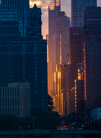
Similar to what Cheryl commented, for me the subject is is the light you have so nicely captured funneling down one of the streets. It reminds me a bit of southwest slot canyons in that way.
Given that, I find the sky and the tops of the buildings distracting. The bright sky tends to pull the eye away from the subject. Cheryl's darkening of the sky helps, but I'd go further and do a tight crop on the part which to me is the real heart of the photograph - I've done that in the attached. I also opened up the shadows a little bit, and cooled them down to better emphasize the warm tone of the sun in the slot canyon of the city street. A different image within an image, but one that resonates a bit more with me. Either way, great eye picking out the wonderful light. |
Jul 28th |
 |
| 96 |
Jul 20 |
Comment |
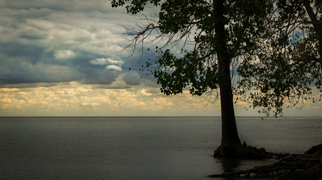
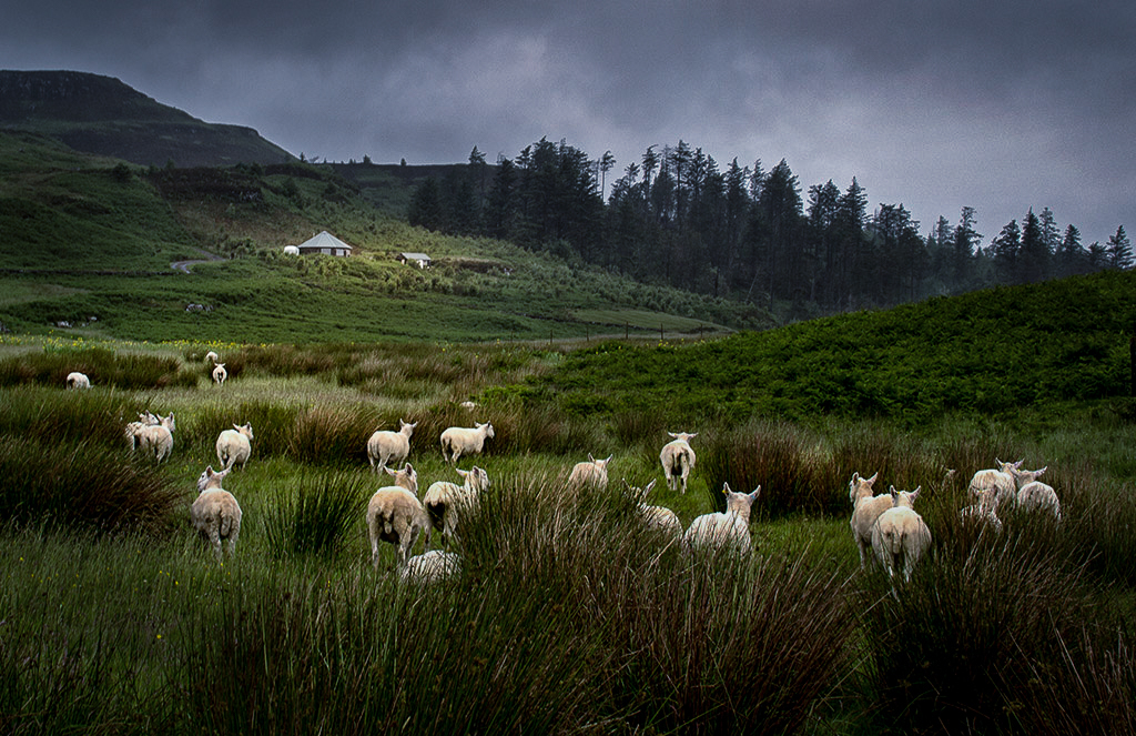
Like others, what strikes me first about this image is the sheep all heading away. They seem like they are on a mission - I'll assumed that is getting home to the structure in the distance not running away from the photographer. You mention quiet, countryside, and satisfying summer day. For me that would have the sheep milling around or facing random directions. So with all of them facing and moving away, this feels more like something else is going on.
Also, the foreground is warm and bright. The colder and darker background (where the structure is) for me fights against the sheep pointing me there. You could perhaps play with the light and color tone to make the them work a little better with where the sheep are trying to take us.
In the attached, I cooled down the image overall, with the exception of the distant structure and the sheep. I also darkened the image both overall and with a vignette, again, except for the structure and the sheep. In the reprocessed image, I think there is a stronger flow from the sheep to the distant structure, and the sense perhaps of foreboding storm gives the sheep a reason to head home. This is perhaps not the look or feel you were after, but seems more consistent with what the sheep seem to be up to. |
Jul 27th |
 |
| 96 |
Jul 20 |
Reply |
Thanks Emily. Your comments about what caught your eye in the shape of the water and details at the top of the third falls are interesting. I was concerned about a lot of the bright highlights around that "edge" over which the third fall drops. I could have sworn I used a polarizer, but it sure does not seem like it. Thanks for the edits which definitely do enhance the details and subtle colors. |
Jul 18th |
| 96 |
Jul 20 |
Reply |
Thanks Cheryl. I think based on all of the wonderful cropping suggestions, I need to go back and play with it now myself. I think you are also right about "over doing" the color and drama in the falls a bit. My goal is not so much to be absolutely representative of the reality of the moment. But on the other hand, I think it little more subtle might be in keeping with the "mystical secret" feeling which I am after. Right now the falls are screaming "here I am".
|
Jul 18th |
| 96 |
Jul 20 |
Reply |
Thanks Dale. Very good point about the distance between the middle and lower falls, which I was thinking about some based on Larry's comments. I don't know if this would have worked, but if I had gotten lower, I might have brought those two falls closer together, which might have helped with the flow. I may do some surgery on the image to try how that looks. Otherwise, yes, cropping out the lower fall is probably the right option. |
Jul 18th |
| 96 |
Jul 20 |
Reply |
Thanks Gerard. I appreciate your kind words as well as your take on the crop. At this point I wish I could go back and take the image again - I definitely would play with a range of different compositions based on all of the wonderful feedback folks have supplied. |
Jul 18th |
| 96 |
Jul 20 |
Reply |
Thanks Richard. Yes, I think the crop is more powerful for the reasons Larry and you point out. So despite clinging to my desire for three falls, I agree this is the way to go. Appreciate you taking a cut at it. I'm wondering what to do about the focus point being pretty dead center. I may play with some alternative to try to get it more off center. |
Jul 18th |
| 96 |
Jul 20 |
Reply |
Larry, sorry for the slow response. I really wanted to play around with the crop for myself and post my own shot at that - something I still have not had time to do.
I have one or two of Galen's books, which I have not read now for many years. I think you have prompted me to dig them out and go through them again. I am definitely in a different place than when I read them first a decade ago.
I agree more and more - once you've pointed in out - the lack of flow, or maybe more specifically, the lack of a resting point. I have to admit, again, now that you have pointed it out, that I go back and forth between the middle and lower falls - back and forth almost like watching a tennis match. So, I get it.
I'm not sure I could have composed it this way, but I wonder whether that would be less so if the angle was lower and the pool in the center was "shorter" putting the middle and lower falls closer together. I'm wondering whether they might pull the eye as one then, vs. the back and forth. Might be a way to get all three falls (eat my cake and have it too). I might do some bending and squishing of the image just to see how that might have worked. But overall, I agree the crop approach is the best route to fix the flow issue. So, I still want to take a shot at that and post my own version.
In terms of communicating the "secret mystery", I think understanding that better, there may be some more subtle changes I can make to enhance that too. The colored falls jump out a little too much for their "secret" status, so toning things down a bit there (something a couple folks have also suggested) is something I will also try.
I really enjoy this discussion - this is what I hoped for in joining DD. So thank you again.
|
Jul 18th |
| 96 |
Jul 20 |
Reply |
Larry, first, thank you for your review and comments. I struggle to find helpful constructive criticism - stuff that goes beyond one or two words - that I can use to improve. I think this is one of the most useful reviews I've ever received on an image. I will do my best to answer your questions about "what I put in the image" or more importantly "what my vision" was for it, but I am not sure I have all the answers myself, particularly on the more emotional side of what I'm trying to express. I'm still very much learning and I admit that I am often in a mode of trying to figure out what I feel about an image. It seems like we are supposed to know this at the time of capture. I guess I generally know I feel something, but I think it is in editing that I am left to try to figure that out more specifically. And even there I often wander a bit before I understand what moved me. So I will tell you more of my thoughts on this image, and then hopefully we can continue the discussion - I would find that very helpful.
Like your reaction, what attracted me was the unusual light. Compositionally I also liked the repetition of three falls, and I struggled to include all three. I needed a relatively long lens to compress the scene so that the interesting "falls" did not become too small an element (particularly the most distant one). Also, the unusual colored reflection only occurred for a very narrow range of angles, so I was very constrained in the angle/perspective I could shoot from. I was also constrained by other pools (deep and cold in December), so I couldn't move forward or back much either. All those factors pretty much defined the composition. But I willingly admit I was not thinking about visual flow when I framed things from that constrained place, nor was I thinking about a specific "focal point" or "subject" beyond it being the three falls and their unusual light. With those things in mind now, I'm not sure what I can do editing the image nor what I would have done differently at the time, unless I was willing to give up on capturing all three falls - maybe that is where I am going wrong. The only thought I have would be to add a subject to the pool in the middle, or the pool at the bottom - perhaps a fall leaf. But then it seems that would be the subject not the falls, and it is of course the falls and their light which I want to make the focus.
Emotionally, I don't think I had things figured out in the first editing and presentation of the image. I was still searching. In the most recent version, I made some changes largely to fix specific problems, and I think in so doing hit upon the mood I was feeling. There was very much a secret mystery feel at the time which again I think I only identified when the image started to reflect that more. Literally hundreds of photographers pass this location every year, yet search as I can, I have not found a similar image on the web. So it feels like nature was revealing something special to me. Even at the time, I think that is what I was feeling. So it is that emotion - secret revealed -that I am trying to communicate. For me, the most recent version of the image gives me that emotional response. But I suspect the image does not convey that feeling to others, which means I have not succeeded (or not yet succeeded at least).
Hopefully that helps give you more background and insight into my thinking. Again, I would love to continue the discussion.
|
Jul 11th |
5 comments - 10 replies for Group 96
|
6 comments - 10 replies Total
|


