|
| Group |
Round |
C/R |
Comment |
Date |
Image |
| 96 |
Jun 20 |
Reply |
What I like about this image is the juxtaposition of the modern looking man-made bridge against the otherwise natural and timeless background of the mountains. I think it suggests a tension, which is consistent with your description that the bridge was controvertial. And again, for me, it is modern intruding on iconic Scotland.
So it is perhaps appropriate to emphasize that intrusion, and render things in a modern, graphic way. The rendering challenges the norm - harsh contrast in the clouds, halos on bridge and mountains, slightly surreal colors in the sky - and has a somewhat pop art like feel. But that reflects the way the modern, man-made bridge challenges the norm of the Scottish landscape. I don't know if that is what you were after, but that is what captures me about what you've done.
Since for me this is more about the bridge, I would find the image stronger with the pole removed. I also think the modern, simple, pop art like feel would be emphasized further if you had composed without the quay, and done a long exposure to render the water textureless.
It is the sort of image that is open to many different interpretations.
|
Jun 13th |
| 96 |
Jun 20 |
Comment |
I really like the snow capped mountains in the distance - my eyes want to go there and for me that is the subject of the image. Like previous comments, the trees on the two sides help provide a frame and is part of the strategy to guide the viewer to the mountains. You picked a good day to get such wonderful clouds - the impact would not be as great if it had been clear blue skies.
I think what would make it even a stronger image would be various approaches to strengthen the mountains as the subject and further help guide the viewer there. Dodging and burning the foreground/mid-ground to provide more of a path through the scene would be one way. Returning to the location at more of a golden hour time might also get you light that highlights the mountains more strongly. Finally, I've never played around with focal length blending - some folks won't go that far - but that would be a way to give the mountains greater size and emphasis. |
Jun 13th |
| 96 |
Jun 20 |
Reply |
Thanks Cheryl. I was trying to direct the viewer back to the more distant aspens on the left as a group - sort of looking through/past the darker foreground trunks to create the depth you suggest. I will play around with going a little heavier with the contrast and saturation. The light shaping I did was also done for the wider crop and probably needs to be adjusted a bit. |
Jun 13th |
| 96 |
Jun 20 |
Reply |
That is a good catch Gerard - I agree that I don't want want bright regions right on the edge. I was a bit too quick with the crop. |
Jun 13th |
| 96 |
Jun 20 |
Reply |
It would be useful if you could post the original before any processing. It seems like you are going for a different look, which is very creative. On the surface it seems like you've overdone quite a few things in the processing, but again, if that is the look you are after - great. Sometimes middle ground is tough. Just like the judges you mention, we can't figure out whether things are intentional or not. |
Jun 7th |
| 96 |
Jun 20 |
Comment |
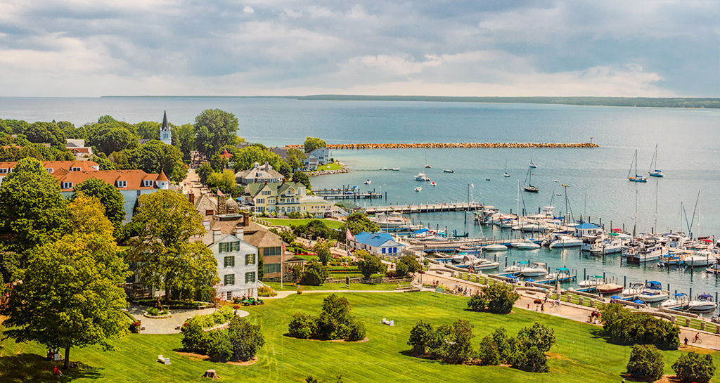
I like the "sense of community" that comes through in the image for me. You get the feeling that this is a relaxing, happy place - lots of friendly people. I think the warm tones and myriad of people walking along the shore line road, as well as inviting park land in the foreground all enhance that feeling.
It also reminds me of a scene one would see in a painting. I'm not generally a fan of such effects, but wondered if you'd considered what it would look like with a painterly effect.
Like others, I'm not a big fan of the current sky - both the "white space" which does look a bit blown out, and the clouds. I think you could do the panoramic crop someone suggested, but you need a little sky remaining as negative space given how busy the rest of the image is. An alternative would be to use the interesting portion of your sky and slide it down (drop another shifted version on top and mask in photoshop to just take the sky). I've attached my quick cut at that.
Lots to work with in this nice image.
|
Jun 7th |
 |
| 96 |
Jun 20 |
Comment |
The image brings back fond memories of past hikes in the Sierra Nevada mountains. I love the texture in the rocks, and the tonality overall. Seeing the color version that you posted, I agree that B&W was the way to go, and it does have a very Ansel Adams feel to it.
I'd love to see more waterfall - too bad you can't just turn the flow on when you are taking such an image. But if the waterfall is the major focus, there are probably ways to enhance its visual mass a little bit. I think you could crop the bottom - the shrubs are a little distracting to me, and I don't think you need as much of the rocks either. You also might also play with the tonality and clarity a bit to better bring emphasis to the fall - a little more front/back separation. Again, assuming that is the center piece you want.
Nice image in any case. And good for you for making the climb up there with the tripod. |
Jun 7th |
| 96 |
Jun 20 |
Comment |
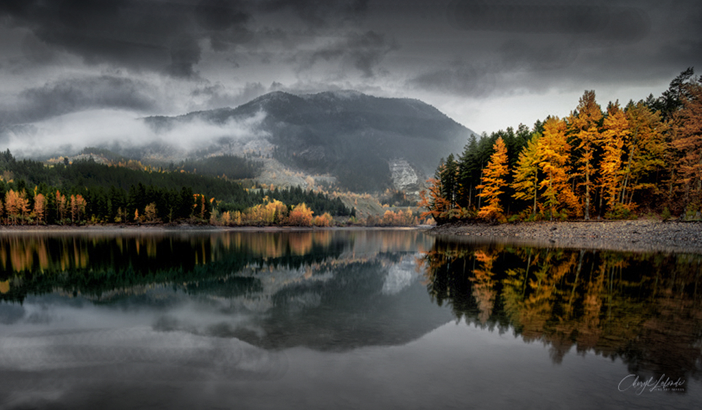
I think this is a beautiful image Cheryl, and I agree with your decision to trim the foreground. I too love the look of water covered rocks in the foreground, but agree they are a little bland here, and it creates a lot of empty mid-ground. I agree the color balance isn't quite right, but it is not uniform. The sky looks a bit purplish to me and the reflection of the sky greenish. I seem to run into this problem from time to time, which I gather is either something about the physics of the reflection, or me managing to create an imbalance in my processing.
My biggest comment though would be that the sky and bright trees seem to compete to be the center of the image. I sense from your comments that for you this is about the clouds, but somehow the trees don't want to give up the main stage. So, I'd actually surrender to them and make them the subject. I really like the diagonals created by the sloping tree lines on the left and right, as well as their mirrored reflections, so my own take would be to emphasize those. The mountain in the center interrupts that, so I'd seek a way to make it recede a bit in emphasis. I did a quick edit with that in mind. I played with exposure, dehaze, contrast, and saturation to emphasize the geometry of the tree line and lower the visual pull of the mountain and sky. I also cropped from the left so that the really dominant trees on the right were not so far proportionally to the side of the frame. Everything was heavy quick and heavy handed, so far from perfect.
It is such a wonderful image with lots of potential directions one can take it. So thanks for indulging me in trying something different. |
Jun 7th |
 |
4 comments - 4 replies for Group 96
|
4 comments - 4 replies Total
|


