|
| Group |
Round |
C/R |
Comment |
Date |
Image |
| 96 |
May 20 |
Reply |
I was thinking the chairs as the subject as well. It looks just like a little chair family enjoying the view! |
May 9th |
| 96 |
May 20 |
Comment |
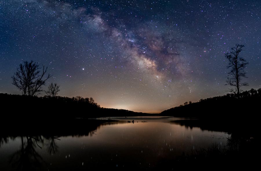
I really like astro landscapes - I'm jealous because I've never done them myself. I think this is a really nice shot.
For me, there are two things that might make this image even stronger. First, the reflections of the stars are a bit distracting to me right now because they appear brighter than the stars in the sky (probably because the moving water has spread them out and made them larger). They are also set against a darker background than the sky and there aren't that many of them - they almost look like big dust spots. The second thing is that my eye is drawn to the light pollution on the horizon more than the milky way - I think this is partly because it is brighter, and partly because the yellow color is a stronger complement to the blue sky.
I played around as follows. I cloned out the reflected stars and then brought them back in a little so they are more diffuse reflections. Then adjusted the tone and saturation of the light pollution to be more consistent with the pinks of the milky way. I saturated the milky way a bit more to further enhance it as the center of interest, and then I cropped the bottom which seemed very dark.
Just some thoughts. It is a nice image either way.
|
May 9th |
 |
| 96 |
May 20 |
Comment |
I think the image is very nice! I don't think the color in the original adds much, so I'd second your decision to bring it to black and white. I think that allows the drama of the stormy conditions to come out better as well. I'm generally not a fan of square format, but I think it works well here. The reflection of the building structure feels a little tight to the bottom of the frame to me, but probably personal preference.
I really like the light coming from the windows - it hints at something more warm and sheltered in contrast to the threatening storm outside. I wonder if that sense couldn't be enhanced further - brightening the lit windows as much as possible and perhaps darkening the highlights in the scene otherwise to bring out that contrast. |
May 9th |
| 96 |
May 20 |
Reply |
Thank you Cheryl - I think you've hit on the solution! I like your crop with the cloning of the sky very much indeed. I think you are right that the dark trunk is such a dominant element that having it cut off by the upper edge doesn't work. I think that is one of the things that was bothering me, but I hadn't been able to identify it. Creating the additional breathing room above it, while using cloning to eliminate the distracting sky is an option I had not considered. I'm still figuring out how far i'm willing to go in altering a photo, but in this case I think it gives the photo balance and helps bring out the mood I'm after. |
May 9th |
| 96 |
May 20 |
Reply |
Thanks Stephen. Yes, I like that better than the original. There is always something magical about 3 vs. 2 though. So, I've fought cutting out the third tree. |
May 9th |
| 96 |
May 20 |
Reply |
Thanks Larry. Others have also told me they like the original as well. But my eye keeps getting stuck on the sky. So I've tried all kind of ways to cut that out. |
May 9th |
2 comments - 4 replies for Group 96
|
2 comments - 4 replies Total
|


