|
| Group |
Round |
C/R |
Comment |
Date |
Image |
| 24 |
Jun 21 |
Comment |
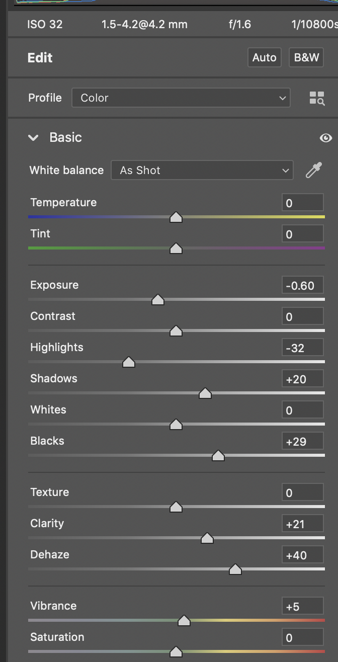
Here are the basic PS adjustments. I prefer these tonal results. Tab |
Jun 23rd |
 |
| 24 |
Jun 21 |
Comment |
Steve, I like this image. It presents a unique situation to me. I think Jim's approach does improve the image, making the composition stronger. My primary concern is with the color. This is a hot image and I think things can be done to bring the color under control. I took Jim's product and took it into PS. I captured my adjustments and am including them as well. Tab |
Jun 23rd |
 |
| 24 |
Jun 21 |
Comment |
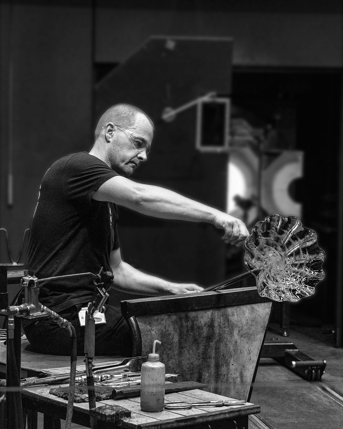
Sam, Very well done. I take your word on the detail being preservrd. I know that often when I have to downsize the file the character of the image can change quite a bit. Your interest in getting more pop might be achieved by doing a color select & mask and applying a curve adjustment to just the foliage. If you drop its luminosity a bit the main characters may pop like you would like.
Tab |
Jun 23rd |
| 24 |
Jun 21 |
Comment |
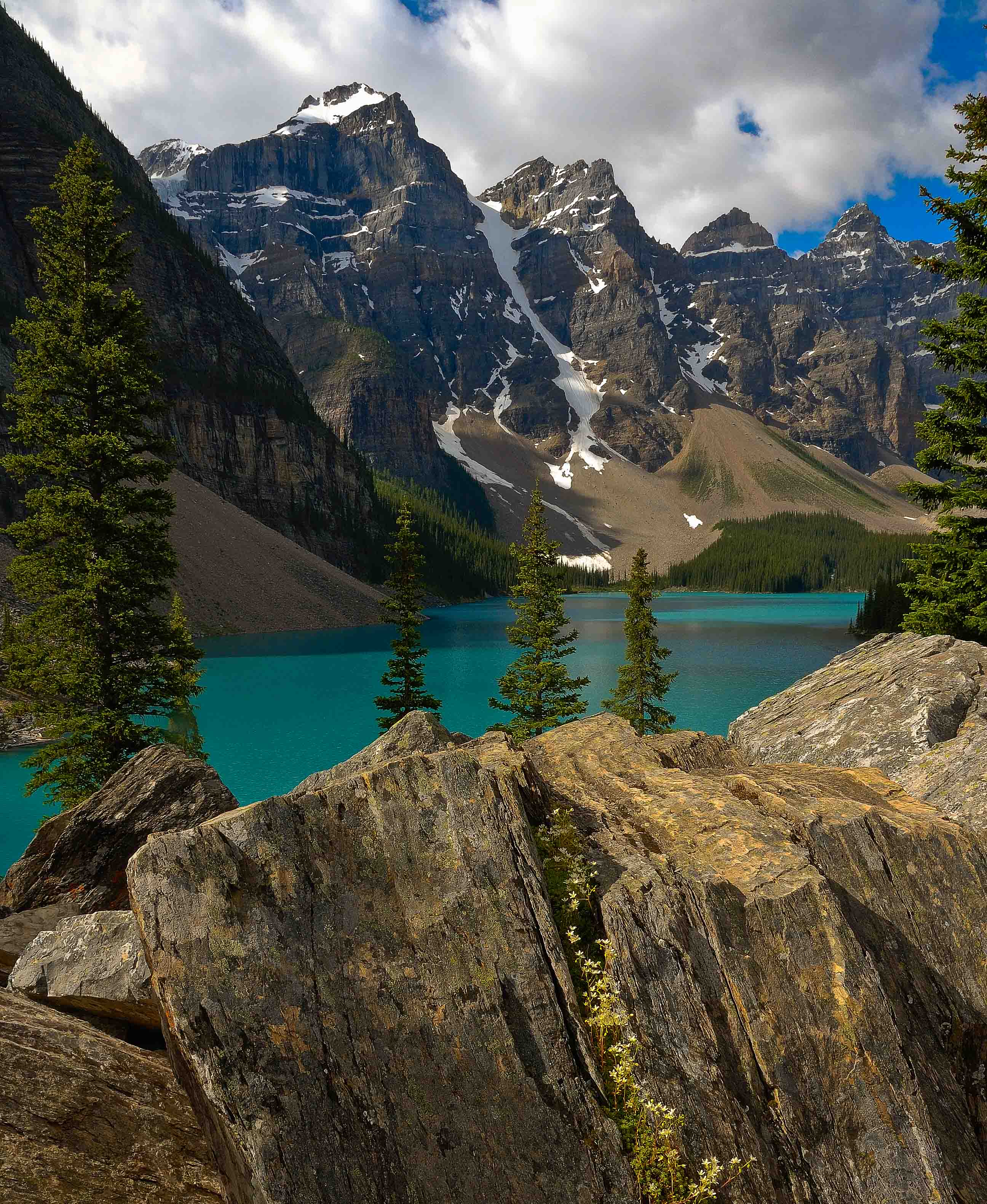
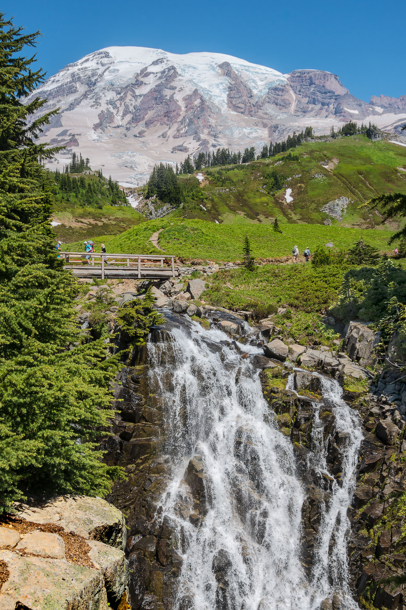
Nice image Jim. I like the detail and shading in the sails. Not clear to me how the tone down on the ring ends up. Smoke needs to be white here. If it goes gray may be more of a problem. Probably have to play to see how it ends up.
Tab |
Jun 23rd |
| 24 |
Jun 21 |
Comment |
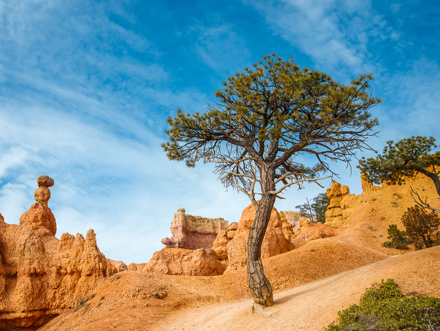
Hi Bob,
Good to hear from you. I will have to start checking your site to see some good images. I see your point on the crop and the tree darkening. Thanks!!
|
Jun 6th |
5 comments - 0 replies for Group 24
|
5 comments - 0 replies Total
|