|
| Group |
Round |
C/R |
Comment |
Date |
Image |
| 24 |
Feb 21 |
Comment |
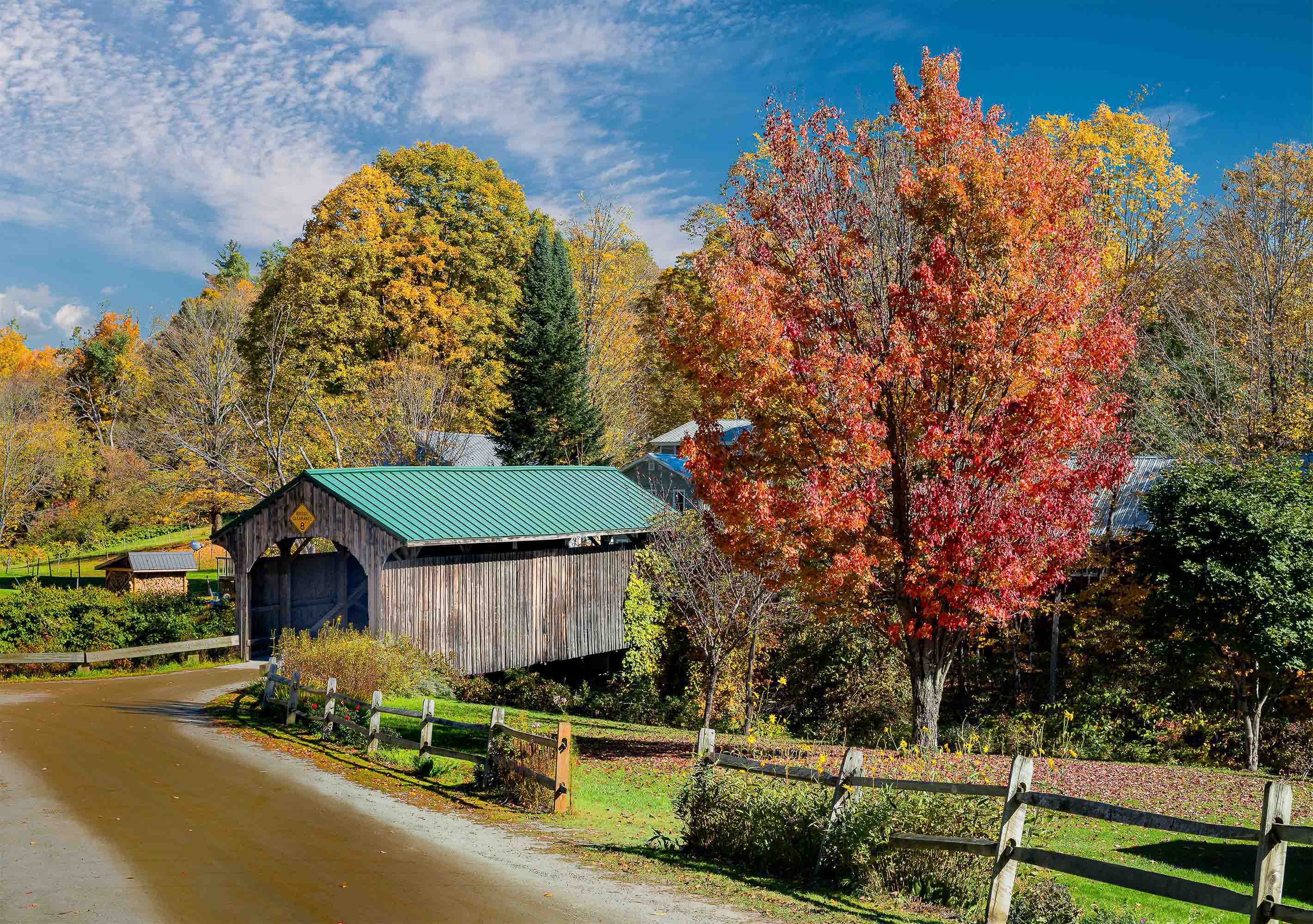
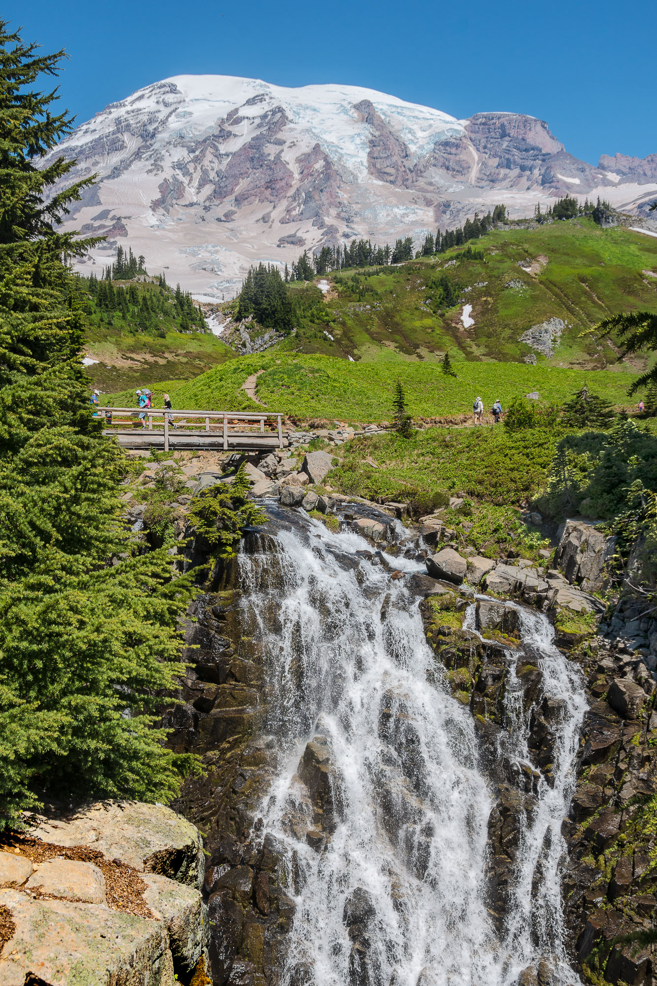
Albert, I like your original composition the best. It could be cropped up from the bottom just a bit. I like how Jim enhanced the rainbow. In your final version the sky becomes much too dominant, taking up almost half the real estate. To me this is an image about the rainbow and the canyon and not the sky. However, I do like the way you have pulled the detail of the clouds out, but they have gone too blue for me. Moody upwelling storms are more neutral as in Orig 2. Some tint may work but this one is too heavy for me. Tab |
Feb 13th |
| 24 |
Feb 21 |
Comment |
Sam, The water droplets along with backlight introduce drama into the image. Getting rid ov the background was an important step and you did that well. However, I agree with Jim that this image needs to have all three nelements in sharp focus. Jim indicated using different focal lengths from the same position, but I think he meant to say three separate focus points from the same location. Those three images could be focus stacked in PS and they would produce an image in which all three tulips and their droplets would sparkle. I would also use some fill light on the front side. You could use a white piece of mat board, or a fill flash set very low to clean up the shadow colors. Right now they appear very muddy. Tab
|
Feb 13th |
| 24 |
Feb 21 |
Comment |
Steve, Nice capture!!! For a nature shot PSA judges are always looking for a story telling aspect to the image, and I think you have that here. I agree with you, do not amputate the shadow of the RH bird. Giving more space on the left is a good idea as well. From a compositional PoV I would crop some, probably from the bottom to take the separation line between sand & water away from the middle. I like reducing the sand area some because it is bright and visually detracts from the birds. 1/3 sand 2/3 water or something like that. Once you have a balance that pleases you visually, set the LH crop so the bird lies on a diagonal bisector from either the upper or lower corner. You have handled the dynamic range quite well for such an extreme setting of B & W birds in the bright sunlight. Tab |
Feb 12th |
| 24 |
Feb 21 |
Comment |
Laura, Nice capture!! I like the color version better. To me the BW is too heavy. I do like the effect of the additional light that Jim has introduced on the floor, it provides more balance to the image and gives it more life. However, I would prevent the brightening effect from changing the central portion of the clock opening by masking that area. I like the contrast and richer coloration of the town, fields and clouds. Tab |
Feb 11th |
| 24 |
Feb 21 |
Reply |
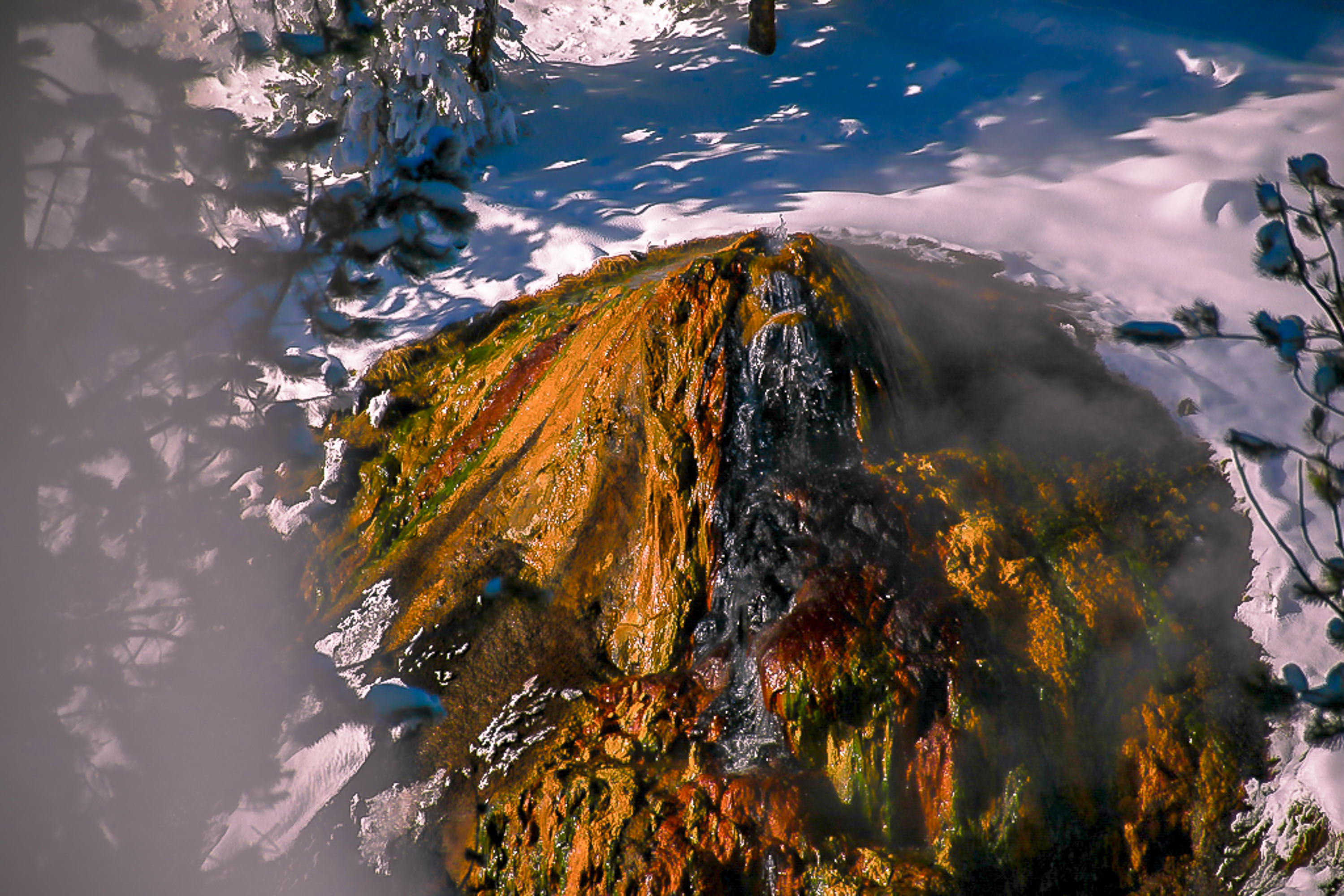
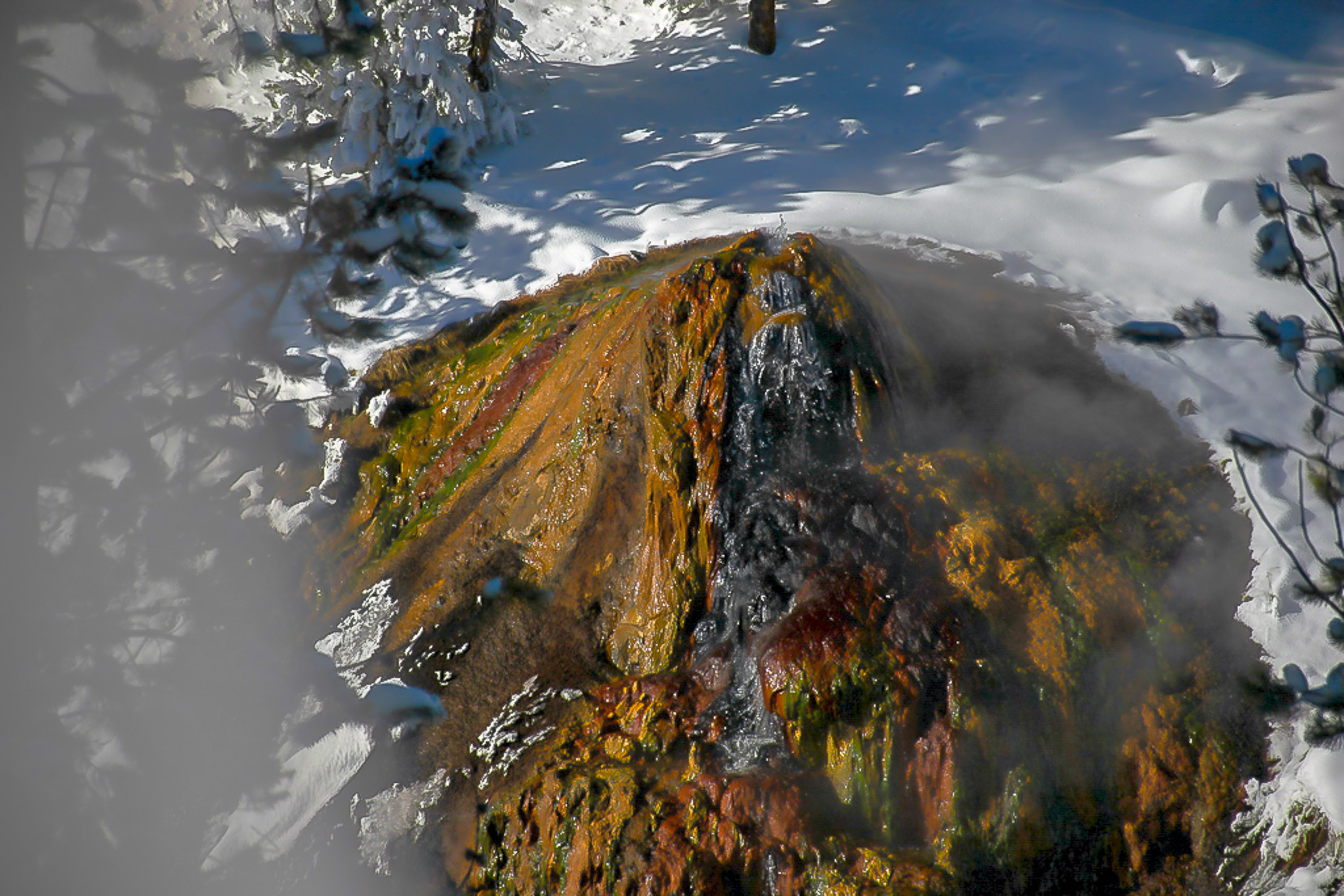
Tint is gone, thermopile is bright! |
Feb 8th |
 |
| 24 |
Feb 21 |
Comment |
Jim, I think this image in BW is a stunner. In color it is not as strong. The textures are outstanding. Composition is just right. This would make a fantastic print. Tab |
Feb 8th |
| 24 |
Feb 21 |
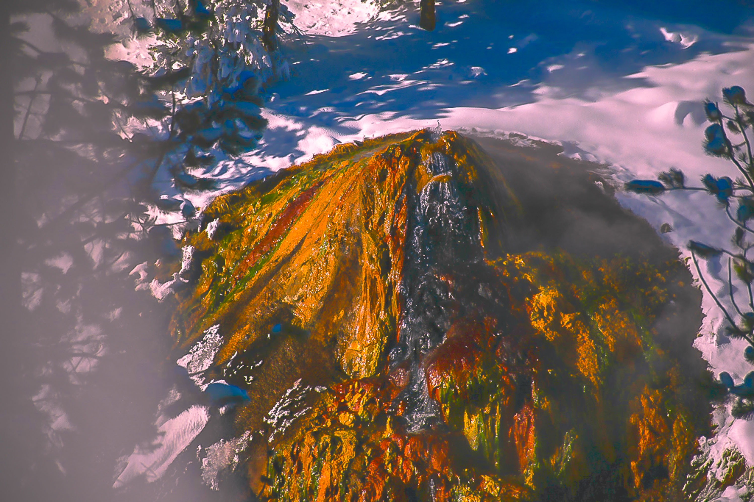
Reply |
OOPs, I may have made the snow tint some. That can be masked out. Tab |
Feb 8th |
| 24 |
Feb 21 |
Reply |
Thorro, We can bring those rich colors back by using a luminosity mask for one of the levels that will concentrate on the areas that concern you, then applying curves or saturation on those regions that the mask will allow, and presto they will be better than even before my messing around. We could even try building a mask on the specific hue that you want to enhance. I tried a quick play with a luminosity mask and then used color adjustments to go after the red/orange area of the color map, don't know if that hits the target you were after. Hope I didn't push those colors up in some unexpected places. If so I could go back and adjust the mask. Tab |
Feb 8th |
 |
| 24 |
Feb 21 |
Comment |
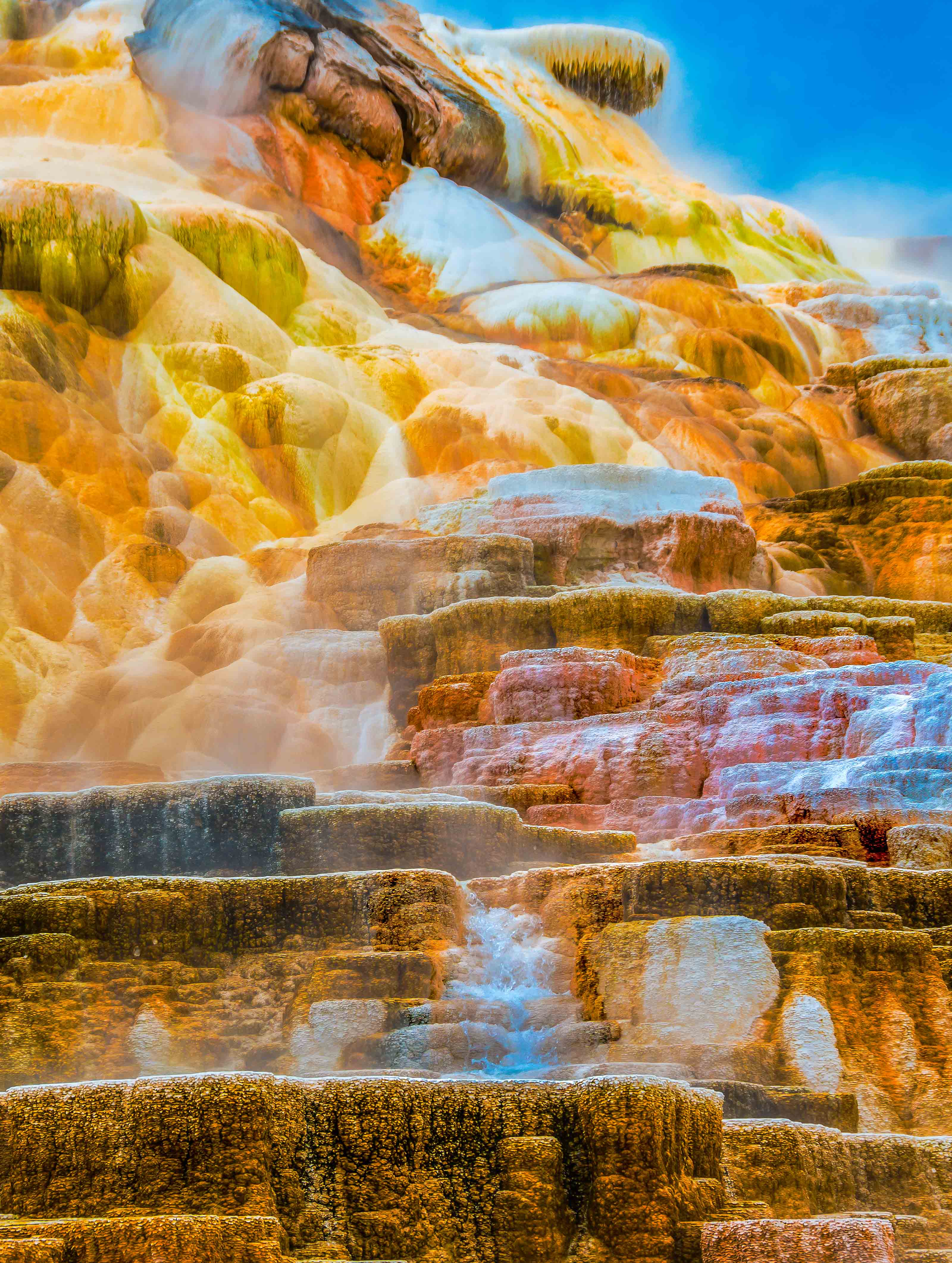
Thorro, This is a tough shot. Not clear how I might have handled it myself. I think Jim's comments are good and your last edit is the best. The issue is such high dynamic range giving very deep shadows on the thermopile. I tried to see if I could bring something out in that area. I took your original into PS and used ACR to develop the image to balance out the histogram, set back the highlights to preserve snow detail and give separation to the steam. I then used a luminosity mask to work the shadow level, not clear if it is any better. Tab |
Feb 8th |
 |
6 comments - 3 replies for Group 24
|
6 comments - 3 replies Total
|