|
| Group |
Round |
C/R |
Comment |
Date |
Image |
| 24 |
Jan 21 |
Comment |
Albert, Welcome to our group! Nice image, but I do agree with Jim that it gains interest when you build the composition on a center of interest. The other thing that can add interest is contrast. As it stands in your original edit there is a lot of white on white. If you can find a viewing angle that puts more dark tones in the background you get a lot more pop on the feathers and that grabs the eye.
I note that you are almost a neighbor as we live in Groton MA, and I still work part time in Lexington at Lincoln Laboratory. Perhaps when this C-19 is behind us we can get together and swap photo stories. I also teach some for our club, the Nashoba Valley Photographic Club (NVPC). If you get too stir crazy give me call at 978-449-0263, or send me an e-mail, the_tabs@verizon.net.
Tab |
Jan 19th |
| 24 |
Jan 21 |
Reply |
Thorro, I liked your comment, and it set me thinking. See my comment and edit to Steve below. Tab |
Jan 18th |
| 24 |
Jan 21 |
Comment |
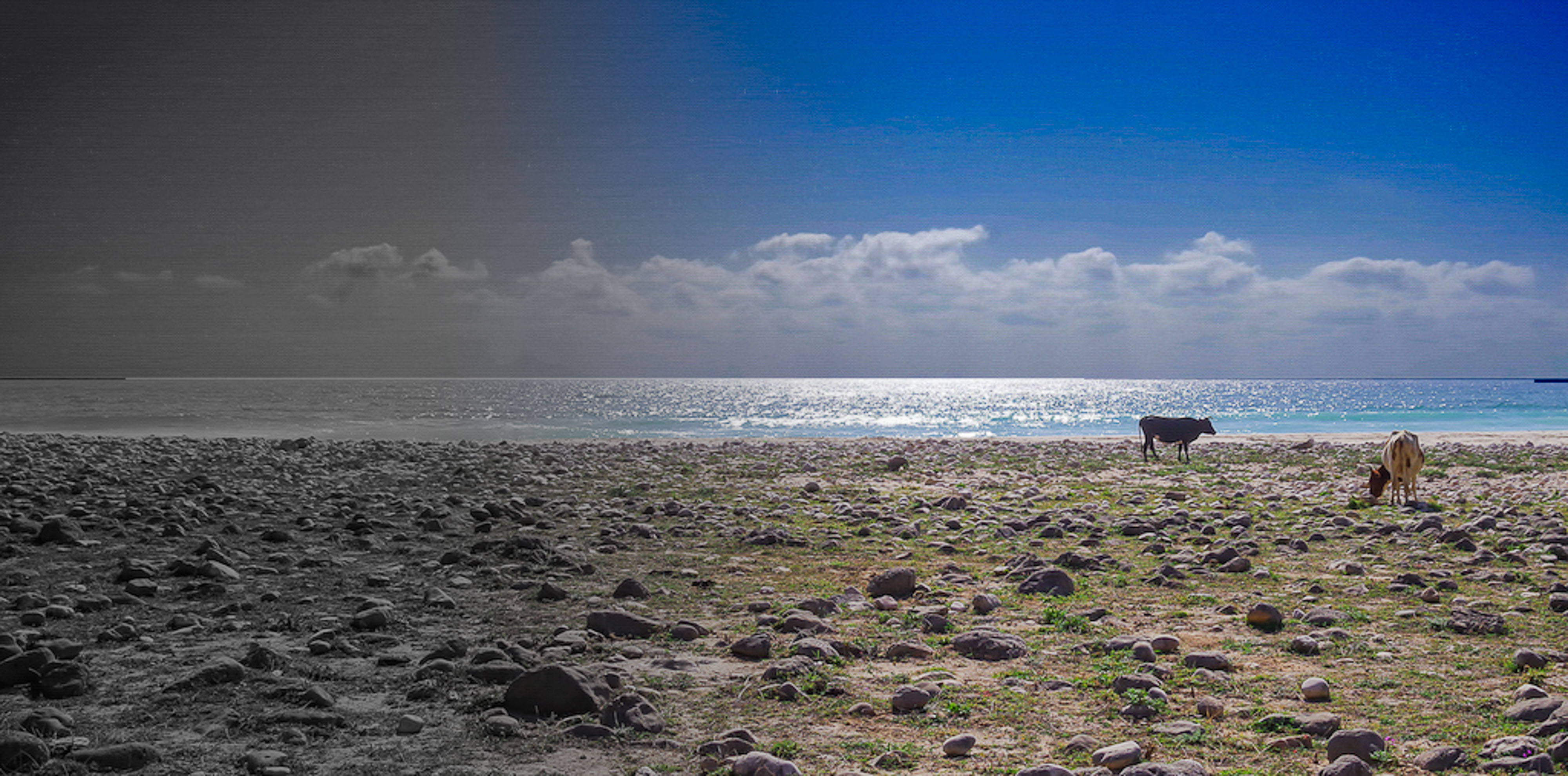
Steve, Interesting concept. As it stands I would never have picked up that the great empty left symbolically represents the past, and so I think it needs help. But first about the optimism for the future. As I primarily shoot landscapes I can never let a beautiful sky languish. So I selected everything above the horizon and applied a curves adjustment to bring out the glory of the clouds. There is texture and color there that needs to be exploited. That gives even more focus on the bright shining sea. Then I thought about the past. As Thorro said, he wanted to represent a fade out of the past. That could be done in many ways. I chose to use a saturation adjustment layer with a gradient mask to reduce the desaturation effect as we come to the right into the present and head to the future. Now when I view the image you figuratively give me a slap on the forehead so my mind is engaged in the riddle re the significance of the left hand side. This is just my first cut thinking on this. The message you wish to convey intrigues me and I will have to play with this in my mind to see how I might really want to have it come out. Tab |
Jan 18th |
 |
| 24 |
Jan 21 |
Comment |
Sam, Great image and derivation. I have never thought about going off in this direction with an image. I am sure the variations are endless. One could even go off into a psychedelic space with all sorts of color contrasts. The composition here is simple enough that I'll bet the original color version is quite striking as well. Tab |
Jan 18th |
| 24 |
Jan 21 |
Comment |
Laura, You did a nice job of balancing the tones, however, Your crop takes away what makes the image interesting to me. I would staighten the stone corner of the building crop a bit from left and bottom. I would also try and bring in a bit more detail in the fence area with a luminosity filter to give the image more depth. I think such a version would be a nice image to use in a Glasgow travel piece. If you place an object in her hand or a few people fleeing down the street it fits the creative genre. Tab |
Jan 17th |
 |
| 24 |
Jan 21 |
Comment |
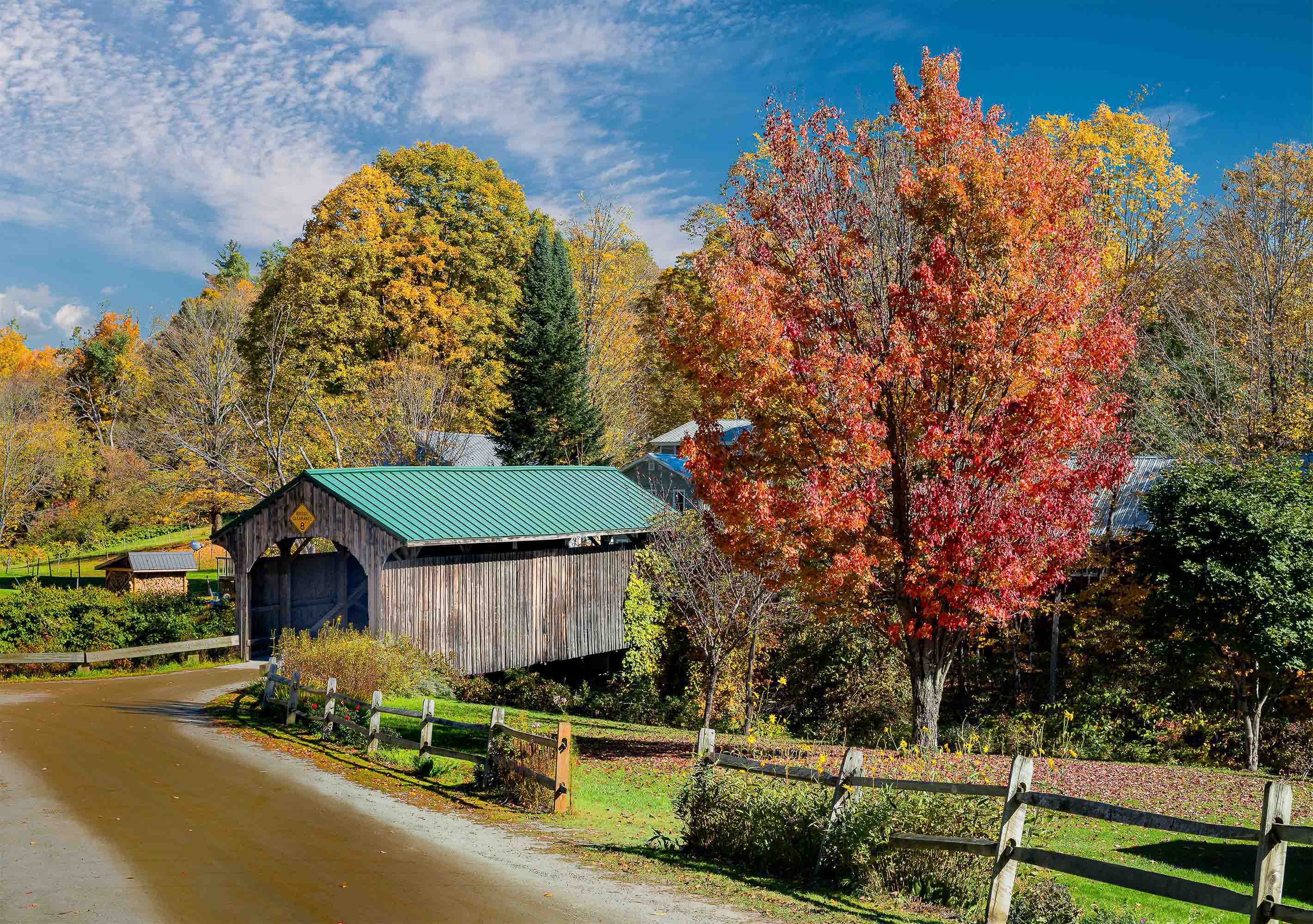
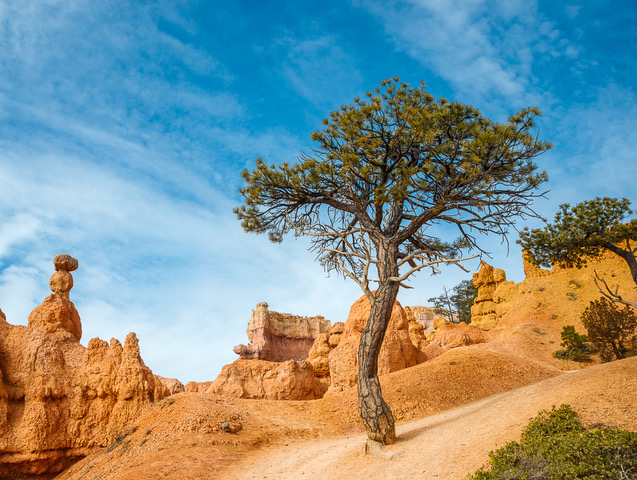
Thorro, Your last edit looks the best to my eye. I like the image. I think it captures your intent of the wide open spaces. Your idea re the two different possible interpretations of the scene is a valid one. That is why I advocate working the scene. Take 25 images from different locations with different lenses. You can throw away the 23 that don't work. I wonder what you would see if you walked down the road to the right, looking back at your lone tree and its reflection along with a view of the peak near the edge of the image. Perhaps a tele could compress that scene into an interesting vertical conveying the impression of Mountains. But then again maybe you find the pond obscured by some tall bushes. Don't know until you try. Tab |
Jan 16th |
| 24 |
Jan 21 |
Comment |
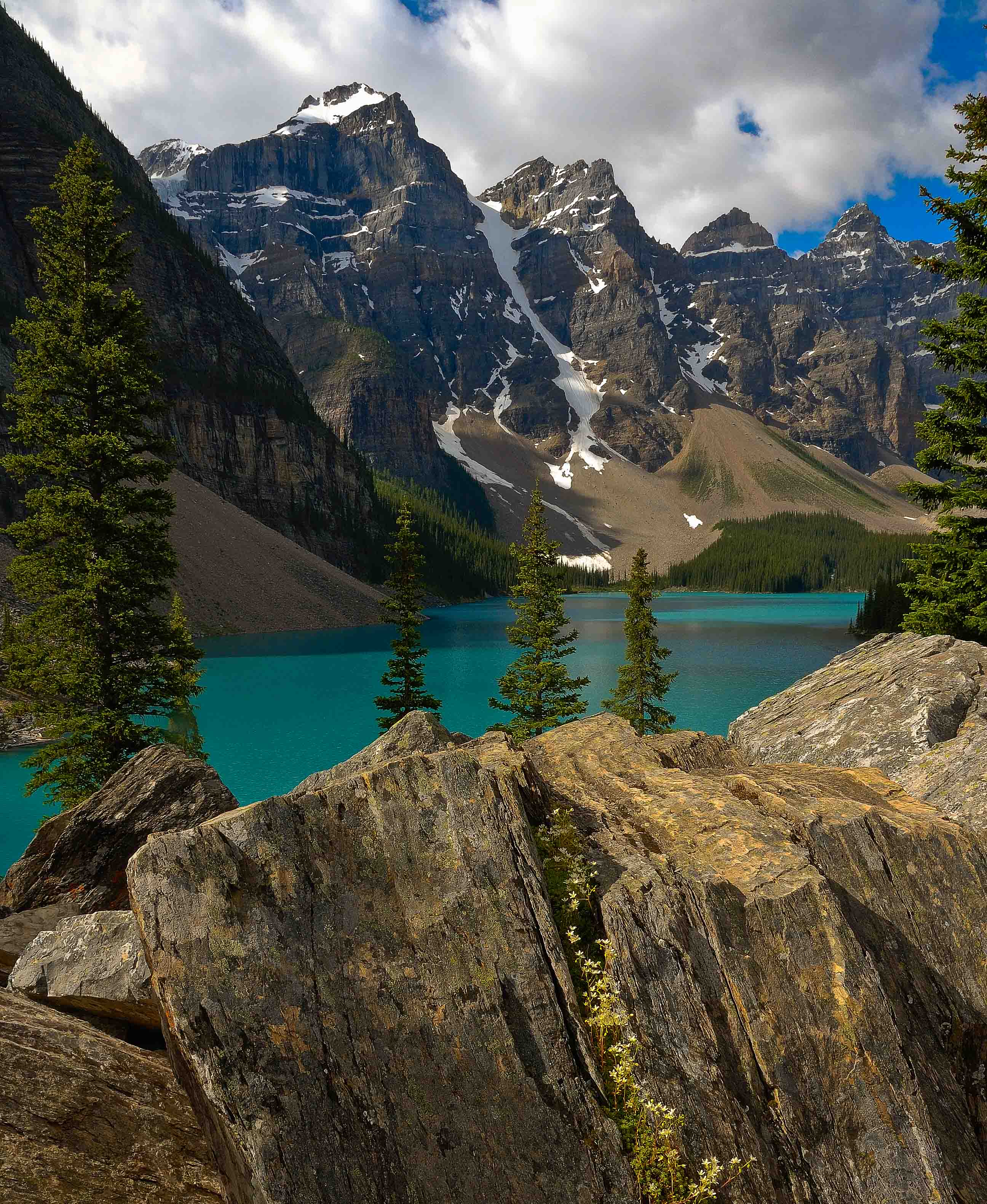
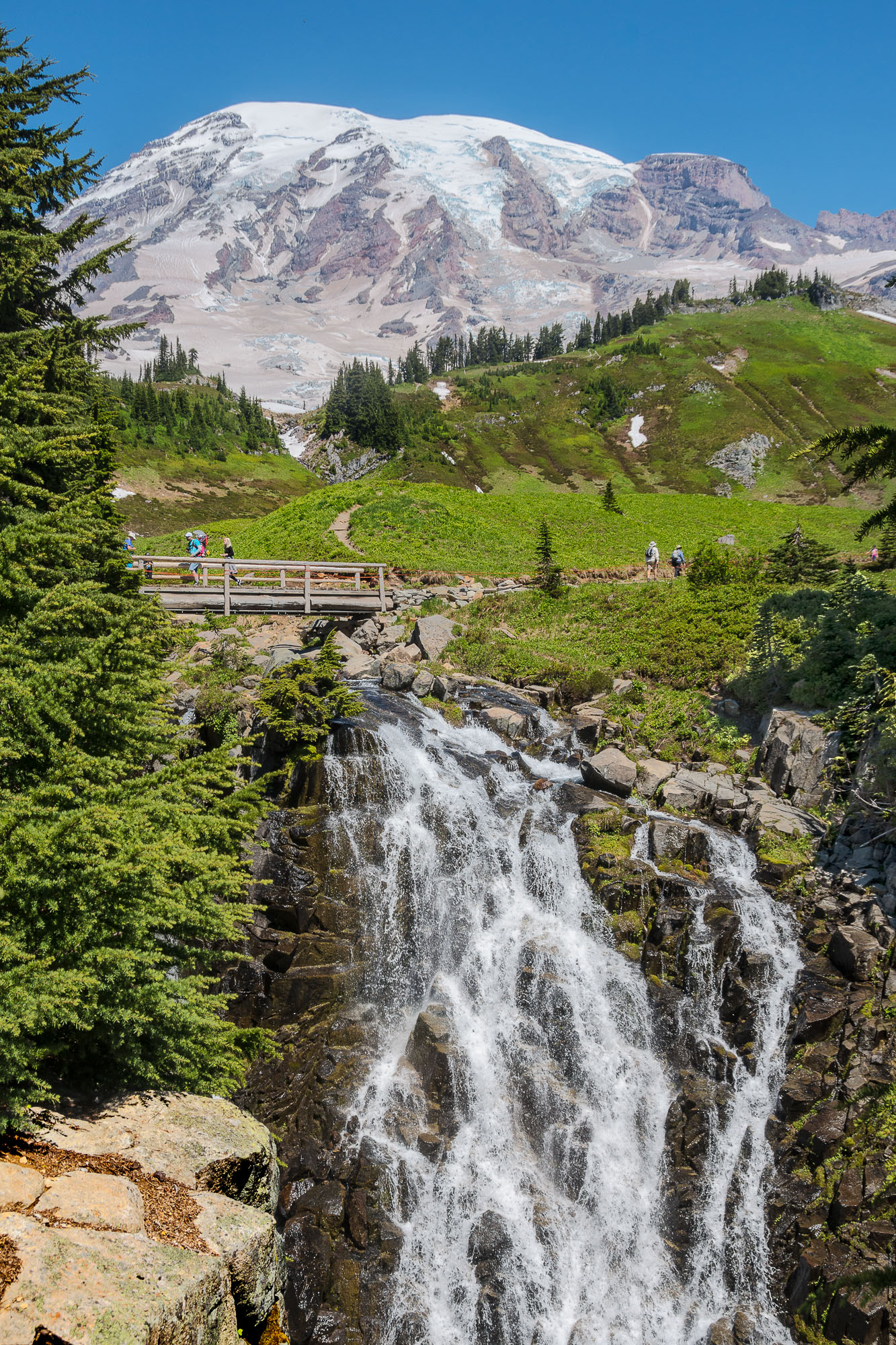
Jim, This is a fabulous image. I am surprised with only 840mm that so much detail could be captured, especially at such a low elevation angle. I am happy that you did enter this image. It has got me thinking about trying some astral photography. I would not have guessed that with our equipment such a result was possible. Thanks for the inspiration. Tab |
Jan 16th |
| 24 |
Jan 21 |
Reply |
Good comments. The sky is black!! Five years ago I did lots of very dark skies. I was harkening back to my BW film days and the red filter that I loved so much. If I were to do this one again today I would have a lighter sky, but it would still be darker than most folks would print it, sort of half way between the red and yellow (K2) filter effects. The print I made sits in a brilliant white mat and so does not suffer a surround merge problem. Sharpness here stems from the use of a tripod and a high shutter spreed. That particular lens is also very sharp for a Nikon mid price zoom. That lens also goes into macro mode. Tab |
Jan 9th |
6 comments - 2 replies for Group 24
|
6 comments - 2 replies Total
|