|
| Group |
Round |
C/R |
Comment |
Date |
Image |
| 24 |
Dec 20 |
Reply |
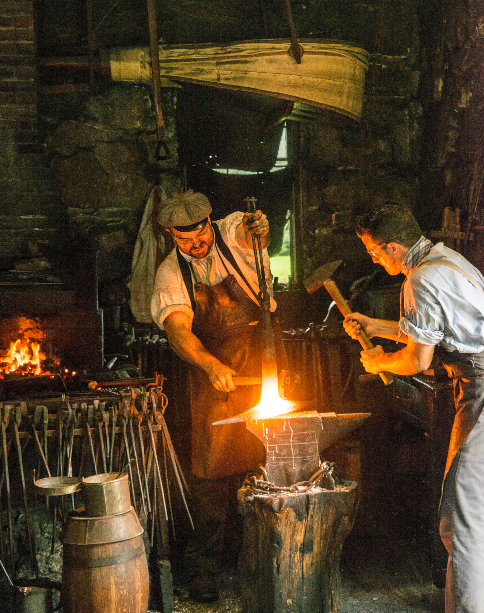
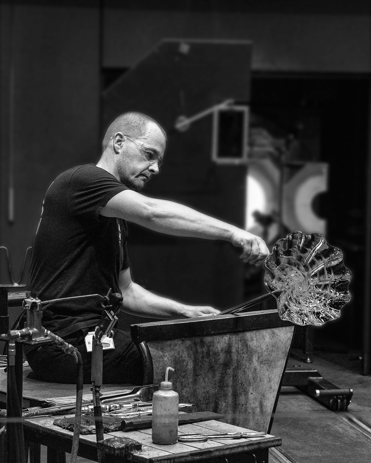
Laura, I like what you have done and it is certainly a valid interpretation of the situation. They are two different images and I like them both for what they are. In your version it is "less is more" and the focus is on the two men working together and your interpretation makes that case. I also like the window treatment. However, for me it loses the grittiness and ambience of the place. The fire place was something I felt was necessary to build that sense of place, as well as the bellows above the two smithies (when I am there again I will try to get an image where the fire is not so close to the edge). Larry's suggestion to darken the bellows would be an improvement. Thanks for your input I think the exchange of ideas is great.
Tab |
Dec 29th |
| 24 |
Dec 20 |
Comment |
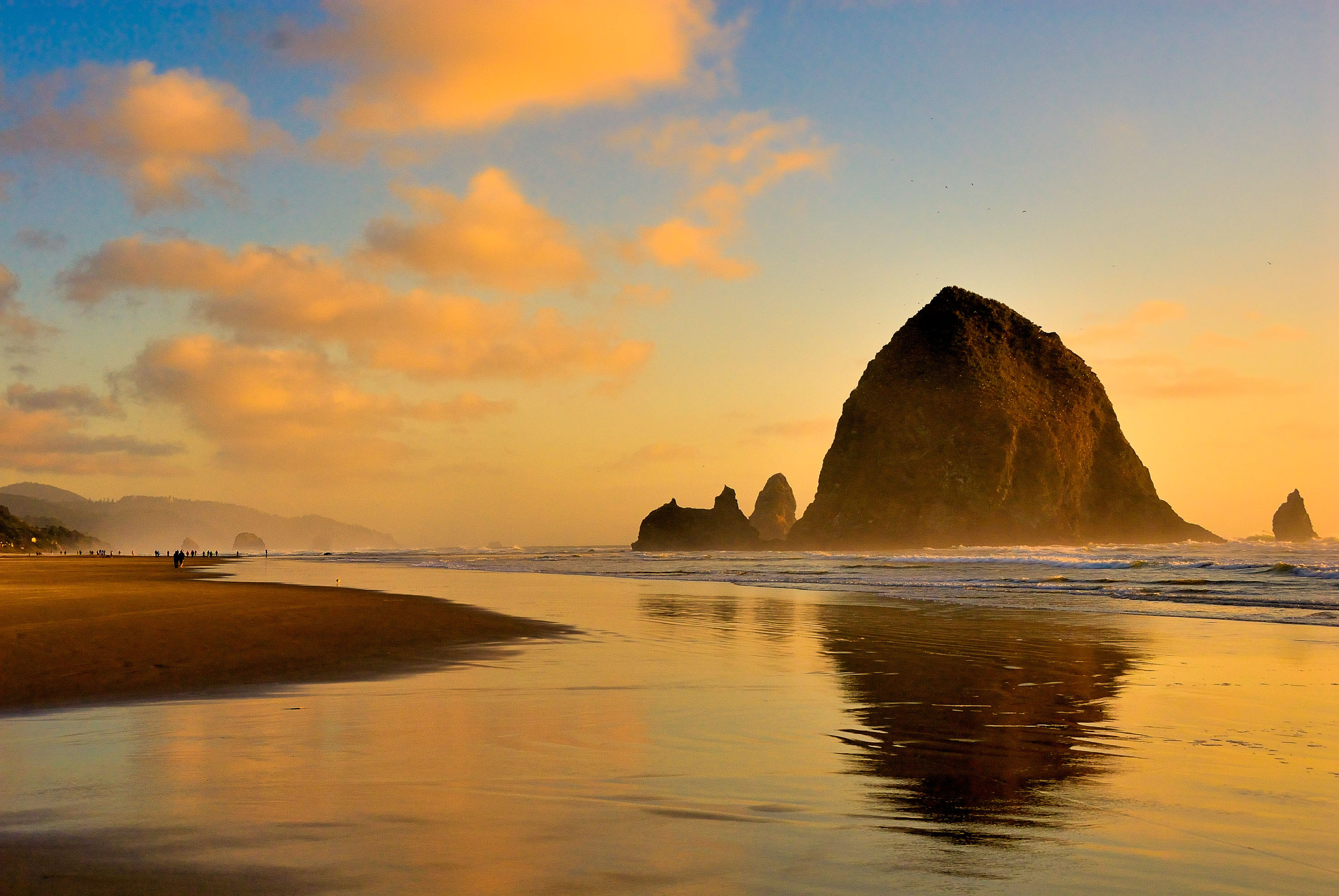
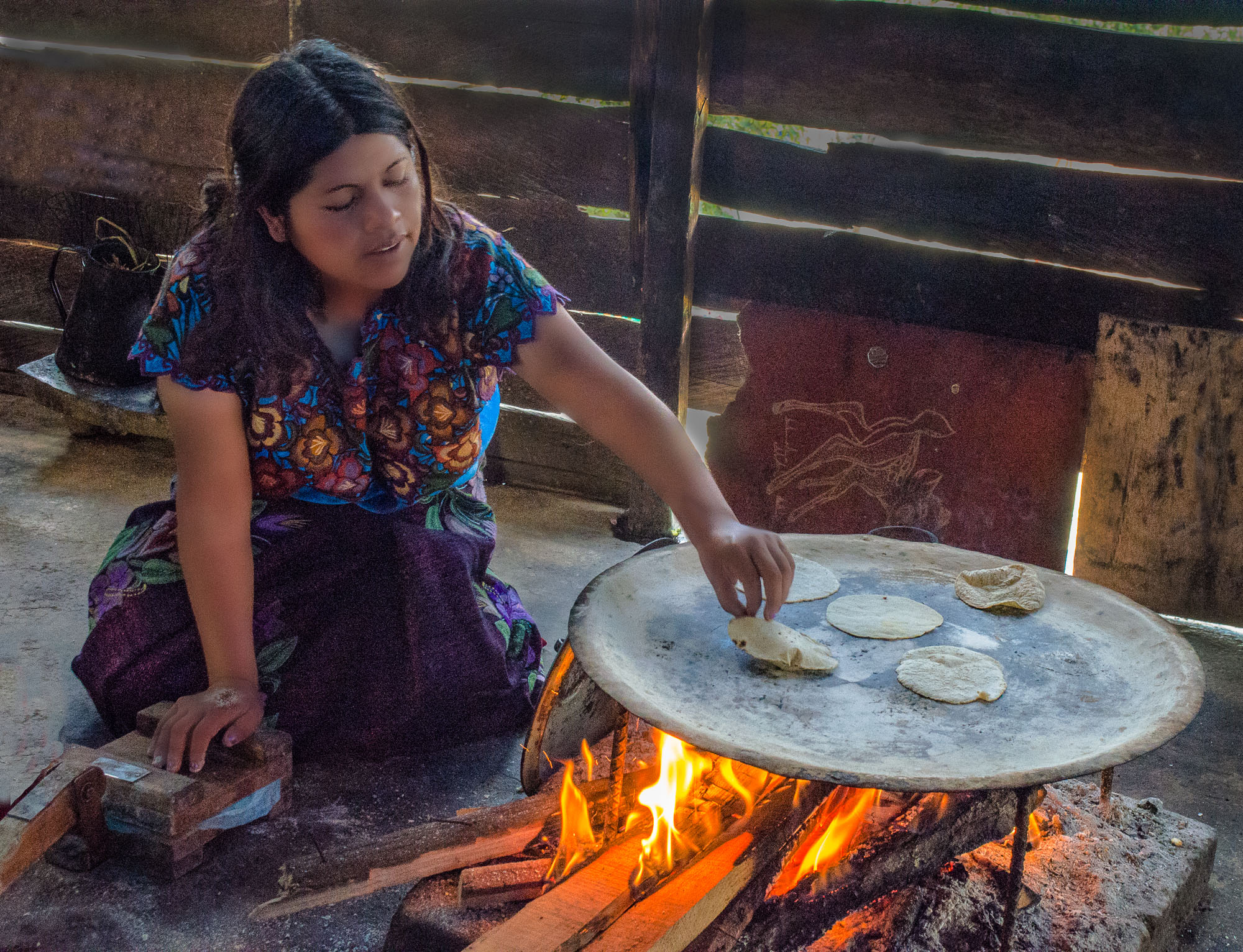
Thorro,
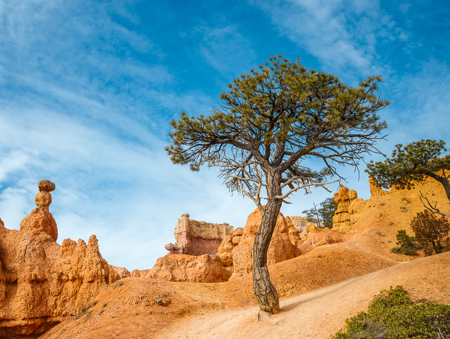
Super image!! The rock texture is well done. I think the woman is essential for this composition, providing scale, balance, and interest. I also like the string of bushes at the lower right. I wonder if flipping the image right to left makes it a stronger composition, with the bushes giving you a leading line in from the lower left. Very nicely done.
Tab |
Dec 20th |
| 24 |
Dec 20 |
Comment |
Sam,
I like the idea you are attempting to visualize here. I feel the boy is too close to the LH margin. You need a bigger deck to get him onto the diagonal. I do like the BW for this image. You did a fantastic job in bringing out the detail in the boy's image.
Tab |
Dec 20th |
| 24 |
Dec 20 |
Comment |
Yes --- Much better!! Tab |
Dec 9th |
| 24 |
Dec 20 |
Comment |
Good seeing Laura!! I think your crop is right on, and the way you brought the red of the door to life is critical to making the image glow. The way you brightened the interior that we view through the glass was also very well done, and enhances the image. You did an excellent job of replacing the bright archway at lower left, but I wonder how the composition might look if you made it a darker tone of the wall color. Tab |
Dec 9th |
| 24 |
Dec 20 |
Comment |
Great image Steve!! Love the texture in the feathers and sharpness at the eye and head. The background is excellent, very smooth with a tone and hue that accent the warbler's color. His pose with the feather fan out makes this standout. One nit, if you had something close to this pose but with the left eye not obscured by the leg, it would be a show stopper. Tab |
Dec 9th |
| 24 |
Dec 20 |
Comment |
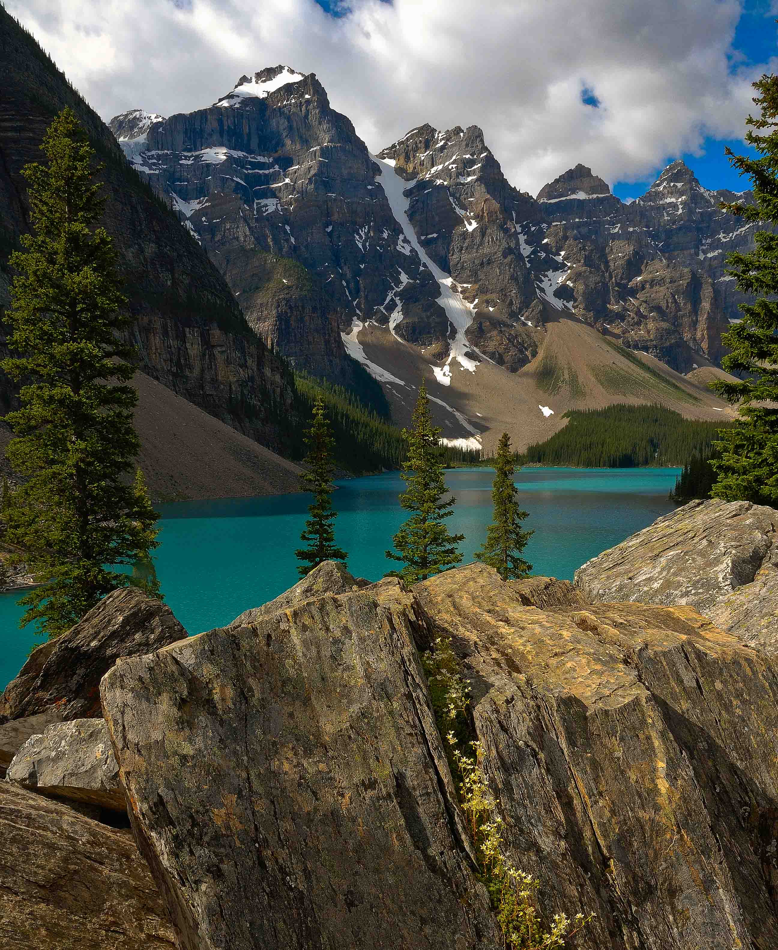
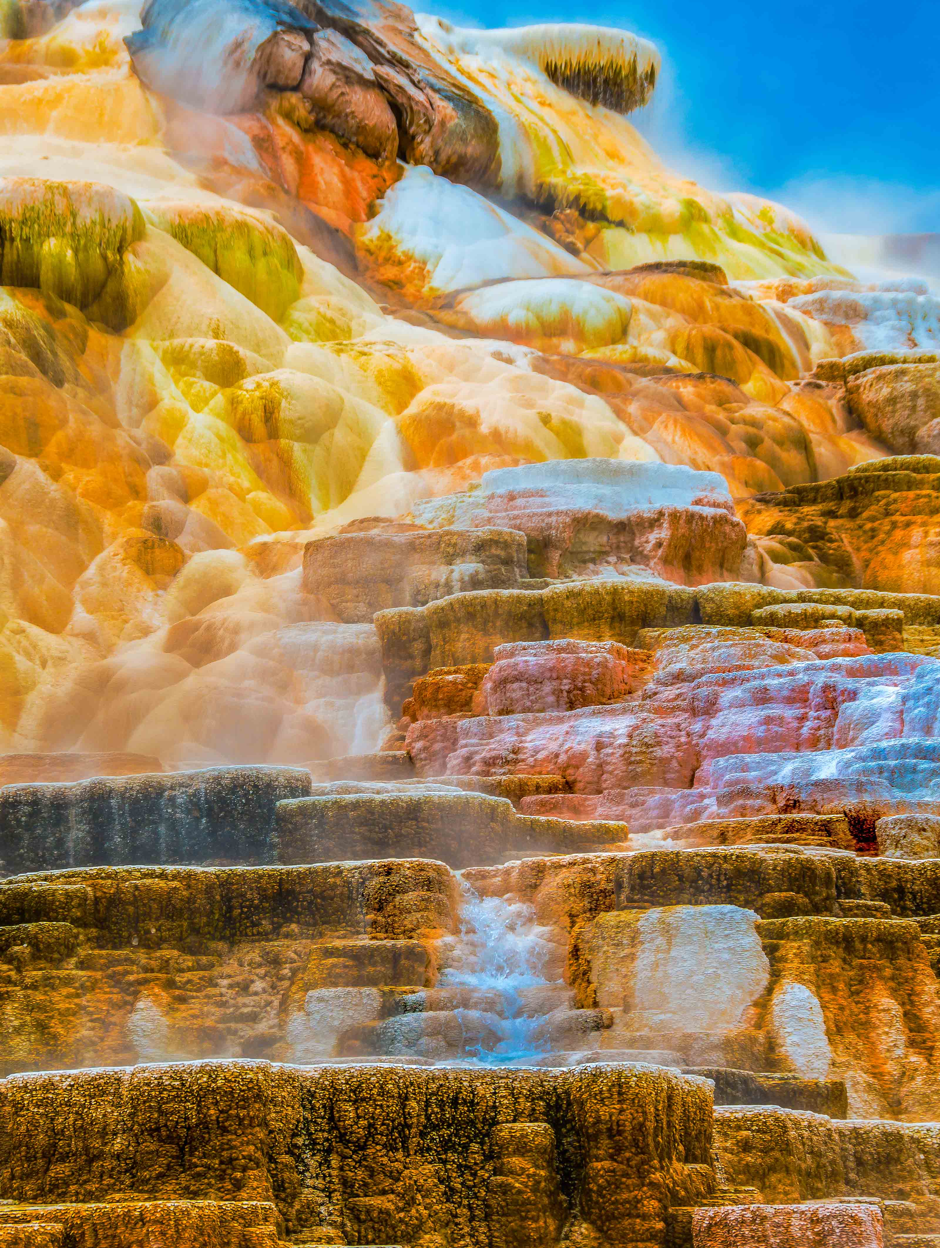
Jim, I like the scene, and I do think the reds in v2 make the image more striking. However, it seems to me the rocks in both v1 &2 are some what hot and lacking in texture. Thorro's rocks are more to my liking. Given the difference in luminosity between rocks and leaves I think a luminosity mask could help you get a good compromise including both effects. If I get a chance I may play with it. Tab |
Dec 9th |
6 comments - 1 reply for Group 24
|
6 comments - 1 reply Total
|