|
| Group |
Round |
C/R |
Comment |
Date |
Image |
| 24 |
Jul 20 |
Comment |
Jim,
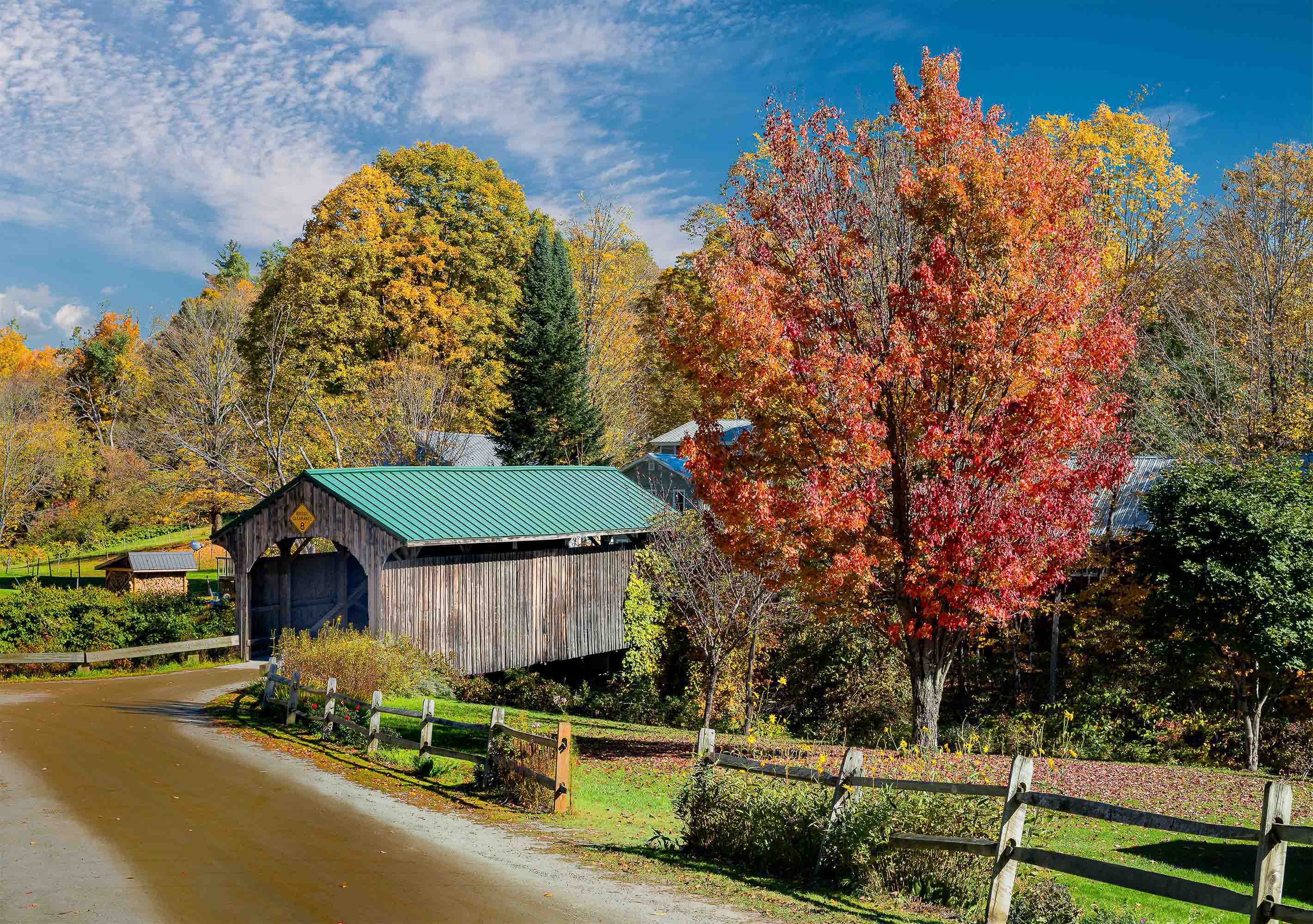
You have a great idea here, and there are good suggestions from Donna, Laura and Sam. I do think it can get better! First, the sky it is fantastic leave it alone. Second, the water....I would go with a luminosity mask and pick some degree of lightness. I would then have to play to see what the right tool is. Perhaps color adjustment, maybe something heavier like a color brush. I think the last version above takes the water too dark, and the one above it does not have enough hue added. Third, the mid layer in these last four versions is too dark. Too much negative space cutting the image in half. The trees need some degree of detail, not much, but some. A walk in the woods in late afternoon or early evening could solve that problem. Orig 3 has trees with some detail and that is good, but I do prefer the more imposing profile of the other tree layer you have in there. The blue halo that Laura commented on should be easy to eliminate. Use color select on the tree layer and it should give you a clean separation. I would never erase the sky, I always use a layer mask because it is non-destructive, and I can always go back to the layered composition to improve it. That way mistakes are never irrevocable.
Tab |
Jul 24th |
| 24 |
Jul 20 |
Comment |
Donna, You have a good start here. Laura's comment re the close crop on the bottom is something I agree with. I feel you need to make the seed bunch pop. Right now the image is too flat for me. I believe that is the intent of Sam's comment. However, I think a vignette would not be strong enough. I think you could do a select on the seed bundle, invert it and apply a curves adj to darken the entire background. I did a quick shot at that so it is crude, and starting with a JPEG imposes severe limits on what one can do. So look at my edit from the POV of tonal balance and ignore the artifacts. |
Jul 22nd |
 |
| 24 |
Jul 20 |
Comment |
Laura,
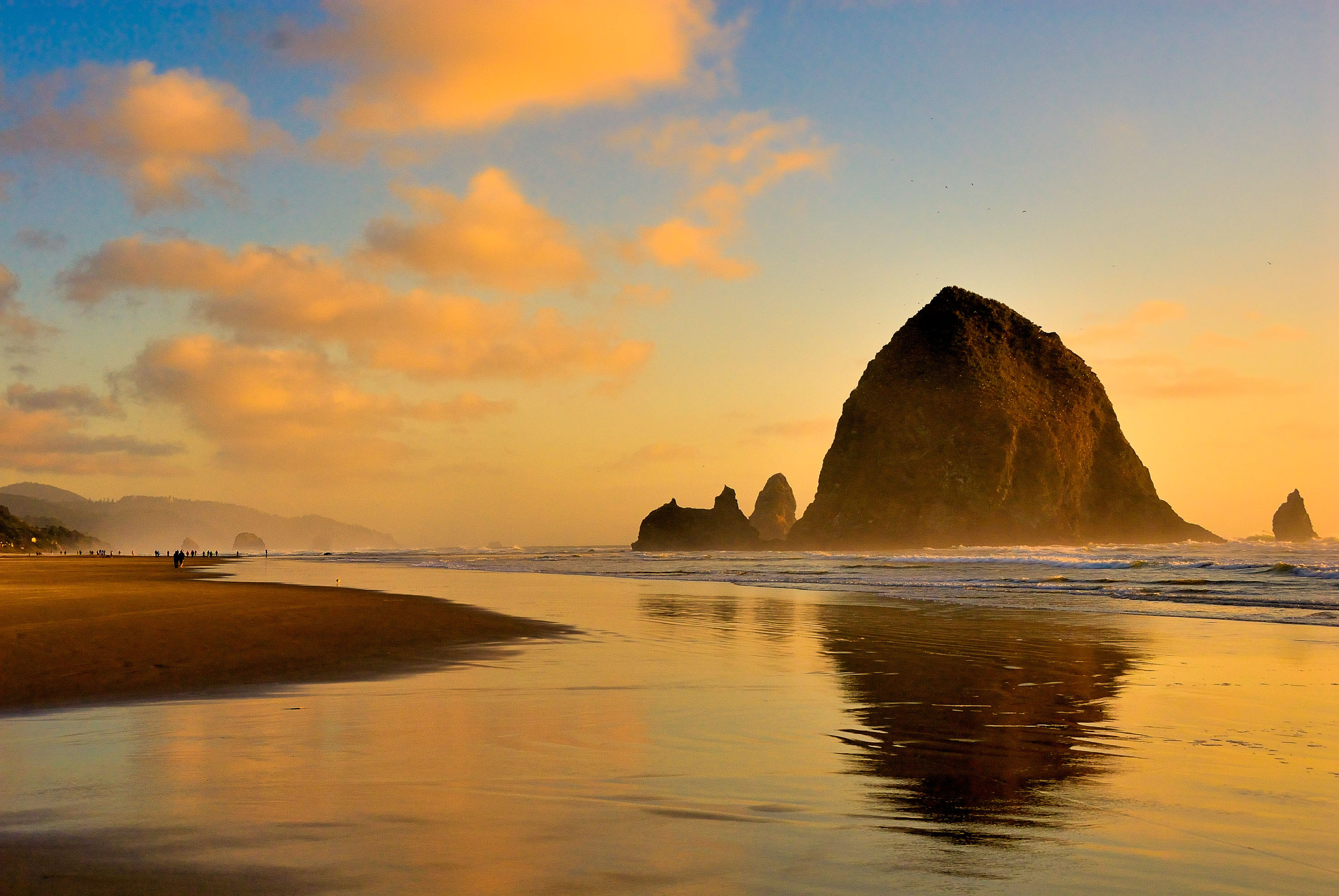
You did an outstanding job in post -processing. The tonal balance between high lights in the sky and shadow on the beach are just the way I would try to do it. Maybe a slight reduction in highlight for the left center sky would bring out additional detail in that cloud area. The clouds give this image the WoW factor. |
Jul 18th |
| 24 |
Jul 20 |
Comment |
Sam, Great capture!! The blue/grey/tan/brown color theme is pleasing. It is good that then animals and the trees separate well. I agree on the crop, almost up to the tree in the background, and then take some off the bottom to get the aspect ratio you like. The separation of the trees between themselves and the animals mis important to the image structure. |
Jul 17th |
| 24 |
Jul 20 |
Comment |
|
Jul 17th |
 |
| 24 |
Jul 20 |
Comment |
Hi All,
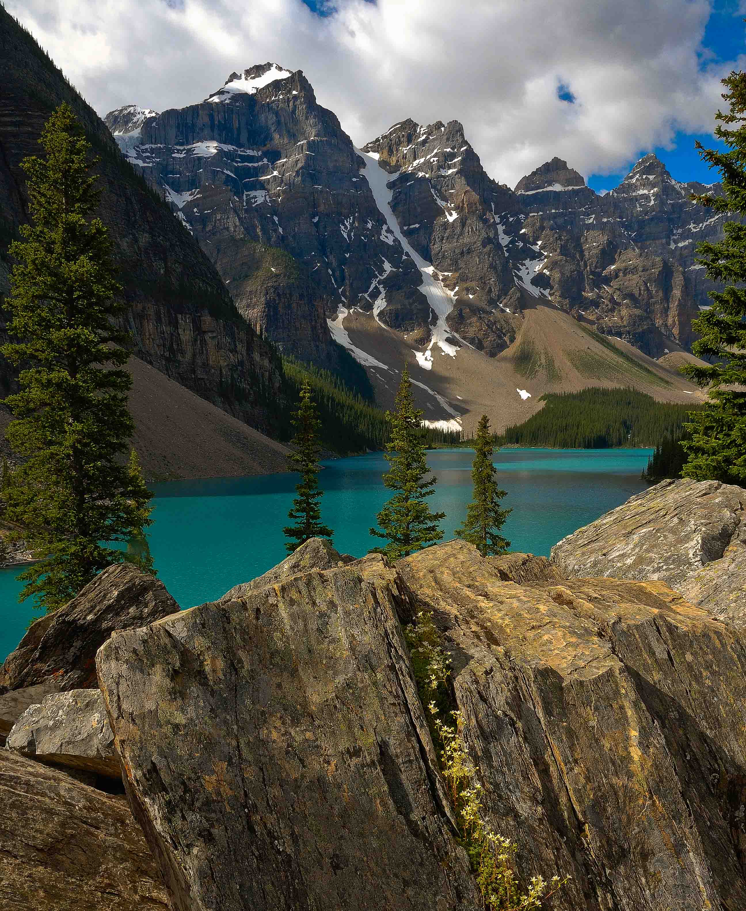
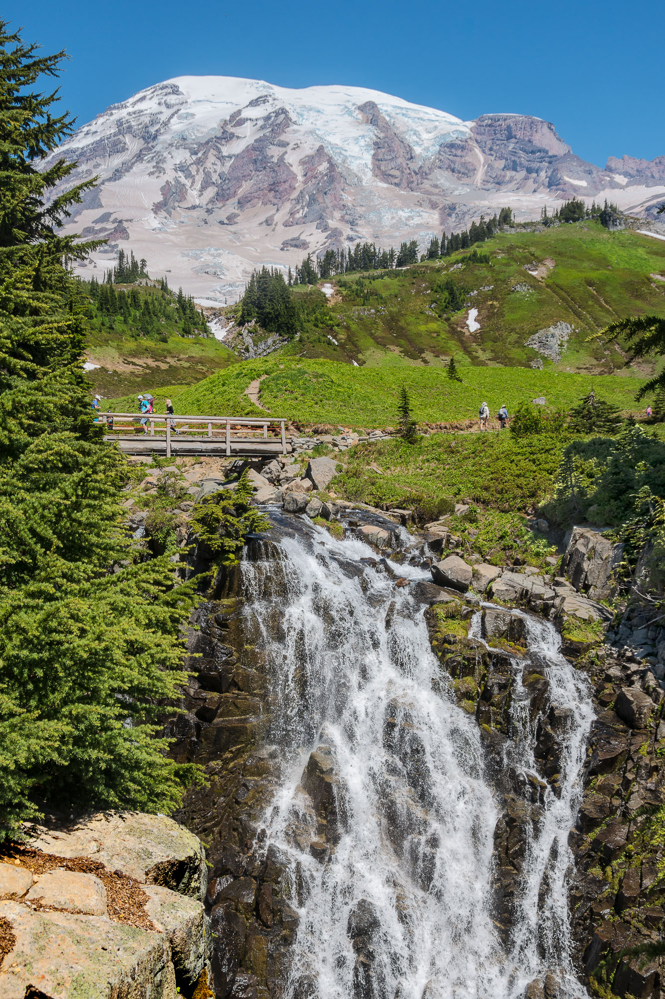
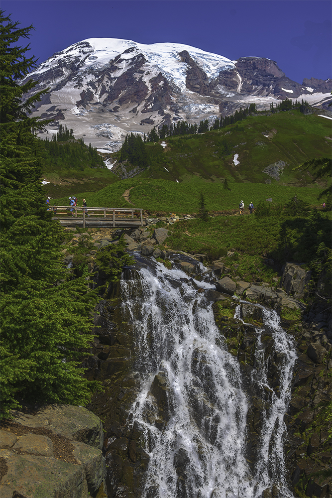
We just returned from a vacation in remote Maine last nite so I did not have much chance to comment on your work and your comments wrt mine. However, I found your comments interesting and I took a good look at what I had submitted, and compared it to the print hanging on our wall. First, I agree the submission looks too hot. Second, the original is too dull, and the snowfields/glaciers do not have the detail that is in there and gives them interest. So I went back to the original raw file and did a re-edit from scratch. in this version 3 I feel I have preserved the detail in the mountain without it feeling over exposed. The greenery has a bit more life, but still could use more work. I may print this version and see how it compares to my original print. Let me know what you think.
Tab |
Jul 17th |
| 24 |
Jul 20 |
Comment |
Jim,
Interesting comment re orig vs submitted. The original is the file used to make a 16x20 print that looks quite good. For printing my screen is calibrated at 85 cd/sqm. I have not submitted any projected images using this new screen so I just boosted the brightness and fiddled a bit with the image so it looked better at that brightness. My concern was that the mountain snow/ice looked a bit washed out. For the original I just exported via LR with a 1Mb limit on the file size. I had to iterate a few times on max pixel dimension because my LR setting does not automatically reduce pixel dimension. Given your comment I went back and brought up both images in separate windows and did a side by side compare. I was surprised that I could not see a difference. Maybe it is my old eyes. It would be interesting to get inputs from the rest of the group wrt the compare. Furthermore, I realized per this discussion that was not the true original!! So the true original is provided here. There is a leap going to the print file. I got rid of some branches and livened up the color palate. The detail in the snow/ice cap was also brought out. So this is the true original. If you like please put the better of the other two into the primary submission. |
Jul 4th |
 |
7 comments - 0 replies for Group 24
|
7 comments - 0 replies Total
|