|
| Group |
Round |
C/R |
Comment |
Date |
Image |
| 24 |
Jun 20 |
Comment |
Jim,
I like the way focus stacking has preserved sharpness from front to back. Too many of my flower images fail because of the depth of field problem. I guess Helicon is a good app. I figure I have to learn the art of focus stacking and I was thinking of using the PS functionality for that. Do you think that is a reasonable way to go or should I bite the bullet and go straight to Helicon?? The colors in your flower are really clean and bright with no distracting shadows and I like that. Good lighting!! However, FWIW I am not a fan of the black background for these flower portraits. I would probably go out in the woods and shoot a bunch of ferns out of focus and use them as the background layer for this image. Just my taste.
Tab |
Jun 16th |
| 24 |
Jun 20 |
Comment |
Laura,
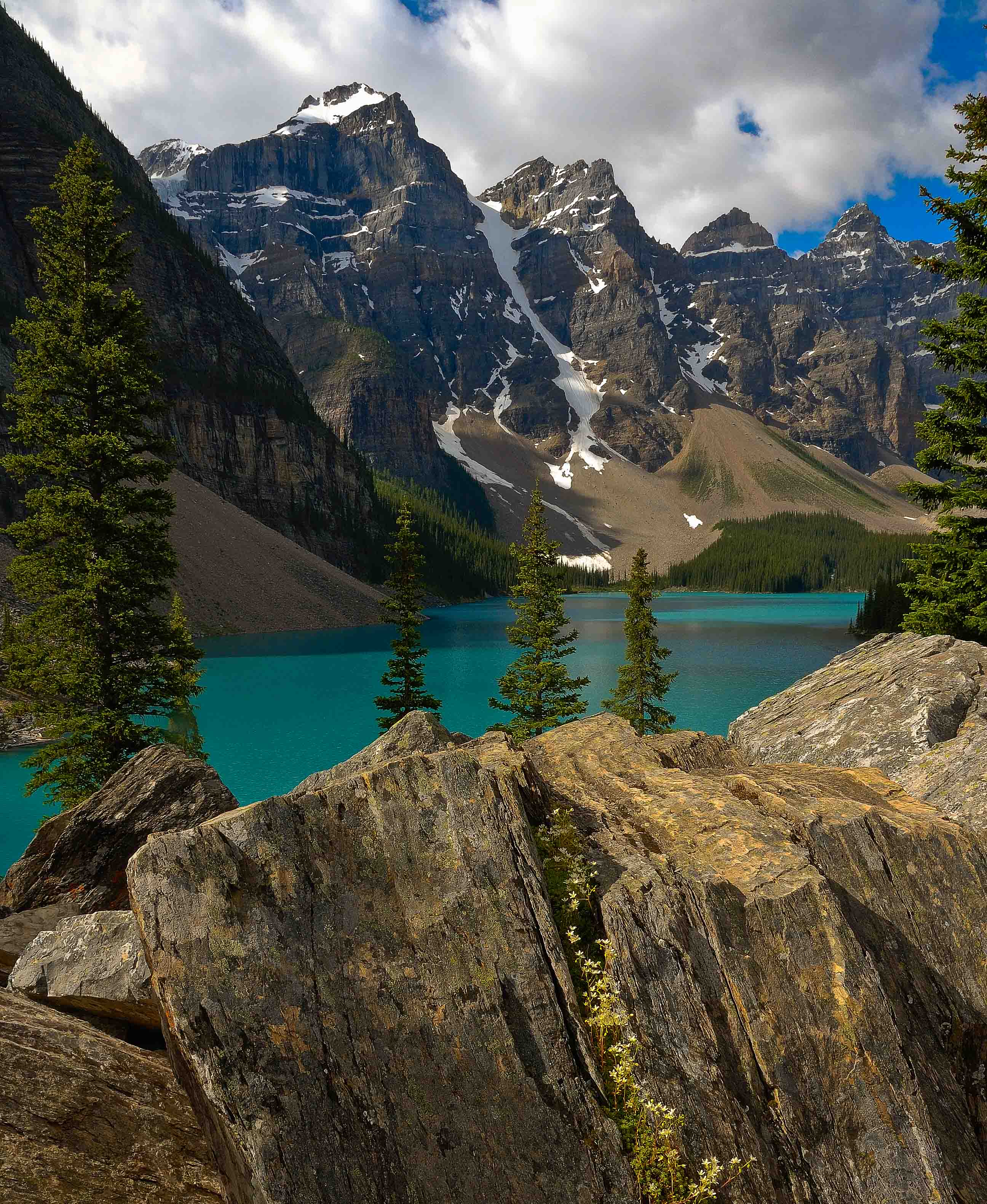
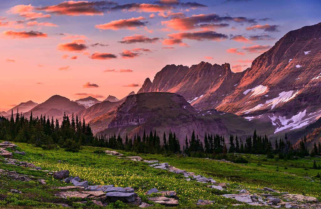
I think you did a fantastic piece of work bringing amazing hues into the clouds and mountains. Glacier and Logan Pass are among our favorite places. I like your idea of bringing life into the stone work. I actually would like to liven up the entire foreground. So I opened your image in PS as a smart object and enhanced the luminosity and some saturation of the green, aqua and yellow hues in the HSL panel. I then did a color select on the rocks and applied a curves to brighten them and enhance their contrast. Let me know if I went too far overboard for your taste. I tend to favor lighter foregrounds going into the grand landscape. It is possible that one could also do some detail enhancement in the mid-ground row of trees, but I did not explore that. I'll bet that with the D800 there is detail in there that can be made to contribute. As they are, it is a bit too dense for me. |
Jun 16th |
 |
| 24 |
Jun 20 |
Comment |
Sam,
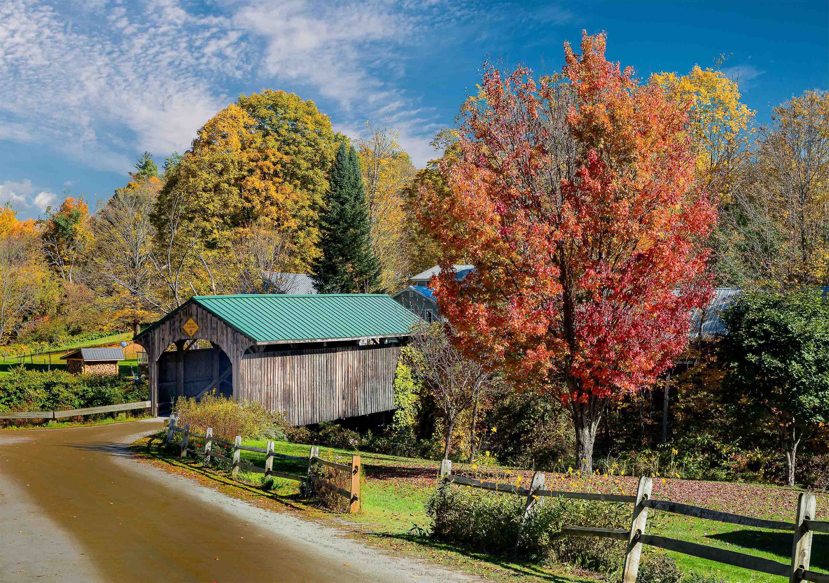
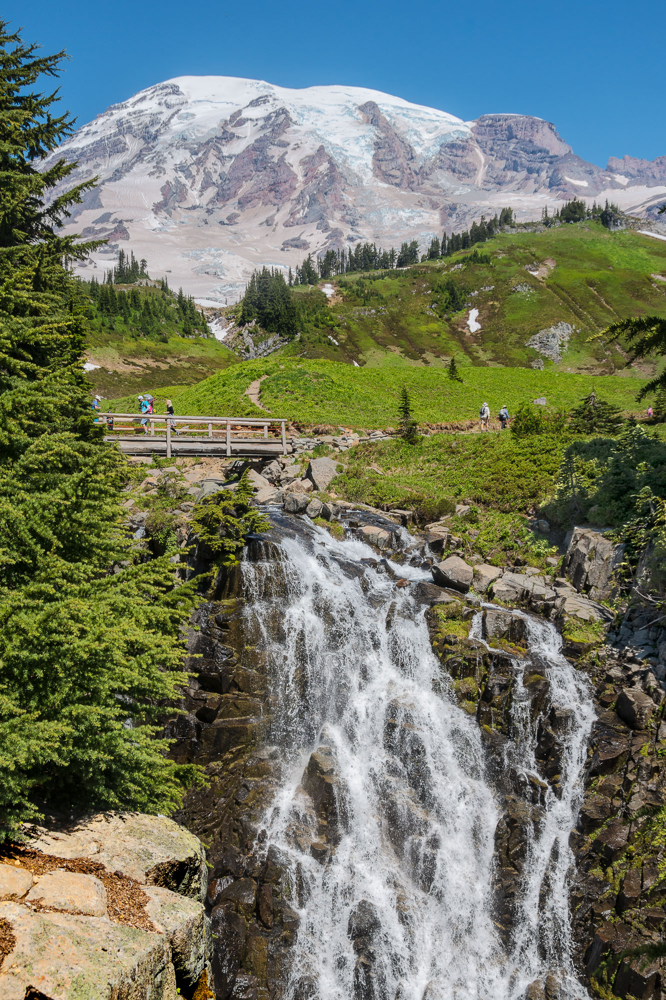
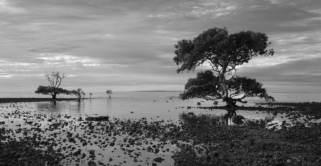
This is a beautiful scene, I love the tree shapes, and I love the textures you captured in the trees. To me the limiting factor to this image is the sky, IMHO not enough drama to complement the trees. It is a place I would go back to many times if I could, in order to capture the scene with one of those Ansel Adams skies. Perhaps a looming thunder head in the distance. I also prefer a tighter crop to bring the trees into greater prominence which I have tried to show in the edit.
Tab |
Jun 16th |
 |
| 24 |
Jun 20 |
Comment |
Sue,
At first glance I was drawn to the image but not in a positive sense. It does elicit curiosity and study. The image is dark and disturbing and stirred negative feelings. Upon reading your objectives I felt the image achieves your goal. Still it is not one that I would hang in my living room. I see it as a museum piece as part of a larger collection of your work. I believe your whole intellectual approach regarding printing it on paper made from pages in the book are brilliant, but a person needs to read the legend for the entire concept to come together. If you want to increase the impression of foreboding hopelessness hang it upside down!! Often I will hang one of my images in a stairway that I use often, so I have to look at it. After a while I will see things that make me want to re-process and reprint the image to enhance some aspect either visually or intellectually. I like your idea of bringing up the blue green tone in the water. As seen on my screen the overall water tone is mostly black. If you had not indicated the info re the layers I would never had guessed. Yes on the red hair enhancement. I think a little more visibility on her right arm would help. There are bubbles between face and right hand that are lost in the darkness. If there were a way to bring them out a bit it would give more feeling of depth. Overall a really interesting concept that gave me a lot to think about. |
Jun 16th |
| 24 |
Jun 20 |
Comment |
Donna,
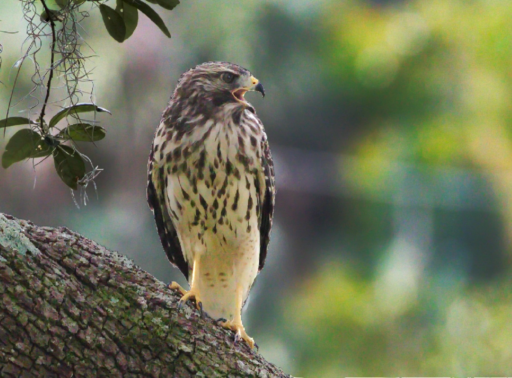
Great capture!! I like the way you cropped the image, the foliage to the left of the hawk gives good balance and enhances the composition. Your image has great potential. I had only a few minutes to play with it and I wanted to see if I could improve the tonal balance. I felt the hawk being in the shadow is flat and diminished in importance. It needed some pop to bring it forward and increase its eye appeal. To do this I created three masks. One contains the bird and the branch, the second is its inverse to control the background, and a third to enhance the eye. All three masks employ curves adjustments. If I had more time I would create a fourth to control the vine/foliage that is to the left of the bird. For the bird/ branch adjustment I brought the curves white point to the left significantly, bent the center of the transfer curve up, and put an s-bend in the toe of the curve. I feel it gives life and detail to the branch as well as the bird. For the background mask I brought the white point down. And then bowed the curve down a bunch more. The eye adjust is a large bow up on the curve. I should note that the masks I made were done quickly with the magic selection tool and the edges were not cleaned up, so a better job can be done there. I think these curve adjustments make a big difference. If I were serious about making a print of this I would first do an up-res using PS or On1, because this image is starting to show pixelation due to the heavy crop that was needed. As noted by others the white region in the background could be muted some. I would do this by painting with a translucent soft brush using some yellow to closely match the nearby yellow hues. Do this on a separate layer so it is easy to change if you are not happy with the result. If you would like I could up load screen shots of the layer panel and curve panels to be more clear about what I described above.
Tab |
Jun 11th |
 |
5 comments - 0 replies for Group 24
|
5 comments - 0 replies Total
|