|
| Group |
Round |
C/R |
Comment |
Date |
Image |
| 18 |
Jul 20 |
Reply |
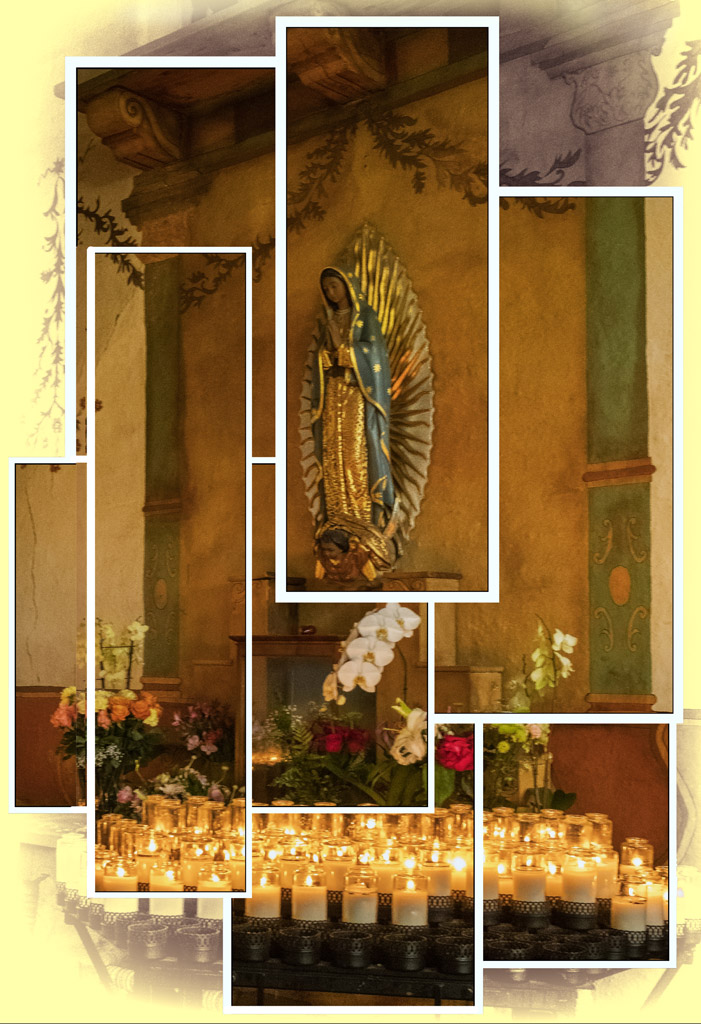
Ian, great observation. This is based on one of David Hockney's Joiners. I ran across one of his images on Pintrest of a man sitting in a chair. It was divided up by equal squares and they had borders. His borders and squares were the same size, I just made them different sizes so it wasn't a copy cat style. I did some research on him and noticed that his Joiner montage/collages of images that didn't really match. Since I was traveling with a group of photographers, I didn't really have time to snap that many photos. So this was my recreation using rectangles in lieu of squares. I need to see if I can find my original and fix the candle situation. |
Jul 12th |
| 18 |
Jul 20 |
Reply |
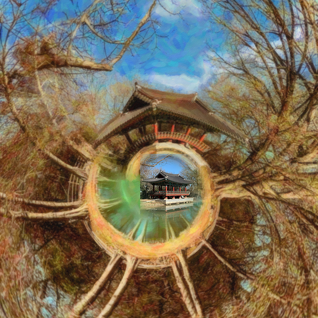
Jim, thank you. I was not trying to convey a look of stained glass window, though that is an interesting concept. I was trying more to convey the look of a puzzle. |
Jul 11th |
| 18 |
Jul 20 |
Reply |
Thanks Mike. I left the candles this way on purpose. The original had an un-framed section of candles in the center but I found it distracting. Then I went to the lower left and did the same thing. Then I decided to do half the candles on that side as a starting point to then let your eye float around the photo. Guess it didn't work! |
Jul 11th |
| 18 |
Jul 20 |
Reply |
Thanks Jen. It was fun to create and yes the irregular frames were intentional. My first was made with same shape and size rectangles but it looked odd and didn't flow. I think the irregular shapes forces your eye to look around more ad view the whole image. I was going to leave a small square of candles in the middle un-framed as a focal point. I found it distracting. So I left the left corner open. Guess it was distracting as well! |
Jul 11th |
| 18 |
Jul 20 |
Comment |
I think the original and the composite could stand alone by themselves as creative images. Very well done and composed.
|
Jul 9th |
| 18 |
Jul 20 |
Comment |
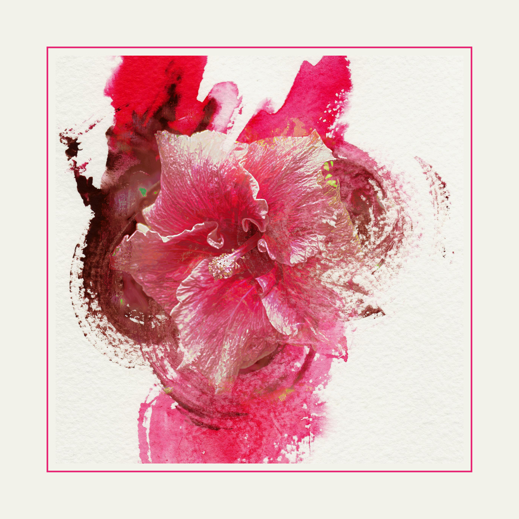
Very interesting and and has a cartoonish illustration quality that would be found in a children's book. |
Jul 9th |
| 18 |
Jul 20 |
Comment |
I love the effect and colorization of the sky. The angle of the jets and the negative space on the right suggests movement and leads your into the space. However, I would suggest removing the sun. It is very distracting. You can make it bigger so our eye moves to it, but maybe an opacity change to reduce the suggested visual perception. |
Jul 9th |
| 18 |
Jul 20 |
Reply |
Thanks Mark. When I travel I take a lot of, what I call snapshots, to remind me of a place. Later, when I come up with an idea, I go looking for a shot to tryout my idea. I did this to several photos before I settled on this on.
|
Jul 9th |
3 comments - 5 replies for Group 18
|
3 comments - 5 replies Total
|