|
| Group |
Round |
C/R |
Comment |
Date |
Image |
| 62 |
Nov 21 |
Reply |
Oliver,
thanks for this version. I had to enlarge it to understand your approach (my first look was on my phone, didn't do it justice). This rendition gives the image a painterly effect - almost ghostly, eerie. I don't dislike it, and maintaining the angle of the original contributes to the other-worldly (to my mind) quality. |
Nov 22nd |
| 62 |
Nov 21 |
Comment |
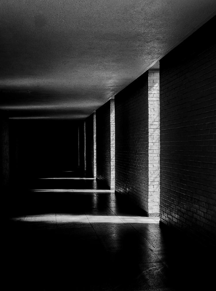
Israel,
not too much to add to what the others have said, as I quite agree - I really like the darkness in the foreground contrasted with the lightness in the background - very effective in black and white.
Thanks for sharing. |
Nov 13th |
| 62 |
Nov 21 |
Comment |
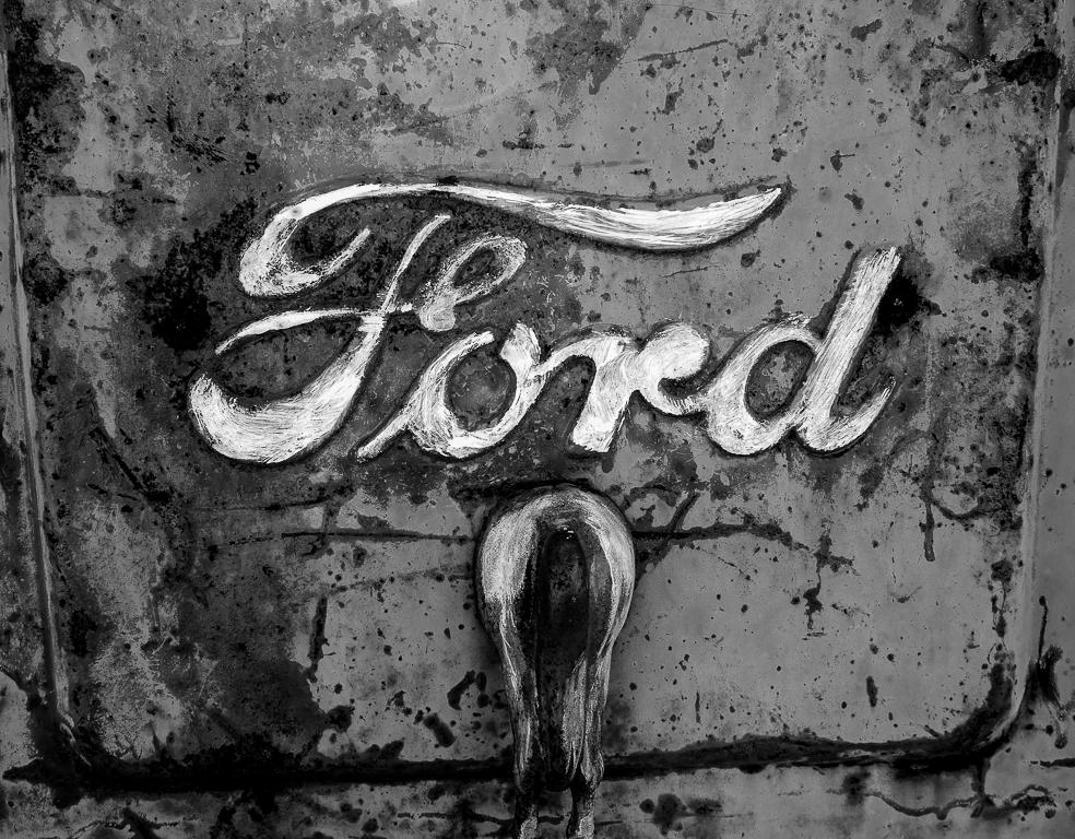
Thanks, Bob,
thank you for sharing. Old beat up trucks have so much potential for photographers, and they seem to lend themselves well to black and white. I agree, $5 was a great investment! Didn't know that "truck" was officially part of the company name.
Enjoyed your image! |
Nov 13th |
| 62 |
Nov 21 |
Comment |
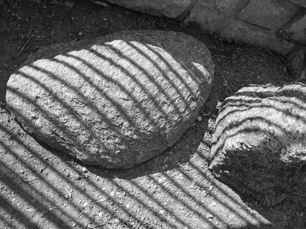
Bunny, fun. Unlike some of the other comments, I really like the pattern from the sun through the mesh of the hat on your husband's face - I do also like the closer in image as well. Clearly a case of one's preference, but I think with this one photo you have lots of options. |
Nov 13th |
| 62 |
Nov 21 |
Comment |
Emil, I can only echo what the others have said - I, too, like the play of light and the textures. I'm inclined to agree that it "works" in black and white in a way it does not in color. I might be inclined to bring out the texture of the wood even more, but I think that is a matter of personal choice. Well seen! (I may have to try to visit Forts de Chartres, as I am only a state away in Indiana.) |
Nov 13th |
| 62 |
Nov 21 |
Comment |
LuAnn,
I smiled to myself when I saw your photo - I once showed a photo of a group of carrots (they were loose in a box at a farmer's market, not at all like seen in the grocery store) at a camera club meeting, in black and white, as it happens. Another photographer commented "I would never think to take a photo of carrots." I was reminded of the incident upon seeing your romaine. Nice to see your inspiration - I had to look up Robert Weston, which is when I realized I had seen his images of peppers, with their quite sensuous qualities - though I had not seen his images of lettuce or cabbage. Well done, and great to find inspiration around the house, especially as we move into the dreary cold season. Personally, I prefer the more angled composition that Bunny has suggested. Never thought of using my carrots here. . . |
Nov 13th |
| 62 |
Nov 21 |
Comment |
Oliver,
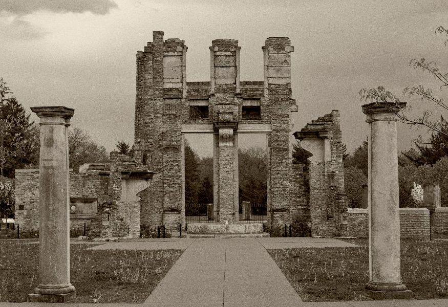
late to the game as usual (not at all sure how it got to be mid-November - I seem to be saying "time flies" quite a lot these days) - I echo what others have said, that I would not have known this was a composite until seeing the two originals, so well done. I agree that sometimes some of nature's loveliest scenes (beach scenes, sunsets/rises, rainbows) can often not be given their due in a photograph. A new challenge, how to create an effective composite. |
Nov 13th |
| 62 |
Nov 21 |
Reply |
Thanks, Bob,
I liked your suggestion and gave it a whirl - see what you think. |
Nov 13th |
 |
| 62 |
Nov 21 |
Reply |
Thanks, Emil,
I prefer a light and direct touch myself (which should be obvious to all by now). Appreciate the feedback. |
Nov 13th |
| 62 |
Nov 21 |
Reply |
Thanks, Emil,
I prefer a light and direct touch myself (which should be obvious to all by now). Appreciate the feedback. |
Nov 13th |
| 62 |
Nov 21 |
Reply |
LuAnn,
I appreciate this analysis based on the principles of dynamic symmetry. I have explored this topic a little bit, and am familiar with the concept, and the website and author you mention. I haven't had the opportunity to study the subject enough to apply it in any meaningful way, but these are insights I appreciate having. Perhaps it explains why the color, original version feels a bit off-kilter to me.
Thanks for the insight. |
Nov 13th |
| 62 |
Nov 21 |
Reply |
Thanks, Lance,
I wholeheartedly agree, the image works equally as well in B&W as in color (or in color as in B&W) - and I had experimented with the colors as well before someone suggested I try it in B&W. Having always had a literal bent, as suggested elsewhere, it seemed only natural to me to rotate this image - but always willing to give things a try! I do appreciate the feedback. |
Nov 5th |
| 62 |
Nov 21 |
Comment |
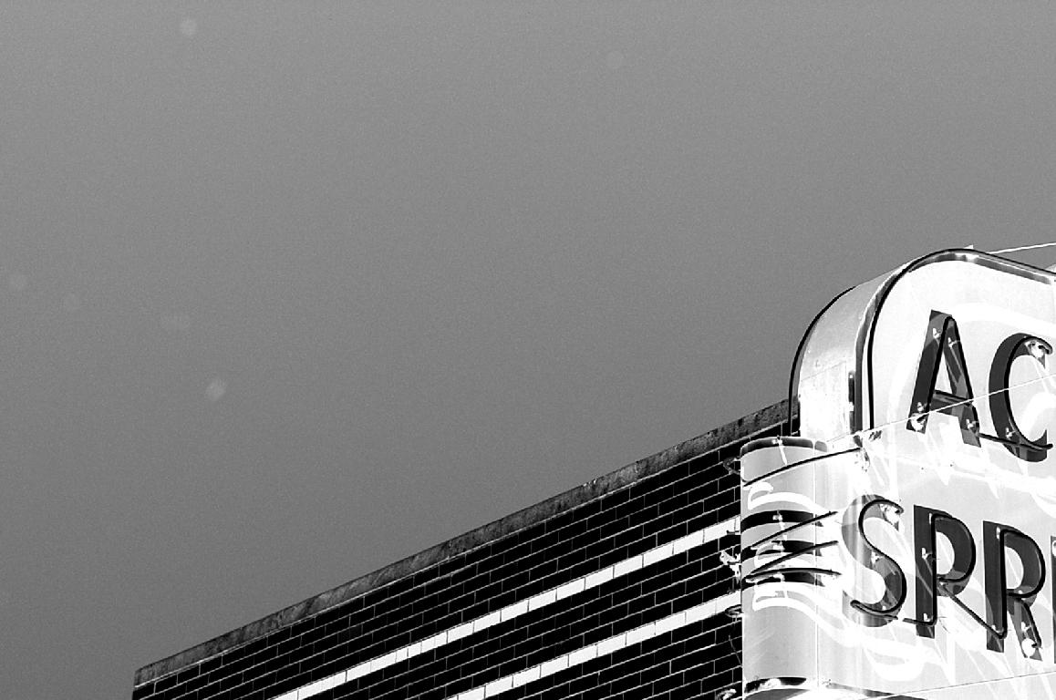
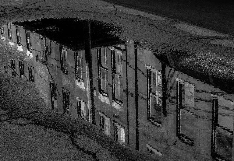
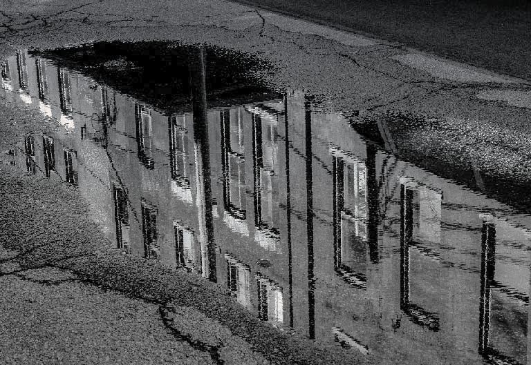
Bunny, thanks for the feedback. I can see what you are talking about with keeping the original orientation - I did take iterations of the puddle image, and because of my affinity for old buildings (I guess) tend to interpret things rather literally. Food for thought!
Interesting also that both you and LuAnn refer to the image as abstract. I am, as you all know, quite fond of abstract images, but to me this is not one. A matter of abstract being in the eye of the beholder - and perhaps another good reason to leave the orientation as in the original. |
Nov 5th |
| 62 |
Nov 21 |
Comment |
Thanks, LuAnn,
for me, the puddle photos are a happy accident - not really something you can plan for, but something to start keeping an eye out for for sure.
I will play with the lights - I can see your point, and will give it a try.
Thanks for the feedback. |
Nov 1st |
9 comments - 6 replies for Group 62
|
9 comments - 6 replies Total
|