|
| Group |
Round |
C/R |
Comment |
Date |
Image |
| 62 |
May 21 |
Comment |
Israel, what a great image - and I really like the way it's been edited, leaving just a hint of color in the bike rider's shirt. I agree that the contrast of the modern (bike) versus the ancient and timeless (camel) forms of transportation is compelling. And again, the desert, I must visit one! So many wonderful images, it seems, come from the desert. Great capture and editing. Thank you! |
May 8th |
| 62 |
May 21 |
Comment |
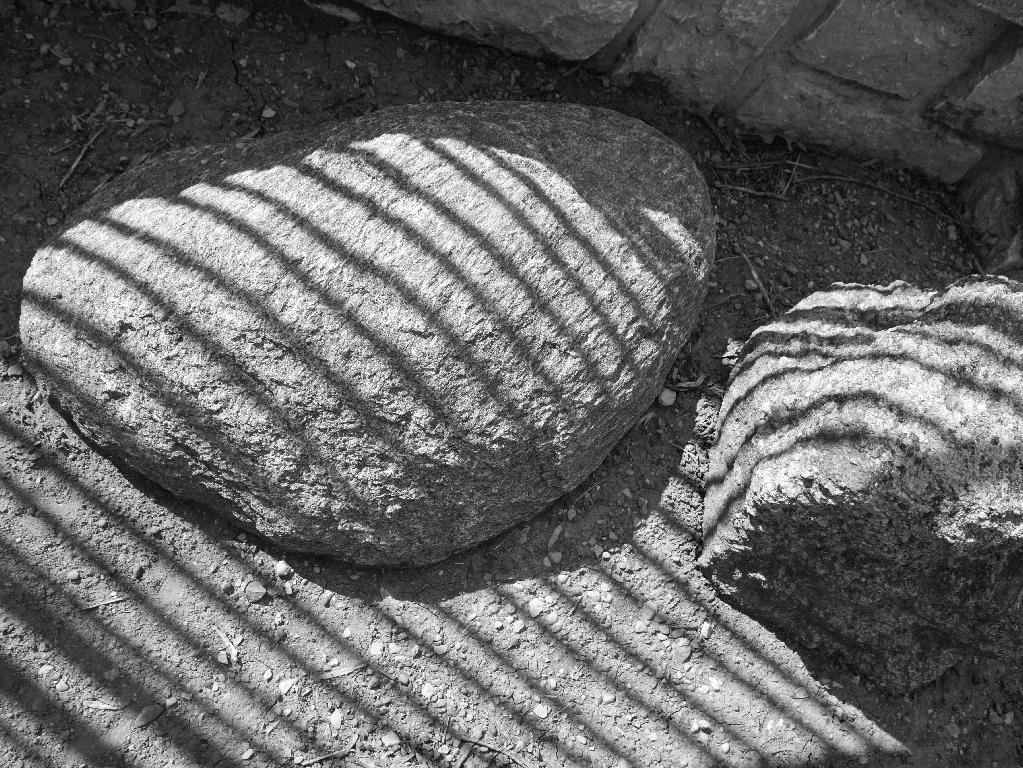
Bob, I agree with LuAnn's observation - this image looks so much like an engraving in metal, at first that is what I thought I was seeing. It's a great effect and look and transforms the ordinary into something extraordinary. |
May 8th |
| 62 |
May 21 |
Comment |
Bunny,
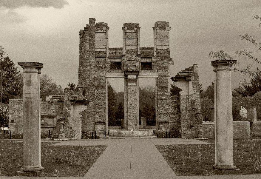
I, too, agree with your choices here - and I appreciate the information on the mausoleum and the symbolism there. I think you achieved the effect you were after with the antique sepia tinting. Your edit has also brought out the fine detail in the architecture (especially the columns) and the trees in the foreground, and also make the image somewhat ethereal. I'll be interested in seeing the version with a blurred effect. for the trees, though I am not 100% convinced it is needed. As you said, the trees are part of the setting of this structure. A minor point - I think the crop at the top is a bit close to the structure, I think a little more space or air above the top would help it breathe, if that makes sense. (Could be balanced by taking a bit off the bottom, maybe the lower two steps.) Having said that, kudos, great image. |
May 8th |
| 62 |
May 21 |
Comment |
Emil, I echo the comments above - this is a wonderful image, simple yet evocative. The transition to B&W really allows the textures and lines to be revealed. It also makes me wish I lived near a desert, if only for awhile.
You have mentioned Bob Curran before, and I looked at one of his videos - your image is a reminder to go back and learn more.
I, too, have no suggestions for improvement. Nicely done. |
May 8th |
| 62 |
May 21 |
Comment |
Oliver,
a very moving image (and story behind it) - her apparent dejection is in contrast to the clothing, I think. To my eye, you met the editing challenge - the first thing I noticed is the texture that you've brought out - in the column she is leaning against, in her hair and face and clothes, and the assemblage of these textures comes together to make a compelling whole. Well seen, and well done in rendering it in monochrome. Thanks for sharing. |
May 8th |
5 comments - 0 replies for Group 62
|
5 comments - 0 replies Total
|