|
| Group |
Round |
C/R |
Comment |
Date |
Image |
| 62 |
Mar 21 |
Reply |
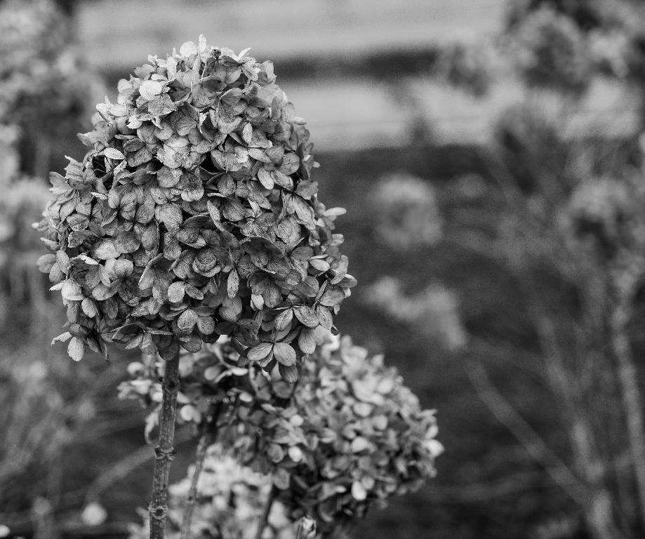
Thanks, Oliver,
this version, to my eye, really makes the flower pop. I had tried a similar look of giving the flower petals more texture, but wasn't sure if it was over the top; your version has suggested, maybe not. I think I like the stronger contrast that this version imparts. |
Mar 6th |
| 62 |
Mar 21 |
Reply |
P.S. I was heartened to notice this week that the daffodils are starting to pop out of the ground in places, and I am hearing and seeing more birds. Most of the huge snow piles have melted, though a few are still apparent on the landscape. But with the longer hours of light and warmer temps, it is starting to feel like the worst of winter is behind us. |
Mar 6th |
| 62 |
Mar 21 |
Reply |
Thanks, LuAnn,
I don't have Topaz but have heard a lot of good things about it. I have seen your efforts, and haven't had a chance to respond until now. I agree that the emphasis needs to be on the flower in the foreground, and appreciate that there are lots of different ways to go about that. Thanks for demonstrating some of them! |
Mar 6th |
| 62 |
Mar 21 |
Comment |
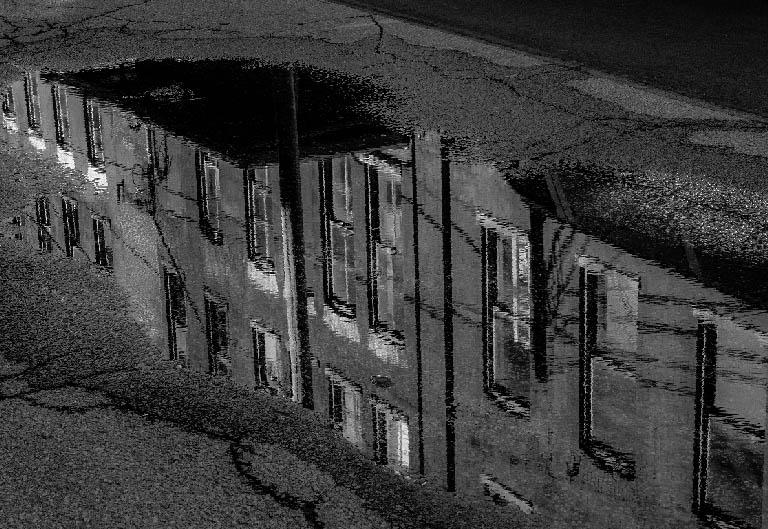
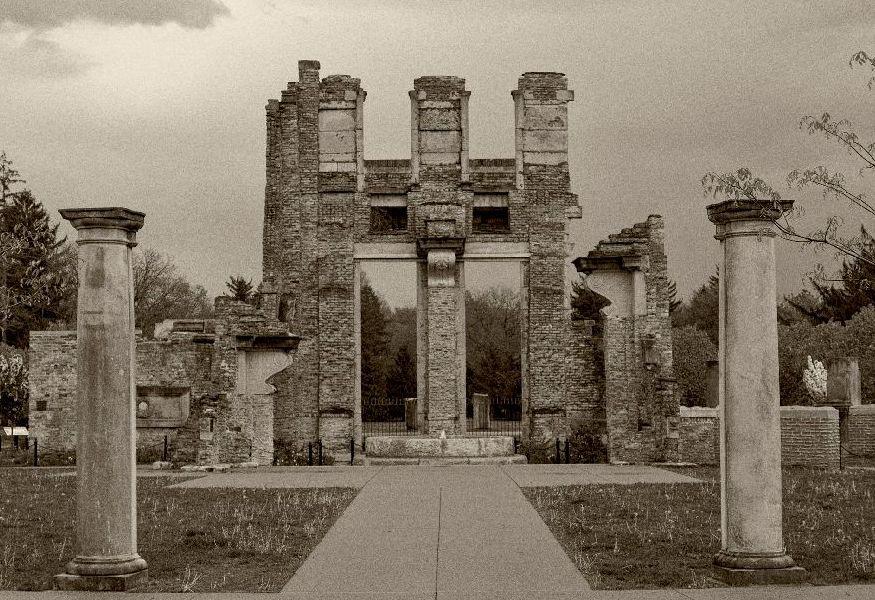
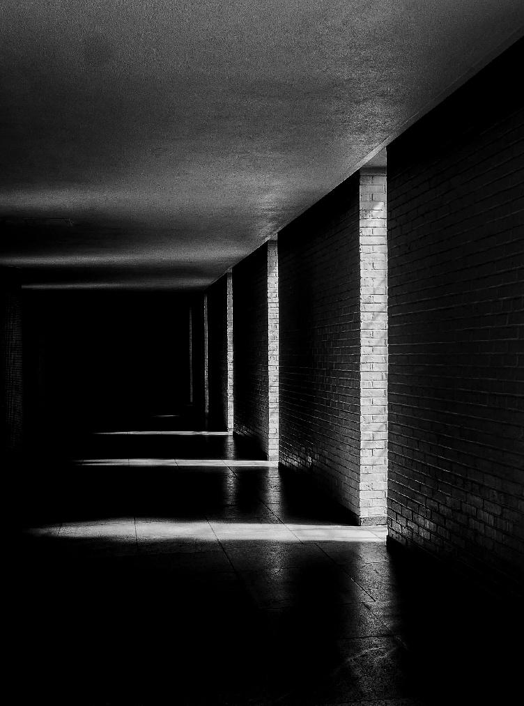
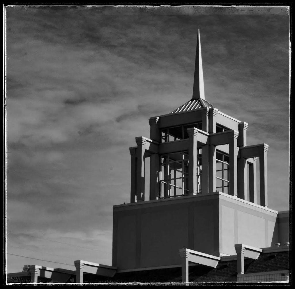
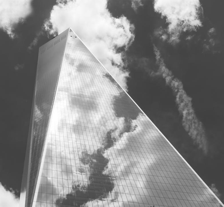
Bunny, I like your image very much - in my day job, I am an architectural historian, so I am a sucker for images of buildings. I love the angularity of this building and the contrast with the fluffy white cloud in the sky and as reflected in the building. The only thing I wondered about was the possibility of cropping out the trees at the bottom, which are to my eye a bit distracting. I am not sure it entirely works, but see what you think. |
Mar 2nd |
 |
| 62 |
Mar 21 |
Comment |
Emil, I can only add to what others have said, and what better compliment than Oliver saying he was inspired by your image. I really like the visual strength of the tree trunks in the B&W version, both the true and the reflected. Unlike some of the other comments, my personal opinion is that the clouds are a bit overdone and start to detract from the rest of the image and starts to compete with the trees and their reflections. |
Mar 2nd |
| 62 |
Mar 21 |
Comment |
LuAnn, I was playing around with photographing wine glasses and bottlese recently, so I very much appreciate your image this month. Your original is much more successful than my attempts, so I can see I must go back to the drawing board. the "dark field" version is very striking, and it really brings out the design in the glass. |
Mar 2nd |
| 62 |
Mar 21 |
Comment |
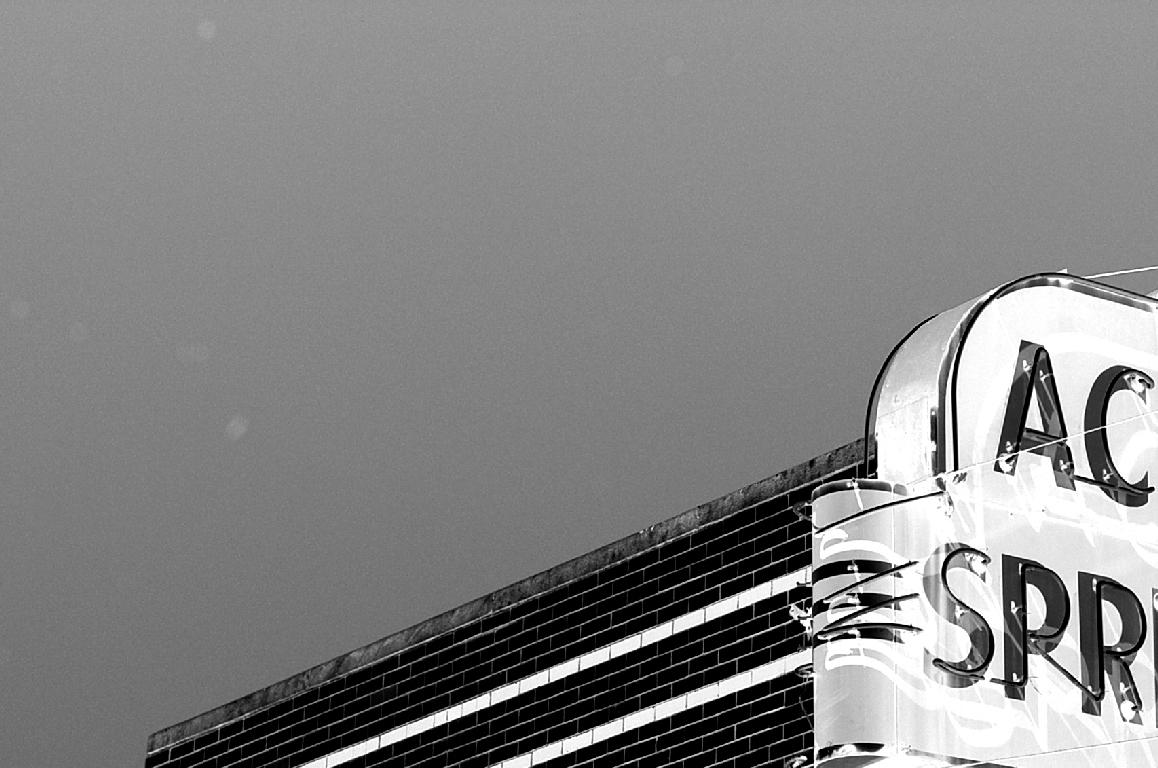
Oliver, thanks for sharing this image. I like the story behind it - I have also been inspired by the work of others in this gorup. I like the scene itself very much, and can see why the scene captured your eye - looks very European to me. I like the way, in the B&W, the building now pops and the image is much more dramatic than the original. I confess, however, my eye is troubled by the hazy diagonal that leads to the building. I suspect it's not meant to be hazy, but that is how it reads to me. Something looks off as that diagonal reaches the top of the hill, over sharpening perhaps? |
Mar 2nd |
4 comments - 3 replies for Group 62
|
4 comments - 3 replies Total
|