|
| Group |
Round |
C/R |
Comment |
Date |
Image |
| 62 |
Jun 20 |
Reply |
Very interesting, thanks for letting me know. Three very different approaches, as well. |
Jun 20th |
| 62 |
Jun 20 |
Reply |
Thanks, Gary,
I appreciate the thoughts. I understand the reaction to the photo is very individual and subjective, and it is useful to get the feedback and learn about viewers' reactions. It is a big part of why I'm here, part of PSA, to learn and grow as a photographer. |
Jun 8th |
| 62 |
Jun 20 |
Reply |
LuAnn,
thank you for the thoughtful comments and for sharing your perspective. I agree that the discussion has been very good, and I appreciate everyone's point of view. I am also a teeny bit embarrassed, as part of my job is research, and somehow it never occurred to me to "google" this topic. Thanks for doing that research,and I will follow up on it to build my own understanding. And, I will continue to pay attention to the photos - and even scenes from movies/tv I see where the perspective of a shot changes from foreground to background depending on focus - to inform my understanding.
Thanks again for the thoughts. |
Jun 8th |
| 62 |
Jun 20 |
Reply |
Emil,
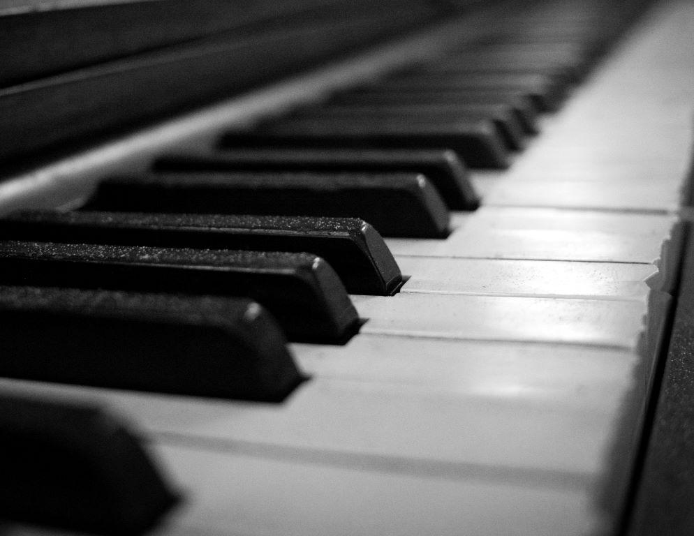
thanks again for your comments. I've had some time to think about this and I have a question and a comment. The comment is that one of the things I like about the image as originally edited is that it shows the ragged edge of the white keys, which to me is part of the story of this piano (abandoned, dusty, forgotten in the back room of an antiques mall). The revised edit/crop removes this edge and creates a different feel.
The question has to do with the foreground out-of-focus key. I have heard before that some viewers prefer that foreground elements be in focus, yet it is a common technique in current photojournalism which I see on popular news sites quite often, once a week or so I'd say. I think that it is used to good effect - putting the focus on the key element. I guess I am wondering why that approach (foreground elements not in focus) has such a bad reputation and would appreciate some feedback. |
Jun 6th |
| 62 |
Jun 20 |
Comment |
I am a sucker for a sunflower photo - and I admire the patience that it took to get the rays of the sun just so - well done, and kudos. An added bonus to me is the backlighting of the flower and the translucent quality it gives to the petals, which is more pronounced in the black and white version. I do prefer the revised edit with the lightened leaves. Thanks for sharing this image, Yosef. |
Jun 6th |
| 62 |
Jun 20 |
Comment |
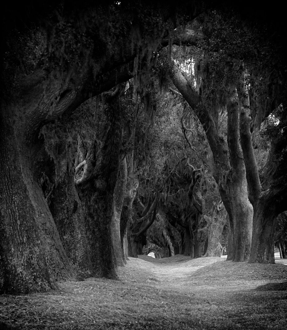
Bob, I agree, the tree tunnel is visually very effective, and I like the way the small opening in the background emphasizes the size of the trees. This is an image that could be edited in so many ways, that I was tempted to play with it a bit. I realize in so doing it becomes my concept and no longer your's, but I was intrigued by the possibility of turning this into a forest out of Grimm's Fairy Tales, sort of sinister and dark. I share for your consideration, though as I said, this is an image that could be rendered in a variety of ways. Thanks for sharing. I do miss a good walk in the woods. |
Jun 6th |
 |
| 62 |
Jun 20 |
Comment |
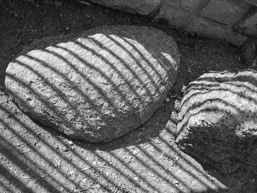
Gary, this image has a very ethereal quality, and without the original image, I am not sure I would have known what it was (which doesn't bother me, just an observation). I think it is the rough pastel/pencil drawn quality that makes the shell seem to almost melt into the background. A good use of downtime, I'd say. |
Jun 6th |
| 62 |
Jun 20 |
Comment |
Emil,
what an interesting take on the St. Louis Gateway Arch, by which I mean most photos I have seen emphasize the width of the arch, and this one seems to condense the width and emphasize the height. This really works for me, and I appreciate the distinctive perspective. The sky is very dramatic which sets off the simplicity of the arch very well I think. I agree that this image is very effective in black and white. The only distraction for me is one of nature, and that is the tree in right foreground which to me creates a visual interruption in the continuity of the arch.
It also reminds me that I need to visit St. Louis. Thank you for sharing this image. |
Jun 6th |
| 62 |
Jun 20 |
Comment |
Oliver, I agree, this image "works" much better in black and white than in color, and I like the crop, which helps to emphasize the tea house as the center of interest. The graininess of the image - I don't know if that's intentional, but I like the visual feel of it. The concern I have is that the tea house doesn't "pop", the tonal and textural qualities of the tea house and the surrounding foliage seem too similar to my eye to allow the tea house to pop. The vignette could help, perhaps using one of the tools that allows for selective editing might work? Not one of my specialities, I'm afraid. |
Jun 6th |
| 62 |
Jun 20 |
Reply |
Thanks, Oliver. I see what you mean about darkening the line above the keys, I will give that a try.
|
Jun 6th |
| 62 |
Jun 20 |
Comment |
Thanks, Emil, I appreciate the thoughts. You'll have to help me though - what is RHS? |
Jun 2nd |
6 comments - 5 replies for Group 62
|
6 comments - 5 replies Total
|