|
| Group |
Round |
C/R |
Comment |
Date |
Image |
| 62 |
May 20 |
Reply |
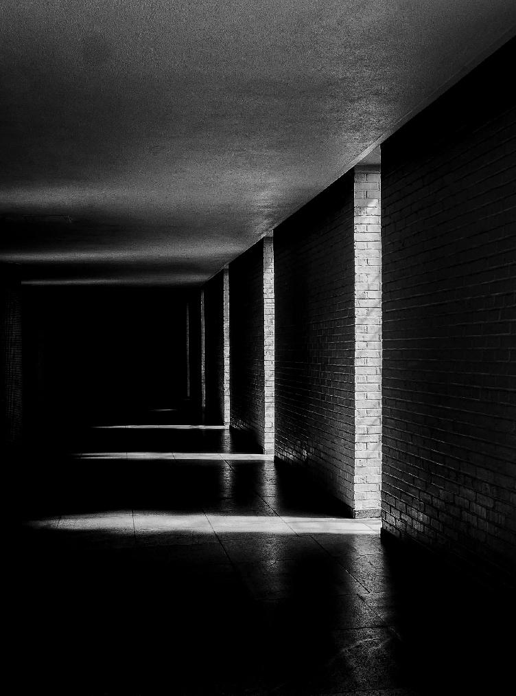
Thanks, LuAnn, I appreciate your comments as well, and I am grateful to the beneficiary of this excellent discussion. Believe it or not, at one point, I thought this image was not salvageable, so it is very fun and rewarding for me to see it being transformed.
I very much appreciate your thoughts on the play of lights and darks in the background, and will take those thoughts into consideration when making adjustments to the image. Thanks also for the suggestion on the alternate technique of painting in color, I will look up Aaron Nace's video. I agree that different tools and techniques work depending on the image and the needs.
Thank you again for your thoughts. Looking forward to working with everyone. |
May 11th |
| 62 |
May 20 |
Reply |
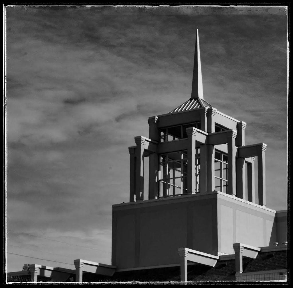
Larry,
thanks so much for your comments. I admit the slight variation on monochrome (rather than a strict b&w image) was an experiment, and I can see how it would not be to everyone's taste, but I thought it worked here, so appreciate your thoughts.
Thanks also for the suggestions - in the past few days, I have played around a bit with trying to use dodge and burn techniques, but that didn't get me too far. I will have to experiment with the clone tool, which I hadn't thought of, so I appreciate that suggestion. (haven't had too much luck with cloning in the past - I am maladept at using many of the tools, but, there is some old saying my brain is reaching for that ends in "try, try again.")
My other approach to "fixing" the image would be to return to the library at a different time of day - or on an overcast day - to see if the light is different or interferes less with the capture of the image - and hopefully it will be open soon so I can do that.
I will also experiment with the crop which I believe Oliver tried in his edit, above. One of my goals would be to preserve the balance that I feel the image has now. I'll play with it, though.
Thanks again for the suggestions and feedback; I am here to learn from others so very much appreciate the ideas. |
May 11th |
| 62 |
May 20 |
Comment |
Bob,
thanks for sharing this image; I agree with Gary, something pleasing about maritime images. I am inclined to agree with Gary that the image is a bit washed out, and I think the stronger tones in Gary's version help give the image a bit more umpf. love the textures on the side of the boat and the reflections in the water. |
May 9th |
| 62 |
May 20 |
Comment |
Israel,
I enjoyed your image. The use of light to draw the viewer's attention to right where it should be - the top of the leaf - is spot on. The clarity and texture of the leaf and the snail are excellent. Very good tonal range, which to me is important to a successful black and white image. Well done! |
May 9th |
| 62 |
May 20 |
Comment |
Gary,this image caught my eye, and I want to thank you for sharing it as well as your "recipe" for creating it. I have just, in the last 24 hours, seen an article with a similar effect, using a flower, although in that case several images were taken of the same flower from different angles. The photographer mentioned in that case was Pep Ventosa. Both approaches are food for thought.
Your particular streetscape image seems to perfectly capture the uncertainty of our times. I like the contrast of sharpness and softness, and the use of black and white really works to enhance that feeling. It's a very compelling image, and I'm not sure I can add much more to what the others have said. Great image, thanks for sharing.
|
May 9th |
| 62 |
May 20 |
Reply |
Thanks, Oliver,
I'm glad to be here!
As I stated above, I do think the image works well in black and white,and I like that you were able to reduce the hot spots that were over-highlighted (if that's a correct term). Looking at the new version in a larger scale, I tend to agree that the finial, in particular, seems a bit overdone for my taste. Thanks for this version, though, as it does give me some ideas. |
May 9th |
| 62 |
May 20 |
Comment |
Thanks, Gary,
I appreciate the feedback, and I can tell I am in with an accomplished group, and hope I am up to the challenge. I will play around with the highlights and see if I can get them toned down successfully. I appreciate your thoughts on the choice of the tones chosen - this image worked in black and white, but when playing around with it, I thought this choice lent itself well to the subject matter and brought out the warmth of the brass - so good to have the feedback.
Thank you! |
May 9th |
| 62 |
May 20 |
Reply |
Thanks, Emil,
I am looking forward to learning from and working with the group. I appreciate the kind words, and I confess that I still have to train my eye to notice the highlights, which seem so obvious when they are pointed out. I am still a beginner at photoshop, and sometimes feel that my efforts at reducing highlights end up looking overwrought and hamhanded - but as they say, practice makes perfect. |
May 9th |
4 comments - 4 replies for Group 62
|
4 comments - 4 replies Total
|