|
| Group |
Round |
C/R |
Comment |
Date |
Image |
| 4 |
Sep 22 |
Comment |
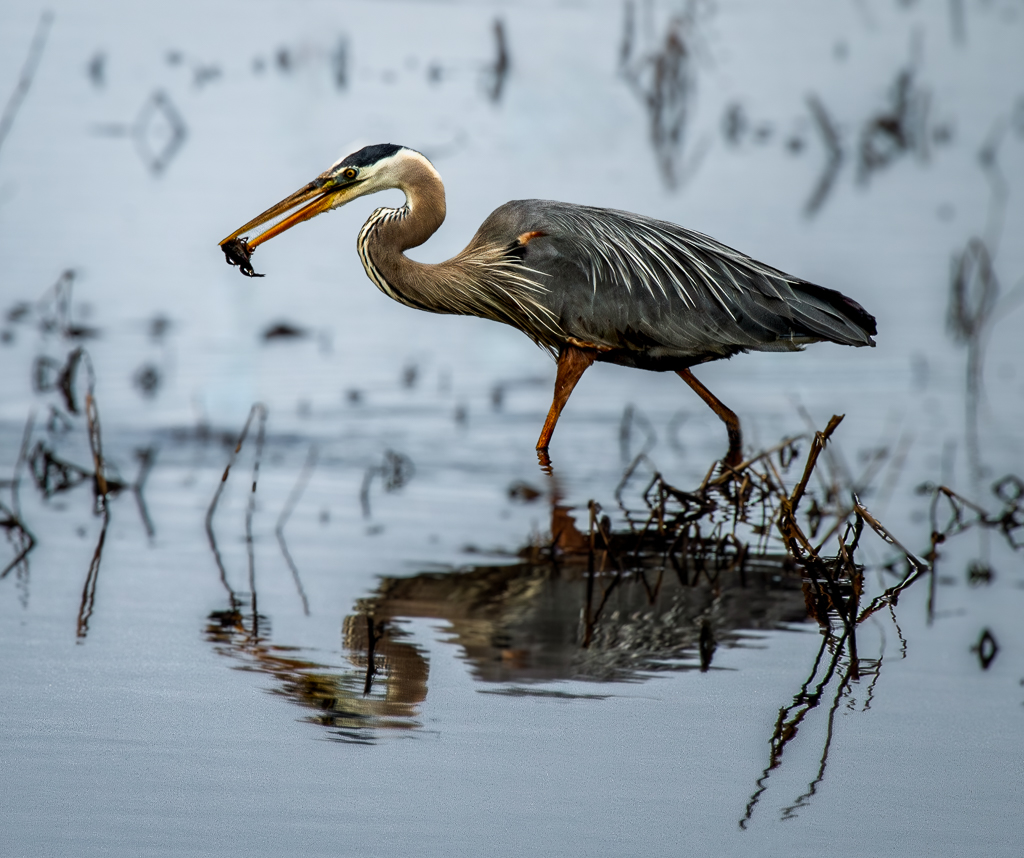
Good exposure given the different tones and lovely light on the fern. The bark has interesting patterns with the green fern (I think a fern) softening the whole image. I can see the red wood of the redwood. I think I would prefer more of the top of the tree to bring the green to the lower 3rd. Otherwise I do like it as it has many interesting patterns and makes me feel more relaxed. |
Sep 11th |
| 4 |
Sep 22 |
Reply |
I think I must have used program mode for some reason. It was taken a while ago when I was not confident in my skills. |
Sep 11th |
| 4 |
Sep 22 |
Reply |
It seems the consensus is for more saturation so thanks for your input. |
Sep 11th |
| 4 |
Sep 22 |
Reply |
Good point about the blue. Thanks for your kind words. |
Sep 11th |
| 4 |
Sep 22 |
Reply |
Well noted and a very easy fix. Thanks for your input. |
Sep 11th |
| 4 |
Sep 22 |
Comment |
Good exposure given the different tones and lovely light on the fern. The bark has interesting patterns with the green fern (I think a fern) softening the whole image. I can see the red wood of the redwood. I think I would prefer more of the top of the tree to bring the green to the lower 3rd. Otherwise I do like it as it has many interesting patterns and makes me feel more relaxed. |
Sep 9th |
| 4 |
Sep 22 |
Comment |
Good exposure given the different tones and lovely light on the fern. The bark has interesting patterns with the green fern (I think a fern) softening the whole image. I can see the red wood of the redwood. I think I would prefer more of the top of the tree to bring the green to the lower 3rd. Otherwise I do like it as it has many interesting patterns and makes me feel more relaxed. |
Sep 7th |
| 4 |
Sep 22 |
Comment |
Curves and shine make for a fun image. I like how your placement of the brass and how some red is reflected in it. Cutting off the fender doesn't bother me since the placement of the wheel in my opinion would be off if you had included the whole fender. You kept details in the black color while keeping the richness of the red. |
Sep 7th |
| 4 |
Sep 22 |
Comment |
You did a really good job with your post processing. Thanks for including the original to help orient oneself. The sign stands out with the background complimenting it. This makes a very interesting expression of life. I think the guitar silhouette in the window anchors the image. You are correct that the original is worthy on its own. |
Sep 7th |
| 4 |
Sep 22 |
Comment |
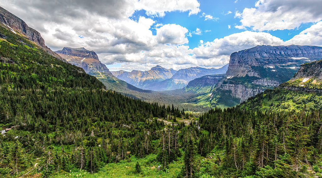
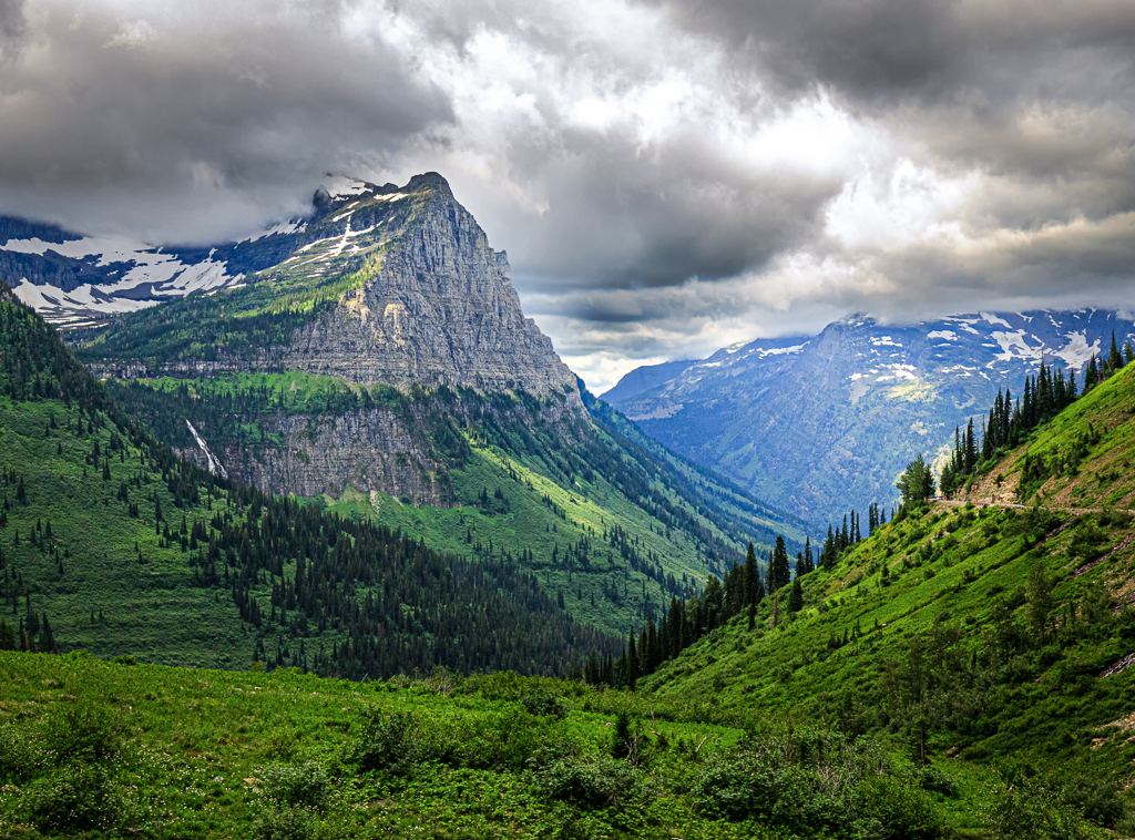
Agree with Gary, just beautiful and you found a great foreground. Love the light on the mesas with the wispy clouds. You have 3 layers to look at with complementary colors. The space between the mesas leads the eye through the photo. |
Sep 7th |
| 4 |
Sep 22 |
Comment |
I am of that era also and had known people affected by the war or died. Everything is sharp and well exposed given the bracketing. Interesting window reflections. Thanks for sharing. |
Sep 7th |
| 4 |
Sep 22 |
Reply |
Thank you for the additional info on the noise. Very interesting. |
Sep 7th |
| 4 |
Sep 22 |
Comment |
Congratulations on your beautiful grandson. What a personality! I am not a portrait person so take my comments with a big grain of salt. I like the posing but I think the lighting is too harsh and the shadows are not even. I see a highlight in his ear. Can you use a diffuser? The expression on the original is precious. He is so animated. |
Sep 7th |
9 comments - 5 replies for Group 4
|
9 comments - 5 replies Total
|