|
| Group |
Round |
C/R |
Comment |
Date |
Image |
| 43 |
Aug 24 |
Reply |
Thanks Bunny. I too like reflections, I feel it makes the scene look magical. |
Aug 30th |
| 43 |
Aug 24 |
Reply |
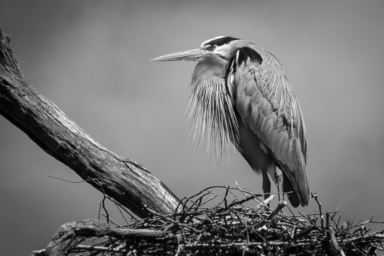
I really like what you have done here Harley. Much improved without the highlights in the background. I tried to eliminate them, but you accomplished that feat and really improved the look of the image. Thanks. |
Aug 30th |
| 43 |
Aug 24 |
Reply |
Thank you Leo. |
Aug 30th |
| 43 |
Aug 24 |
Reply |
Thanks for your comments Mark. |
Aug 30th |
| 43 |
Aug 24 |
Reply |
Thanks for your comments Andrew. Yes, the highlights are a distraction. I did work on them a bit, but did not seem to do much good. They were much brighter to start and I think the only way to get rid of them would have been to shoot from a different position. |
Aug 30th |
| 43 |
Aug 24 |
Comment |
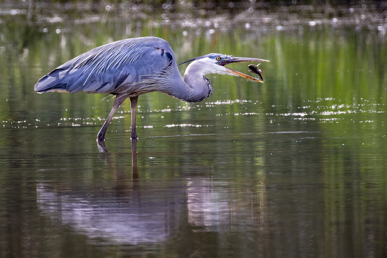
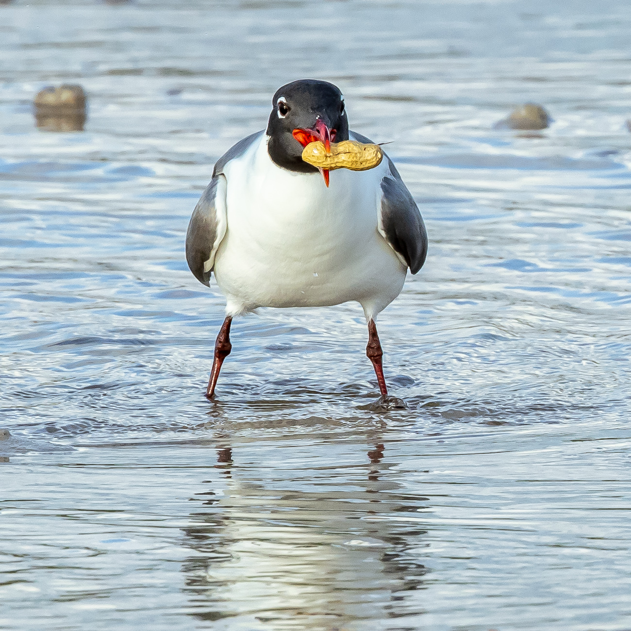
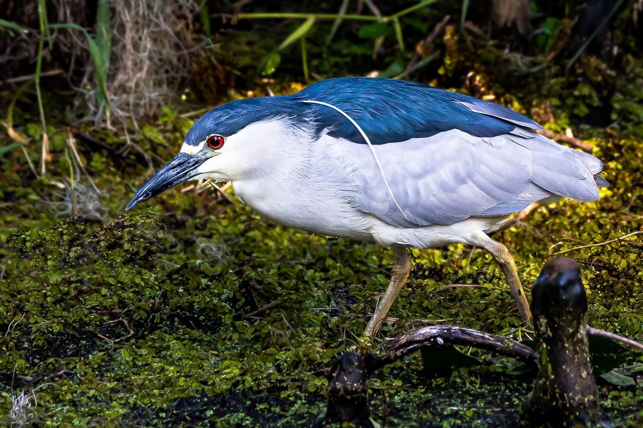
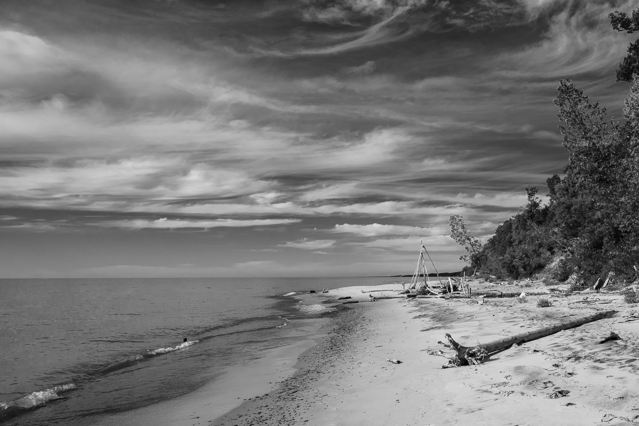
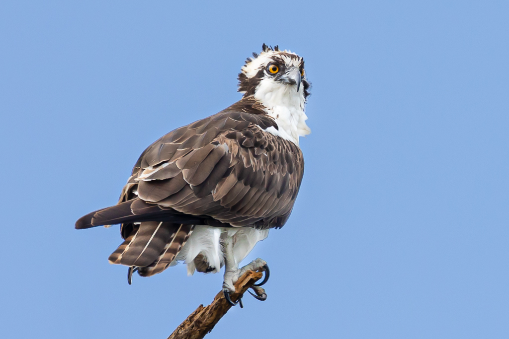
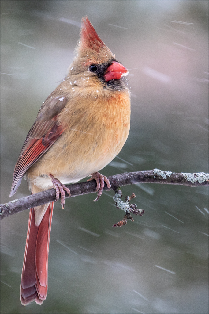
Wonderful shot Mark. One I have always wanted to capture. Your framing is just right and you caught him with a mouthful--what could be better. I think Andrew's comments and visual example are the way to go. The image looks much sharper in his processed example. I might suggest a slight vignette also which would bring the eye right to bird and make the background look more "foggy". I hope you are 100% recovered now. I know as we age it takes much longer to feel better even from minor bumps and bruises. Stay well my friend. |
Aug 13th |
| 43 |
Aug 24 |
Comment |
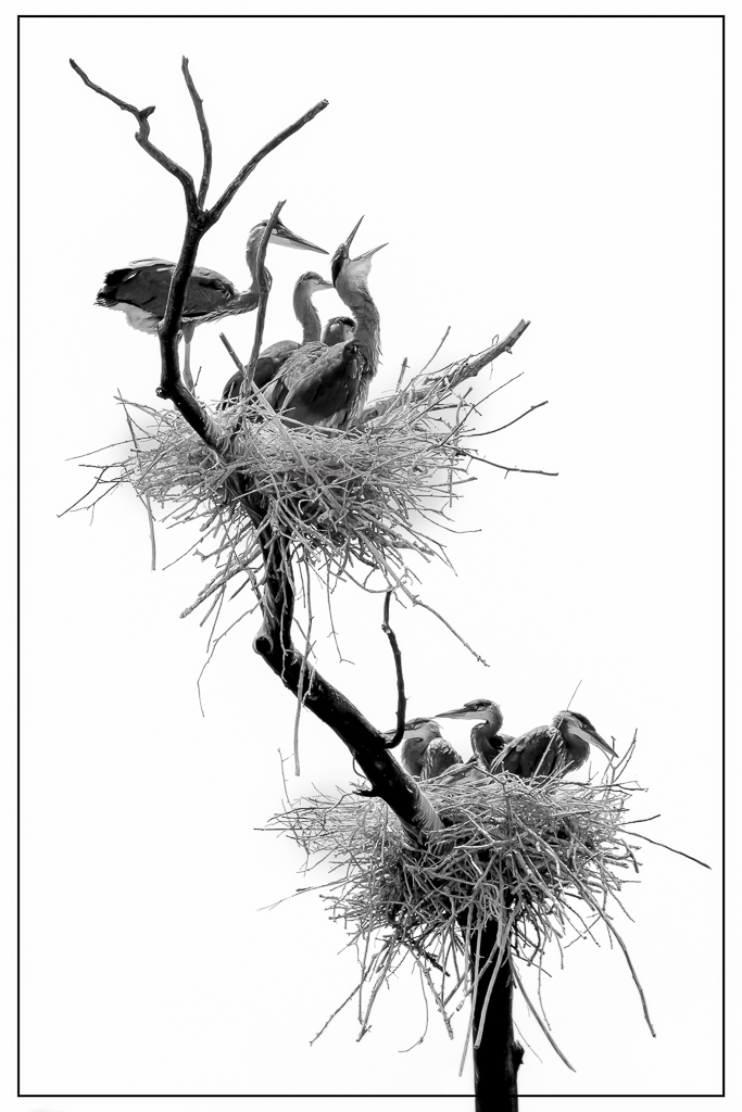
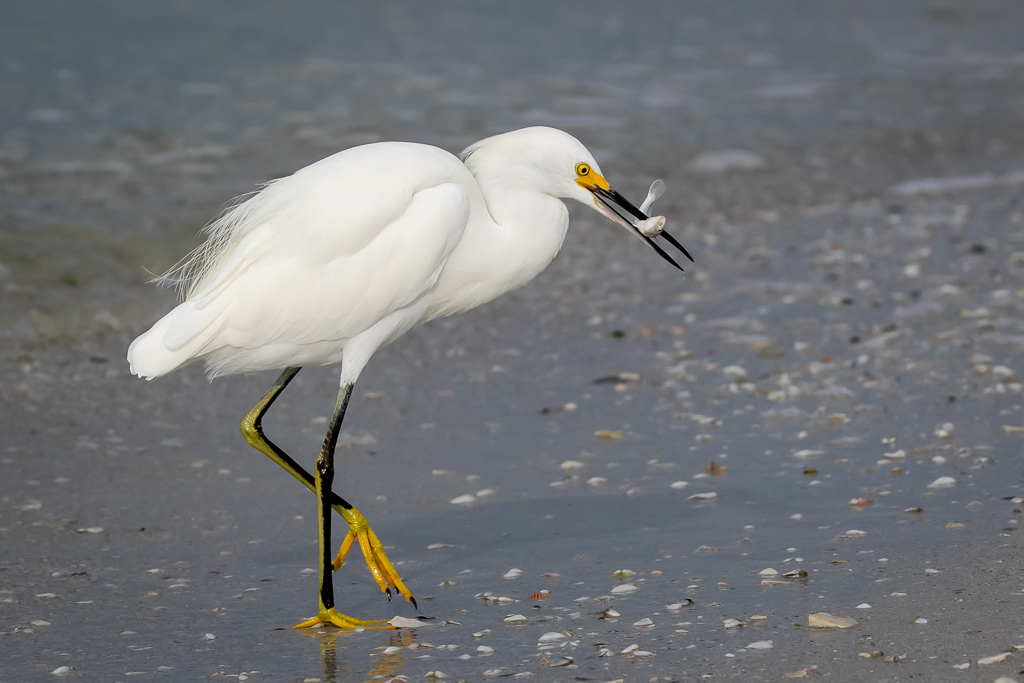
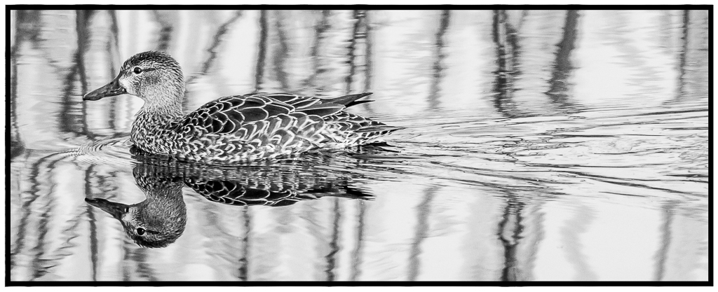
Good catch Bunny. You caught them at the perfect moment. It is like they were putting on an arial show for you. I like your crop giving the gulls space to fly into and their position relative to the horizon adds to the "movement" of the birds. White birds are hard to photograph with sun on them and Mark did a nice job of adding a bit of detail to the heads. I see some darkness on the wing tops which may be a result of processing. I have tried to eliminate some of this in a quick trip to Lightroom and have also lightened and added some blue to the background which, in essence, changes the feel of your shot--sorry this is just my take on it hope you don't mind. Take a look and let me know your thoughts. I know there are lots of fuzzy areas, but without a RAW file it is hard to make detailed changes.
|
Aug 13th |
 |
| 43 |
Aug 24 |
Comment |
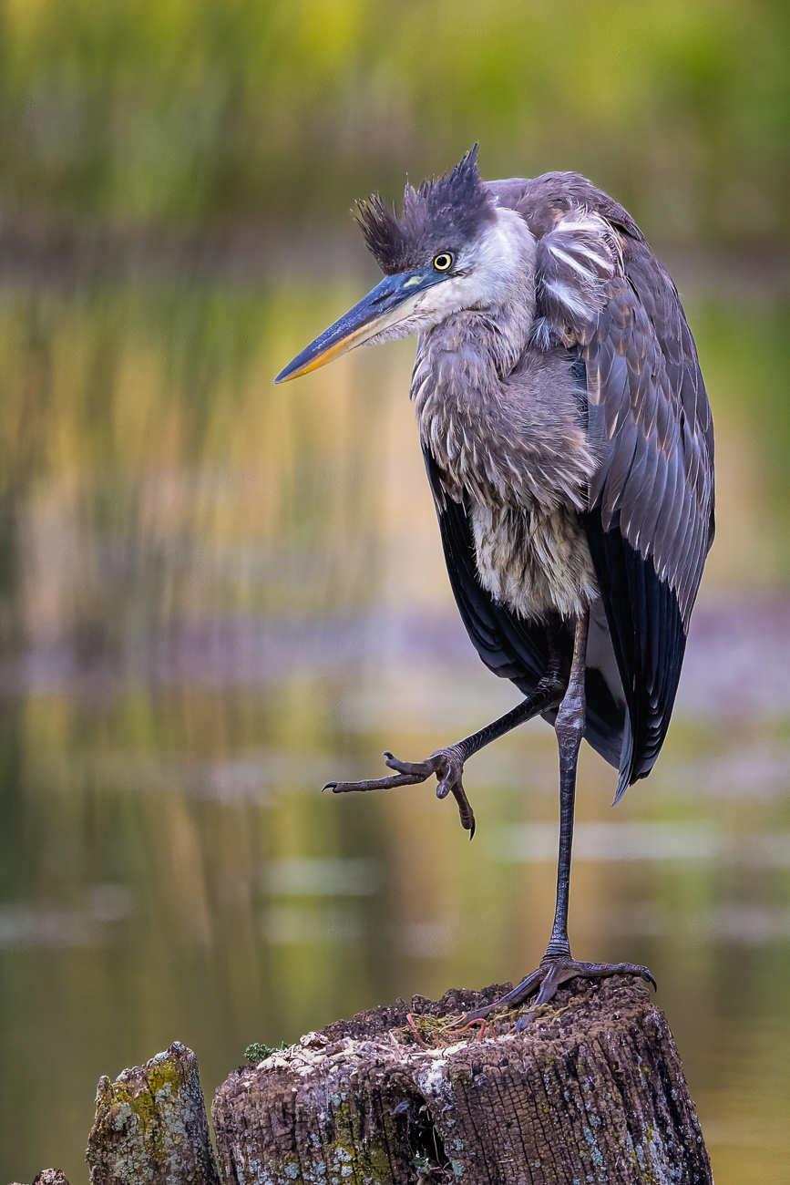
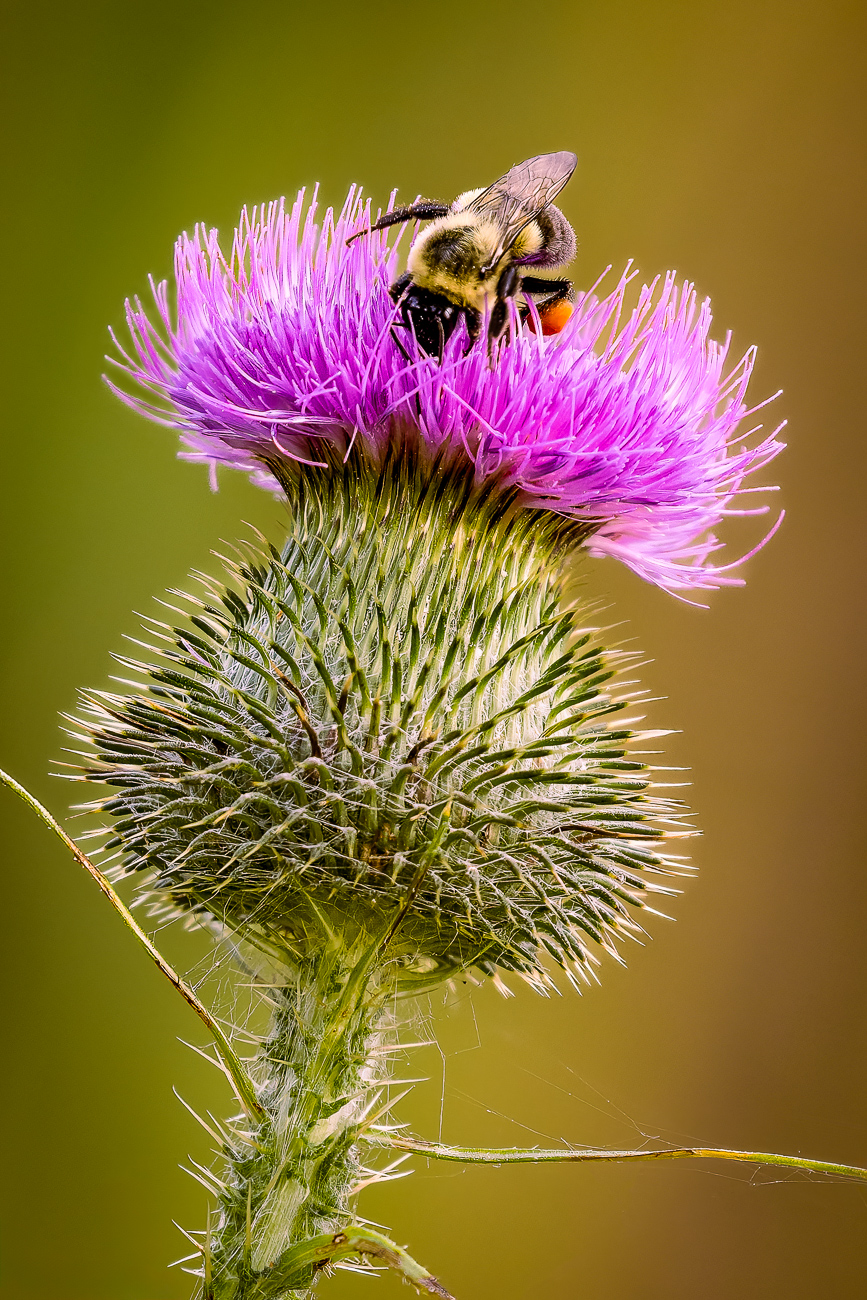
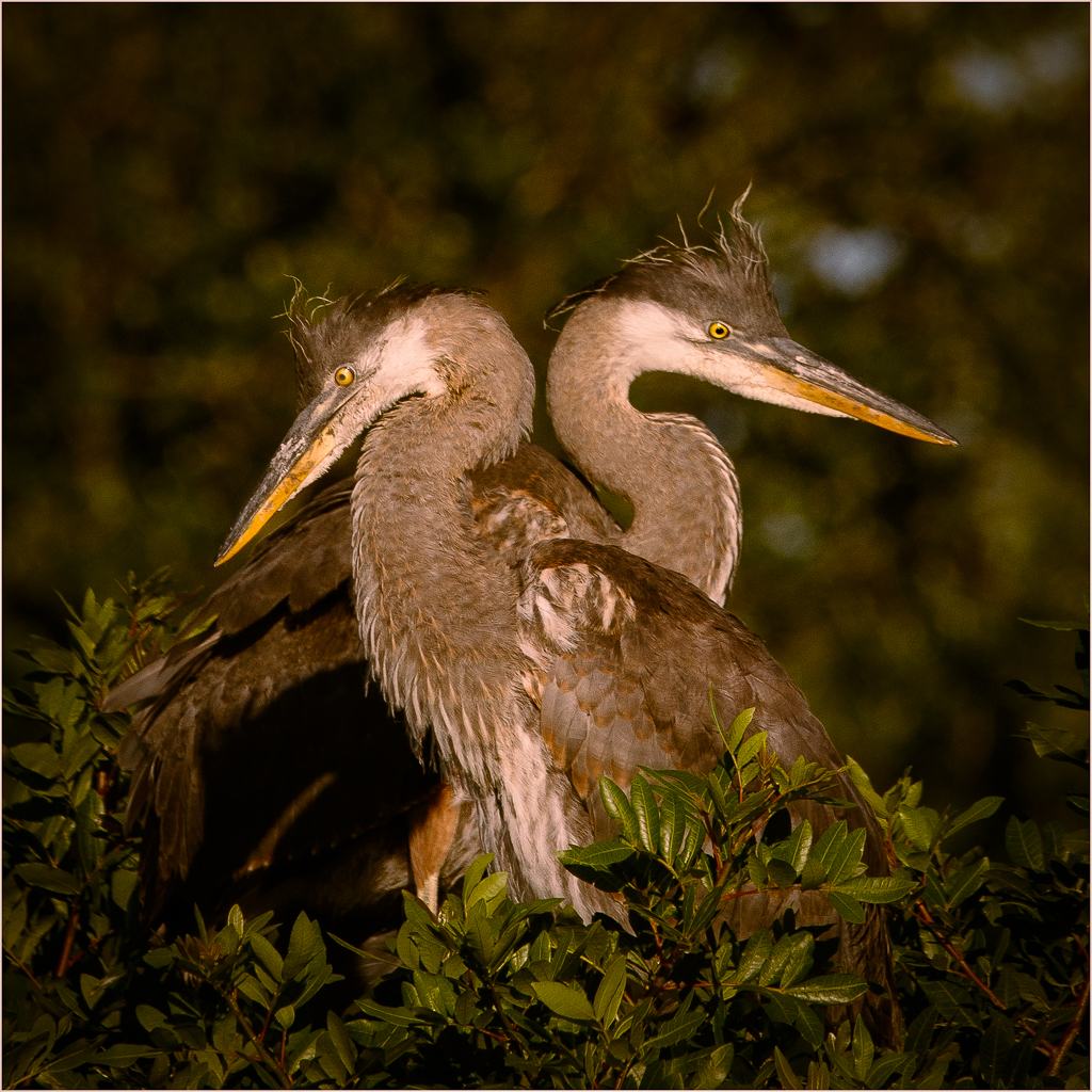
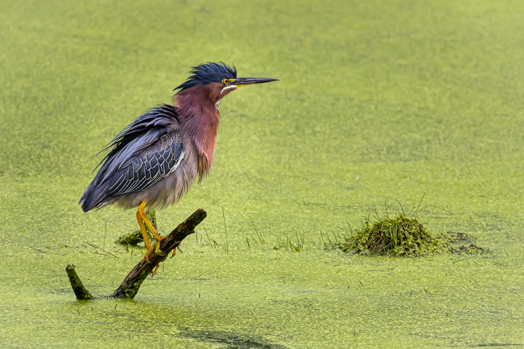
Well Andrew, your image, in my opinion, excels in its simplicity. You have used negative space well to call attention to your subject and I don't think the colors could be better if you painted them yourself--they all work well together. I feel your composition is just right and I agree that the bit of orange on the end of the reed adds to the image. I can see what looks like a reed or branch in the background arching from upper right to lower left--a fortunate placement as I think this just calls attention to the birdie and looks so intentional (was it?). I might suggest to lighten the left side of your friend just a bit more to open those shadows a little more. If this were a greeting card the title could be "I Miss You". Nice work Andrew. |
Aug 13th |
3 comments - 5 replies for Group 43
|
3 comments - 5 replies Total
|