|
| Group |
Round |
C/R |
Comment |
Date |
Image |
| 43 |
Jan 23 |
Comment |
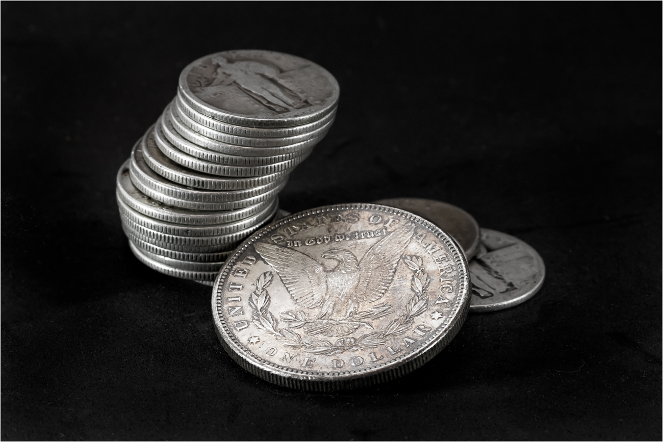
Thanks for your comments Harley. Yes, tension is what I was trying to achieve. I stacked the coins many ways and also tried piles, piles and stacks and what you see is my final result. I think it worked because it was the simplest composition. Who knew. |
Jan 18th |
| 43 |
Jan 23 |
Reply |
Thanks Mark, yes it looks easy until you start placing objects on the table to photograph. So many choices and what I really mean is so many bad choices. I know what looks good when I find it in the wild, but setting it up myself is a whole different animal. |
Jan 18th |
| 43 |
Jan 23 |
Reply |
Thanks Lane. As I mentioned to Linda I did not want to spend the time to look for my piece of velvet and this is what I get for being lazy. |
Jan 18th |
| 43 |
Jan 23 |
Reply |
Thanks for your comments Leo. |
Jan 18th |
| 43 |
Jan 23 |
Reply |
Thanks Linda, I did sharpen in LR, but have never used High Pass in PS. It has achieved what I wanted but could not get in LR. As far as the spots on the background go it was my own fault since I used foamy sheeting vs. velvet (did not want to spend the time looking for the velvet). |
Jan 18th |
| 43 |
Jan 23 |
Comment |
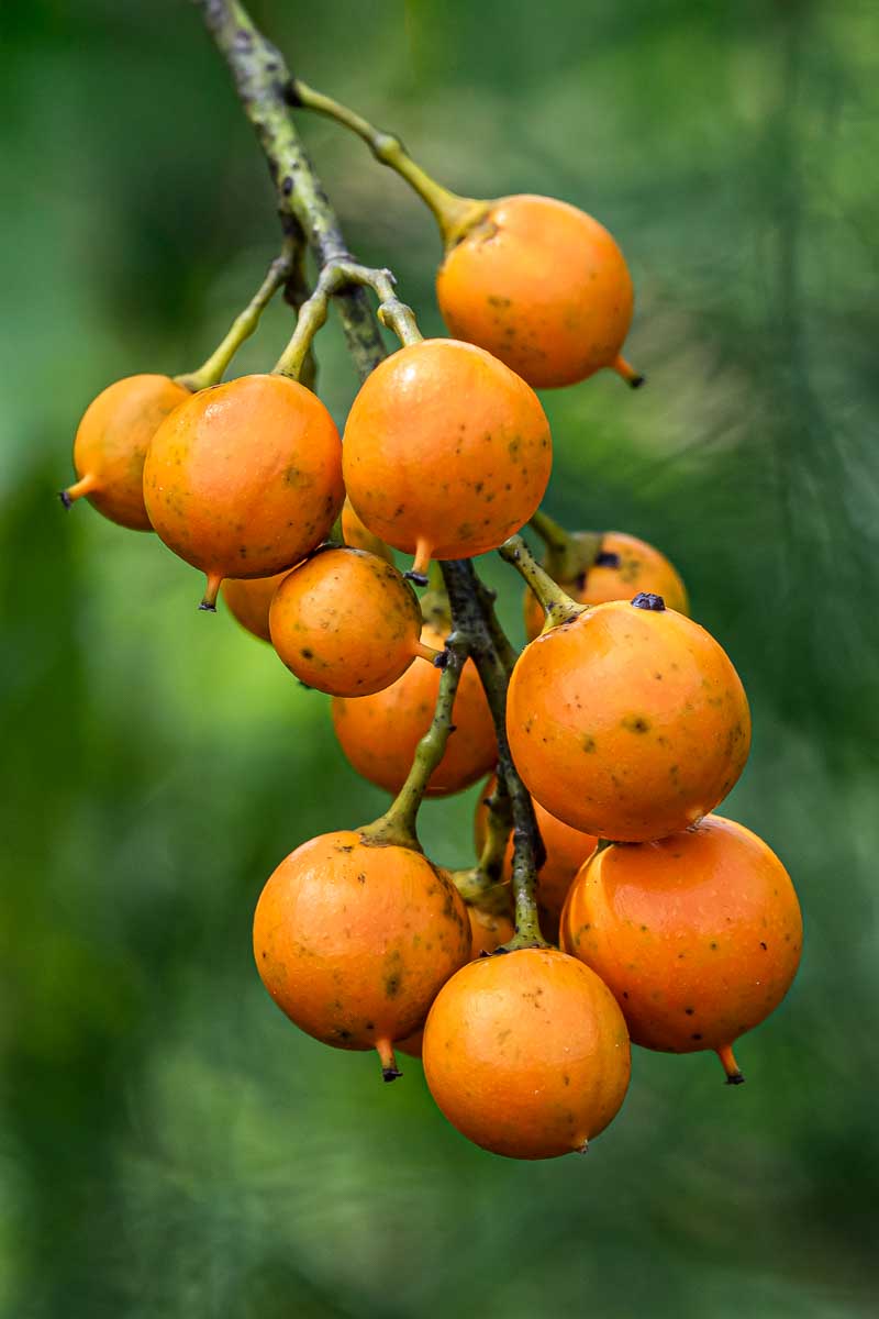
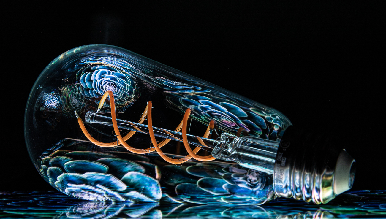
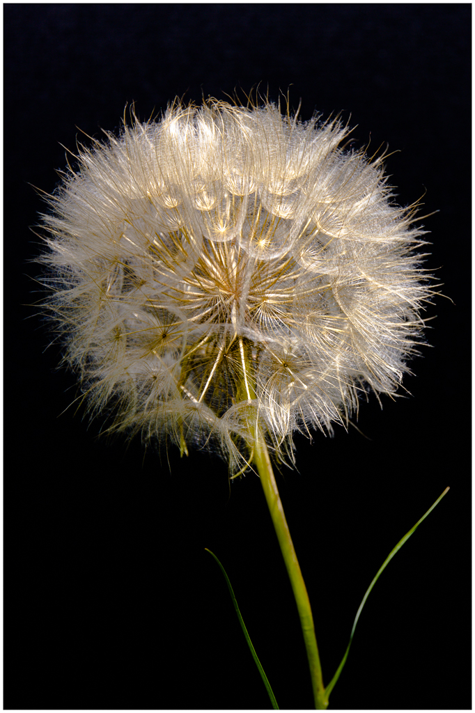
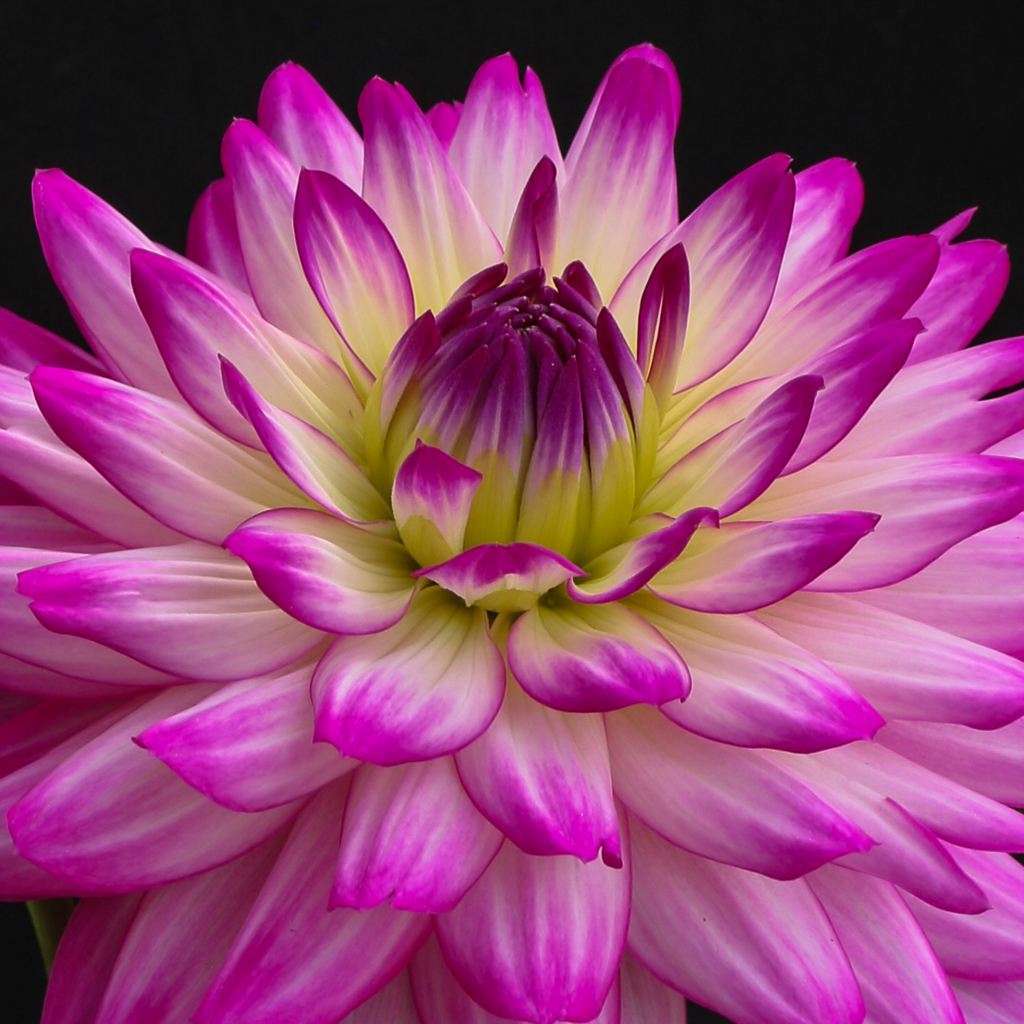
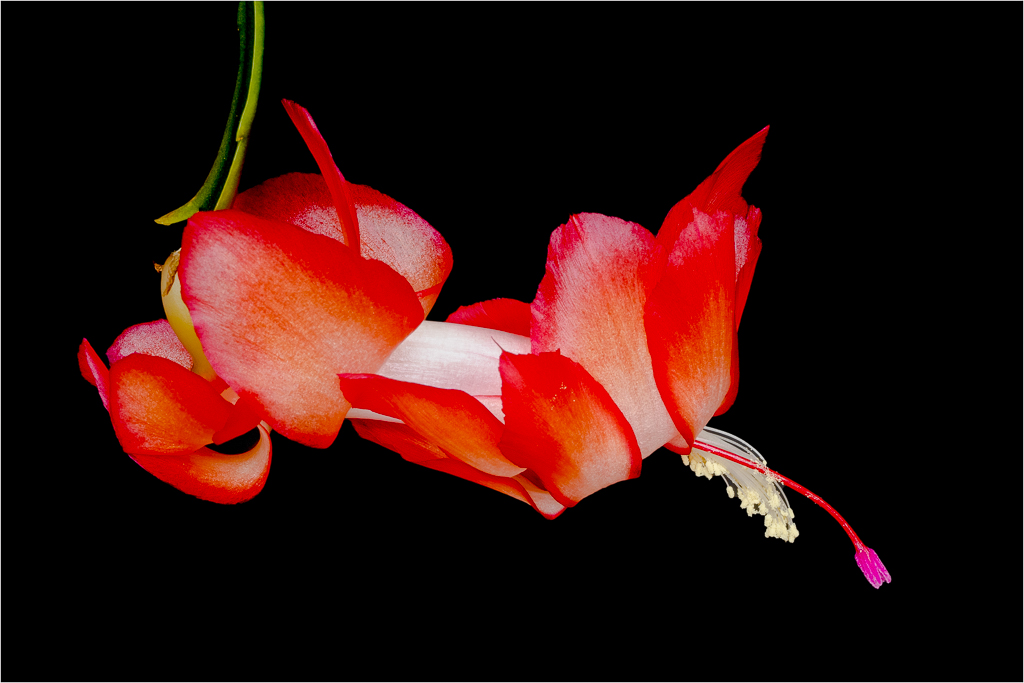
Love the macro Harley. You have nailed the focus here with your bracketing. The colors and detail are true and just what we like to see in a macro. You have given us "less is more" and done it very well. I do like how Linda has cleaned up a bit and as I tell everyone when you have a dark subject you must put a 1-2px white border just to separate it from the background when viewing in DD so we get a feel for the scope of the image. I can see this as a Tryptic with the image rotated for each panel.
Cool work. |
Jan 18th |
| 43 |
Jan 23 |
Comment |
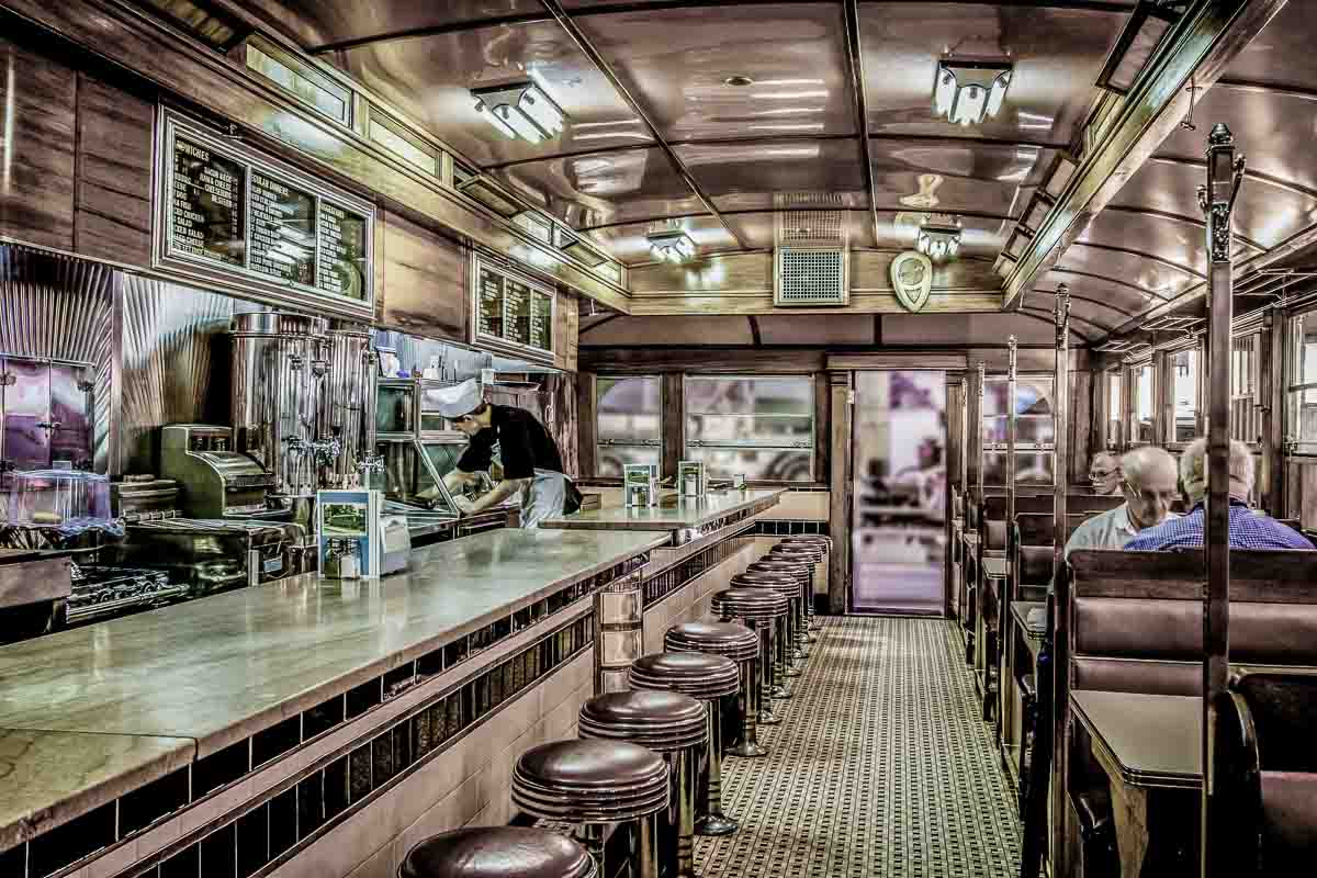
I like this one very much Mark. You went the extra mile in putting this together for us. Exposure and tone are perfect and although the window is a bit blown out it is not a deal breaker since as a viewer I expect to see it that way. Darkening a bit or not your call. I feel the joints in the marble ceiling slabs are the star here giving us texture, repetition of pattern and leading us to view the paintings on either side as well as the interesting staircase and knee wall with repeating balusters.
The lower offices don't really add anything to the shot, but I don't see how you could crop them out and keep the look you are going for here. They too aren't a deal breaker. My only suggestion is to straighten the horizon as it tilts slightly to the left. Nice work here counselor. |
Jan 18th |
| 43 |
Jan 23 |
Reply |
Thanks Andrew. Not my specialty, but it was fun doing something different for a change. |
Jan 13th |
| 43 |
Jan 23 |
Comment |
Well seen Lane. I like this image and can see it on a greeting card. The leaves add nice detail and a pop of color and the swirls on the lower left give it motion. I wonder how it would look with less shadow on the right? Fun image. |
Jan 13th |
| 43 |
Jan 23 |
Comment |
I can almost hear the fog horns Linda. Nice moody capture of the harbor with all the cool riggings on the vessels. I particular like the Bakersfield boat as it is drawing attention right into your image because of the darker color. You are telling the story well and have enough visibility to give us a total look. I would like to see a bit more on the right past the building, but sometimes mystery is good. Nice work. |
Jan 13th |
| 43 |
Jan 23 |
Comment |
Beautiful capture of the market with the hustle and bustle all of the colors and people shopping and wandering around. This gives us a nice view of life at the Night Market which is quite a vibrant scene. I like how you have shown an expansive view for the viewer to get a sense of place and feeling for the location. I do also like the edit Linda provided. |
Jan 13th |
| 43 |
Jan 23 |
Comment |
Very nice image Andrew, you are telling a good story here. I like the warmer tones as they add to the "humanity" of the image. You have done a nice job separating the subjects from the background and drawing our focus to the chimps. I think your crop is just right your focus is spot on. Nice image. |
Jan 13th |
7 comments - 5 replies for Group 43
|
7 comments - 5 replies Total
|