|
| Group |
Round |
C/R |
Comment |
Date |
Image |
| 42 |
Jan 22 |
Comment |
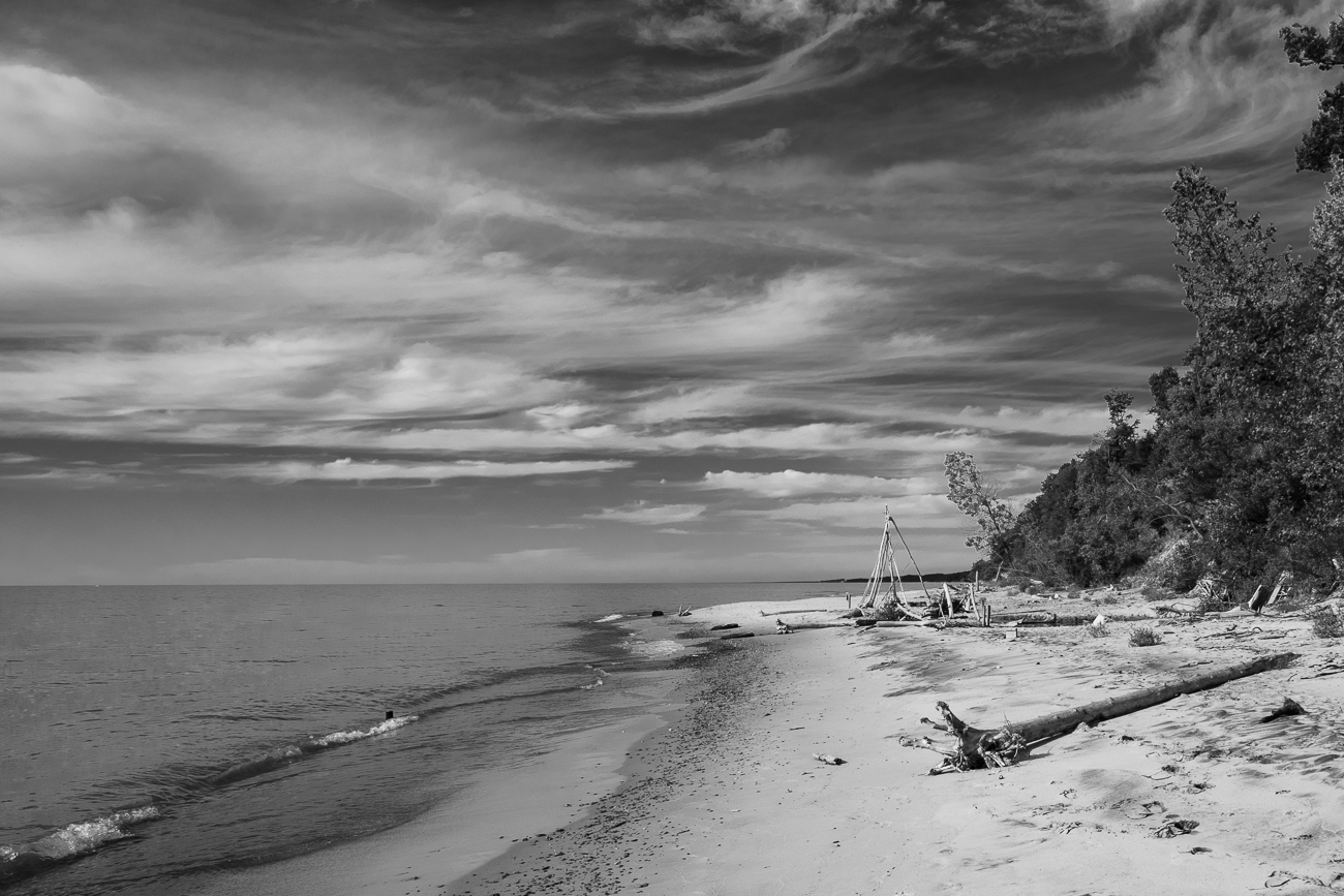
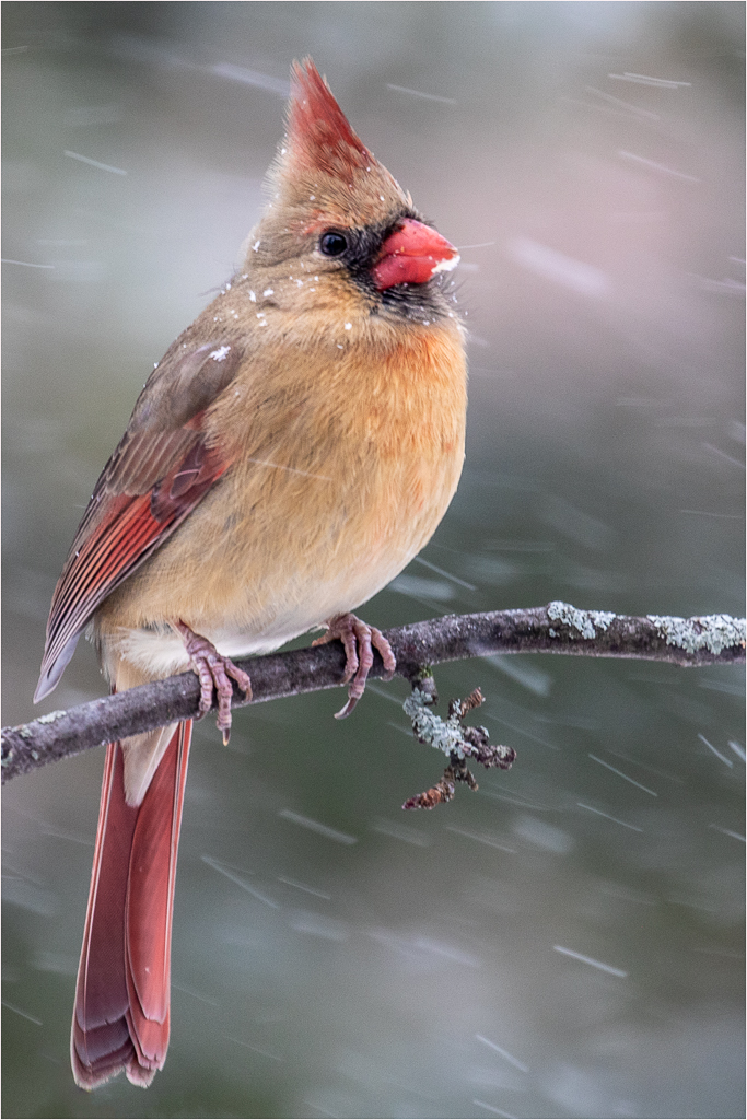
You have worked hard on this image and have a few keepers. I like the look of this final one, exposure is nice, detail is good and the rocks do look better now that you have "watered" them. I see it snowed since you started and while I think the snow is fine I find it draws my eye a bit toward it since it is so light toned compared to the subject. |
Jan 23rd |
| 42 |
Jan 22 |
Comment |
Happy to chat with you about your image. Just goes to show that there are many ways to shoot the same subject. |
Jan 14th |
| 42 |
Jan 22 |
Comment |
I like this one better Robert. You have given us a nicer look at the lantern and opened up the shadows a bit. The lantern is definitely the main subject here. I do agree that wet rocks would be nice likely giving a rich deep black look to the ground. It is unfortunate that the grass was flattened by the snow, but I think you did a nice job blurring the background anyway. Thanks for taking the time to shoot a second look here. Which one do you like better? |
Jan 13th |
| 42 |
Jan 22 |
Comment |
Hi Robert, just visiting from group 43. I read your comments that you wanted more discussion and less one and done. Well that is why I took the time to comment on you image.
I like the monochrome look here and I feel your exposure is right on. You have a nice pleasing composition with the little shrine on one of the Power Points of the Rule of Thirds which gives it strength and calls for attention.
I wish I could see more of the shrine though. I feel a lower vantage point (think laying on the ground) for the shot would give us a good look and the grass would be a pleasing background too. That, in my opinion, would lessen the focus on the rocks in the foreground which are a bit plain and make the shrine the star of the show.
Nice image.
|
Jan 9th |
4 comments - 0 replies for Group 42
|
| 43 |
Jan 22 |
Reply |
Very cool Harley. I will have to check out YouTube for some instructions. Those shadows really look like the real thing.
Was this done with a layer style? Thanks for the comment. |
Jan 17th |
| 43 |
Jan 22 |
Reply |
Thanks Andrew. I like still life images too, but have a hard time setting them up for a pleasing shot for some reason. I hope to do more in the coming year. |
Jan 17th |
| 43 |
Jan 22 |
Reply |
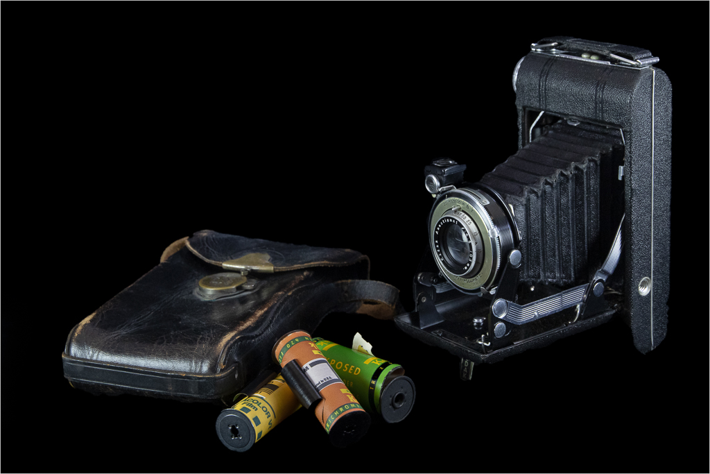
Thanks Harley. Here is a different background and a roll on its side. I like the color (adobe color theme suggestion), but since I am not an expert at Photoshop the props looks placed on the background rather than shot on the background. I need to learn how to create shadows to give the illusion of that dimension. Anyway, is the color any better than the stark white? |
Jan 17th |
 |
| 43 |
Jan 22 |
Reply |
Thanks Lane. It was hard taking pictures in the "old days". |
Jan 17th |
| 43 |
Jan 22 |
Reply |
Thanks for posting your take on the comments Andrew. It shows us something we already know, but sometimes forget when commenting and that is that "every adjustment to an image changes many things and sometimes there are unwanted consequences". Hence, blurring the props may have blurred the fire suppressant too and that, of course, is the subject of your image. Thanks for creating a great discussion. |
Jan 17th |
| 43 |
Jan 22 |
Comment |
I think you have captured a nice action shot of the rider coming out of the turn. I like the spray of dirt behind the rider giving us a sense of speed and movement. I like that you have the rider moving into the frame and I think you nailed the exposure. I do think a tighter crop or different camera angle would be good here--focus more on the bike rider and try to eliminate the white sign and fence in the background. Nice image Leo. |
Jan 9th |
| 43 |
Jan 22 |
Reply |
Thanks Mark. Still life arrangement is not my strong suit. I played with those film rolls a lot, they just never seemed to look right. As for the black background, I like it. But I also like the white too. As for the fact that one roll is in front of the other--I'll try opening them up next time. |
Jan 7th |
| 43 |
Jan 22 |
Reply |
Thanks Linda. |
Jan 7th |
| 43 |
Jan 22 |
Comment |
I think this is a very cool shot Andrew. You have captured the peak of the action and are telling a good story. I really like the way we see the red fire suppressant suspended in mid-air and just touching the burning vegetation on the ground. Colors are great and my eye moves right up to the plane dropping its payload. I think this is well captured. One thing I like to see with prop planes is a bit of blur in the propellers, I feel it gives them a less static look.
Well done |
Jan 7th |
| 43 |
Jan 22 |
Comment |
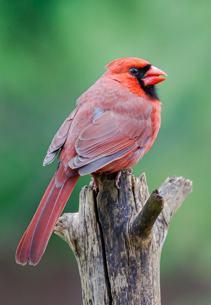
I think you captured a great portrait of this guy Harley. I like your crop putting his eye on one of the "power points". The lighting is working well too giving that hairy face dimension and character. I also like the fact that all is in focus from that nose to his eye, and sharply detailed too. Good capture.
|
Jan 7th |
| 43 |
Jan 22 |
Comment |
I like your crop Mark and the story it tells, but I really like the original more. The reason is that I feel it is more of a Street Photography photo than a Travel Photo. The original, I feel, shows the "urgency" of the many women crowding to get into the restroom--lots of people--too few facilities. As far as the one you have chosen goes I like how the color and tones all are all in the blue family as the ladies wait their turn and the fist in the air is a great quirky element that makes this a very unique shot. Well seen, and well captured. |
Jan 5th |
| 43 |
Jan 22 |
Comment |
Very pretty image Lane. I like the red leaves on the rocks to the left and the drips of water in that area, you have done well to capture detail in the small cave area and I find it quite interesting and mysterious. Your colors and texture in that area really work well. You have also presented us with a lovely waterfall, in my opinion. The slow shutter speed has softened the water nicely and given a soft silky look to this area. I would like to see more though--I want to know where that water coming from! Great fall capture. |
Jan 5th |
| 43 |
Jan 22 |
Reply |
Sorry I wasn't very clear. DD is Digital Dialogue and the background our images are shown on is black. So if you have a black edge (fade from light center color to black edge) on your submitted image it just blends into the Digital Dialogue background and makes it harder for the viewers eye to find the edges of the photo. |
Jan 5th |
| 43 |
Jan 22 |
Comment |
Well seen and well captured Linda. As Mark said the leading lines are wonderful. First the vertical post and then the very cool spiral staircase. I think you are leading the viewer right to the center of the action and when they get there there is much to see. My eye kept viewing in circles at the top trying to see everything. I also like the rich warm tones in your image and your transition from dark to light just adds to the presentation. Love it!
You might consider a thin white border on images that fade to black at the edges for DD. The DD background is black and a image with black at the edge bleeds into it. |
Jan 5th |
6 comments - 8 replies for Group 43
|
10 comments - 8 replies Total
|