|
| Group |
Round |
C/R |
Comment |
Date |
Image |
| 43 |
Jul 20 |
Reply |
Thanks Lane, I'll give it a try. |
Jul 18th |
| 43 |
Jul 20 |
Reply |
Thanks for your comment Linda. |
Jul 11th |
| 43 |
Jul 20 |
Reply |
Thanks Mike. |
Jul 10th |
| 43 |
Jul 20 |
Reply |
Thanks for your comments Mark. |
Jul 10th |
| 43 |
Jul 20 |
Comment |
Great sharp focus on the tongue and nice detail, I like how it gives your image a pop of color making it the focal point. I think you are telling a good story here and I can feel for the poor horse battling the flies. I think the assembly of files on the nose really add to your image. To my eye, the dark background really works. Something I think you might try would be to darken the light vertical strip on the right and you might clone out the stray flies at the top and sides to see if that would enhance the look. |
Jul 9th |
| 43 |
Jul 20 |
Reply |
Thanks Harley |
Jul 9th |
| 43 |
Jul 20 |
Comment |
Neat shot Harley, I really like your subject it coveys fun and action. You did well, in my opinion, tightening the crop and warming the sand a bit. I can almost hear the geese squawking! I think you have a nice visual line from the boy through all of the birds. I suggest you try to center the image a bit giving less space at the bottom and a bit more at the top, thus giving the birds a bit of room to "fly away". I realize the wall might be an issue if you do this, but there might be a software work around. |
Jul 9th |
| 43 |
Jul 20 |
Comment |
I think you have created a very nice abstract photo from your pond. I really like the blending of colors in the water and the patterns in the solid color area. Reminds me of Starry Night by Van Gogh. The bubbles really stand out, in my opinion, and the bright touches of magenta and green are great highlights. I also like the leading line of bubbles which brings my eye right into the image. I do feel a few of the highlights are a bit bright and would benefit from minor reduction in brightness.
|
Jul 6th |
| 43 |
Jul 20 |
Comment |
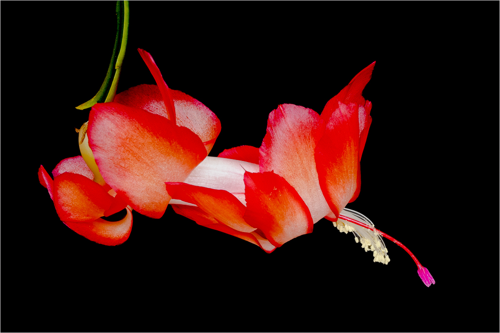
I like how you have isolated the lotus from the background and also think the muted colors are very pleasing. Since you told us that it was very windy you did well to get a nice sharp, in focus, shot and were able to maintain the detail in the petals. I do see a bit of fringing on the petals that could possibly be removed in an editing program. To my eye, the area directly behind the flower is a bit dark, if it were a bit lighter it might highlight the flower just a bit more while still keeping the subtle tones. |
Jul 5th |
| 43 |
Jul 20 |
Comment |
I like how you have framed this image with the leaves at the top and your perspective is very interesting. I think the colors are just right so your cooling of the image worked well. You have caught a great moment in time for two ladies and your photo tells a story and makes me wonder what they are talking about. I feel it would benefit the image if you put a thin white stroke around it since the DD images are shown on black and it is hard to see the edges when an image has a black edge.
|
Jul 4th |
5 comments - 5 replies for Group 43
|
5 comments - 5 replies Total
|