|
| Group |
Round |
C/R |
Comment |
Date |
Image |
| 10 |
Dec 23 |
Comment |
Lovely. The petals of the mum create drama. Perfectly captured with your Lensbaby. It pops against the black background. I like it. |
Dec 26th |
1 comment - 0 replies for Group 10
|
| 60 |
Dec 23 |
Reply |
Thank you kindly, Rita. |
Dec 15th |
| 60 |
Dec 23 |
Reply |
Thank you, Blair. |
Dec 11th |
| 60 |
Dec 23 |
Comment |
Hi Anne,
Creative shot. The black and white stripes on the zebra create an interesting pattern. |
Dec 8th |
| 60 |
Dec 23 |
Comment |
Hi Rita,
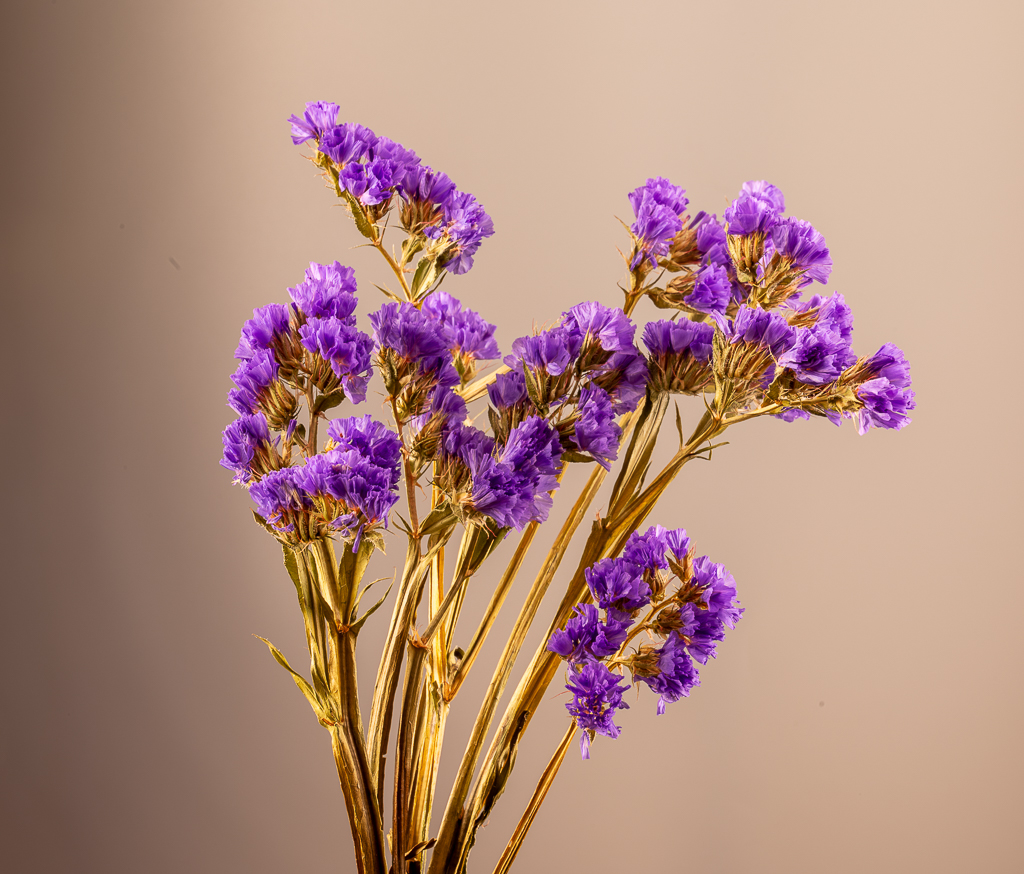
Eye-catching image. Nicely composed. The flower, vibrant colors and busy little bee create a nice image. However, the sharpness is missing.
If you intend to submit the image into a macro competition, it must be tack sharp, especially in the center. |
Dec 8th |
| 60 |
Dec 23 |
Comment |
Great architectural image, Blair. Good perspective. The lines, shapes, columns, and strong red color create a pleasing image. Well exposed. The reflections add interest.
The right and left windows seem to be tilted a bit. It can be fixed. I don't know what post processing software you use, but you can straighten the lines with the "perspective tool" in Pbotoshop, Lightroom, or other post processing software. Nice job. |
Dec 8th |
| 60 |
Dec 23 |
Comment |
Nice shot, Damon. The selective focus and warm tones worked well. |
Dec 8th |
| 60 |
Dec 23 |
Comment |
Magnificent image, Dean. The light and shadows, colors, and composition create strong impact. The leaning trees add interest. Love the pink and blue. Well executed.
|
Dec 8th |
| 60 |
Dec 23 |
Reply |
When I say "flat", I mean it lacked dimension. It looked pasted onto the background. So I tried to add depth by applying a texture.
Looking at it again, it probably was due to the placement of the lights. As we all know, it's all about the light. Happy Holidays! |
Dec 7th |
| 60 |
Dec 23 |
Reply |
Damon,
I wasn't correcting you. You mentioned the lighting, so I was letting you know I used continuous lighting rather than flash in a softbox.
I always considered blending a texture to be more of a toning tool, not a composite, but I stand corrected.
You are correct.
Hope this clarifies everything.
Originally, I thought my image looked flat. That is the reason I added a texture to add depth. I don't know why image looked flat. |
Dec 7th |
| 60 |
Dec 23 |
Reply |
Thank you, Damon. It isn't a composite. I've attached the original. A light texture was applied to the beige background. I don't know why you think it's a composite. I didn't use flash. I used continuous light. A texture was applied and blended over the original image. I appreciate your feedback. |
Dec 7th |
 |
| 60 |
Dec 23 |
Reply |
Thank you, Dean. |
Dec 7th |
5 comments - 6 replies for Group 60
|
| 99 |
Dec 23 |
Reply |
Thank you, John. |
Dec 21st |
| 99 |
Dec 23 |
Reply |
Thank you, Linda. I like it. |
Dec 13th |
| 99 |
Dec 23 |
Comment |
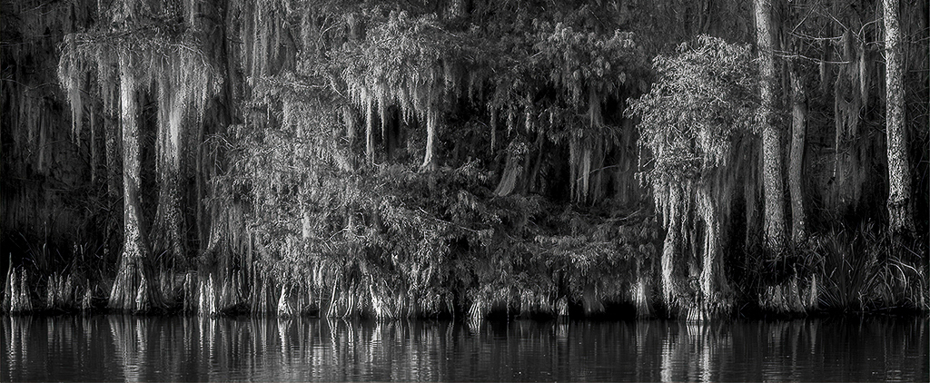
Hi Linda,
Lovely scene with nice contrasting tones. I find the Cypress trees at the edge of the water, and the reflections in the water to be the most interesting part of the image. I cropped out the top half of the frame to direct more attention to the shore. What do you think? |
Dec 10th |
 |
| 99 |
Dec 23 |
Comment |
Tom,
Interesting shot of a modern oldie but goody. Water fountains are rarely seen today.
I agree with the other members. The light should be the subject. The back wall of the fountain provided a good background for the light. Dark and moody works well. |
Dec 9th |
| 99 |
Dec 23 |
Comment |
Nice abstract, John. The lines, shapes, and tonal variation along with your perspective give it a 3D appearance. Well exposed and sharp. Good job. |
Dec 9th |
| 99 |
Dec 23 |
Comment |
Great architectural shot, Peter. The image has lines, curves, texture, and good contrast. Nice job capturing the double exposure. Your addition of the threatening sky creates impact.
The image should score highly in the camera club competition. It's different and well executed. |
Dec 8th |
| 99 |
Dec 23 |
Comment |
Kathleen, it is a very interesting scene with the spaceship -like building. Nicely composed. The black rails on the dock leads you into the harbor, and the building provides a canopy over the ships. Good tonal variation. In addition to Gerard's and Peter's suggestions, I would remove or crop the small black part poking out on left side edge of the frame. Thank you for sharing. I like it. Well done. |
Dec 8th |
| 99 |
Dec 23 |
Comment |
Eye-catching image, Gerard. You captured incredible details on this piece of art. Sharp and well exposed. Unique angle of view. Well done.
I prefer the monochrome version since it complements the old, worn foot on the statue.
Your Shadow image in Group 79 is nicely done. I like the colored shadows. It works well. |
Dec 8th |
| 99 |
Dec 23 |
Reply |
Thank you for your suggestions, Peter. The blotches are part of the texture I applied to the background coupled with the shadows in the original. I needed to look up "pangolins". It was interesting to see their scalelike body does resemble a cone. |
Dec 5th |
| 99 |
Dec 23 |
Reply |
Thank you, Kathleen. |
Dec 5th |
| 99 |
Dec 23 |
Reply |
Thank you, Gerard. |
Dec 5th |
6 comments - 5 replies for Group 99
|
12 comments - 11 replies Total
|