|
| Group |
Round |
C/R |
Comment |
Date |
Image |
| 14 |
Sep 23 |
Comment |
Spooky and well done. The lighting effects and blue coloring created strong impact. |
Sep 1st |
1 comment - 0 replies for Group 14
|
| 24 |
Sep 23 |
Comment |
Beautiful! Thank you for sharing your technique. |
Sep 4th |
1 comment - 0 replies for Group 24
|
| 60 |
Sep 23 |
Reply |
Thank you, Debbie. |
Sep 16th |
| 60 |
Sep 23 |
Comment |
Hi Damon,
You captured a nicely focused self portrait. The camera and computer work well for your story. I agree with everyone that the blurred umbrella in the upper left should be removed. I might also consider removing the light behind your left shoulder. Another suggestion might be to just darken the background a bit. Good story. |
Sep 14th |
| 60 |
Sep 23 |
Comment |
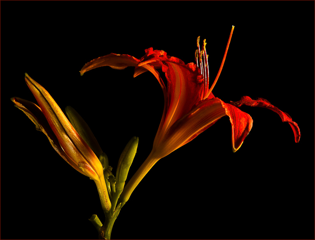
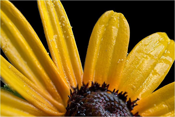
Very interesting shot, Dean. Good texture and color. You captured nice details on this unique plant. Great find. I am curious what is the plant? |
Sep 14th |
| 60 |
Sep 23 |
Comment |
Hi Rita,
Nice ICM shot. Pleasing colors. The bright areas look ok, as they flow with the rest of the image. I think it looks great, and no changes are needed. Good job. |
Sep 14th |
| 60 |
Sep 23 |
Reply |
You're absolutely right, Debbie. Good eye. |
Sep 12th |
| 60 |
Sep 23 |
Comment |
Hi Debbie,
Nice, peaceful landscape shot. The reflection of the green trees in the water is pleasing.
I would prefer the background of trees to be darker. Good job.
|
Sep 12th |
| 60 |
Sep 23 |
Reply |
Thank you, Rita. |
Sep 9th |
| 60 |
Sep 23 |
Reply |
Thank you, Dean. |
Sep 9th |
| 60 |
Sep 23 |
Comment |
Hi Blair,
Lovely! The white dogwood flower pops against the black background. Sharp details and nice texture. I like the slight inward curve of the bloom. It's a keeper.
I would prefer a clean black background. Also, I agree with Dean the highlights in the flower are a little bright. I reduced the highlights and darkened the background. See if you like it. |
Sep 9th |
 |
| 60 |
Sep 23 |
Reply |
Thank you, Blair. |
Sep 7th |
| 60 |
Sep 23 |
Comment |
Thank you, Damon. I appreciate your thoughtful suggestions. I agree, "It's all about the light".� |
Sep 4th |
6 comments - 5 replies for Group 60
|
| 75 |
Sep 23 |
Comment |
Lovely composition, Murphy. Well done. |
Sep 1st |
1 comment - 0 replies for Group 75
|
| 99 |
Sep 23 |
Comment |
Hi Denice,
Nice dark and moody shot. The backlighting enhances the texture and detail on the leaves. The shadows create depth and add to the mood. Yes, I do see the bird, but only because you mentioned it. I like the composition. Good job. |
Sep 13th |
| 99 |
Sep 23 |
Comment |
Hi Kathleen,
Great composition. Love the lines and patterns created by the shadows. Perfectly captured. Well done, indeed. |
Sep 12th |
| 99 |
Sep 23 |
Comment |
Hi Tom,
Nicely done. The antiqued treatment complements the old bicycle with the kickstand. Your composition is reminiscent of yesteryear. The good old days.
I agree with Peter to remove the reflection of the street sign. Everything else flows nicely with the story. I like it. |
Sep 12th |
| 99 |
Sep 23 |
Comment |
Nice shot, Peter. I prefer the black and white version, I think it works better for street photography. The little girl and lamb are sharply focused against the softly blurred action in the background. Nice texture on the grass. You captured the story.
The only change I would make is to allow more space on the left of the frame as Gerard has suggested. Everything else is part of the story and well done. |
Sep 11th |
| 99 |
Sep 23 |
Comment |
Great emotional shot, Linda. You captured the action and happiness of the day. Your timing was perfect when their feet were off the ground. All the bridesmaids are sharply focused. Black and white improved the image. Nice job.
Peter also did an excellent job replacing the background. I prefer his clean beach background. However, both images are well done. |
Sep 11th |
| 99 |
Sep 23 |
Reply |
Thank you, Linda. It looks good. |
Sep 9th |
| 99 |
Sep 23 |
Comment |
Hi Gerard,
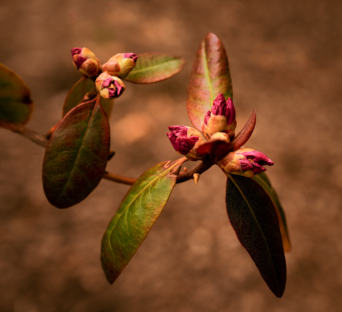
Creative and well presented flowers on a leaf.
Your original 2 sooc image is tack sharp and well exposed. Perfectly captured. I like the contrast of the sharp, colored flowers against the matte grey background. I agree with Peter to remove the water droplets. The color of the flowers in your original 2 looks great. My vote is the original 2. Your original colored version is my second choice. Color is definitely a better choice. It looks like a ceramic plaque. Nicely done.
|
Sep 9th |
6 comments - 1 reply for Group 99
|
15 comments - 6 replies Total
|