|
| Group |
Round |
C/R |
Comment |
Date |
Image |
| 19 |
Dec 21 |
Reply |
Hi Stan,
I went back to the original image to see why it had a blue tint. The white balance needed to be corrected. It looks so much better without the blue hue. Thank you for bringing that to my attention. I need to keep an eye on the white balance setting. |
Dec 21st |
| 19 |
Dec 21 |
Comment |
|
Dec 16th |
 |
| 19 |
Dec 21 |
Reply |
Hi Stan,
I've attached the original image SOOC. This is the original sky. It does appear to have a blue cast. |
Dec 16th |
| 19 |
Dec 21 |
Comment |
Hi John,
Nice street photography shot. Funny story. The railings frame the subject. The man and all his belongings keeps my eye in the frame. The sign is perfect. |
Dec 7th |
| 19 |
Dec 21 |
Comment |
Hi Stan,
Great landscape shot. Perfectly composed. The golden light on the rocks, water, and sand enhances the image. It is a very peaceful scene pleasing to my eyes. |
Dec 7th |
| 19 |
Dec 21 |
Comment |
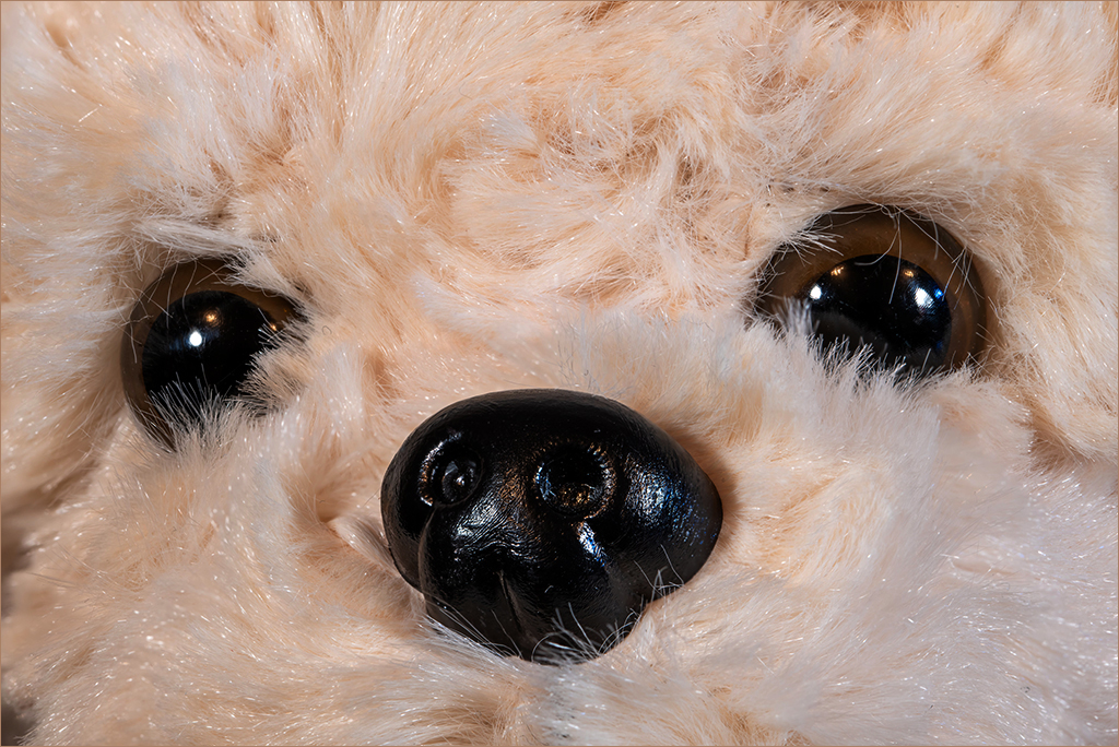
Hi Harriet,
You captured Elaine's face with her big, brown eyes with sharp details. Nice texture and color on her fur. Beautiful portrait, nicely done. Thank you for rescuing her. I'm an animal lover too. |
Dec 7th |
| 19 |
Dec 21 |
Comment |
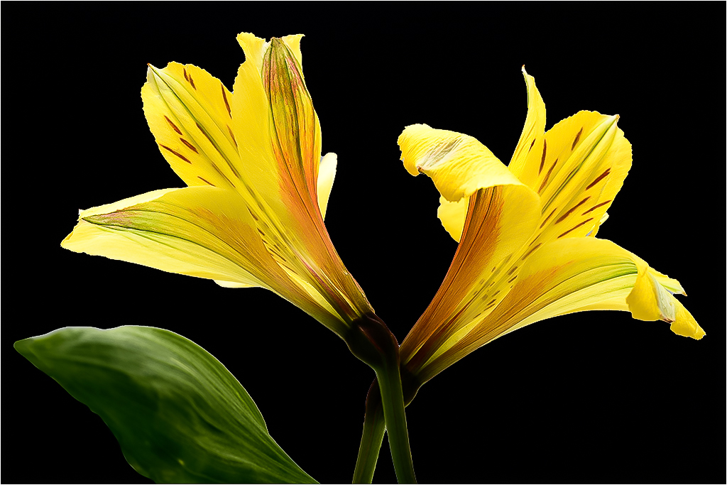
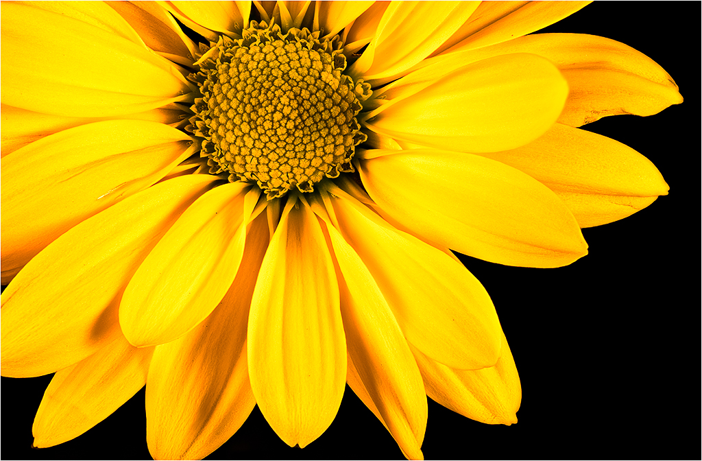
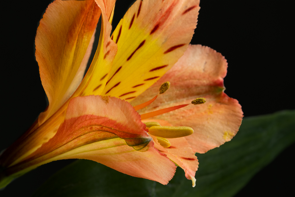
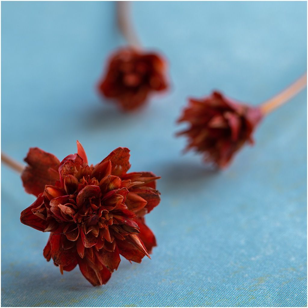
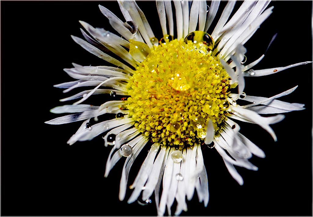
Hi Marian,
The colors and shape of the poppy are lovely. I believe your intent was to capture and focus on the raindrops. You accomplished what you set out to do. I like the sharp raindrops against the soft flower. |
Dec 7th |
| 19 |
Dec 21 |
Comment |
Hi Norm,
Your perspective of the Arch, the warm colors against the blue sky, the texture throughout, and the various tones in the canyon worked together to create this incredible image. Well done. |
Dec 7th |
| 19 |
Dec 21 |
Comment |
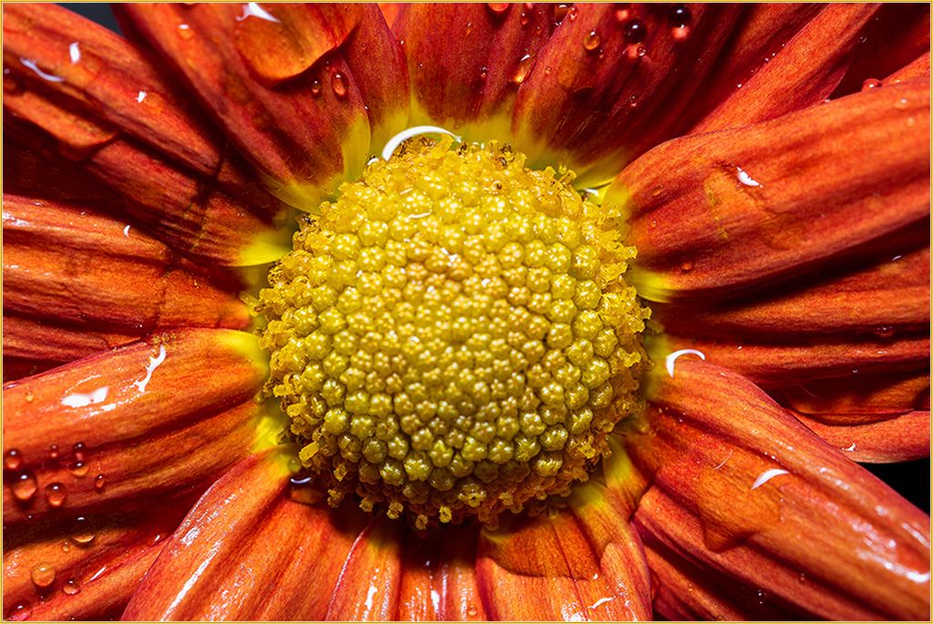
Hi Marcela,
This is a beautiful image. The colors are striking. Sharp details. Good exposure. I also enjoy focus stacking flowers. When I focus stack I also use a focus rail, tripod, and remote shutter. If you use a tripod you can use a low ISO of 100 or less, and choose whatever f stop you want. Norm made a good suggestion to use a poster board as a backdrop. |
Dec 6th |
| 19 |
Dec 21 |
Reply |
I see that now. Thank you Marcela. |
Dec 6th |
| 19 |
Dec 21 |
Reply |
Thanks Norm. You have a good eye. I can clone that unknown structure out. |
Dec 6th |
7 comments - 4 replies for Group 19
|
| 63 |
Dec 21 |
Reply |
Thank you Pricilla. Let us know how you fared in your abstract competition. I really like your shimmering leaf. |
Dec 12th |
| 63 |
Dec 21 |
Comment |
Hi Richard,
Wow. Impressive that it was in flight and you captured the details nicely. My only comment would be to darken the background a bit to give the beautiful monarch more attention. |
Dec 11th |
| 63 |
Dec 21 |
Comment |
Hi Neal,
Great image. Good composition. Your border within the frame is creative and adds impact to the image. Sharp details and nice colors on the damselfly. I agree with Murphy about the background. A few areas are a bit bright. |
Dec 11th |
| 63 |
Dec 21 |
Comment |
Hello Charles and welcome to our group. I didn't realize you were a new member. When I read your comment I thought you were visiting.
It will be great to have another focus stacker close by.
Nice shot. The details and colors on the bee are incredibly sharp especially handheld. I like the sharpness of the bee against the soft flower. |
Dec 11th |
| 63 |
Dec 21 |
Comment |
Hi Alane,
Your perspective captured all the bright colors, shapes, and curves on the pinwheel nicely. The details on the pinwheel are sharp. I agree with the other members suggestion to darken the background. It would make your subject pop. |
Dec 11th |
| 63 |
Dec 21 |
Reply |
Hi Charles,
Thank you so much for your explanation. It answered my questions. Now I understand I must take smaller steps and more images. I'm going out to buy a few flowers and try again. I also need a bit more patience. |
Dec 11th |
| 63 |
Dec 21 |
Comment |
Hi Pricilla,
Yes, this is an abstract image nicely done. Well composed. The backlighting enhances the curved lines, texture and colors of the leaf. In addition to Neal and Murphy's suggestions I might crop out the right side of the image just a little to eliminate the blurred out of focus areas toward the bottom of the frame. |
Dec 10th |
| 63 |
Dec 21 |
Comment |
Hi Murphy,
Lovely image. The colors are stunning. Well exposed. The texture, colors, and lines on the leaves are sharp. The colors pop against the black background. Nicely done. I found this image to be very pleasing to my eyes. |
Dec 10th |
| 63 |
Dec 21 |
Reply |
Hi Neal,
Thank you for responding. Could you explain what you mean " photo layer at that level"?
My method is as follows:
First, I use my out of focus hand as the first and last shots in the stack.
I move my focus point in small increments from the bottom straight up to top of the flower. I don't move the focus point left or right.
Then I discard the first and last out of focus images, sync the other images in lightroom, and export the stack into Helicon. Finish the stack in Photoshop.
In addtion to capturing focus on one level, should I move the focus point to the left or right on the level to capture sharp focus on the part that is partially out of focus.? Will it stack properly? Thank you.
|
Dec 10th |
6 comments - 3 replies for Group 63
|
| 99 |
Dec 21 |
Reply |
I agree with you 100%. � |
Dec 5th |
| 99 |
Dec 21 |
Reply |
Your long exposure shots are exceptional. The water is like glass. |
Dec 5th |
| 99 |
Dec 21 |
Reply |
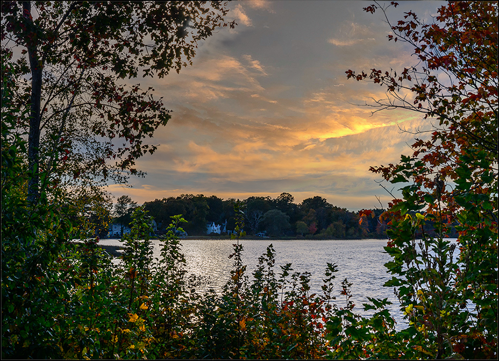
Thank you Michael. Now the question is should we be allowed to use a Photoshop sky replacement in a competition? I vote "no". Our sky replacements from our own images should be allowed. I think skies can be an important and powerful element in an image and should be our own sky in a competition. Competition images should contain only our image or composite of our images. That would be fair. Using a powerful sky replacement would not be fair. Thoughts? |
Dec 5th |
| 99 |
Dec 21 |
Comment |
Hi Michael,
You've captured a peaceful scene nicely. The rocks provide good shapes and texture. I like the shadows and smoothness of the water. You blended the sky with the water flawlessly. However, I would prefer to see the horizon clearly defining the sky and water thereby adding more depth to the image. That's just my opinion. As you know I like skies. |
Dec 5th |
| 99 |
Dec 21 |
Comment |
Hi Peter,
You managed to transform a beautiful, sunny image of the nunnery into a dark, foreboding background. Your placement and treatment of the nun in the frame worked well. Her white skelton face and veil pop out against the dark tones. Very creative image and story. Nicely done. I noticed some shadows in the lower left corner resulting from the sun in the original image. I thought maybe they should be removed, but I suppose the shadows could also be from the moonlight. Just a thought. |
Dec 5th |
| 99 |
Dec 21 |
Comment |
Hi Randy,
Your feat was accomplished. The image portrays a dreary, barren tract of farmland. Nicely composed. The repeating barrel shapes draws my eye through the frame. Your choice of darker lighting enhances the lonely mood. |
Dec 4th |
| 99 |
Dec 21 |
Comment |
Hi Linda,
Nice portrait. I like everything about your image. Black and white was a good choice. My only suggestion is to lighten the background to the same level as your original image. The subject seems to pop out against the lighter background in the original. Just my thoughts. |
Dec 4th |
| 99 |
Dec 21 |
Reply |
Hi Peter,
In this instance I used a sky replacement from Photoshop. Sometimes I will use a sky from another image in my library. I have noticed that some sky replacements in Photoshop look fake and are low quality. Others work well when you have a boring sky. Overall it can be helpful. |
Dec 4th |
| 99 |
Dec 21 |
Comment |
Hi Gerard,
Great shot. The side lighting really enhanced the texture of the artichoke. Sharp details. You captured the light and shadows nicely. One minor suggestion would be to remove some specks visible on the black background mostly on the left side of the subject. I would darken the background to eliminate any distracting spots. |
Dec 3rd |
| 99 |
Dec 21 |
Reply |
Hi Michael,
Thank you for your suggestions.However, I like the white streak and puffy cloud in the sky. I think it adds movement to the sky.
|
Dec 2nd |
5 comments - 5 replies for Group 99
|
18 comments - 12 replies Total
|